[press release]
The December Stamps 2016 PostNL will send a card as possible for everyone in the Christmas and New Year period to family, friends and relations at a cheap rate. The December special rate of € 0.65 per stamp this year is valid from November 14, 2016 until January 6, 2017
Issued November 14, 2016 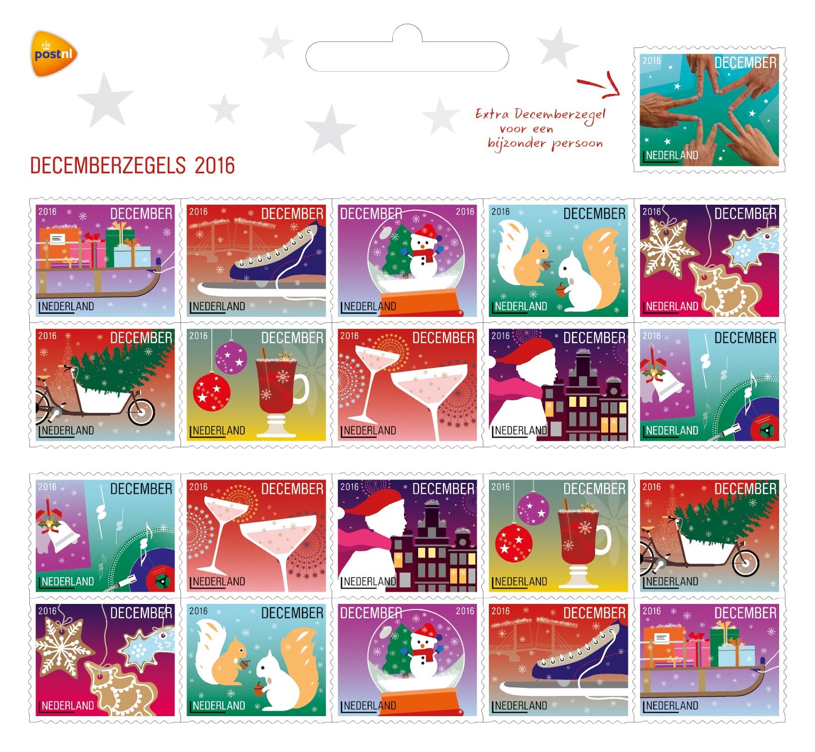 About the design:
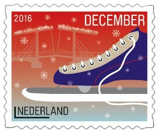
A sheet of 2016 December stamps contains two pages with ten stamps each and the extra December stamp. The ten illustrations on the stamps look like festive miniature stories. Each illustration refers to the festive month of December: a sleigh full of presents, a skate on wintery ice, a crystal snow globe with a snowman, squirrels collecting acorns, Christmas cookies, a Christmas tree in a cargo bicycle, mulled wine and ornaments, 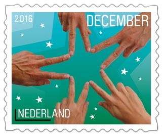 champagne glasses, a woman wearing a knit cap and scarf on a cold, wintery night and a record player with cheery Christmas music. Each stamp features gradient rich, warm colours. The atmosphere on the stamps is enriched with crystal shapes each with a different function – from fireworks to snowflakes, from champagne bubbles to even the shiny reflections on the ornaments and the single on the record player. There is a certain, unique logic to each of the colours. For example, the squirrels are set in a green environment, the skate is on blue ice and the drawbridge is shown against the red evening afterglow. The background colour on the extra December stamp was taken from the same palette as the other stamps. The image is a picture of five hands spread out to make a star. This image symbolises unity and connecting people and goes nicely with the thought of using this stamp to send a card to a special person. The font used for the typography is the modern, round, friendly and modest Brauer by Philippe Desarzens of Elektrokosmos from 1999/2006, an updated version of Pierre Miedinger’s font of the same name from 1974.
Technical Specifications:
 Stamp size: 25.3 x 20.8 mm
Perforation: 14½ : 14½
Paper: normal with phosphor tagging
Gum: synthetic
Printing: offset
Circulation:
PostNL: 4,860,000 sheetlets
Trekpleister: 130,000 sheetlets
Kruidvat: 500,000 sheetlets
Printing house: Joh. Enschedé Security Print, Haarlem
Print colors stamp: yellow, magenta, cyan and black
About the designer:
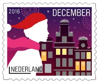 Edgar Smaling and Carlo Elias of Smel have designed stamps for PostNL before. The last ones were the 2014 December stamps. “This new assignment was a complete surprise,” Carlo says, “and of course again a great honour. PostNL asked us to build on the style we developed in 2014, but not to copy it completely. Which was a good thing, as that wouldn’t do our style justice. We also had other concepts to deal with. Ten different illustrations instead of twenty. A horizontal format instead of a vertical one. And the extra 21st stamp to surprise a special person with a Christmas greeting.” For the illustrations, Smel looked for modern subjects. Edgar: “Of course we have the classics like Christmas trees, ornaments, bells and snowflakes. But it also features contemporary images. The modern cargo bicycle used to transport children for example, with the Christmas tree in it. The comeback of the record player with the renewed interest in vinyl. The mulled wine with star anise. And the German Lebkuchen, fast gaining popularity in our country as Christmas cookies. We focused on the same principles in the selection of each subject: recognition, sharing, warmth and cosiness.” “We also revised our illustration style”, Carlo explains. “We went for a two-dimensional approach with a stronger focus on the larger picture than on finer lines. No 3D, no classic perspective, but we did create depth through a clever use of colour and layers. Look at the Magere Brug (“Skinny Bridge”) stamp. Positioning the skate on the foreground and blurring the colour of the bridge automatically creates distance. This sheetlet contains lots of dynamic images. The snow globe is tilted, because it will only snow once you shake it. The sleigh is also tilted up
 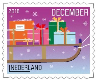 somewhat, a logical direction that refers to pulling the rope. The cargo bicycle is riding into the stamp, the woman is rushing along the canal houses, the champagne glasses are moving towards each other and the record on the record table is spinning. That movement is counter-balanced by the calm of the illustrations on the stamps with the mulled wine and the squirrels. That was how we brought balance to all of it. There is a similar balance in our choice of location – half of the stories are set outside and the other half is inside.” As is often the case in Smel’s work, these illustrations again contain subtle details. Edgar: “There are many different ways to depict the arm of the record player. The art is in leaving things out while still maintaining recognisability. The details are an essential part of the illustrations. Take the nostalgic triangle on the single or the mirrored squirrels, for example. Or look at the cinnamon stick in the mulled wine, next to the star anise. You can even see the lemon peel floating in the glass. The shape of the star anise is blown up in the background. It’s barely visible, but it’s there. We applied the same technique for the windmills on the back of the stamp sheetlet.” Carlo calls it “a challenge to find the right balance between what most people like and what we think is a good design. What we make is usually pert and unique. So for example, giving an unaesthetic subject like Lebkuchen its own aesthetic was quite the challenge. With all the necessary details. All stamps were designed as miniature stories on a miniature scale, but I dare say the design would have the same strength and effect if it were blown up to poster size.” About the designers The 2016 December stamp sheet was designed by Edgar Smaling and Carlo Elias, founders of Smel. Both designers studied between 1993 and 1997 at the Academy of Art and Design St. Joost in Breda. Smel, founded in 2001, consists of an energetic team of dedicated, multidisciplinary creative professionals, working for clients in government, fashion, design, art, photography and architecture. They design strategic corporate identities, magazines, books, house styles and websites. In doing so, they aim for airy shape concepts subtly connecting quality and the power of imagination. Smel provided the designs for the 2009 Summer stamps, the 125 Years of Carré stamps in 2012 and the December stamps in 2014.
 NORTH POLE — Yes, Virginia, there is a Santa Claus — and the U.S. Postal Service can help you prove it when Santa replies to your child’s letter — complete with a North Pole postmark.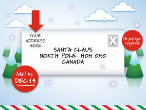
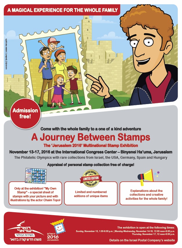 Israel Post says its retail and marketing operations will be at the show and unable to fulfill orders or answer e-mails during that period.
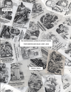 The Comprehensive Listing of ArtCraft Covers: Their Varieties and Values (1939-2015) is the Sixth (Compendium) Edition in this mammoth project which documents all known ArtCraft covers and varieties produced by the Washington Press (Washington Stamp Exchange). The Listing references over 15,000 collectibles, spanning the company’s full 76 years of production, and has been affectionately labeled “The ArtCraft Bible” by the active community of ArtCraft collectors worldwide.
 Is there one unalterable truth for stamp collectors? If so, I would propose that it is a universal feeling that U.S. stamp design is less than spectacular, and many of us share a belief that if we were running things, we could do better. Perhaps.
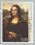 While any or all of these criticisms may have merit, it is all second-guessing. And my guess is that all artists — even the great ones — had to put up with similar carping (“That’s supposed to be a smile on Mona Lisa? Looks more like she’s
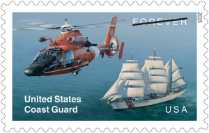 In my view about 10% of U.S. issues really rank high on both subject and design scales.
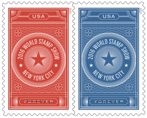 subject.
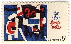 I well remember when modern art first made its appearance on a U.S. stamp with the 5¢ “Fine Arts” issue of 1964 (left). One would have thought listening to the reaction of collectors that the world as we knew it had come to an end.
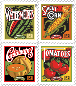 I personally don’t enjoy much of the poster art that has been and is used. The “Summer Harvest” issue is an example (right). And as to modern art, I think much of it is a fraud on the public when presented as works of inspiration possessed of deep and profound meaning. And yet, a portion of the public buys it and goes to see it in museums.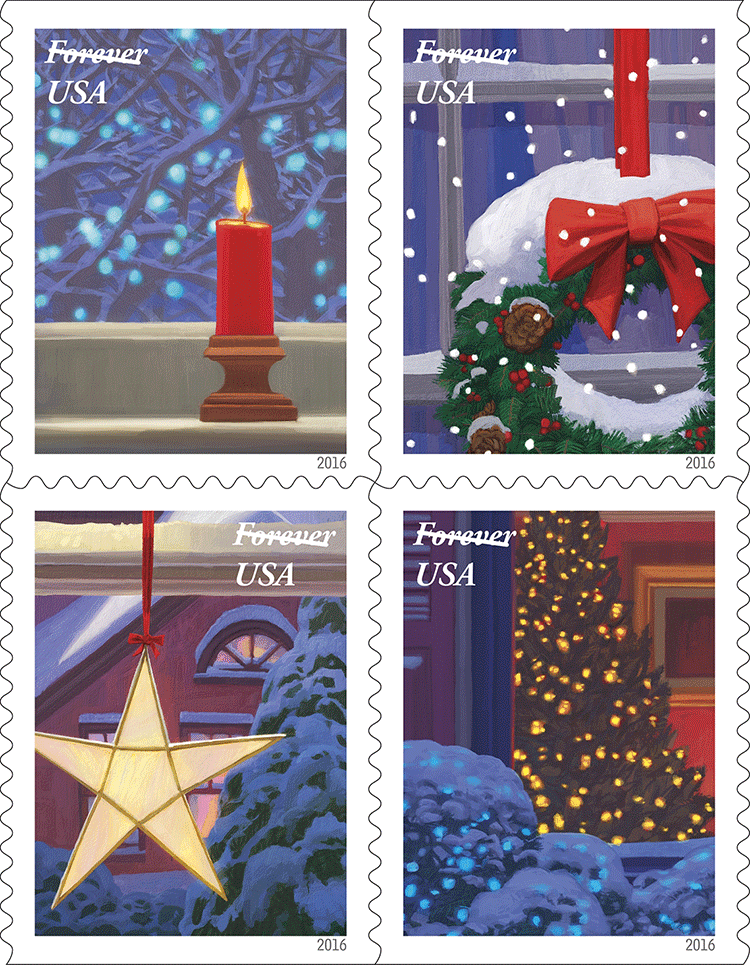
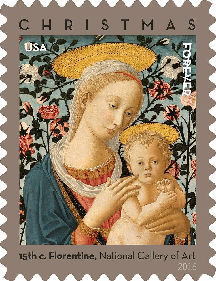
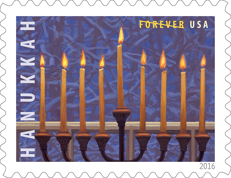
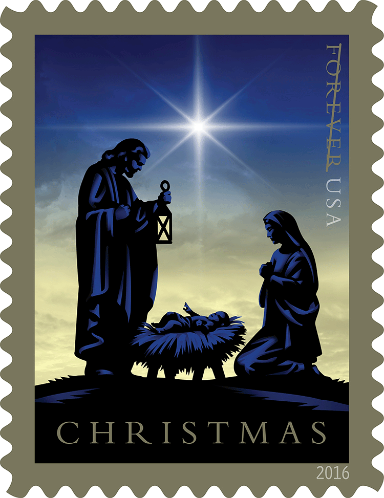 Other holiday-season issues: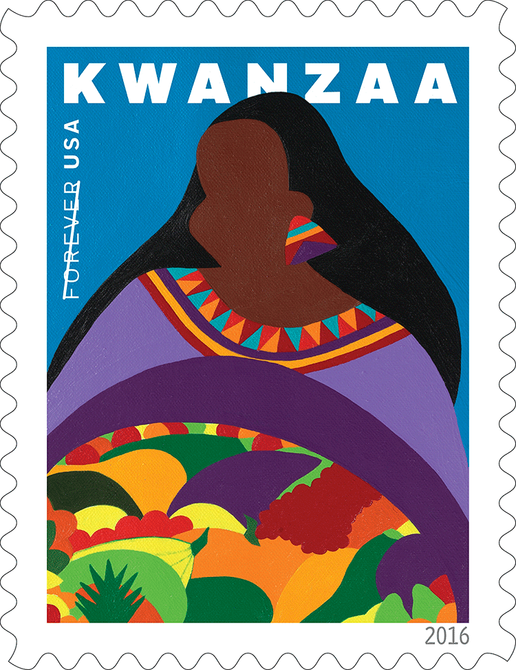
 It seems like only yesterday that Bob Lamb and Ken Lawrence drove me from APS headquarters in Patton Township (“State College”) Pa. to Bellefonte to see a derelict factory complex. On a later trip, Ken Martin took me up into the loft area of “Building 4.” We had to watch where we put our feet, because the flooring wasn’t very solid. But I saw the view out the open end of the loft and said, “Wow! This could really be something.”
 It’s now 16 years later (left), and it really is something. In fact, when I went up to the second floor for the first time during the celebratory weekend, I was a little choked up.
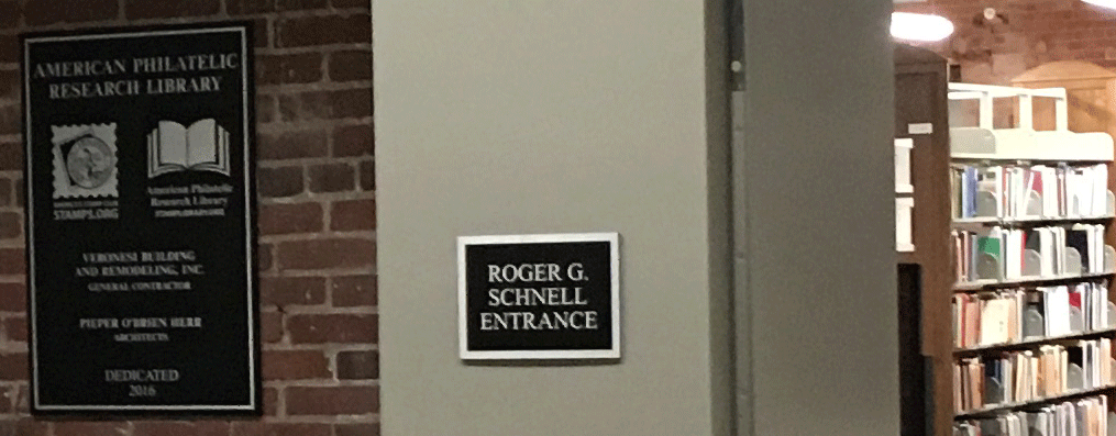
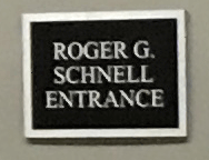 Roger Schnell was on the Board when the vote was taken; he voted against it. His comment as soon as the results were announced was, “Congratulations. You just bought yourselves a pile of bricks.” Yet as you enter the new facility, there’s the sign shown on the right: The Roger Schnell Main Entrance. Despite his misgivings, once the decision was final, Roger became a major donor for the complex’s renovation. There’s a lesson there that some mainstream national politicians haven’t learned.
  Every local official paid tribute to Ken Martin, now the APS Chief Operating Officer as an important part of the project. I think some philatelic leaders don’t appreciate Ken enough.
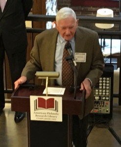 w, after an ugly APS election in 2007 and the subsequent lawsuit, and his always sharp tongue — he can flay you with his pen — but Ken was a driving force behind the “Match Factory” project. APRL president Roger Brody praised Ken, while admitting that he is often “prickly.” (I think that is the word he used.) Kudoes to Roger for broaching the subject. I’m sure it wasn’t easy, nor was deciding whether to do so wasn’t easy, either.
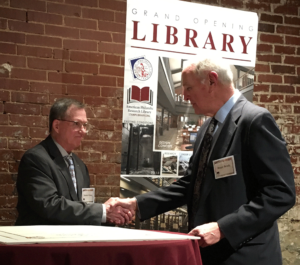 I was surprised that more wasn’t made of Dennis Gilson’s contribution to the project when he received his Luff Award for Service to the American Philatelic Society. In reading a list of his activities before Dennis signed the Luff scroll, Ken Martin first listed all his many activities on behalf of the APS, quite a few of which are continuing. Perhaps it’s because the American Philatelic Center actually belongs to the APRL, not the APS. Dennis was the first project manager, using his engineering background to get the work started. He retired from that post after the first two phases were completed and the two organizations had moved to the Center.
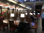 I was both pleased and surprised to see how closely the finished product (right) looks like the architectural renderings (left).
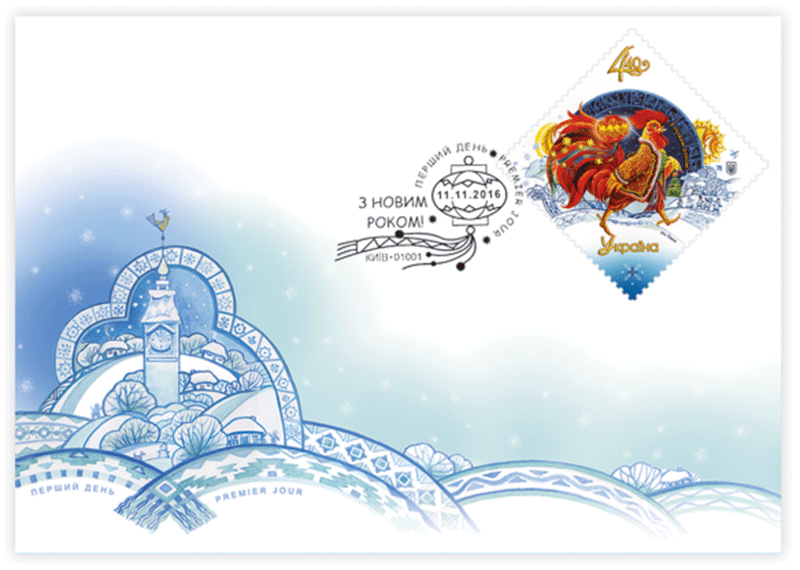
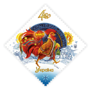 Issue Date: November 11, 2016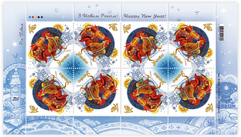
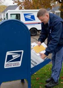 WASHINGTON — The United States Postal Service today filed notice with the Postal Regulatory Commission (PRC) of price changes for Mailing Services products to take effect next year, following the end of the holiday mailing season. The new prices, if approved, include a two cent increase in the price of a First-Class Mail Forever stamp, returning the price to 49 cents, the price of a Forever stamp before the Postal Service was forced to reduce prices by the PRC as part of the exigent surcharge removal.