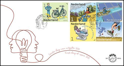
December (Holidays) Stamps (Netherlands 2021)

[press release]
December Stamps 2021

Date of issue: 15 November 2021
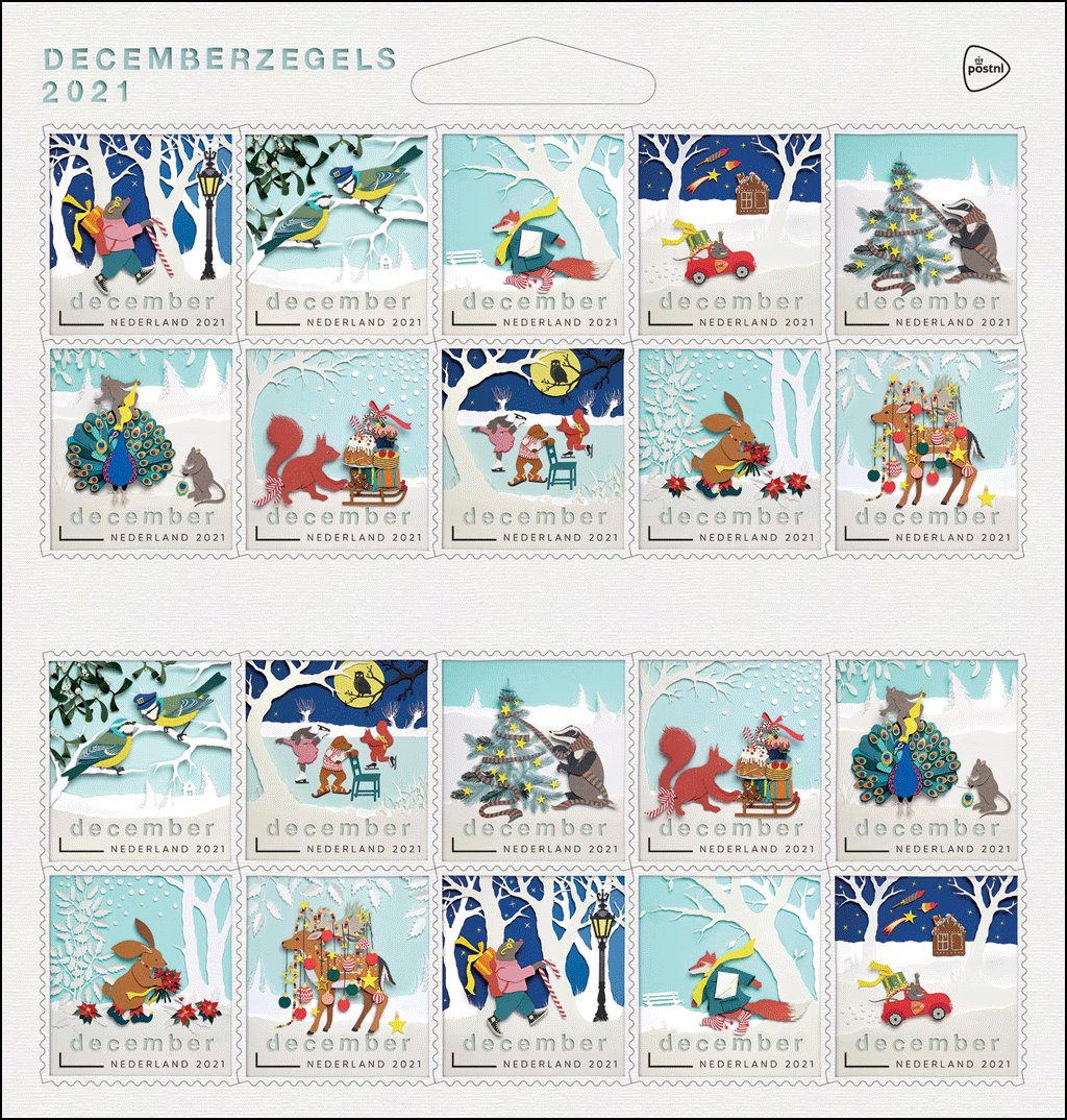
Appearance: sheetlet of twenty December stamps in ten different designs, with a special December rate for destinations in the Netherlands
Item number: 411261
Design and illustration: Geertje Aalders, Kampen
Graphic design: Corine Zwier, Kampen
Image processing: Ro de Boer, Haarlem

Each year, PostNL issues new December stamps, which can be used by consumers and companies to send each other Christmas and New Year cards at a reduced rate. The special December rate of € 0,91. per stamp applies from 15 November 2021 up to and including 6 January 2022. This year, a sheet of twenty December stamps costs € 18,20. When purchasing two sheets of December stamps, each customer receives a free Christmas decoration especially designed for PostNL by Vondels. This ornament is in the shape of the red postal car that appears on one of the 
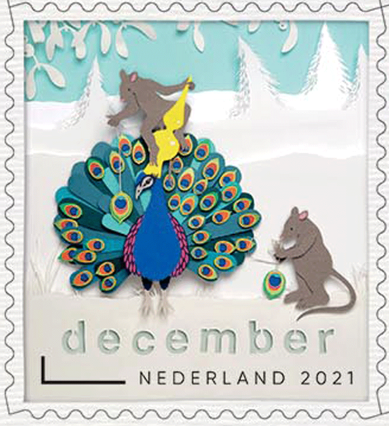
December stamps. The illustrations for the December stamps 2021 were made by paper cutting artist Geertje Aalders from Kampen.

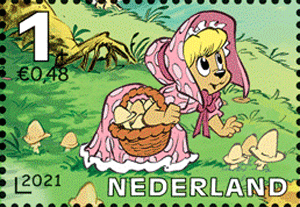
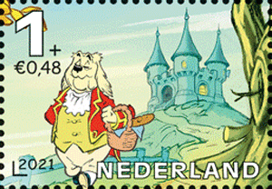
The illustrations on the December stamps 2021 are papercuts, specially made for this issue by paper cutting artist Geertje Aalders. For this year’s December stamps, she has invented a fantasy world full of stories in which a lot happens. In the ten different scenes on the December stamps, all the animals are enjoying the festive month of December. Everyone is doing their best to make it enjoyable for each other. The hare has fetched a bunch of Christmas roses, and the squirrel is on his way with treats for someone else. In this way, Aalders shows that this time of year it is extra nice to be together and to let people know that we are thinking of them.

The earliest examples of paper-cutting or cut-out art date from the 3rd century BC. The art of cutting paper is not only part of popular art, but famous modern artists such as Matisse have also worked with it. Famous Dutch cutting artists of the past include Anna Maria van Schurman, Elisabeth Rijberg and Johanna Koerten, who worked in the 17th and 18th centuries. We know that enormous sums were paid for cuttings by Koerten. The Paper Cutting Society was founded in the Netherlands in 1983. In 2013, the society was granted the right to bear the UNESCO logo after paper cutting was placed on the Dutch National Inventory of Intangible Heritage as a craft. The Paper Cutting Museum is located in Westerbork. Other important collections can be found in the Westfries Museum in Hoorn and the Netherlands Open Air Museum in Arnhem.

The following winter scenes are depicted on the December stamps 2021 in the form of papercuts:

  • A mole with candy cane and rucksack
  • 2 love-struck blue tits under a mistletoe
  • a fox with a fluttering scarf and envelope
  • a mouse in a red postal car
  • a badger decorating the Christmas tree with his scarf
  • 2 mice decorating a peacock
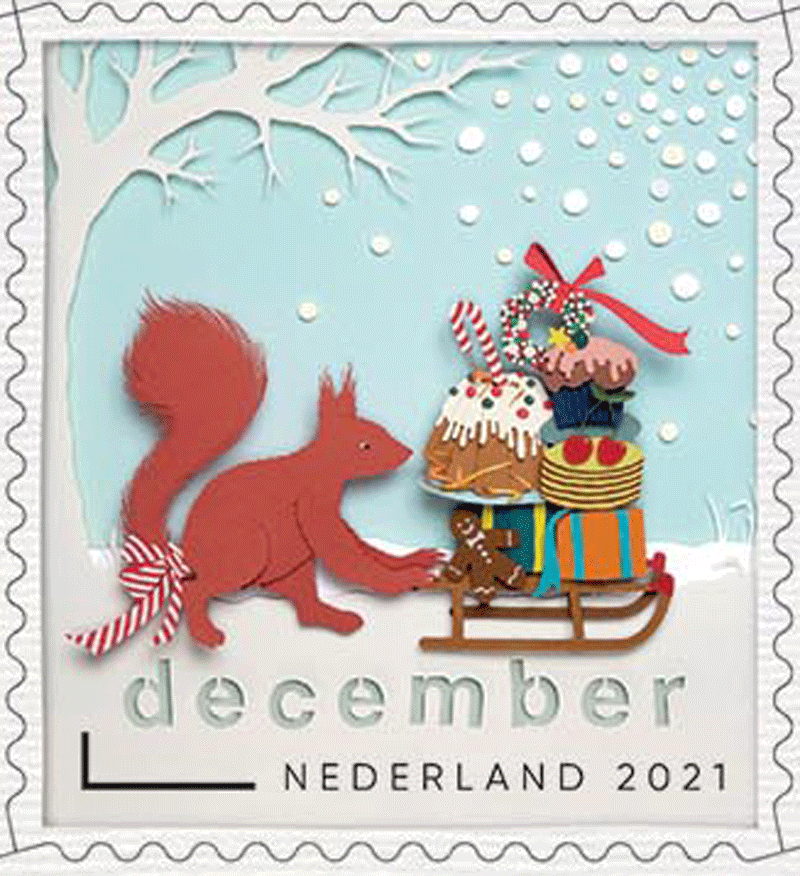
  • a squirrel pushing a sleigh with gifts and treats
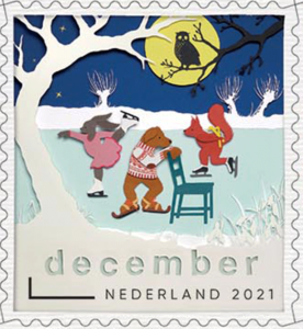
  • a squirrel, hare, dog and owl by the skating pond
  • a hare with a bunch of Christmas roses, and
  • a fallow deer decorated as a Christmas tree.

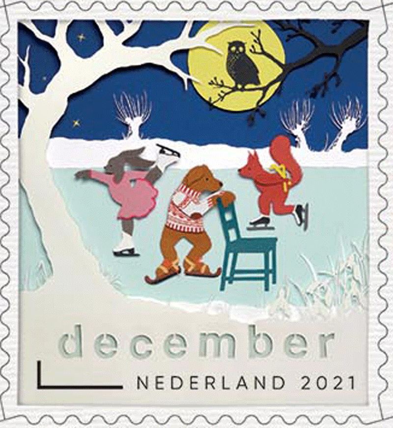
All the animals are depicted in a friendly winter landscape, a cosy animal forest with 
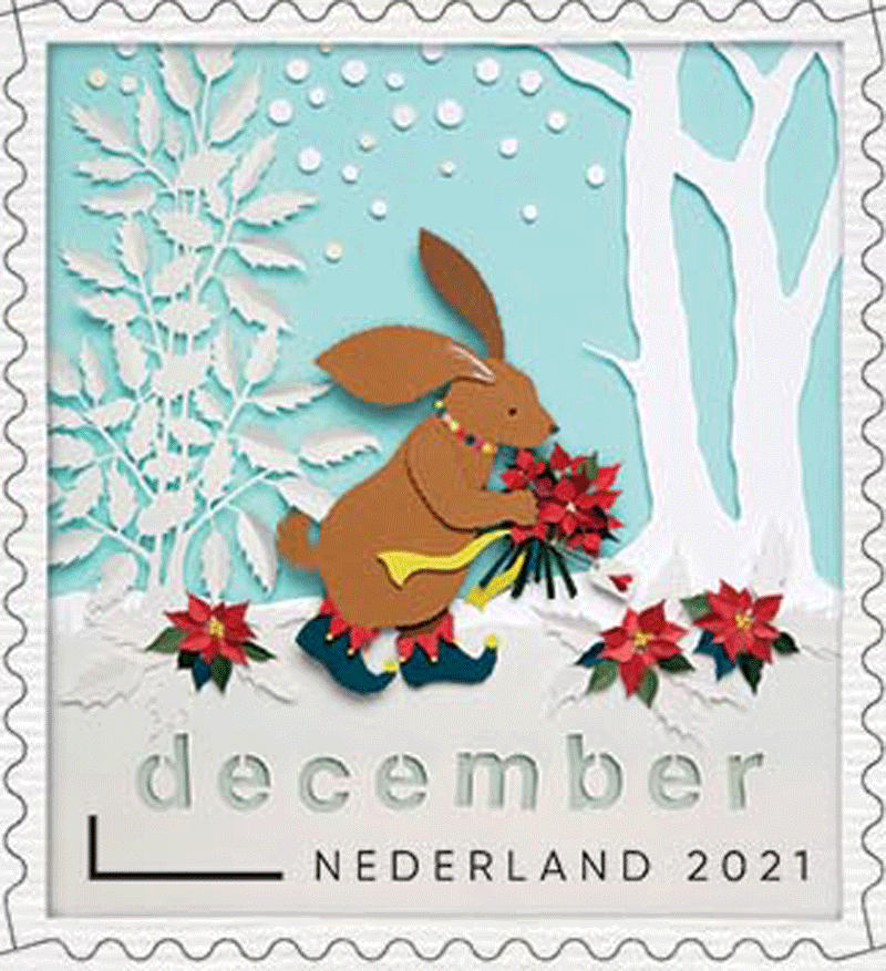
brightly coloured picture elements. Sometimes a larger scene can be seen, other times all the attention goes to one animal. There are three types of sky: light blue, bright blue and dark blue for the morning, afternoon and night respectively. Each December stamp tells its own story. Together, the ten December stamps form a whole because the animals are all, in one way or another, engaged in the theme of Christmas, winter or December.

Typography
For the title of the issue, the December indication on the stamps and the header on the back, round letters hand-cut by Geertje Aalders were used. For the remaining typography, the Gilroy Regular (by letter designer Radomir Tinkov, 2016) and the Alte Haas Grotesk (letter designer Yann le Corroler, 2007) were used.
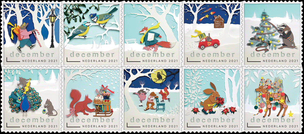
Designer
The creation of the December stamps is always a highlight of the PostNL issue programme. The large circulation, the Christmas and end-of-year feeling, the accompanying publicity campaign – everything is different. This applies all the more this year because the illustrations on the December stamps are, for the first time, based on cutting works of art made of paper. These papercuts were made by illustrator Geertje Aalders from Kampen.

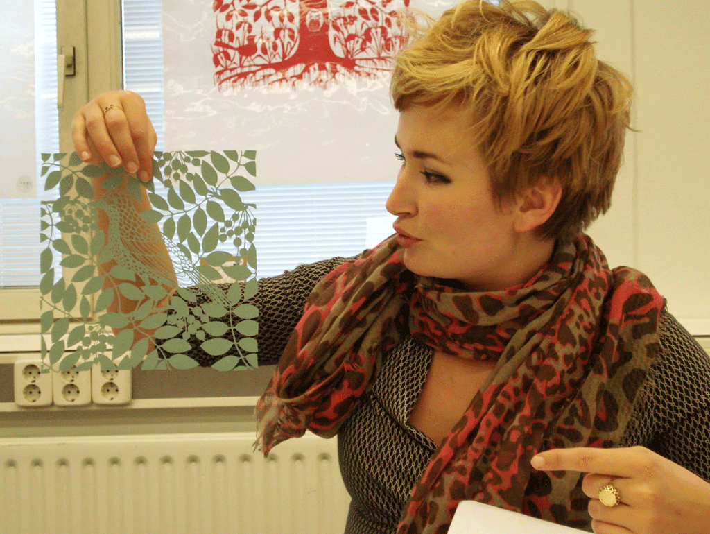
Geertje Aalders (right) has been active as a paper cutter since 2006, among other things for magazines and books. Despite her extensive experience, the December stamps were a very special commission for her as well. “It was already great to see how something like that comes about. On the one hand, there is a lot of structure in the planning and organisation, on the other hand, I was given all the freedom to do what I wanted to do. Really wonderful. It was more than fantastic to be able to work on this commission.”

Aalders started writing before she started cutting. “I often do that, making up little stories 
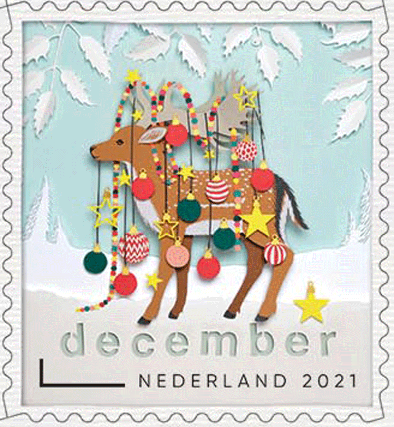
first, like this one about the animals in the forest, with a shared story. Only then did the sketches come. The special thing about papercuts is that you have a beginning and an end, but you cannot show halfway through what it is going to be. Hence the stories and the sketches. I also made a colour chart and completely worked out and cut one of the December stamps – the one with the mole on it – beforehand.”

After PostNL had approved the stories, the sketches, the sample stamp and the chosen colours, it was time to make the papercuts. Aalders: “I always use the same knife that my grandmother gave me 30 years ago. To put it more precisely, I use the same holder with a different blade every time. I change the blade often – sometimes every fifteen minutes – because it has to stay razor-sharp. Otherwise the knife may slip. For the December stamps, I used a lot of paper in many colours. For example, each eye on the peacock’s tail consists of at least seven 
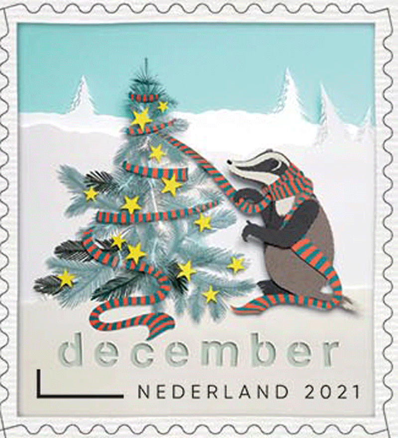
pieces of paper in different colours, one on top of the other. First I cut all the animals and the main objects, like the lamppost, the car, and the gingerbread house. Only then did I start with the surroundings, the trees, and the sky. No two papercuts are the same. A scene with many details takes a lot of time, for example. With others, it is sometimes difficult to get the composition right. I have paid a lot of attention to the smallest details in the silhouette, so that you can quickly see what kind of animal it is. In the mole, for example, the curve at the top of its nose is very important, as is the small hollow under its chin. If it is not right, I will cut it again. Just until I am satisfied.”

While cutting, Aalders adds all sorts of details that are not in her sketches. “For example, I cut different kinds of skates for the animals on the frozen pond: Frisian skates, ice speed skates, and figure skates. The blue tit’s post cap is another reference to how you can recognise that bird by its blue cap. I like to include secret jokes in my clippings, like the 
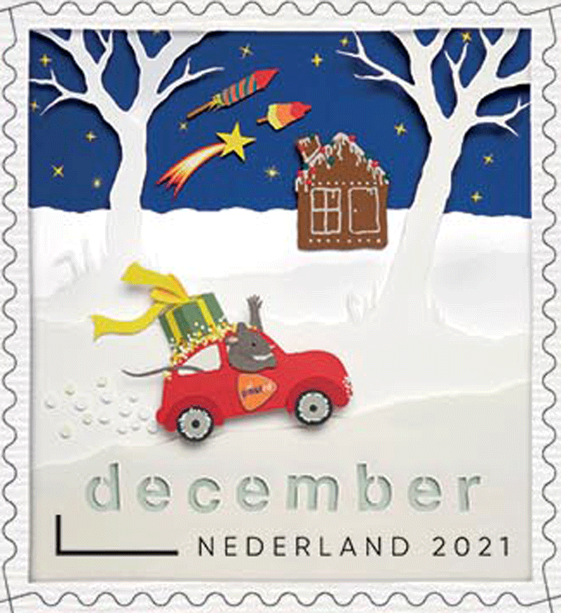
PostNL crown on the lamppost. And there is a rocket in the New Year’s Eve sky, but in the shape of an ice cream.”

Aalders cuts in mirror image, i.e. on the back of the paper. “Based on the sketches, I draw the desired contours in pencil. Then I start cutting. Not everything is suitable as a silhouette. For example, a rose is beautiful to look at, but its silhouette is uninteresting. A fox, on the other hand, is beautiful in silhouette, instantly recognisable by its tail and the ears sticking up. I made all the papercuts for the December stamps at the same time. Each stamp is a story in itself, but together they should of course form a beautiful whole.”

The Big Story
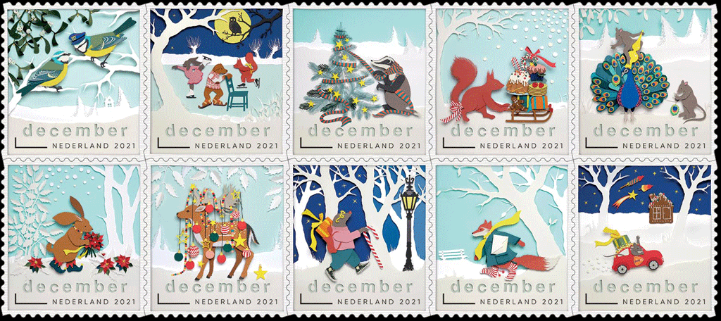
Together, the ten stories on the December stamps tell one big story, in which the animals in the forest are busy celebrating December. “They are decorating the place,” says Aalders. “They are on their way with gifts and mail, and they pay attention to each other. Just look at the kissing blue tits under the mistletoe. Everyone is having a good time. While making the papercuts for the December stamps in the spring, I often thought back to last winter. Then the pond in front of my house was frozen over, children were busy skating, 
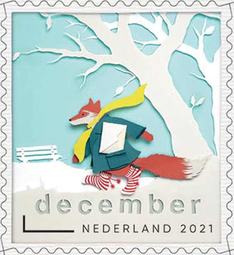
adults were having snowball fights, and everyone was having lots of fun. I wanted to convey that feeling.”

All cut elements are brought together in a three-dimensional frame of usually about 40 x 35 centimetres. Aalders: “I use this to put the papercut together. They are fragile works with a whole framework behind them to connect all the layers of paper. I use pieces of balsa wood, a light and strong type of wood. Not all the paper layers are in a flat plane in the 3D frame. Sometimes I tilt them a little to enhance the spatial effect.”

All frames with the cut-out illustrations for the December stamps were photographed by Aalders herself. “With a special lens, straight from the top. On the basis of the photos, I determined the cutout. Some papercuts have been readjusted and photographed again to get the perfect cutout. For example, I very carefully removed the mistletoe and moved it a little closer to the blue tits. Everything I do is analogue, I don’t adjust anything on the 
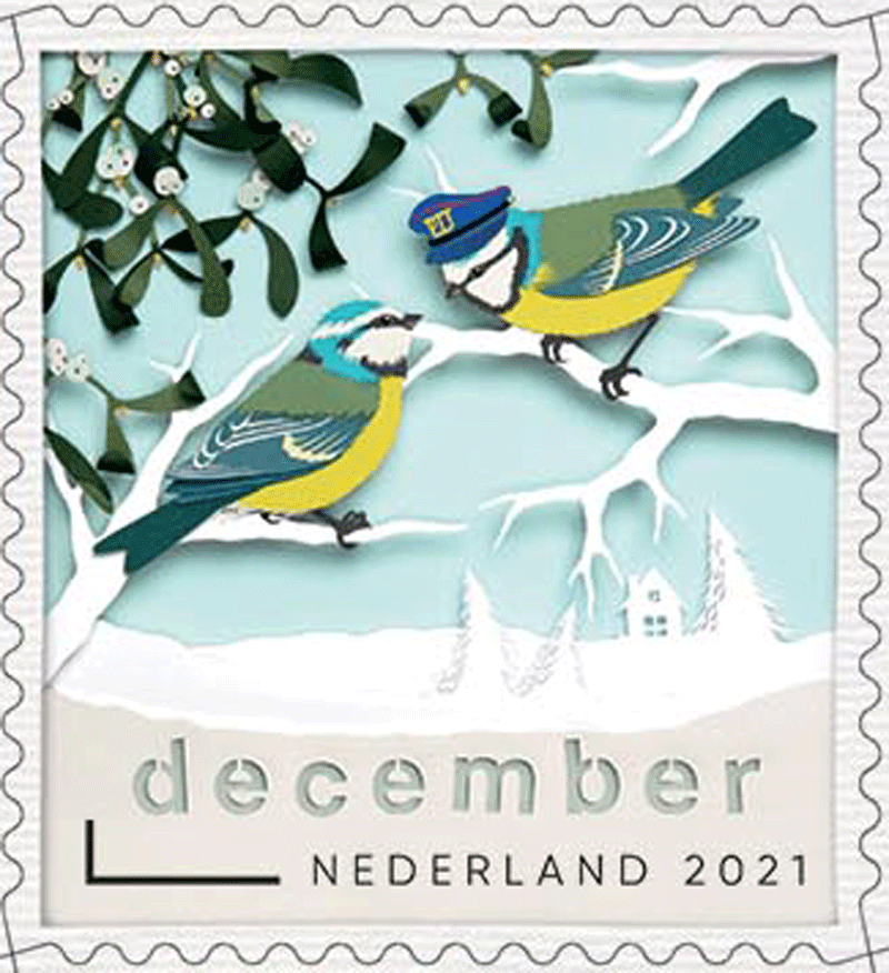
computer. The colours are determined by the paper I choose, the shapes by the way I cut the paper. The only image editing was done by photographer Ro de Boer, with whom I often work. He made sure that the different colours of the sky would have the same intensity. I enlisted more help. Designer Corine Zwier has placed the cut-out letters in the stamps in such a way that it seems as if they have been cut out of the stamp paper. That was her idea. Corine also added a frame to the December stamps with a shadow border, as an imitation of the 3D frame. The background of the sheet was given a relief structure as if it were a real paper sheet.”

Order
The final step in making the December stamps was to determine the order on the sheet. “That was a bit of a puzzle,” says Aalders. “Because I wanted as much variety as possible. So preferably no animals with the same colour next to each other, not the same types of sky next to each other, and not the same walking direction of the animals next to each other. Moreover, by giving the bottom block of ten December stamps a different order than the top block, at first sight it looks like a sheet with twenty different designs. I am very happy with the final result, I worked very hard on it. Hopefully, people will also like it and realise that they are cut-out illustrations. The wren on the back of the stamp sheet is the best proof of this. To confirm that everything has been cut, there is a scissor on the back instead of a copyright symbol.”

About The Designer
Geertje Aalders (Doetinchem, 1983) is a Dutch illustrator who is best known as a paper cutting artist and an authority on modern cutting in the Netherlands. Aalders studied graphical design and illustration at Constantijn Huygens School of the Arts in Kampen and ArtEZ University of the Arts in Zwolle from 2001 to 2008. Since 2006 she has worked as a freelancer for magazines such as Flow Magazine, Happinez, and Margriet. Other well-known clients are Albert Heijn, Bekking&Blitz, and Hema. In addition, Aalders illustrates all kinds of books that are also published abroad. Arab fairy tales (Gottmer Publishers Group) from 2017, with adaptations of fairy tales by Rodaan Al Galidi and with cuttings by Aalders, was awarded the Libris Most Beautiful Book Cover and the Jenny Smelik-IBBY Prize. In addition to cuttings, Aalders makes detailed pen drawings and illustrations in oil. She also wrote a handbook on paper cutting, Het Papercutboek (Kosmos Publishers, 2019).

Limited Validity
The 2021 December stamps are available from 15 November 2021 at all PostNL sales outlets in the Netherlands and through www.postnl.nl/collectclub. The stamps can also be ordered by phone from the Collect Club customer service on +31 (0)88 868 99 00. The validity period is indefinite, but the December stamps can only be used on their own from 15 November 2021 up to and including 6 January 2022.

The December stamps with the special rate are intended for use on mail weighing up to 50 g and on envelopes with minimum dimensions of 14 x 9 cm that are destined for delivery in the Netherlands in the period from 15 November 2021 up to and including 6 January 2022. Two December stamps are enough for mail weighing up to 50 g destined for delivery to addresses outside the Netherlands. December stamps can also be used outside of the period from 15 November 2021 up to and including 6 January 2022, provided that they are accompanied by an extra stamp for the rate applicable at the time of sending.

Stamp size: 26.5 x 29 mm
Sheet size: 144 x 151 mm
Paper: normal with red phosphor print
Glue: self-adhesive
Printing technique: offset
Printing colours: cyan, magenta, yellow, and black
Print run: 3,615,000 sheets
Appearance: sheet of 20 stamps with 10 different designs
Design: Geertje Aalders, Kampen
Graphic design: Corine Zwier, Kampen
Image processing: Ro de Boer, Haarlem
Printing company: Koninklijke Joh. Enschedé B.V., Haarlem
Item number: 411261

Underwater Landscapes (Netherlands 2021)

[press release]
Dutch Underwater Landscapes
Issue date: 16 November

Three sheets with five personal stamps in three different designs, marked with ‘1’, the denomination for items up to 20g in weight destined for delivery in the Netherlands.

Design and image editing: Bart de Haas, The Hague

Photography: Willem Kolvoort, Arthur de Bruin and Matthijs de Vos, Peter van Rodijnen, Paul van Hoof, Buiten-Beeld (Jelger Herder, Luc Hoogenstein, Nico van Kappel, Wil Meinderts, Ron Offermans, Peter Verhoog)

Item Number / Issue for 16 November 2021:
810064 Life in a flood plain [subscription only]810065 Fish in the North Sea810066 Invertebrates in the North Sea

The Dutch underwater landscapes series consists of 25 sheets, each with five personal stamps in three different designs. After the issues on 16 November 2021, every quarter for the next three years, subscribers to this series will receive two new stamp sheets with the following titles:

Item number / Issue
810067 Fish in the Oosterschelde
810068 Invertebrates in the Oosterschelde
810069 Fish in freshwater lakes
810070 Plants in freshwater lakes
810071 Fish in peat ponds and lakes
810072 Plants in peat ponds and lakes
810073 Fish in sand quarry ponds
810074 Plants in sand quarry ponds
810075 Fish in rivers
810076 Invertebrates in rivers
810077 Fish in freshwater tidal zones
810078 Plants in freshwater tidal zones
810079 Fish in farming ditches and canals
810080 Plants in farming ditches and canals
810081 Fish in the pond
810082 Plants in the pond
810083 Fish in the uplands
810084 Amphibians in the uplands
810085 Amphibians in the fenns
810086 Plants in the fenns
810087 Amphibians in pools
810088 Invertebrates in pools

[According to Wikipedia, The Eastern Scheldt (Dutch: Oosterschelde) is a former estuary in the province of Zeeland, Netherlands, between Schouwen-Duiveland and Tholen on the north and Noord-Beveland and Zuid-Beveland on the south. It has also the largest national park in the Netherlands, founded in 2002.]

From November 2021 to September 2024, PostNL will issue two personal stamp sheets in the Dutch underwater landscapes series every quarter. The first two stamp sheets with issue date 16 November 2021 are entitled Fish in the North Sea and Invertebrates in the North Sea. Subscribers also receive the unique stamp sheet Life in a flood plain free with their first set. This stamp sheet is not for sale separately. In June 2022, all subscribers will receive a handy storage album, also free of charge.

In addition to the usual stamp release schedule, PostNL also has an annual personal stamp release schedule. This programme is flexible. It allows PostNL to respond to topical developments and requests. Each issue is designed based on a fixed layout with a fixed number of personal stamps.

The stamp sheets can also be purchased separately at [direct link] and from the Collect Club’s customer service. This does not apply to the additional Living in a flood plain stamp sheet and the storage album. These gifts are for subscribers only.

Each stamp sheet in the Dutch underwater landscapes series includes five personal stamps in three different designs. The stamps feature plant or animal species from the relevant underwater landscapes. The pictures are framed by wavy graphic lines alternating between the top and the bottom of the picture. The edge of each stamp sheet features a large landscape photo of the underwater landscapes being depicted. The wavy motion of the graphic lines returns on the edge of the sheet, both at the top of the sheet and at the top and bottom of the strip of five stamps.

The Life on the flood plain issue features a burbot, a garlic toad and a yellow floating heart. The background image on the sheet edge depicts a submerged willow forest. The Fish in the North Sea issue features a red mullet, a school of pout whiting and an Atlantic wolffish. The background image on the sheet edge depicts a school of hunting needlefish. And finally, the Invertebrates in the North Sea issue features a maritime lobster, dead man’s fingers coral and a compass jellyfish. The background image on the sheet edge depicts bryozoa on Dogger Bank.

Typography
The font used for the denomination 1 and Nederland was designed in 2018 by font designer Martin Majoor from Arnhem. For the remaining typography, the Puffin Display Soft (2008-2021) by Pieter van Rosmalen, Bold Monday from Eindhoven was used.

Subject
The Netherlands has many different types of surface water: standing and flowing water, fresh, salt and brackish water, waters that may or may not be isolated and vary in size from small ditches, fens, ponds and pools, meandering rivers and streams to straight canals, city canals, lakes, estuaries, an inland sea and a marginal sea. Water makes up 19 percent of our country (13 percent is built-up area and 68 percent is greenspace). People mainly see and use the surface of this 19 percent, but below the water it is teeming with life. There are plenty of aquatic plants and fish, of course, plus all kinds of other species such as arthropods (crabs, lobsters, shrimps and insects such as dragonflies), coelenterates (polyps, anemones and jellyfish), echinoderms (starfish and sea urchins), molluscs (bivalves, snails) and amphibians (frogs, toads and salamanders).

Designer
The 25 stamp sheets from the Dutch underwater landscapes series were designed by graphic designer Bart de Haas. He realised he needed expert help while he was researching the subject. ‘So I contacted photographers and filmmakers who are specialised in this discipline, for instance. They know like no other what goes on beneath the water surface and which species are representative. I learned a lot from the tips of underwater specialists like Willem Kolvoort, the photographers of Blikonderwater – Arthur de Bruin and Matthijs de Vos – and Peter van Rodijnen.’

From large to small
Based on all the information gathered, De Haas selected a number of images from the Kolvoort and Blikonderwater image archives. Where necessary, he supplemented the images with pictures from Buiten-Beeld, the image bank for nature photography. De Haas explains: ‘The most important criterion in the selection was the habitat. The species featured should, of course, naturally occur in the relevant waterway or wetland area. I picked a number of underwater landscapes in our country, with the overarching aim to present as many different plants and animals as possible. In addition to the special issue featuring creatures and plants on flood plains, the stamps feature marine life in the North Sea and the Oosterschelde, followed by freshwater lakes, peat ponds, sand quarry ponds, rivers, freshwater tidal zones, farming ditches and canals, the Limburg uplands, fens and pools.’

Recognisability and variety
Another criterion for the choice of pictures was recognisability. ‘Not all photos taken by nature photographers are suitable for the miniature format of a postage stamp. Fish are tricky anyway because of their long bodies, which do not always fit onto a vertical postage stamp. That is why, for example, for Fish in the North Sea I picked a picture of a red mullet swimming into the picture at an angle. I also alternated more and less familiar species. For example, the burbot featuring on Life in a floodplain is extremely rare, whereas the lobster on Invertebrates in the North Sea is much more common. Of course, I wanted beautiful images – and I found them – but content-related criteria took precedence.’

Photo editing
As the choice of pictures was extremely high-quality, De Haas had to do very little editing, if at all. ‘That only applies to the plants and animals. They had to stay true to life. I did edit the colours and details in the background. The aim was to separate the species from the background, while ensuring the different stamps would go together at the same time. The fact that each type of water has its own colour plays a significant role in this respect. The North Sea tends to be grey, for example, while peat ponds and lakes are reddish. I took advantage of the arrangement of five stamps in three designs by putting the unique design in the centre of the sheet. Then I arranged the double images symmetrically around it. This also reinforces that sense of unity.’

Sheet edge
The atmosphere of the stamp sheet is also determined by the large-format photo of the mysterious underwater world around the edge of the sheet. De Haas was inspired by the school posters depicting nature designed by M.A. Koekkoek (1873-1944). Many generations of Dutch people grew up with these posters, and the species featured on these posters can still be found in our country. De Haas: ‘This approach allows me to show the mysterious atmosphere of the underwater world. A colourful, serene, fairy-tale world that is much more diverse than I thought. The more you pay attention to the details, the more magnificent and beautiful this world becomes. Everything moves, even though many Dutch waterways don’t really move very much. This movement returns in the flowing character of the font. And you can also see it in the graphic lines, which are an abstract representation of the movement and currents below the water. The lines soften the rectangular character of the stamp sheet. Because you will not find rectangles under water.’

About the designer
Bart de Haas (1966, The Hague) graduated from the Royal Academy of Art in The Hague. After working for several design agencies, he established himself as an independent graphic and typographic designer in 1993. He has a strong preference for book design, but has also designed posters, magazines, websites and visual identities in the past. Bart de Haas has designed books for Huis Marseille in Amsterdam, the Army Museum Delft, nai010 publishers, Brill publishers, de Buitenkant, Clio, SUN, THOTH, Vantilt, W-Books and Waanders, among others. For PostNL, he previously created the Primeval Species stamp series (2021-2023) and the stamps for Dutch castles (2017), Apple and pear varieties in the Netherlands (2016), National musical instruments (2014) and Long live the woods! (2010).

Photographers
Willem Kolvoort is one of the photographers who took pictures for the Dutch Underwater Landscape series. Kolvoort has been obsessed with underwater photography since he was young. Back in the 1960s, he went exploring with his home-made diving and camera equipment. ‘While I was on an excursion in the Wadden Sea I saw a huge ray swim past. It was unbelievably exciting.’ Captivated by this dramatic sight, Kolvoort subsequently travelled the world to produce underwater reports. He feels that he is primarily a landscape photographer. ‘I look for atmosphere and alienation, for mystery. I have a picture of Spirogyra, photographed from below. An amazing image, taken in the pond behind our house.

The Dutch Underwater Landscapes series also features photographs by Arthur de Bruin. He still remembers how he used to traipse around the countryside catching frogs and sticklebacks in canals and ditches. ‘That fascination with what the surface of the water is hiding from us never left me,’ De Bruin says. His most spectacular ‘picture catch’ in the Netherlands was a huge catfish. ‘But I also enjoy the little sunbleak, the smallest fish in our waters. Under the surface of the water you can find a unique, hidden parallel world. We are showing how beautiful and fascinating that world is. I hope that people will be looking at the stamps and think “is this really in the Netherlands? I want to see more!” I only have one answer to that: do it. Go snorkelling in the local open air swimming pond, and be amazed by the treasures you’ll find underwater.’

Availability and Validity
The stamps are available while stocks last at www.postnl.nl/bijzondere-postzegels and can be ordered by telephone from the Collect Club customer service on telephone number +31 (0)88 868 99 00. The validity period is indefinite.

Technical Details:
Postage stamp dimensions: 30 x 40mm
Appearance: five personal stamps in three different designs, marked: with ‘1’, the denomination for items up to 20g in weight: destined for delivery in the Netherlands
Print run: 3000 per issue
Item numbers:
810064: Life in a flood plain
810065: Fish in the North Sea
810066: Invertebrates in the North Sea: :
Issue date: 16 November 2021
Design and image editing: Bart de Haas, The Hague
Photography: Willem Kolvoort, Arthur de Bruin and Matthijs de Vos, Peter van Rodijnen, Paul van Hoof, Buiten-Beeld (Jelger Herder, Luc Hoogenstein, Nico van Kappel, Wil Meinderts, Ron Offermans, Peter Verhoog)

Digi Art (Netherlands 2021)

Appearance: Five different personal stamps marked ‘Nederland 1’, the denomination for post weighing up to 20g sent to an address within the Netherlands
Date of issue: 28 October 2021
Item number: 810060
Design: stamps Tim Ottens (Rijswijk), sheet edge Sandra Smulders (Gouda)With the Digi Art issue, PostNL is the first postal company in the world to issue a stamp sheet with a design created by a computer algorithm. The Digi Art stamp sheet features five different personal stamps that were designed by an algorithm based on a collection of around 1500 stamps from the period from 1852 to 1920. The personal stamps are marked ‘Nederland 1’, the denomination for post weighing up to 20g sent to an address within the Netherlands.

Background:
Artificial intelligence (AI) refers to computer systems that mimic human intelligence. These AI systems are capable of extrapolating large amounts of data, making new decisions and choices, and coming up with new interpretations. To achieve this, the computer systems use algorithms – mathematical formulas that are able to make independent decisions based on data or indicators – and learn from them. The developments in artificial intelligence are coming thick and fast. It is used in numerous applications, from face recognition on smartphones and self-driving cars to smart thermostats and deep fakes – digitally manipulated images, sounds and texts. Within AI there is a separate discipline called generative art, which is when a computer algorithm creates an original work of art or design. And this is exactly what was used for PostNL’s Digi Art stamp issue.

Design:
The stamp Digi Art stamp sheet features five postage stamps in five different designs. The five stamps feature five unique computer-generated designs against a dark background. At first glance, the five stamps look as if they have been issued before, but appearances can be deceiving. They may look like classic stamps, but they are not. All the elements are familiar, such as a supporting picture in the centre with a frame around it, a strip at the bottom for text, decorations in the corners and a frame with perforations… and yet, they are different from the familiar stamps from the 1852-1920 period.

The sheet edge, which was designed by graphic designer Sandra Smulders, features ten old Dutch stamps. From left to right, these are: King Willem III 5 cents (1864), Numeral stamp ½ cent (1876), Queen Wilhelmina 20 cents (1899), King Willem III 7½ cents (1872), Postal order stamp 4 guilders (1884), Numeral stamp 2 cents (1876), Numeral stamp 1½ cents (1899), Jubilee stamp 100 years of independence 12½ cents (1913), Coronation stamp Queen Wilhelmina 1 guilder(1898) and Michiel de Ruyter 1 cent (1907).

The 10 stamps are connected to the personal stamps with vertical lines via a horizontal elongated wave. The lines indicate the direction that the old stamps have travelled through the algorithm – represented by the wave – to form the new stamps. The background colour is derived from the personal stamp in the centre. The dark corners suggest depth. The gradient returns in the background of the stamps. In between the stamps, there are six individual letters in binary code (ones and zeros). The ones and zeros have different hues to symbolise the process of their creation.

Typography:
The font used for the denomination 1 and Nederland was designed in 2018 by font designer Martin Majoor from Arnhem. Pirulen Bold is used for the typography of the title, Pirulen Book for the binary code and Pirulen Light for the remaining text. All these fonts were designed in 2016 by Raymond Larabie of Typodermic Fonts in Nagoya, Japan.

Designer:
The Digi Art personal stamps are the brainchild of Tim Ottens, data scientist with the Analytics & Decision Support team at PostNL. Ottens introduced the idea during a hack-time project: time he and his colleagues were allowed to spend on innovations not directly related to their own job. The result was so popular and the stamp colleagues at PostNL were so enthusiastic, that they decided to issue the Digi Art stamp sheet. During the creation process, Ottens worked together with Ying Yu, a data engineer at PostNL, to teach the computer algorithm to design new stamps.

Feedback
To explain how the algorithm works in practice, Ottens draws a comparison with the learning process of a real artist or designer. ‘Their designs are based on existing works of art, designs and impressions on the one hand and on feedback from others on the other. Generative art, so when an algorithm creates a design, works pretty much the same way. The algorithm also has to learn from existing works of art and designs plus feedback. To accomplish this, we need a considerable amount of data. In this case, we fed the algorithm a huge collection of images of old stamps. That’s what we call a dataset. When you have a good dataset, you get a balance between diversity and homogeneity. In other words, the stamps used as input for the algorithm must be different, but at the same time they should not be too different. That is why we focused on the more classic stamps from the period from 1852 to 1920.’

Marked stamps
Ottens started with a total dataset of 4500 different stamps from dozens of countries to feed the algorithm. This was whittled down to 1500 stamps over time. That is because the process ran across quite a number of obstacles. Ottens: ‘Images of marked stamps, for example. The algorithm doesn’t realise that it is a mark, so it teaches itself to create images with black splodges. So we removed all the marked stamps from the dataset.’

Noses
The next obstacle was the fact that many stamps feature faces. So when an algorithm creates new images based on these, you may end up with a face with two noses or no nose. ‘For an algorithm, this is only a small deviation, but we humans immediately notice that something is not right,’ says Ottens. ‘That is why we filtered all the stamps featuring faces from the dataset. And then there was the problem that the quality of some of the images just wasn’t adequate. We removed these by hand or adapted them to determine the final dataset. Sometimes, we offered the same stamps to the algorithm again, but in a different colour, or with a small piece cut off. Because the more variation you have in a dataset, the better the final result will be.’

Millions of evaluations
Ottens and Yu adapted open-source software to design the Digi Art stamps. This specific algorithm is able to learn unsupervised. This means that the algorithm discovers the structure of the input itself and does not receive any commands relating to the desired output. In practice, there are two algorithms: the first is called the ‘generator’, the second the ‘discriminator’. Ottens: ‘The first algorithm functions as an artist who comes up with images from scratch. The second algorithm provides feedback by analysing the difference between the invented images and real stamps and passing this on to the other algorithm. By the way, the generator doesn’t just create a single image, it produces lots of them. That does take some computational time, the algorithms create and evaluate images millions of times.’

Human assessment
Ottens and Yu regularly checked a sample of the generated stamp designs. Ottens: ‘At first it didn’t look like anything, then slowly we saw outlines of stamps emerging. It started with the perforations and other recurring elements. During each assessment we tinkered with the program to give the algorithm a little push in the right direction. At some point we put together a longlist of the results and, together with our stamp colleagues, chose a number of designs. We didn’t adjust them any further, even the colours were picked by the algorithm. I am very happy with the final result, which far exceeded my expectations. Especially because sometimes unexpected details emerged. Like the double perforation on the centre stamp, for example. I couldn’t have come up with that myself.’

About the designers
Tim Ottens (Winterswijk, 1989) studied business economics, marketing intelligence and marketing management at the University of Groningen from 2010 to 2015. After graduating, he worked as a data-analyst at T-Mobile for four years. In 2019, he moved to PostNL, where he is now a senior data scientist responsible for projects related to predictive modelling and artificial intelligence. He applies his knowledge and experience to, for example, the personalisation of the PostNL app. He also develops models for the prediction of package volumes and the time lapsed between the pre-advice and the actual delivery of the packages.

Sandra Smulders (The Hague, 1974) studied advertising and presentation design at Nimeto Utrecht from 1991 to 1995, specialising in graphic design. She started the Vormgoed agency in Gouda in 2007 as a graphic designer and art director. Smulders specialises in designing logos and corporate styles and further developing the associated means of communication. For PostNL Smulders also designed the Stamp Day 2021 and 2020 stamp sheets, the Back to the 20th Century and Trains & Journeys (2019) stamp series, the 2018 Children’s Welfare Stamps, the stamp series celebrating 50 years of the Daily Fable (2018) and the 25 years of Fokke & Sukke (2018) stamp series.

The stamps are available while stocks last at www.postnl.nl/bijzondere-postzegels and can be ordered by telephone from the Collect Club customer service on telephone number +31 (0)88 868 99 00. The validity period is indefinite.

Value:
The denomination on these stamps is ‘1’, the denomination for items weighing up to 20 g destined for delivery in the Netherlands.

Technical Specifications:
Postage stamp dimensions: 30 x 40mm
Appearance: five different personal stamps marked ‘Nederland 1’, the : denomination for post weighing up to 20g sent to an address within the Netherlands
Print run: 8,000 per issue
Item number: 810060
Design: stamps Tim Ottens (Rijswijk), sheet edge Sandra Smulders (Gouda):

Copyright: © 2021 Koninklijke PostNL BV

Children’s Welfare: Mr Bumble and Tom Puss (Netherlands 2021)

[press release]
Issue: 2021 Children’s Welfare Stamps
Date of issue: 11 October 2021
Appearance: sheetlet of five special stamps in five different designs, marked with ‘1’, the denomination for mail up to 20 g in weight destined for delivery in the Netherlands, with a € 0.48 surcharge
Item number: 410960
Illustrations: Tim Artz, Nijmegen
Design: Ubald Seveke, Amsterdam

On 11 October 2021, PostNL will issue a new stamp sheetlet with Children’s Welfare Stamps marked with ‘1’ for destinations within the Netherlands. The five stamps are dedicated to the 80th birthday of Tom Puss. Since 1924, PostNL has been issuing Children’s Welfare Stamps to raise money for projects aimed at improving the welfare of vulnerable children. This is achieved by adding a € 0.48 surcharge to each stamp. The proceeds from all surcharges will be used for projects developed by the independent Stichting Kinderpostzegels Nederland foundation. The foundation is committed to giving children in both the Netherlands and in other countries a chance of a better life. To make this aid possible, the foundation organises, among other things, the Children’s Welfare Stamps campaign. The campaign has been listed in the Dutch National Inventory of Intangible Cultural Heritage since 2017.

The Children’s Welfare Stamps campaign aims to offer help to children who do not have a safe home. This year, more than 100,000 pupils from the last two years of primary schools will be taking orders for the Children’s Welfare Stamps from 29 September up to and including 6 October. Because of corona, new ways of presenting the stamps have been devised. For example, children can send personal video messages. With a special sales box and order forms through the letterbox, it is also possible to keep the necessary distance at the door. PostNL will deliver all orders from 11 October. The proceeds from the 2020 campaign amounted to 7.6 million Euro.

In 1941, now 80 years ago, the first of 177 stories conceived by Marten Toonder (1912-2005) was published. The stories, in which Tom Puss and his friend Olivier B. Bumble experience countless adventures, together form the classic Bumble saga. For nearly 60 years, Tom Puss appeared in many Dutch newspapers almost every day. The daily comic took the form of a text strip in black and white, with the text underneath the pictures. From 1955, Tom Puss also appeared in the weekly magazine Donald Duck, as a balloon comic in colour. The success of the comic led to the creation of the Toonder Studios where other comics such as Panda, Kappie and King Hollewijn were made as well. In addition to the comic department, there was a successful animation department. The Toonder Studios were closed in 2002, but Marten Toonder’s work continues. The copyright on Marten Toonder’s works is vested in the Stichting Het Toonder Auteursrecht foundation; the business activities have been incorporated in the Toonder Company, and the licences are managed by Rubinstein publishing company.

Stamps about Tom Puss and Olivier B. Bumble were already published at an earlier time, such as, for example, the stamps Tom Puss 75 years (design Frank Janse) in 2016, and the Comic Stamps (design Julius Vermeulen) in 1996.

Pascal de Smit, Director of Stichting Kinderpostzegels: “As with children’s stamps, millions of children have grown up with the adventures of Mr. Olivier B. Bumble and Tom Puss. We are therefore pleased and proud that the comic heroes can be seen on this year’s children’s stamps and are celebrating their 80th anniversary with us. After all this time, their stories are still alive and connected to current issues.”

Design
The Children’s Welfare Stamps 2021 feature various characters from the adventures of Mr Bumble and Tom Puss. The sheetlet includes four equally sized stamps and one double-sized stamp in the middle. On the large stamp, Tom Puss and Mr Bumble walk side by side along a sandy path. The smaller stamps are reserved for other characters from the adventures of Tom Puss: Doddeltje, Wammes Waggel, the butler Joost, and the Marquis de Canteclaer. Together, the five stamps show a large scene in the open air. To the left and right, the illustration is flanked by two large trees. Near the left tree, Doddeltje is picking mushrooms, and between the roots of the right tree, Wammes is playing his accordion. The stamp with Joost shows Bommelstein Castle. On the stamp with the Marquis, the Dark Trees Woods can be seen in the distance. The illustration continues on the edge of the sheet, which also features the logos of Tom Puss 80 years, the Children’s Welfare Stamps campaign, and PostNL.

For the typography of the texts, the Antique Olive (1958, Roger Excoffon) and the Comic Sans (1994, Vincent Connare) were used.

The illustration on the Children’s Welfare Stamps 2021 was made by comic strip artist Tim Artz. He became acquainted with Mr Bumble and Tom Puss at a very young age. “I was four or five years old when I saw the film If you know what I mean on television. My parents still have drawings that I made of Bommelstein Castle, Tom Puss, and the little dragon. Every year I would check the TV guide to see if it was being broadcast again. Until I got the film on video at the feast of Saint Nicholas. This is how my love of drawing was born. And of Marten Toonder’s work. I now also draw for Disney and previously for Woezel and Pip and Ducktales, but everything started with Mr Bumble and Tom Puss. First with the film, then with the balloon strips in Donald Duck and, when I was about eight years old, with the giant pocket books published by De Bezige Bij. For me, Tom Puss is the greatest comic hero in the Netherlands. Toonder was leading because of his beautiful drawings with a lot of attention for the atmosphere and the characters. I wanted that too.”

Young Artz published his drawings on Internet forums. His talent was quickly recognised; first by Disney, later by the Toonder Company. Artz: “In 2015, the Toonder Company was looking for illustrators for individual illustrations. That’s how I got into it. Recently, it has been very busy because of the celebration of Tom Puss’ 80th birthday. For example, I worked on the new comic book Tom Puss and the time-turner for two years. The story for this book had already been written before I was born. It was very special. I also made the illustrations for a new Golden Booklet. And for the stamps, of course.”

In recent years, Artz has become ever more familiar with Toonder’s way of drawing. “Obviously, you start by copying,” he says. “It becomes more difficult when you want to put the characters in different situations and poses. I have practised endlessly. I also learned from other illustrators with Toonder experience. I looked at the work of Piet Wijn for inspiration, and also that of Wil Raymakers and Henrieke Goorhuis. It is often about very subtle details. Moreover, Toonder’s characters act much more than the average comic character. That makes it extra difficult.”

Artz was asked to create a large scene for the children’s stamps, composed of five smaller scenes for each stamp. Furthermore, he was given complete freedom to choose the characters and the scenery. “I put the big stamp right in the middle, with Mr Bumble and Tom Puss on it together. This was a logical choice. I have not thought too long about the other characters either. Doddeltje and Joost are the closest to the main characters, and Wammes Waggel is one of my personal favourites. I hesitated a little longer about De Canteclaer. Hocus P. Pas and Kwetal were also good candidates. But the marquis is very popular with the fans. I often notice that at signing sessions. I also think it’s a great character myself.”

In the scene devised by Artz, Mr Bumble and Tom Puss walk side by side. The butler Joost follows with the picnic basket, Doddeltje is picking mushrooms. Wammes provides the music, and the marquis watches from a distance, disapproving as always. “They are having a picnic for Tom Puss’ birthday,” says Artz. “Other than that, there is no big story attached to it. Doddeltje picks mushrooms because the children’s stamps come out in the autumn. That is also why the leaves on the left tree are yellow. The biggest puzzle was to give the individual scenes a natural place within the individual stamps. In the drawing I have added some difference in height for the characters who are further away, like Joost and the marquis. Otherwise they would be too small on the stamp. And Wammes’ feet are lying comfortably on a stone because that makes the typography stand out better.”

Between 1957 and 1966, stories about Mr Bumble and Tom Puss appeared in Revue weekly magazine. The accompanying drawings were given their own treatment with special colouring. Artz used the atmosphere of these Revue comics as inspiration for his illustration on the children’s stamps, after he had studied a Golden Booklet to learn about this style. “Many fans of Mr Bumble and Tom Puss consider the stories in Revue to be the most beautiful colour work that has come out of the Toonder studios. So do I. It has a picturesque appearance. You can see this in the trees, for example. These are real Toonder trees: large, gnarled, and twisted. They almost seem like characters. I also wanted to keep it light and friendly. Fresh and cheerful. Precisely because they are children’s stamps.”

Graphic designer Ubald Seveke from Amsterdam was responsible for the design of the Children’s Welfare Stamps 2021. Seveke is familiar with the world of illustrations and comics. For example, he has designed many books for Rubinstein publishers with Dick Bruna’s Miffy in the leading role. Seveke also devised the logo of Puss 80 years, commissioned by the Toonder Company.

More about Marten Toonder
In the Toonder Studios, Marten Toonder (1912-2005) liked working on the newspaper comic about Tom Puss and Olivier B. Bumble best. After moving to Ireland in 1965, Toonder worked with renewed energy on the comic, which gradually developed from a children’s comic into a literary phenomenon. Via the literary giant pocket books published by De Bezige Bij, the comic found its way to an adult audience. On the occasion of Tom Puss’ 80th birthday, a new adventure was published in comic book form this year, The time-turner. An adaptation of the balloon comic book The blowing spirit was also published as a Golden Booklet. This year, shoe manufacturer Van Bommel (Mr Bumble’s Dutch namesake) is selling special Bommel shoes and, in a few years’ time, an indoor amusement park will arise in the Achterhoek region under the name Bommel world.

More about Children’s Welfare Stamps
Children’s Welfare Stamps were first issued in 1924 to give children orphaned due to the Spanish flu a safe home. The rich history shows many milestones. In 1948, children started selling stamps from door to door for the very first time. Since then, many princes and princesses have been depicted on the stamps, and major organisations and projects such as the Children’s helpline were established thanks to the money raised by the Children’s Welfare Stamps campaign. Stichting Kinderpostzegels Nederland is still committed to supporting children who live in an unsafe home environment. Projects such as Huisje Boompje Beestje and the Warm Welcome Bag help children feel at home in shelters for the homeless and for women.

More about the theme: Give more power
The corona crisis has had a profound effect on the lives of all 1.5 million primary school pupils in the Netherlands. The long-term consequences of the abrupt closing of schools and loss of social contacts are slowly becoming apparent. Reports of domestic violence are increasing in number, and more children are affected by poverty. This year, more than ever before, children’s requests for help are about emotional problems such as loneliness, anxiety, and depression. Every child has been affected by the consequences of the corona measures. As a result, every child has become vulnerable. The proceeds of the Children’s Welfare Stamps campaign go to projects that help children develop more resilience, so that they are better able to cope with these times of crisis.

Sale/Validity
Pupils from the last two years of primary schools will be taking orders for the Children’s Welfare Stamps from 29 September up to and including 6 October 2021. While stocks last, the stamps are available at Bruna as well as via www.postnl.nl/bijzondere-postzegels and on the Stichting Kinderpostzegels Nederland website. The stamps can also be ordered by phone from the Collect Club customer service on telephone number +31 (0)88 868 99 00. The validity period is indefinite.

The denomination on these stamps is ‘1’, the denomination for items weighing up to 20 g destined for delivery in the Netherlands.

Technical Details
Stamp size: 4 stamps measuring 36 x 25 mm and 1 stamp measuring 36 x 50 mm:
Sheet size: 144 x 75 mm
Paper: normal with phosphor print
Glue: synthetic
Printing technique: offset
Printing colours: cyan, magenta, yellow, and black
Print run: 1,232,000 sheets
Format: sheet of 5 stamps in 5 different designs
Illustration: Tim Artz, Nijmegen
Design: Ubald Seveke, Amsterdam
Printing company: Koninklijke Joh. Enschedé B.V., Haarlem
Item number: 410960

Copyright
© 2021 Koninklijke PostNL BV
Illustration © Stichting Het Toonder Auteursrecht, licensed by Rubin

Experience Nature: Haarzuilens (Netherlands 2020)

[press release]
Cultural landscape Haarzuilens on stamps

Date of Issue: 16 August

West of the city of Utrecht is the Haarzuilens estate, with the fairytale castle De Haar in the middle. The lands around the castle are owned by Natuurmonumenten [Natural Monuments]. The latest PostNL stamps from the Experience nature series feature the flora and fauna of this cultural landscape. The issue about the Haarzuilens estate is the last in the series Experience nature from 2021. Earlier this year, stamps were published about the Dwingelderveld heathland in Drenthe, the De Onlanden marsh landscape near the city of Groningen and the Duin en Kruidberg dune area in North Holland.

Reintroduction of old crops
Landgoed Haarzuilens is a versatile cultural landscape, with flower-filled meadows, extensive fields, forests, farms, orchards, vegetable gardens, ditches, a duck decoy and even an apartment building for swallows. Natuurmonumenten brings the cultural history to life here by reintroducing old crops such as buckwheat, oats, alfalfa, rye and flax.

Character determines choice
All kinds of residents of the Haarzuilens estate make their appearance on the stamps. The character of the area, with fields, meadows, water and forests, is reflected in the selection of the flora and fauna depicted. From the pollard willows on the banks of the ditches, the frogs in the water and the insects that buzz around them. The buzzard and nuthatch make their appearance, as does the hare, the symbol of nature on the Haarzuilens estate.

Autumn is coming
The stamp sheetlet about Haarzuilens is a design by graphic designer Frank Janse from Gouda. The atmosphere of the stamps refers to the arrival of autumn, with dark yellow, grey-green and blue-purple colours. The chosen photos were also taken in the autumn, when the chestnuts fall to the ground, the beech forest is steaming and the wings of the maple flutter down.

Layout in balance
In the distribution of the plants and animals on the stamp sheetlet, Janse has striven for an overall picture that is as beautiful and balanced as possible. This was done, according to the designer, “by combining detail and total shots, by different viewing directions of the animals and by also making diagonal connections. For example, between the two insects on the stamp sheetlet: the speed skater at the top right and the four-spot at the bottom left.”

Availability
The stamp sheetlet Experience nature – Haarzuilens estate has 10 different stamps with the value indication Nederland 1, intended for mail up to and including 20 grams with a destination within the Netherlands. The stamps will be available from August 16, 2021 at all PostNL sales points, the Bruna stores and via the website [direct link]. The stamps can also be ordered by telephone from Collect Club’s customer service on 088 – 868 99 00. The validity period is indefinite.

one of the 2 FDCs (“eerstedagenenvelop”) for this issue

[In de Nederlandse taal]
Cultuurlandschap Haarzuilens op postzegels

Uitgiftedatum: 16 August

Ten westen van de stad Utrecht ligt landgoed Haarzuilens, met in het midden het sprookjesachtige kasteel De Haar. De landerijen rondom het kasteel zijn eigendom van Natuurmonumenten. Op de nieuwste postzegels van PostNL uit de serie Beleef de natuur is de hoofdrol weggelegd voor de flora en fauna van dit cultuurlandschap.

De uitgifte over landgoed Haarzuilens is de laatste uit de serie Beleef de natuur van 2021. Eerder dit jaar verschenen postzegels over het heidegebied Dwingelderveld in Drenthe, het moeraslandschap De Onlanden bij de stad Groningen en het duingebied Duin en Kruidberg in Noord-Holland.

Herintroductie oude gewassen
Landgoed Haarzuilens is een veelzijdig cultuurlandschap, met bloemrijke weides, uitgestrekte akkers, bossen, boerderijen, boomgaarden, moestuinen, slootjes, een eendenkooi en zelfs een flatgebouw voor zwaluwen. Natuurmonumenten brengt hier de cultuurhistorie tot leven door de herintroductie van oude gewassen als boekweit, haver, luzerne, rogge en vlas.

Karakter bepaalt keuze
Op de postzegels maken allerlei bewoners van landgoed Haarzuilens hun opwachting. Het karakter van het gebied, met akkers, weiden, water en bossen, keert terug in de selectie van de afgebeelde flora en fauna. Van de knotwilgen aan de oever van de sloten, de kikkers in het water en de insecten die eromheen zoemen. De buizerd en boomklever maken hun opwachting, net zoals de haas, hét symbool van de natuur van landgoed Haarzuilens.

Het najaar is aanstaande
Het postzegelvel over Haarzuilens is een ontwerp van grafisch ontwerper Frank Janse uit Gouda. De sfeer van de postzegels verwijst naar de komst van het najaar, met donkergele, grijsgroene en blauwpaarse kleuren. Ook de gekozen foto’s zijn in de herfst gemaakt, als de kastanjes op de grond vallen, het beukenbos dampt en de vleugeltjes van de esdoorn naar beneden dwarrelen.

Indeling in balans
Bij de verdeling van de planten en dieren op het postzegelvel heeft Janse een zo mooi en gebalanceerd mogelijk totaalbeeld nagestreefd. Dat is gebeurd, aldus de ontwerper, “door combinaties van detail- en totaalopnames, door verschillende kijkrichtingen van de dieren en door ook diagonale verbanden te leggen. Bijvoorbeeld tussen de twee insecten op het postzegelvel: de schaatsenrijder rechtsboven en de viervlek linksonder.”

Verkrijgbaarheid
Het postzegelvel Beleef de natuur – landgoed Haarzuilens telt 10 verschillende postzegels met de waardeaanduiding Nederland 1, bedoeld voor post tot en met 20 gram met een bestemming binnen Nederland. De postzegels zijn vanaf 16 augustus 2021 verkrijgbaar bij alle verkooppunten van PostNL, de Bruna-winkels en via de website. De postzegels zijn ook telefonisch te bestellen bij de klantenservice van Collect Club op telefoonnummer 088 – 868 99 00. De geldigheidstermijn is onbepaald.

one of the 2 FDCs (“eerstedagenenvelop”) for this issue

Innovative Netherlands (Netherlands 2021)

[press release]
PostNL illustrates how the Netherlands innovates

Issue date: 16 August

A new PostNL stamp sheetlet focuses on the innovative capacity of our country. The illustrations on the stamps refer to various innovations, developed by scientists at TU Delft, the largest and oldest technical university in our country. The Netherlands occupies a leading position internationally when it comes to innovative capacity. In the European Union, our country is in the top 5, worldwide we are in the top 10. The high score is partly due to the intensive public-private partnership between knowledge institutions, governments and the business community.

Summer
Each of the 10 stamps of the Innovative Netherlands stamp sheet has a cheerful illustration about a special innovation project at TU Delft. The illustrations were made by cartoonist and cartoonist Erwin Suvaal from Rijsbergen. The summery colored drawings show the essence and the application of each innovation with a wink.

Airy
On the small footprint of the stamps, Suvaal has managed to bring something light to each illustration. He does this by first selecting the elements that are necessary to understand the innovation. “For example, solar energy on inland waterways involves water and solar panels,” says Suvaal. “So you can’t get around that. But I draw something to make it come alive. For example, by emphasizing the water with a man in a boat rowing between the solar panels.”

Stages of innovation
The stamps show that the innovations are being applied in all kinds of areas, ranging from energy saving projects, smart transport solutions and flexible production options to effective water management and innovations in healthcare. The selection takes into account the stages that an innovation goes through. For example, there are inventions that are still in a prototype phase, other innovations are currently being extensively tested and others are in full production.

Innovations through collaboration
In addition to leading-edge education and research, TU Delft is fully committed to innovation. An important breeding ground for this is the TU Delft Campus: a unique ecosystem with more than 250 companies, start-ups, research institutes and field labs, with the university as the beating heart. Paul Althuis, Director TU Delft Innovation & Impact Center: “We strongly believe in collaboration between science and partners to accelerate innovations and provide solutions to current challenges in society. We are proud that these innovations are now on a postage stamp and are thus passed around the world.”

Availability
The Innovative Netherlands stamp sheet has 10 different stamps with the value indication Nederland 1, intended for mail up to and including 20 grams with a destination within the Netherlands. The stamps will be available from August 16, 2021 at the Bruna stores and via the website [direct link here]. The stamps can also be ordered by telephone from Collect Club’s customer service on 088 – 868 99 00. The validity period is indefinite.

one of the 2 FDCs (“eerstedagenenvelop”) for this issue

[In de Nederlandse taal]
PostNL illustreert hoe Nederland innoveert

Uitgiftedatum: 16 augustus

Een nieuwe postzegelvel van PostNL gaat alle aandacht uit naar het innovatieve vermogen van ons land. De illustraties op de postzegels verwijzen naar uiteenlopende innovaties, ontwikkeld door wetenschappers van de TU Delft, de grootste en oudste technische universiteit van ons land.

Nederland neemt internationaal een vooraanstaande positie in als het om innovatief vermogen gaat. In de Europese Unie behoort ons land tot de top 5, wereldwijd zitten we in de top 10. De hoge score is onder meer te danken aan de intensieve publiek-private samenwerking tussen kennisinstellingen, overheden en bedrijfsleven.

Zomers
Op elk van de 10 postzegels van het postzegelvel Innovatief Nederland staat een vrolijke illustratie over een bijzonder innovatieproject van de TU Delft. De illustraties zijn gemaakt door cartoonist en striptekenaar Erwin Suvaal uit Rijsbergen. De zomers gekleurde tekeningen laten met een knipoog de essentie en de toepassing van iedere innovatie zien.

Luchtig
Op het kleine oppervlak van de postzegels is Suvaal erin geslaagd in elke illustratie iets luchtigs te brengen. Dat doet hij door eerst de elementen te selecteren die nodig zijn om de innovatie te kunnen begrijpen. “Bij de zonne-energie op de binnenwateren bijvoorbeeld gaat het om water en om zonnepanelen”, aldus Suvaal. “Dus daar kun je niet omheen. Maar ik teken er iets bij waardoor het tot leven komt. Door bijvoorbeeld het water te benadrukken met een man in een bootje die tussen de zonnepanelen door roeit.”

Stadia van innovatie
De postzegels laten zien dat de innovaties op allerlei gebieden worden toegepast, uiteenlopend van energiebesparingsprojecten, slimme transportoplossingen en flexibele productiemogelijkheden tot effectief watermanagement en vernieuwingen in de gezondheidszorg. In de selectie is rekening gehouden met de stadia die een innovatie doorloopt. Zo zijn er uitvindingen die zich nog in een prototypefase bevinden, worden andere innovaties op dit moment uitgebreid getest en zijn weer andere volop in productie.

Innovaties door samenwerking
Naast toonaangevend onderwijs en onderzoek zet de TU Delft vol in op innovatie. Een belangrijke broedplaats daarvoor is de TU Delft Campus: een uniek ecosysteem met meer dan 250 bedrijven, startups, onderzoeksinstituten en fieldlabs, met de universiteit als kloppend hart. Paul Althuis, Directeur TU Delft Innovation & Impact Centre: “We geloven sterk in de samenwerking tussen wetenschap en partners om innovaties te versnellen en oplossingen te bieden voor actuele uitdagingen in de samenleving. We zijn er trots op dat deze innovaties nu op een postzegel staan en zo de wereld overgaan.”

Verkrijgbaarheid
Het postzegelvel Innovatief Nederland telt 10 verschillende postzegels met de waardeaanduiding Nederland 1, bedoeld voor post tot en met 20 gram met een bestemming binnen Nederland. De postzegels zijn vanaf 16 augustus 2021 verkrijgbaar bij de Bruna-winkels en via de website. De postzegels zijn ook telefonisch te bestellen bij de klantenservice van Collect Club op telefoonnummer 088 – 868 99 00. De geldigheidstermijn is onbepaald.

one of the 2 FDCs (“eerstedagenenvelop”) for this issue

Experience Nature: Dune Residents (Netherlands 2021)

[press release]
Dune Residents on New Dutch Stamps

The Hague, June 14, 2021 – The latest PostNL stamps have a well-deserved spot for the flora and fauna of Duin and Kruidberg. This pristine dune area in North Holland is part of the Zuid-Kennemerland National Park, which covers no less than 3800 hectares.

In the series Experience nature, PostNL will issue 4 stamp sheets this year with a total of 40 stamps. The stamps feature images of plants and animals from various Dutch nature reserves. Earlier it was the turn of the Dwingelderveld heath landscape (January 2) and the De Onlanden wetland area (February 22). The last issue of this year is about the park at the Haarzuilens city estate (August 16).

Bats in the Icehouse
The Duin en Kruidberg nature reserve is located in the South Kennemerland region in the province of North Holland. This vast dune area was the domain of the lords of Brederode for centuries. Nowadays Duin en Kruidberg is owned by Natuurmonumenten. Nature has now taken the place of the former inhabitants, with bats in the ice cellar and stinsen plants in the tree-lined avenues and roadsides.

Natural Monuments
The series Experience nature for 2021 was designed by graphic designer Frank Janse from Gouda. This year the leading role in the series is reserved for the flora and fauna of special Dutch nature reserves. Janse collaborated with nature conservation organization Natuurmonumenten in selecting them. For the stamp sheetlet Experience Nature – Duin en Kruidberg, he compiled a list of animals and plants, of which 10 eventually remained: dune fritillary, rabbit, fox, sea buckthorn, parnassia, fallow deer, nightingale, dune violet, common thyme and konik horse.

Relationship between flora and fauna
The names of the plants and animals often make it clear that they have a predilection for this environment. There are also often special relationships between the flora and fauna in this dune area. For example, the fox maintains the rabbit population, the dune violet prefers to grow in places where the rabbits leave their droppings and the dune violets are an important food source for the mother-of-pearl butterfly caterpillars.

Other vegetation
Designer Frank Janse has been able to put a special landscape on the stamps. “As a result of the salty sea air and the wind, you will encounter a completely different vegetation on these sandy soils than in the clay and peat area behind the dunes. From Santpoort-Zuid you walk or cycle for 5 kilometers through the dunes until you reach the sea. You then go through a rough landscape, with winding paths where you don’t encounter many people.”

Availability
The stamp sheet Experience nature – Duin en Kruidberg has 10 different stamps with the value indication Nederland 1, intended for mail up to and including 20 grams with a destination within the Netherlands. The stamps will be available from 14 June 2021 at all PostNL sales points, the post office in the Bruna stores and via www.postnl.nl/bijzondere-postzegels. The stamps can also be ordered by telephone from Collect Club’s customer service on 088 – 868 99 00. The validity period is indefinite.Direct link for ordering these stamps

Typically Dutch: Terraced Houses (Netherlands 2021)

[press release]
The terraced house is also really typically Dutch

The Hague, June 14, 2021- Nothing is quite as Dutch as the terraced house. No country in the world has as many terraced houses as our country. Three quarters of them date from after 1945. With the stamp sheetlet Typically Dutch – Terraced Houses, PostNL pays tribute to the type of housing where 60 percent of the Dutch feel at home.

In 2021, the Typically Dutch series will pay attention to housing types and facades that are characteristic of our country. Stamps have already been published about stolp farms, wooden houses, canal houses and houseboats. The latest postage stamps about terraced houses are the last in this year’s series.
The latest postage stamps about terraced houses are the last in this year’s series.

The newest stamps about townhomes are the last in the series this year.

Identical homes
Of the 7 million homes in our country, 4 million are listed. The origin of this type of house in the Netherlands lies in the identical houses in the courtyards, the first of which appeared at the end of the 15th century. Most terraced houses were built after the Second World War, the newest in the Vinex neighborhoods since 1995.

Brabant fortified town
The stamps Typically Dutch – terraced houses features a colorful illustration of modern terraced houses in an otherwise empty street. The young trees in front of the houses are in full leaf and the sky has a summery blue. The terraced houses on the stamps are in reality in the middle of the new neighborhood of Brandevoort in the west of Helmond. The center of Brandevoort is set up as an old fortified town in Brabant, with the accompanying city wall, canals and mansions.

Always just different
The designer of the stamps is Edwin van Praet, of Total Design in Amsterdam. In his search for terraced houses, he accidentally came across the photo of the houses in Brandevoort. “It is a colorful image, partly thanks to the sun screens,” says Van Praet. “Behind the facades, the houses are undoubtedly very similar, but the outside is always slightly different: the height, the rhythm of the windows, the type of doors, the color of the bricks.”

Historicizing Architecture
The typical mood that Van Praet evokes in his illustration is partly due to the fact that he hardly uses color gradients or shadows. The depth is in the landscape and the sky. Van Praet: “As far as atmosphere is concerned, this issue fits nicely into the series. The other housing types in the series are older, but due to the historicizing architecture of the terraced houses in Brandevoort, they still fit in well.”

Availability
The stamp sheetlet Typically Dutch – terraced houses has 6 equal stamps with the value indication Nederland 1, intended for mail up to and including 20 grams with a destination within the Netherlands. The stamps will be available from 14 June 2021 at the Bruna stores and via www.postnl.nl/bijzondere-postzegels. The stamps can also be ordered by telephone from Collect Club’s customer service on 088 – 868 99 00. The validity period is indefinite.
Direct link for ordering this stamp

Queen Máxima’s 50th Birthday (Netherlands 2021)

[press release] [click on the picture for a larger version] [translated by Google
Queen Máxima on Stamps in Honor of her 50th Birthday

The Hague, May 7, 2021 – May 17, Queen Máxima will celebrate her 50th birthday. Just like the 50th birthday of King Willem-Alexander, PostNL is publishing a special stamp sheetlet dedicated to this special day.

The stamp sheetlet Queen Máxima 50 years has a striking layout because the stamp with the black and white portrait of the Queen is twice the size of the stamps with the color photos. The stamps are intersected by narrow, kinked lines in the colors of the Dutch flag.

1971-2002-2013
Máxima Zorreguieta was born on May 17, 1971 in Buenos Aires, Argentina. In 2002 she married Prince Willem-Alexander. As the wife of King Willem-Alexander, Queen Máxima has been supporting the head of state in fulfilling his duties and his unifying, representative and encouraging role in society since 2013.

Involvement
Queen Máxima is a member of the Council of State and fulfills various other positions at home and abroad. Designer Maud van Rossum chose photographs of Queen Máxima for the stamps, which show her involvement in the various positions she holds. The color photos were taken by photographer Robin Utrecht, the black and white portrait is a private photo.

Small insight
The black and white photo caught the attention of Van Rossum during a TV speech by King Willem-Alexander from his office. Special permission was given to use the photo as a small insight into their private life. “It’s a beautiful image, very intimate,” says Van Rossum. “I don’t think a queen has ever been depicted like that on a stamp.”

Oranjehuis [House of Orange]
Stephan van den Eijnden, commercial director Mail of PostNL, is happy with the latest issue about a member of the Royal Family for several reasons. “It has again become a very beautiful sheet of stamps, with striking portraits of Queen Máxima in a fascinating design. Moreover, it is 170 years ago this year that the first stamp appeared in the Netherlands, then with a portrait of King Willem III. There is of course no other subject that is depicted so often on Dutch stamps as the Oranjehuis. We are very proud of that.”

Availability
The Queen Máxima 50 years stamp sheet has 5 different stamps with the denomination Netherlands 1, intended for mail up to and including 20 grams with a destination within the Netherlands. The stamps will be available from 17 May 2021 at the Bruna stores and via the PostNL website [direct link]. The stamps can also be ordered by telephone from the Collect Club customer service on telephone number 088 – 868 99 00. The period of validity is indefinite.

Typically Dutch: Houseboats (Netherlands 2021)

[press release]
The “art of small living” on stamps
[large illustration of entire sheet at end; click any image for larger version.]

The Hague, April 6, 2021 – Houseboats can be found all over the world, but especially in the Netherlands. The latest PostNL stamps from the Typically Dutch series give a good impression of what the houseboats look like in our country.

In 2021, the Typically Dutch series will focus on housing types and facades that are characteristic of our country. Previously, the stamps about traditional farmhouses, wooden houses and canal houses were published. Another issue about terraced houses will follow later this year.

Small waves
The Typisch Nederlands – houseboats stamps feature a colorful illustration of 2 houseboats in an idyllic setting with water in the foreground and tall trees in the background. The houseboat on the left is depicted in its entirety, the houseboat on the right partially. At the bottom of the stamp is a black line that refers to the street level of where the original photos of the houseboats were taken.

Arks, scharken and houseboats
The oldest written sources on the history of houseboats in the Netherlands date back to around 1600. From that time onwards, living on ships was certainly permanent, especially on cargo ships converted for habitation. Houseboats were later built especially for this purpose. Connoisseurs of houseboats make a distinction between arks or scharken (respectively a concrete or steel hull with a superstructure of wood, stone or plastic) and houseboats (decommissioned inland vessels that have been given a residential function).

Nice thoughts
The stamps about the houseboats in the Netherlands were designed by Edwin van Praet of Total Design. He describes a houseboat as a house as something special. “It’s the art of small living, after all. And in theory you have the option to drop anchor and sail to another place. I know: that doesn’t happen often, but it’s a nice thought.”

Availability
The stamp sheetlet Typically Dutch – houseboats has 6 identical stamps with the denomination Nederland 1, intended for mail up to and including 20 grams with a destination within the Netherlands. The stamps are available from April 6, 2021 at the Bruna stores and via the website [direct link]. The stamps can also be ordered by telephone from the Collect Club customer service on telephone number 088 – 868 99 00. The period of validity is indefinite.