[press release]
Dutch Underwater Landscapes
Issue date: 16 November
Three sheets with five personal stamps in three different designs, marked with ‘1’, the denomination for items up to 20g in weight destined for delivery in the Netherlands.
Design and image editing: Bart de Haas, The Hague
Photography: Willem Kolvoort, Arthur de Bruin and Matthijs de Vos, Peter van Rodijnen, Paul van Hoof, Buiten-Beeld (Jelger Herder, Luc Hoogenstein, Nico van Kappel, Wil Meinderts, Ron Offermans, Peter Verhoog)
Item Number / Issue for 16 November 2021:
810064 Life in a flood plain [subscription only]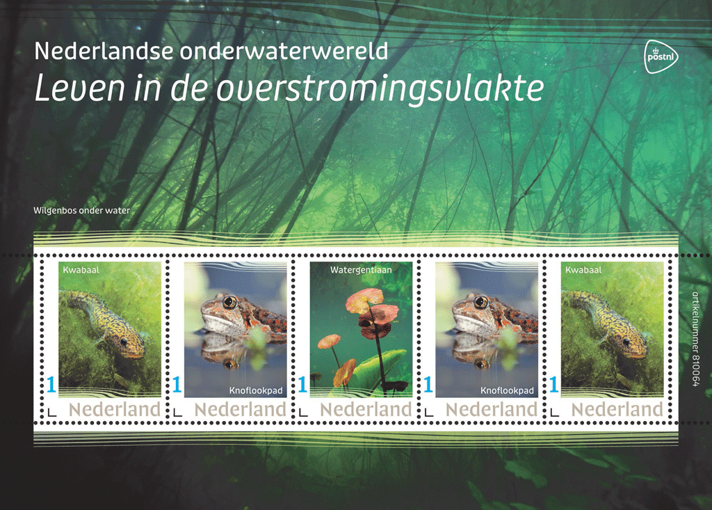 810065 Fish in the North Sea
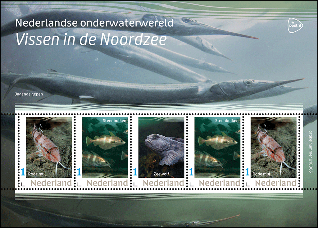 810066 Invertebrates in the North Sea
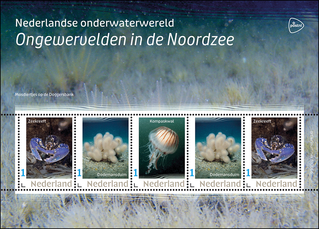
The Dutch underwater landscapes series consists of 25 sheets, each with five personal stamps in three different designs. After the issues on 16 November 2021, every quarter for the next three years, subscribers to this series will receive two new stamp sheets with the following titles:
Item number / Issue
810067 Fish in the Oosterschelde
810068 Invertebrates in the Oosterschelde
810069 Fish in freshwater lakes
810070 Plants in freshwater lakes
810071 Fish in peat ponds and lakes
810072 Plants in peat ponds and lakes
810073 Fish in sand quarry ponds
810074 Plants in sand quarry ponds
810075 Fish in rivers
810076 Invertebrates in rivers
810077 Fish in freshwater tidal zones
810078 Plants in freshwater tidal zones
810079 Fish in farming ditches and canals
810080 Plants in farming ditches and canals
810081 Fish in the pond
810082 Plants in the pond
810083 Fish in the uplands
810084 Amphibians in the uplands
810085 Amphibians in the fenns
810086 Plants in the fenns
810087 Amphibians in pools
810088 Invertebrates in pools
[According to Wikipedia, The Eastern Scheldt (Dutch: Oosterschelde) is a former estuary in the province of Zeeland, Netherlands, between Schouwen-Duiveland and Tholen on the north and Noord-Beveland and Zuid-Beveland on the south. It has also the largest national park in the Netherlands, founded in 2002.]
From November 2021 to September 2024, PostNL will issue two personal stamp sheets in the Dutch underwater landscapes series every quarter. The first two stamp sheets with issue date 16 November 2021 are entitled Fish in the North Sea and Invertebrates in the North Sea. Subscribers also receive the unique stamp sheet Life in a flood plain free with their first set. This stamp sheet is not for sale separately. In June 2022, all subscribers will receive a handy storage album, also free of charge.
In addition to the usual stamp release schedule, PostNL also has an annual personal stamp release schedule. This programme is flexible. It allows PostNL to respond to topical developments and requests. Each issue is designed based on a fixed layout with a fixed number of personal stamps.
 The stamp sheets can also be purchased separately at [direct link] and from the Collect Club’s customer service. This does not apply to the additional Living in a flood plain stamp sheet and the storage album. These gifts are for subscribers only.
Each stamp sheet in the Dutch underwater landscapes series includes five personal stamps in three different designs. The stamps feature plant or animal species from the relevant underwater landscapes. The pictures are framed by wavy graphic lines alternating between the top and the bottom of the picture. The edge of each stamp sheet features a large landscape photo of the underwater landscapes being depicted. The wavy motion of the graphic lines returns on the edge of the sheet, both at the top of the sheet and at the top and bottom of the strip of five stamps.
The Life on the flood plain issue features a burbot, a garlic toad and a yellow floating heart. The background image on the sheet edge depicts a submerged willow forest. The Fish in the North Sea issue features a red mullet, a school of pout whiting and an Atlantic wolffish. The background image on the sheet edge depicts a school of hunting needlefish. And finally, the Invertebrates in the North Sea issue features a maritime lobster, dead man’s fingers coral and a compass jellyfish. The background image on the sheet edge depicts bryozoa on Dogger Bank.
Typography
The font used for the denomination 1 and Nederland was designed in 2018 by font  designer Martin Majoor from Arnhem. For the remaining typography, the Puffin Display Soft (2008-2021) by Pieter van Rosmalen, Bold Monday from Eindhoven was used.
Subject
The Netherlands has many different types of surface water: standing and flowing water, fresh, salt and brackish water, waters that may or may not be isolated and vary in size from small ditches, fens, ponds and pools, meandering rivers and streams to straight canals, city canals, lakes, estuaries, an inland sea and a marginal sea. Water makes up 19 percent of our country (13 percent is built-up area and 68 percent is greenspace). People mainly see and use the surface of this 19 percent, but below the water it is teeming with life. There are plenty of aquatic plants and fish, of course, plus all kinds of other species such as arthropods (crabs, lobsters, shrimps and insects such as dragonflies), coelenterates (polyps, anemones and jellyfish), echinoderms (starfish and sea urchins), molluscs (bivalves, snails) and amphibians (frogs, toads and salamanders).
Designer
The 25 stamp sheets from the Dutch underwater landscapes series were designed by graphic designer Bart de Haas. He realised he needed expert help while he was researching the subject. ‘So I contacted photographers and filmmakers who are specialised in this discipline, for instance. They know like no other what goes on beneath the water surface and which species are representative. I learned a lot from the tips of underwater specialists like Willem Kolvoort, the photographers of Blikonderwater – Arthur de Bruin and Matthijs de Vos – and Peter van Rodijnen.’
From large to small
Based on all the information gathered, De Haas selected a number of images from the Kolvoort and Blikonderwater image archives. Where necessary, he supplemented the images with pictures from Buiten-Beeld, the image bank for nature photography. De Haas explains: ‘The most important criterion in the selection was the habitat. The species featured should, of course, naturally occur in the relevant waterway or wetland area. I picked a number of underwater landscapes in our country, with the overarching aim to present as many different plants and animals as possible. In addition to the special issue featuring creatures and plants on flood plains, the stamps feature marine life in the North Sea and the Oosterschelde, followed by freshwater lakes, peat ponds, sand quarry ponds, rivers, freshwater tidal zones, farming ditches and canals, the Limburg uplands, fens and pools.’
Recognisability and variety
Another criterion for the choice of pictures was recognisability. ‘Not all photos taken by nature photographers are suitable for the miniature format of a postage stamp. Fish are tricky anyway because of their long bodies, which do not always fit onto a vertical postage stamp. That is why, for example, for Fish in the North Sea I picked a picture of a red mullet swimming into the picture at an angle. I also alternated more and less familiar species. For example, the burbot featuring on Life in a floodplain is extremely rare, whereas the lobster on Invertebrates in the North Sea is much more common. Of course, I wanted beautiful images – and I found them – but content-related criteria took precedence.’
Photo editing
As the choice of pictures was extremely high-quality, De Haas had to do very little editing, if at all. ‘That only applies to the plants and animals. They had to stay true to life. I did edit the colours and details in the background. The aim was to separate the species from the background, while ensuring the different stamps would go together at the same time. The fact that each type of water has its own colour plays a significant role in this respect. The North Sea tends to be grey, for example, while peat ponds and lakes are reddish. I took advantage of the arrangement of five stamps in three designs by putting the unique design in the centre of the sheet. Then I arranged the double images symmetrically around it. This also reinforces that sense of unity.’
Sheet edge
The atmosphere of the stamp sheet is also determined by the large-format photo of the mysterious underwater world around the edge of the sheet. De Haas was inspired by the school posters depicting nature designed by M.A. Koekkoek (1873-1944). Many generations of Dutch people grew up with these posters, and the species featured on these posters can still be found in our country. De Haas: ‘This approach allows me to show the mysterious atmosphere of the underwater world. A colourful, serene, fairy-tale world that is much more diverse than I thought. The more you pay attention to the details, the more magnificent and beautiful this world becomes. Everything moves, even though many Dutch waterways don’t really move very much. This movement returns in the flowing character of the font. And you can also see it in the graphic lines, which are an abstract representation of the movement and currents below the water. The lines soften the rectangular character of the stamp sheet. Because you will not find rectangles under water.’
About the designer
Bart de Haas (1966, The Hague) graduated from the Royal Academy of Art in The Hague. After working for several design agencies, he established himself as an independent graphic and typographic designer in 1993. He has a strong preference for book design, but has also designed posters, magazines, websites and visual identities in the past. Bart de Haas has designed books for Huis Marseille in Amsterdam, the Army Museum Delft, nai010 publishers, Brill publishers, de Buitenkant, Clio, SUN, THOTH, Vantilt, W-Books and Waanders, among others. For PostNL, he previously created the Primeval Species stamp series (2021-2023) and the stamps for Dutch castles (2017), Apple and pear varieties in the Netherlands (2016), National musical instruments (2014) and Long live the woods! (2010).
Photographers
Willem Kolvoort is one of the photographers who took pictures for the Dutch Underwater Landscape series. Kolvoort has been obsessed with underwater photography since he was young. Back in the 1960s, he went exploring with his home-made diving and camera equipment. ‘While I was on an excursion in the Wadden Sea I saw a huge ray swim past. It was unbelievably exciting.’ Captivated by this dramatic sight, Kolvoort subsequently travelled the world to produce underwater reports. He feels that he is primarily a landscape photographer. ‘I look for atmosphere and alienation, for mystery. I have a picture of Spirogyra, photographed from below. An amazing image, taken in the pond behind our house.
The Dutch Underwater Landscapes series also features photographs by Arthur de Bruin. He still remembers how he used to traipse around the countryside catching frogs and sticklebacks in canals and ditches. ‘That fascination with what the surface of the water is hiding from us never left me,’ De Bruin says. His most spectacular ‘picture catch’ in the Netherlands was a huge catfish. ‘But I also enjoy the little sunbleak, the smallest fish in our waters. Under the surface of the water you can find a unique, hidden parallel world. We are showing how beautiful and fascinating that world is. I hope that people will be looking at the stamps and think “is this really in the Netherlands? I want to see more!” I only have one answer to that: do it. Go snorkelling in the local open air swimming pond, and be amazed by the treasures you’ll find underwater.’
Availability and Validity
The stamps are available while stocks last at www.postnl.nl/bijzondere-postzegels and can be ordered by telephone from the Collect Club customer service on telephone number +31 (0)88 868 99 00. The validity period is indefinite.
Technical Details:
Postage stamp dimensions: 30 x 40mm
Appearance: five personal stamps in three different designs, marked: with ‘1’, the denomination for items up to 20g in weight: destined for delivery in the Netherlands
Print run: 3000 per issue
Item numbers:
810064: Life in a flood plain
810065: Fish in the North Sea
810066: Invertebrates in the North Sea: :
Issue date: 16 November 2021
Design and image editing: Bart de Haas, The Hague
Photography: Willem Kolvoort, Arthur de Bruin and Matthijs de Vos, Peter van Rodijnen, Paul van Hoof, Buiten-Beeld (Jelger Herder, Luc Hoogenstein, Nico van Kappel, Wil Meinderts, Ron Offermans, Peter Verhoog)

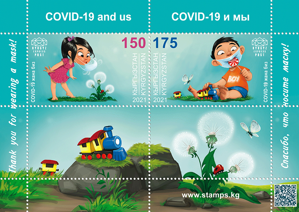
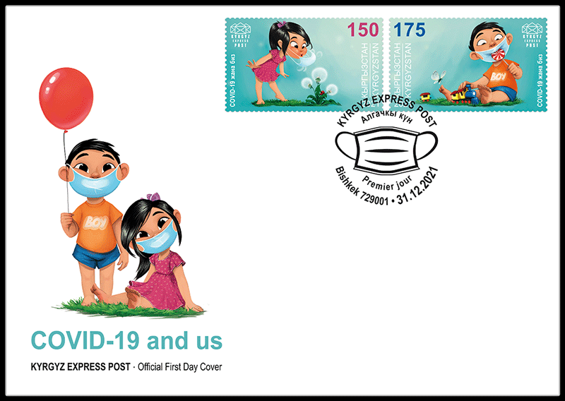
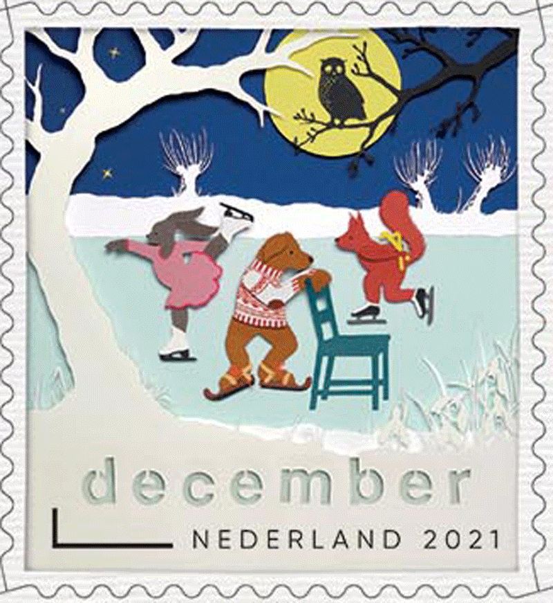
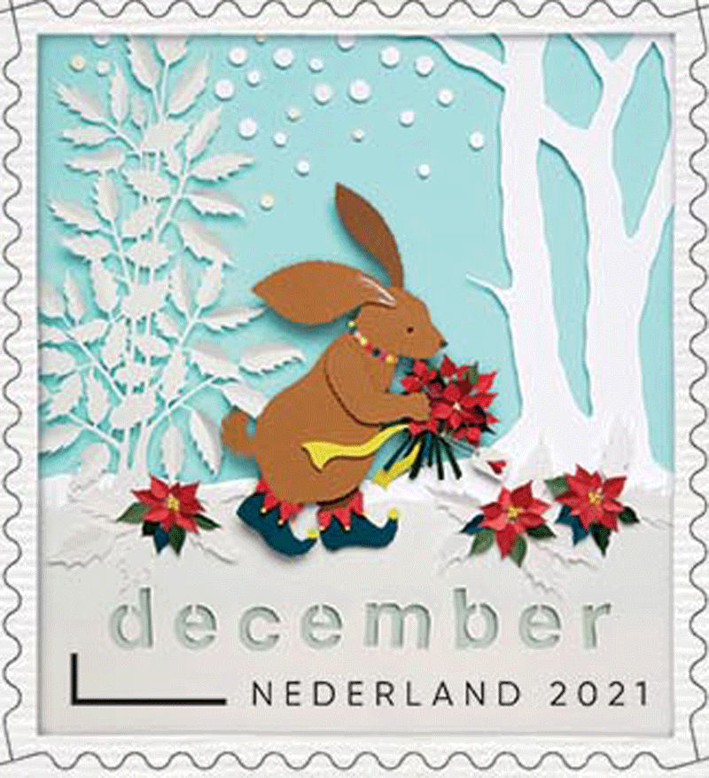
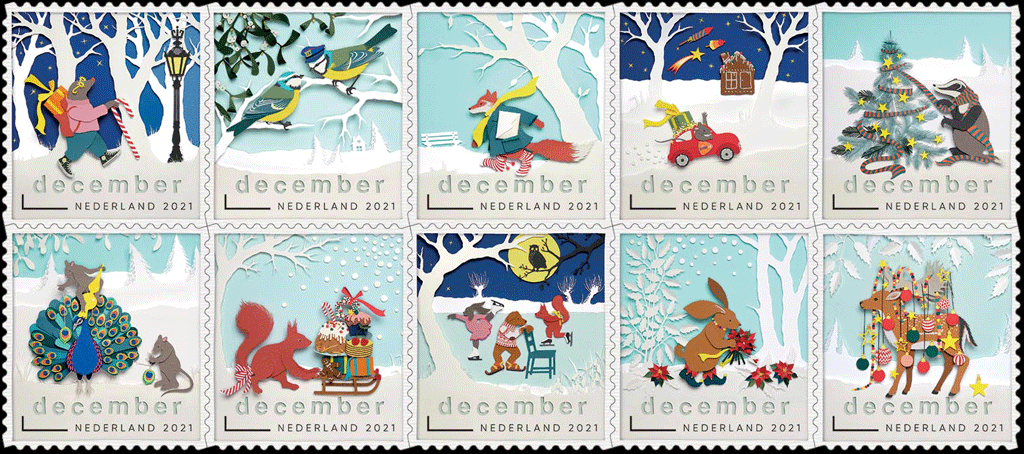
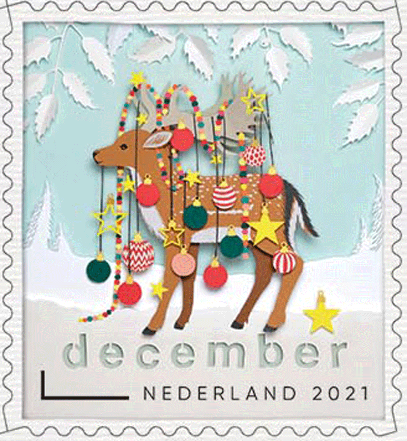
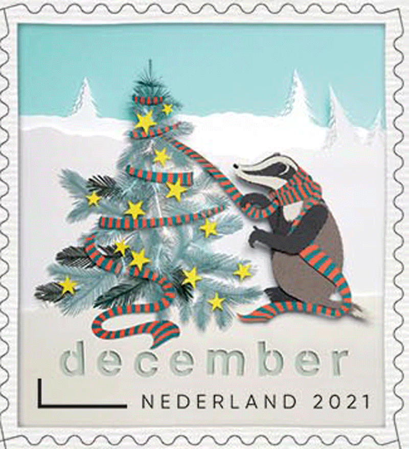
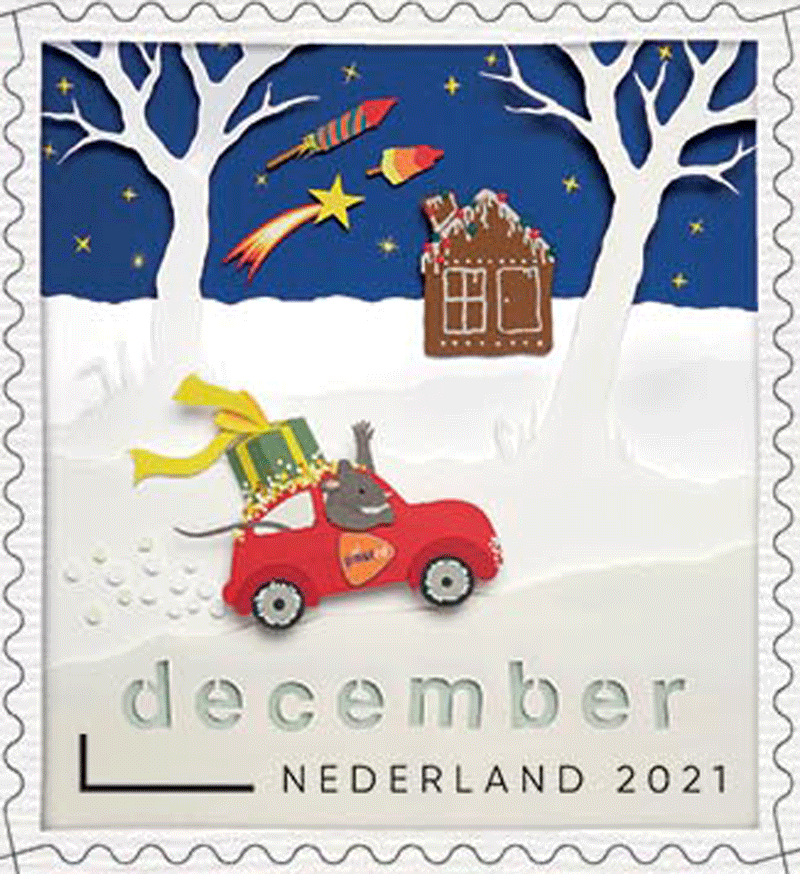
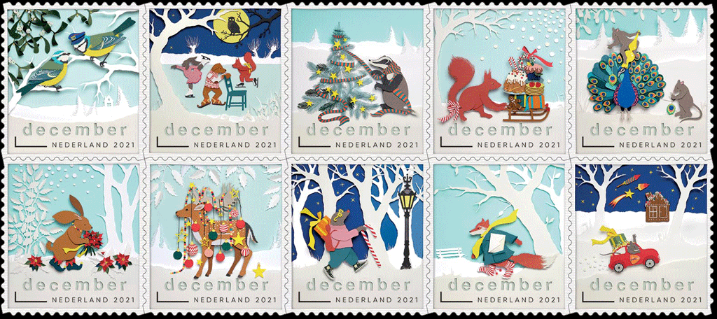
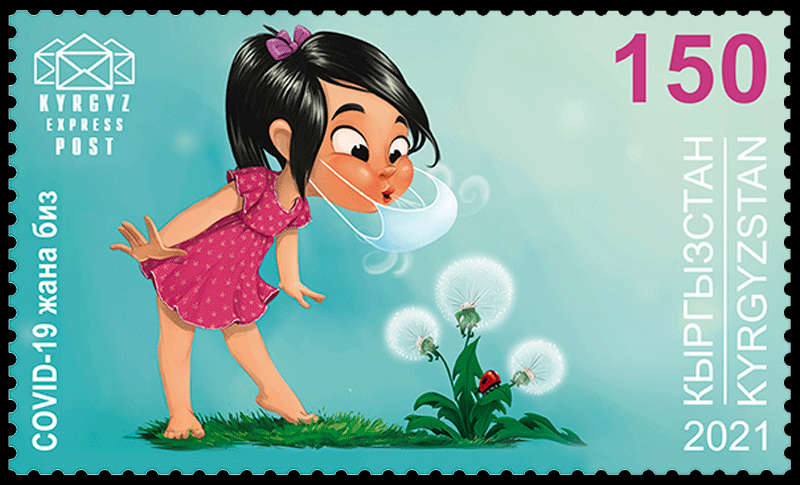 Nevertheless, the virus continues to be a significant factor in our lives.
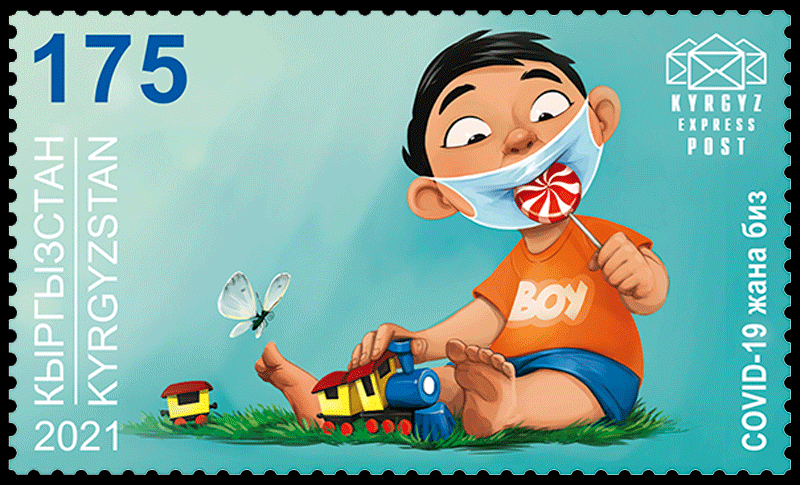 illustrated some situations of this kind on the new stamps.
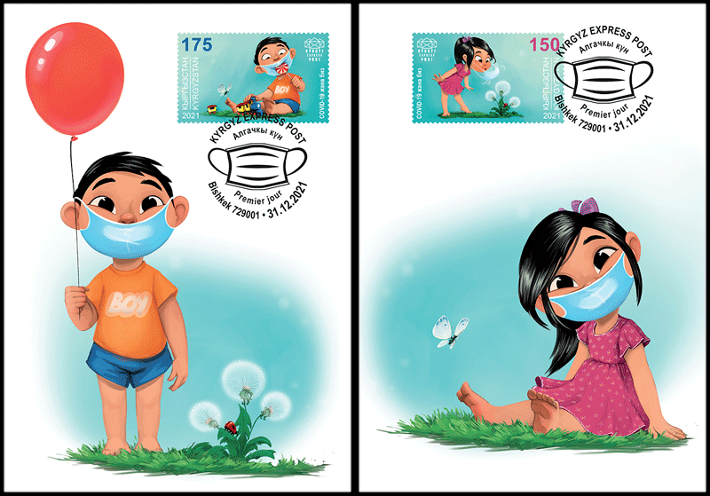
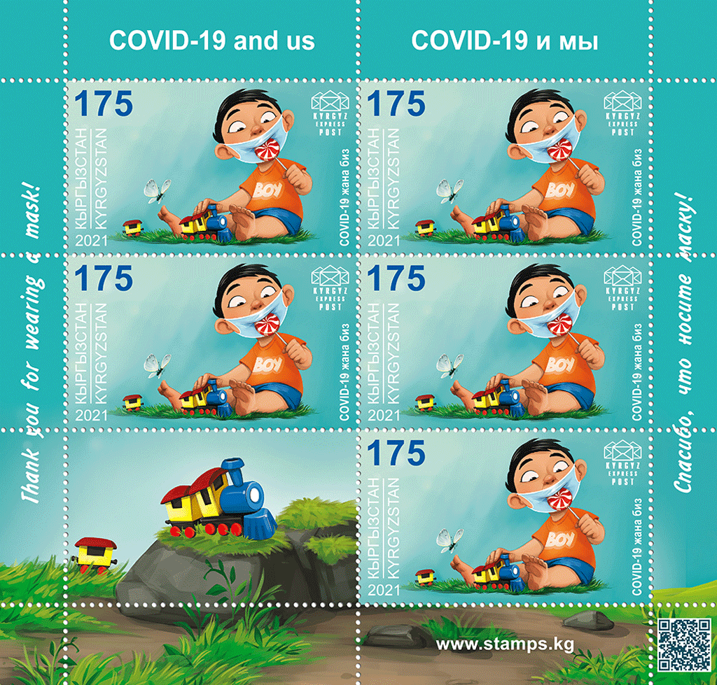 Printing method: full-color offset lithography.
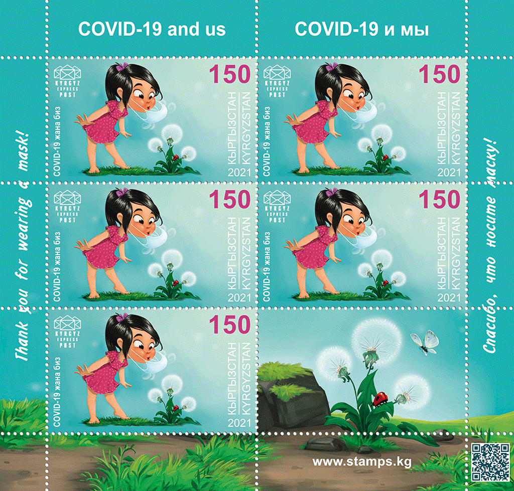 Quantity issued: 9 000 pieces each stamp, including the