From PostNL
Experience Nature – Fort Ellewoutsdijk
Issue: Experience nature – Fort Ellewoutsdijk
Date of issue: 3 January 2022
Appearance: sheet of ten stamps in ten different designs
Item number: 420162
Design: Frank Janse, Gouda
Photography: Buiten-Beeld
 On 3 January 2022, PostNL will publish the Experience Nature – Fort Ellewoutsdijk issue: a sheet of ten stamps in ten different designs. The denomination on these stamps is ‘1’, the denomination for items weighing up to 20g destined for the Netherlands. The stamp sheet about Fort Ellewoutsdijk is part of the multi-annual Experience nature 2021-2023 series. In the series, four stamp sheets are issued every year, each comprising ten different stamps. The stamps feature images of plants and animals in unique Dutch nature reserves across the country. In 2022, it is the turn of the provinces of Zeeland, Zuid-Holland, Limburg and Gelderland. The 3 January 2022 issue focuses on the Zeeland Fort Ellewoutsdijk, located on the coast of Zuid-Beveland. Later this year, stamps will be issued featuring the peatlands of the Nieuwkoopse Plassen in Zuid-Holland (21 February 2022), chalk landscape of the Sint-Pietersberg in Zuid-Limburg (13 June 2022) and the Leuvenum Woods on the Veluwe in Gelderland (15 August 2022).
Fort Ellewoutsdijk is a defensive structure built in 1839. It was built by the Netherlands in 1830 to control shipping on the Westerschelde after the secession of Belgium. The hexagonal fortress lies outside the dyke, just outside the Ellewoutsdijkpolder, south of the village of Ellewoutsdijk. In 1981, Fort Ellewoutsdijk was bought by the Vereniging  Natuurmonumenten (Society for the Preservation of Nature) because of its extraordinary position as a cultural heritage site in the landscape of Zuid-Beveland. The area around the fortress is part of the Natura 2000 area Westerschelde & Saeftinghe. This area is unique because it gives a good idea of what Zeeland looked like before the land reclamation, with one of the few outer dyke salt marshes in the Westerschelde. The area is attractive for breeding colonies of, for example, the black-headed gull and the Mediterranean gull. At low tide, the bare mud flats are a resting and feeding area for waders and water birds. In winter, thousands of dunlin, bar-tailed godwit and grey plover come here to visit. On the salt marshes, you will find sea purslane, sea aster, sea lavender and sea couch. Behind the Westerschelde dyke at Ellewoutsdijk there are two inlagen – sunken areas sheltered between the dykes. In the spring, Inlaag 1887 is a favourite breeding ground for birds. Inlaag 2005 alternates between salt water, brackish and freshwater areas. Here, plants such as strawberry clover, Crested Dog’s Tail and spiny restharrow get a chance to thrive.
Sources: natuurmonumenten.nl, wikipedia.nl, zeeuwseankers.nl
Society for the Preservation of Nature
Bianca van Swieten is nature conservation coordinator for the Zeeland islands and a small part of West Brabant at Vereniging Natuurmonumenten. In this capacity, she also keeps an eye on Fort Ellewoutsdijk and the surrounding nature reserves such as Zuidgors, Inlaag 1887 and Inlaag 2005. ‘Our unit is responsible for around 3,500 hectares of nature reserves owned or managed by Natuurmonumenten. This includes Fort Ellewoutsdijk, an extraordinary cultural and historical monument that we are keen to preserve as much as possible. The fortress provides truly fantastic views of the natural landscape of the Westerschelde. This part of Zeeland is an important link for migratory birds to fatten up, rest and refresh. The fortress is a wonderful place, where it seems as if time has stood still. Not entirely, of course, because the dyke reinforcement did change the landscape somewhat. The elevated sea dyke behind the fortress was rerouted, for instance, so the moat has partially disappeared. Ellewoutsdijk is located in a quiet and remote area, which is definitely part of its charm. The fortress’s face changes throughout the seasons. On a summer’s day it is beautifully serene, while in winter it can be a harsh place where you are at the mercy of the elements. But that dynamic is also what draws people here.’
Flora and Fauna on The Stamps
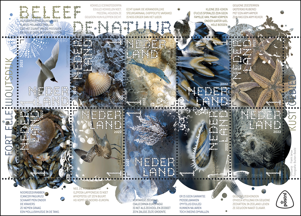
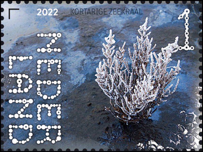
The Experience nature – Fort Ellewoutsdijk stamp sheet features the following ten 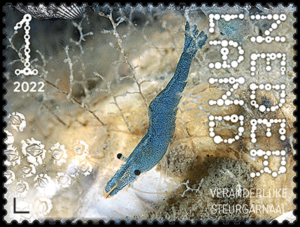 inhabitants of the surrounding nature reserves: brown crab, Mediterranean gull, bar-tailed godwit, cockle, marsh samphire, chameleon prawn, common mussel, spiral wrack, harbour seal and common starfish. Each has its own stamp. The stamp sheet also features many more images of flora and fauna from this area. A separate graphic layer of transparent images features: bladder wrack (top left), green sea urchins (top right), cockles (middle left), barnacles (just below middle), common ringed plover (right under middle), starfish (left under middle) and bladder wrack again (bottom right). These transparent images cross the perforations and link the stamps with each other and the sheet edge.
Design
The Experience Nature – Fort Ellewoutsdijk stamp sheet was designed by graphic designer Frank Janse from Gouda. On the sheet, the ten plants and animals are depicted in their natural environment, each on their own stamp. In some cases, the image or background colour continues onto the adjacent stamp and onto the sheet edge. All photos are incorporated in a graphic layer of different-sized overlapping circles, which break through the boundaries of the perforations. The circle pattern returns as small droplets on the sheet edge and the tabs. There is another graphic layer on top of the circles featuring transparent images of animals and plants from this area. The monochrome images are almost abstract and link the stamps.
For the typography, Janse used his own font, which he designed especially for the  Experience Nature series. The font, which consists of tiny circles, was given the name Fdot. The explanatory texts on the sheet edge are set in the TT Milks Light and Demibold in capitals (2017, Ivan Gladkikh for Typetype). In the text, the designer creatively expresses his associations with the names, features and appearance of the plants and animals depicted, adding a touch of humour.
While the focus was on various animal and plant species in the period from 2018 to 2020, in 2021-2023 the focus will be on unique Dutch nature reserves and their flora and fauna. The 3 January 2022 issue highlights the Zeeland Fort Ellewoutsdijk, located on the southern coast of Zuid-Beveland.
Fascinating stories
The nature reserves were chosen in consultation with experts from the nature conservation 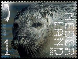 organisation Natuurmonumenten. A number of considerations played a role in the selection of these diverse landscapes. Each area had to have plenty of interesting flora and fauna, for example. There had to be enough diversity, so every species could be represented: from plants, trees and mammals to insects, reptiles and amphibians. Janse: ‘I also wanted to have a decent choice of beautiful images and it had to have a captivating story attached to it. For Fort Ellewoutsdijk, this is the unique natural area outside the dykes, the tremendous force of the water and of high and low tides, and the resilience of the animals and plants we find here.’
List of candidates
For the Experience nature – Fort Ellewoutsdijk stamp sheet, Janse drew up a list of plant and animal candidates, of which ten eventually remained. ‘I did this for all of the landscapes in the Experience nature 2021-2023 series at the same time. That way we could show a nice range. After all, many plants and animals occur in multiple nature reserves in the Netherlands. This way, we avoided repetitions. The species depicted at Fort Ellewoutsdijk have in common that they all live off or in the water: from the birds and the seal to the shellfish that are found there. And the seaweed too, of course.’
Birthplace
For Janse, the issue of Fort Ellewoutsdijk meant a return to the province where he was born and raised. ‘I come from Vlissingen on the island of Walcheren, no more than 20 kilometres as the crow flies from the fortress. Vlissingen and Ellenwoutsdijk both lie on the Westerschelde, the estuary to which they both owe their existence. I now live and work in 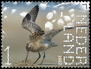 Gouda, but still love going there to visit family. When I am visiting, I always want to go to the beach. Zeeland is really different from other provinces which is, of course, due to the influence of the huge amount of water that surrounds it and the common past as a collection of islands. It smells different. Fresher, saltier. Outside the dykes, the water still does as it pleases. When I think of Zeeland’s nature, I see salt marshes, mud flats and silt. I think of high and low tides, of the Westerschelde, which is constantly changing, constantly creating new sandbanks that then just vanish completely. That is why Vlissingen still has pilots on board the ships sailing to and from Antwerp.
Balanced overall image
When distributing the plants and animals over the Experience nature – Fort Ellewoutsdijk stamp sheet, Janse’s aim was to create as beautiful and balanced an overall image as possible. Initially, he creates a substantive distribution so the same species do not end up in one place. Janse: ‘But I sometimes change that again in practice. The composition is always a guide, with a balanced distribution of colours and shots from close-up and far away. This stamp sheet comes out in winter, so I went looking for pictures in which cold, snow, hoarfrost and ice play a major part. I really want to show raw nature. Everything is weathered by salt and wind, which is reflected in the grey and drab colours, with the addition of the kind of steel blue that we associate with winter. In many images, you can see that bright, typical Zeeland light, which accentuates the cold. It is in there already, I didn’t have to emphasise anything.’
Representative selection
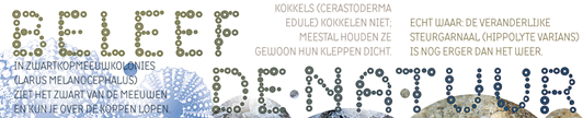
From the huge number of shells, seaweed species, birds and other animals and plants available, Janse chose ten representatives to be featured as main characters on the stamps. The transparent images play an important part in the design. Take the green sea urchin, for example, which was incorporated as a radiant sun in the picture of the Mediterranean gull on the stamp at the top right. Janse: ‘I wanted to use the green sea urchin because its skeleton is absolutely gorgeous. It fits in perfectly with the visual language of the design and typography. The gull was also a sure candidate from the start, as this bird is of course very characteristic of the Zeeland coast. It had to be the Mediterranean gull because its head adds graphical interest. I put the brown crab opposite the gull in the wintry sky. The picture was taken on the beach, where you can see the crab scuttling across mussels and other shells. The shapes of the shells match the round blisters of the transparent bladder wrack that continue to the photo of the bar-tailed godwit below. The cockle on the stamp next to the black-tailed godwit is so unusual because of the translucent ice crystals. It must have been very cold when the picture was taken, because the freezing point of salt water is much lower than that of freshwater. Incidentally, it is not just the colours and the transparencies that connect the stamps. On the top stamps, for example, you can see similarities in the ridges on the cockles and the striped patterns of the outer feathers of the wings. And the blue line of the sea in the godwit picture corresponds with the blue in the picture of the crab and the other stamps.’
Greyish and abstract
Janse chose the marsh samphire because the plant is often found on salt marshes and mud flats. ‘The plant is actually green, but because it is frozen in the picture it looks greyish, almost translucent. I love eating samphire, it reminds me of Zeeland. ‘That saltiness, it is a really salty vegetable. The chameleon prawn next to it is also edible. It is a true chameleon because it can actually change colour. I know shrimps and prawns from my childhood, when I used to catch them with a net between the basalt blocks, near the groynes or in pools on the beach. With its strange shape and translucency it is rather a strange creature. Its little eyes are a good match for the font of the title Experience Nature. But that is a complete coincidence.’
Samphire and chameleon prawn
When it comes to seafood, Zeeland is particularly famous for its oysters and mussels. Janse chose the latter for the stamp sheet. ‘The main reason for this is that you can still find plenty of them in nature. This photo is unusual because of its wintry appearance, with visible hoarfrost along the shell edge. Judging by its light colours, it is probably a young individual. A very nice picture, with a shallow depth of field. The brownish yellow and blue recur in the image of the spiral wrack next to it. You can often find this kind of seaweed on groynes. At high tide they float under water, at low tide the pole is dry and the spiral wrack hangs down, looking a bit like dreadlocks. They survive low tide because the little vesicles can hold moisture and air. It was the perfect image to link to the transparent great ringed plover on the sheet edge. I let the blue from the picture of the sea oak carry on in the chest band of the common ringed plover.’
Mussel and spiral wrack
The stamp on the bottom left features a harbour seal. This way, the designer draws attention to the fact that protecting nature can have a real impact. ‘When I was growing up, this seal had almost disappeared in Zeeland, mainly due to environmental pollution,’ Janse explains. ‘The ban on hunting and the improvement of the water quality have led to a return of the population. Of course, it is not as large as that in the Wadden Sea, but still. It is a very cuddly animal, unlike the starfish next to it. That is – and remains – a mysterious creature that you hardly ever come across on Walcheren’s beaches these days. But you can still find them at Fort Ellewoutsdijk. You often see them lying in the foam of the surf. That foam returns in the circle on the sheet edge. This is where you can also find the transparent bladder wrack, which has a particular significance. When a dislodged piece of bladder wrack ends up on the beach, it usually contains other plants and creatures that have been dragged along. And this often includes starfish.’
About the designer
Frank Janse (Vlissingen, 1967) graduated as a graphic designer from the Willem de Kooning Academy in Rotterdam in 2001. Until 2019, he worked for various advertising and design agencies, including Room for IDs, and he also worked for himself as Frank Grafisch Ontwerp in Gouda. In 2019, together with Leene Communicatie, he founded the new company Leene Visuele Communicatie, which designs communication tools focusing on content and information design. Frank Janse is a specialist in corporate identity, branding, infographics and communication campaigns. Leene Visuele Communicatie works for various educational institutions and both profit and non-profit clients. Their customers include real estate specialist Fortierra, PostNL, the Dutch central government, the Municipality of Rotterdam, Vattenfall and ZonMw, the organisation for health research and health innovation. On the instructions of PostNL, Frank Janse has previously designed various luxury storage systems and personal stamps, including the 2017 themed collection on bird species of the Netherlands. He also produced the designs for the Experience nature series from 2018 to 2021.
Availability & Validity
The stamps in the series Experience nature – Fort Ellewoutsdijk are available while stocks last at all PostNL sales outlets, the post office counter in Bruna shops and at www.postnl.nl/bijzondere-postzegels [in Dutch]. The stamps can also be ordered by phone from the Collect Club customer service on telephone number +31 (0)88 868 99 00. The validity period is indefinite.
The denomination on these stamps is ‘1’, the denomination for items weighing up to 20 g destined for delivery in the Netherlands.
Technical Specifications
Stamp size: 40 x 30mm:
Sheet size: 122 x 170mm
Paper: normal with phosphor print
Glue: self-adhesive
Printing technique: offset
Printing colours: cyan, magenta, yellow and black
Print run: 285,000 sheets
Appearance: sheet of 10 stamps in 10 different designs
Design: Frank Janse, Gouda
Photography: Buiten-Beeld
Printing company: Cartor Security Printers, Meaucé-La Loupe, France
Item number: 420162
Details on the Species Depicted
Brown crab
The brown crab, also known as edible crab, (Cancer pagurus) is about 10 cm long and 15 cm across, although some specimens can grow to 30 cm across. The pincers are usually two different sizes. The largest is used for cracking shellfish, for example, and the smaller and often sharper one for tearing apart tissues. The abdomen of a female crab is much broader than that of a male. She uses it to protect the eggs she carries throughout the winter and spring. Brown crabs are mainly nocturnal, and they eat shellfish, starfish and other animals that cannot easily escape. They are not only found in intertidal areas but also at great depths of up to 300 metres. They are mainly found on stony sea beds and rocks with cavities in which they can hide.
Source: soortenbank.nl
Mediterranean gull
The Mediterranean gull (Larus melanocephalus) is a fairly rare species in the Netherlands with around 4,000 to 4,100 breeding pairs (2019), although their numbers are going up. They are found mainly in the delta area of our country, but their numbers are increasing in other parts such as the IJsselmeer region. They are often found on intensively managed farmland and sometimes, in the winter months, in cities among the other gull species. Mediterranean gulls spend the winter along the Atlantic coast of France, Great Britain and occasionally Spain and North Africa. Adult birds have completely white primary feathers. The mantle is light grey and the underparts are snow-white. The head is black, with striking white eyelids. The bird can also be recognised by its blood-red, thick bill and red legs. The male and female look the same.
Source: vogelbescherming.nl
Bar-tailed godwit
The build of the bar-tailed godwit (Limosa lapponica) is more compact and heavier than that of the black-tailed godwit, and it has shorter legs. The summer plumage of the male is a warm chestnut brown from top to toe, which explains its Dutch name rosse (red) grutto. In the Netherlands, the species is only a transient and winter visitor. When they are passing through and on the wintering grounds, they are mainly found on (sandy) mudflats, and in spring on coastal grasslands and sometimes on the beach. In our country, this bird feeds on lugworms, sandworms, ragworms, other worms, bivalves (for example Baltic clams) and crustaceans. In grasslands, earthworms and leather jackets are a favourite snack. The bar-tailed godwit searches for food both by sight and by touch through pecking and jabbing. Wintering population 61,000-76,000 (2013-2015), migrating birds 130,000-200,000 (2012-2017).
Source: vogelbescherming.nl
Cockle
The common cockle (Cerastoderma edule) is a bivalve mollusc, with a firm shell that is greyish brown to grubby white in colour. It grows to a length of about 5 cm. It usually has around 24 longitudinal ribs running along its shell that end in blunt serrations along the edge of the shell. The cockle also has growth rings, which can be used to determine its age. This shell lives low in the intertidal zone, buried in sand, silt or fine gravel. It is a salt water species that can tolerate a salt content of 2 per mille. The Latin name ‘edule’ means ‘edible’, and this species is indeed a well-known and, in some countries, beloved delicacy. In the Netherlands, a considerable branch of the fishing industry focuses on cockle fishing. Most cockles are caught using large ships that dig out the sandbanks on which they are found.
Source: soortenbank.nl
Marsh samphire
The marsh samphire (Salicornia europaea), also known as glasswort, is a plant in the amaranth family. Outside the dykes, on the side of the sea, it is mainly found above the medium-high tide line. Within the dykes, marsh samphire generally grows in more or less open, very saline areas. The plant can reach a height of 30 cm and flowers from July to October. The anthers are 0.25 to 0.55 mm long and it has slanted side branches. The flower-bearing parts conjoin to form 0.5 to 3.5 cm long spikelets. The tops of the perigonium come off easily when the seeds are ripe, scattering the seeds. The seeds are very hairy and between 0.6 and 1.4 mm long. The stem is usually branched. The plant tends to be green, but often turns bright red or dark purple in late summer.
Source: soortenbank.nl
Chameleon prawn
Just like all members of the Hippolytidae family, the chameleon prawn (Hippolyte varians) has a carapace (head armourz) and a sizeable, sharp rostrum (snout). It also has a single short tooth on the surface, just in front of the eyes. The abdomen is bent downwards, the acute angle giving the impression that it has been snapped in half. The chameleon prawn grows to a length of 32 mm. Its colour may be red, brown or green. It can also have a gorgeous transparent pattern of red, brown or green blotches. At night, the prawn often looks even more transparent. It can perfectly adapt its colour to the surface it is on, which is why it is called the chameleon prawn. This prawn species mainly eats small crustaceans, worms, seaweed and organic waste.
Source: soortenbank.nl
Common mussel
The common mussel (Mytilus edulis) has an oval, slightly triangular shell, ranging between 3 and 8 cm in size. The shell colour varies from a deep dark blue to almost black. The mussel attaches itself to a solid surface using so-called byssal threads, which consist of an adhesive substance secreted by a special gland. The mussel feeds on phytoplankton. Fertilisation takes place externally, in the water. The eggs hatch into larvae, which remain suspended in the plankton. After some time, the larvae develop a shell and sink to the bottom. This is known as spat settlement, after which they hopefully find a surface to attach themselves to. Mussels are mainly found in intertidal zones. Mussels often form dense aggregations, which grow constantly as new mussels settle on top of older and dead mussels.
Source: soortenbank.nl
Spiral wrack
Spiral wrack (Fucus spiralis) is a seaweed that grows to 20-30 cm long and branches evenly. The flattened blades, which are about 1 cm wide, grow from a discoid holdfast. Even though it looks like they broaden at the tip, this is not the case. This effect is caused by the fanning effect of the branching leaves, which always stay more or less in the same plane. The tips of the blades can be quite swollen on either side of the vein and are usually lighter in colour. This is where the reproductive bodies are. The plant is usually a greenish-brown. It does not have air-vesicles. Spiral wrack is found on rocks and stones high up in the intertidal zone.
Source: soortenbank.nl
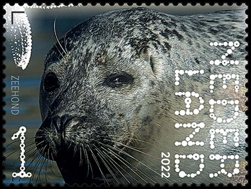
Harbour seal
The harbour seal (Phoca vitulina) has a torpedo-shaped body and grey to brownish-grey fur with black spots. It mainly eats groundfish, which it hunts using its sensitive whiskers. The main difference between the harbour and the grey seal is that the latter clearly has a flattened head, while that of the harbour seal is rounder. Males are 150-190 cm long and weigh 55-130 kg, while females are 120-155 cm long and weigh 45-105 kg. Hunting of harbour seals has been prohibited in both Germany and the Netherlands since 1975. This mammal lives mainly in tidal areas with spots that are exposed during low tide. These spots are mainly found along sandy coasts and rocky shores, but also on weed-covered reefs, pebble beaches, sandbanks and rocks.
Source: zoogdiervereniging.nl
Common starfish
The common starfish (Asterias rubens) is the most familiar starfish found in our regions. Its colour can vary from a pale orange to a very dark purple and its diameter ranges from 14-30 centimetres, although outliers can grow to a diameter of 50 cm. Like many other echinoderms, it has five-sided symmetry. If they lose an arm, a new one grows in its place, although it does not always grow to the same size. The common starfish eats all kinds of invertebrates, but mostly bivalve molluscs. It is quite well known for the way it eats mussels: it fixes the suction discs on the underside of its body to the shell of the mussel and pulls. On top of that, the starfish cuts the mussel off from the water surrounding it, so it also starts suffering from a lack of oxygen. Once it has prised the mussel shell open, the starfish secretes gastric juice, digesting the mussel while it is still in its own shell.
Source: soortenbank.nl

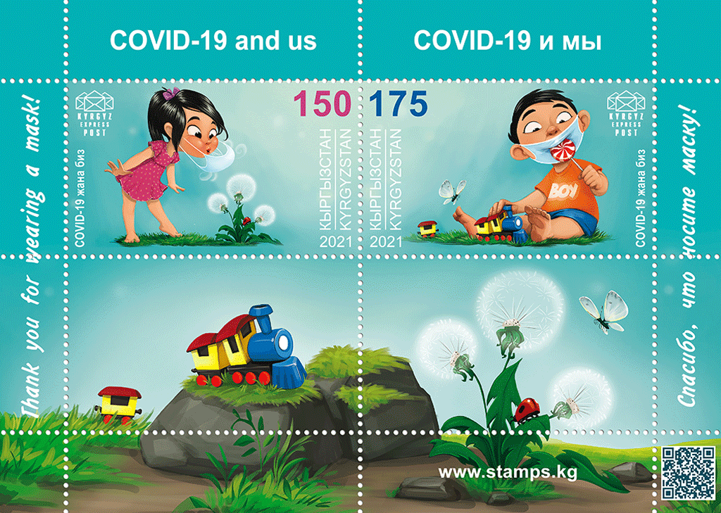
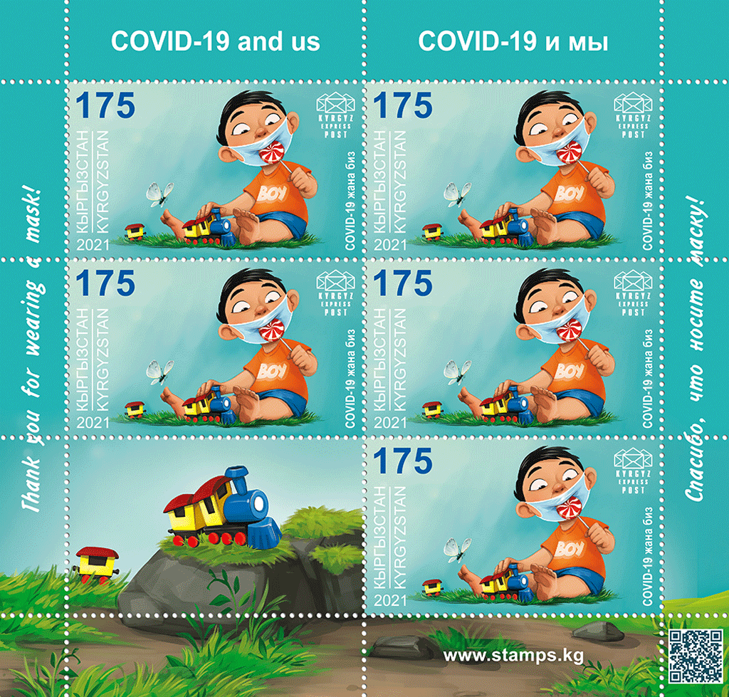
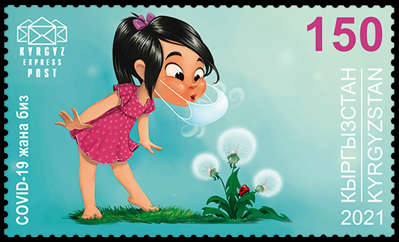 Nevertheless, the virus continues to be a significant factor in our lives.
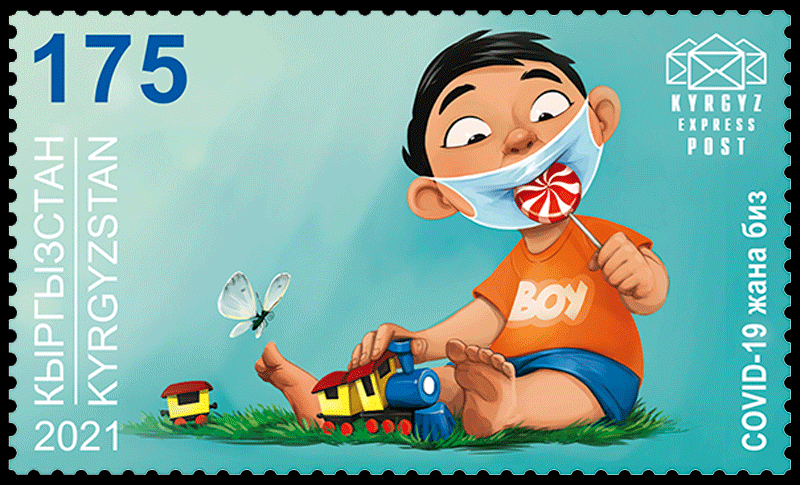 illustrated some situations of this kind on the new stamps.
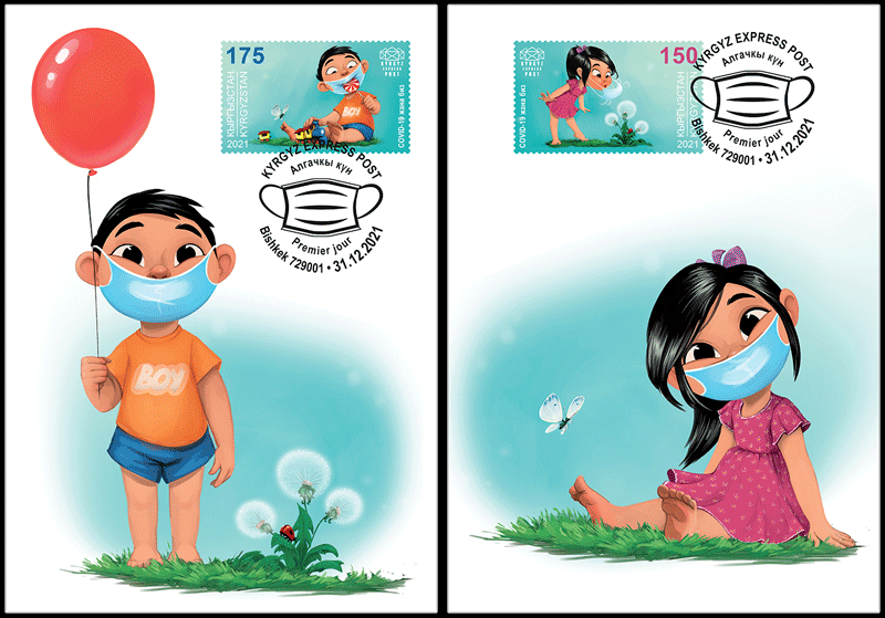
 Printing method: full-color offset lithography.
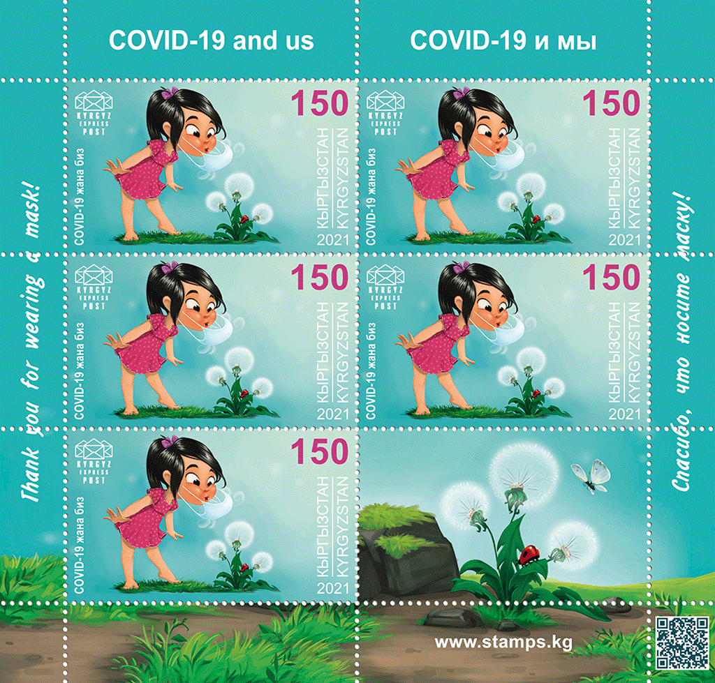 Quantity issued: 9 000 pieces each stamp, including the
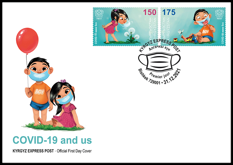


 Claire Bedon (Paris, 1993) studied journalism at the IICP in Paris, followed by photography, art direction and graphic design at the École de Condé, also in Paris. After graduating, she worked as a graphic designer for various agencies and clients until she joined Total Design in 2020. There, she is currently part of the International Branding Team. On behalf of Total Design, she is the curator for LogoArchive, the Instagram account that hosts a collection of all significant Dutch logos.
 Edwin van Praet (Breda, 1971) studied graphic and typographic design at the Academy of Art and Design St. Joost in Breda. After graduating, he worked as a graphic designer at Tel Design in The Hague for seven years. In 2003, he joined Total Identity/Total Design, first as a Senior Designer and now as Creative Director. Van Praet is part of the Branding Team at Total Design. He has won many awards for his work in both national and international design competitions. Van Praet previously designed the 100 years of aviation (2019) stamps and the stamps in the Typically Dutch series featuring typically Dutch dishes (2020) and house types and façades that are typical for the Netherlands (2021).