From PostNL; click on any picture for a larger version
Typically Dutch: Skating
Issue: Typically Dutch – skating
Date of issue: 3 January 2022
Appearance: sheet of six stamps in six identical designs
Item number: 420163
Design: Claire Bedon and Edwin van Praet (Total Design), Amsterdam
On 3 January 2022, PostNL will publish the Typically Dutch – skating stamp sheet. This issue is the first in the Typically Dutch series this year. In 2022, the multi-annual series is 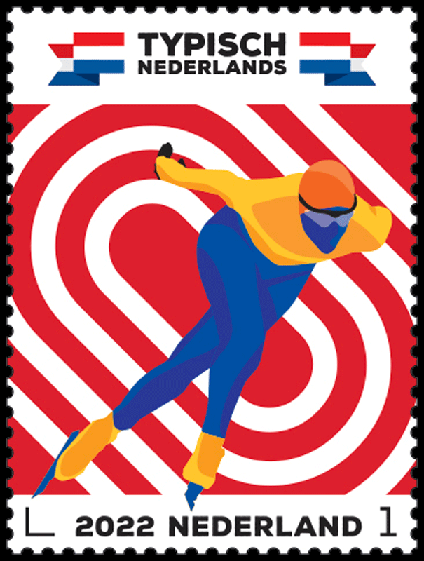 dedicated to five sports in which the Dutch excel. The six identical postage stamps will be marked ‘Nederland 1’, the denomination for items weighing up to 20g destined for the Netherlands. The Typically Dutch – skating issue was designed by graphic designer Clair Bedon and creative director Edwin van Praet from Total Design in Amsterdam. Over the coming months, stamps featuring the typical Dutch sports of hockey (21 March), cycling (4 April), sailing (9 May) and football (15 August) will appear in the series.
The Netherlands loves skating. This has been the case for centuries, as demonstrated by, for example, the famous paintings by Hendrick Avercamp (1585-1634). We learn to skate at an early age and continue to do so until we are quite ancient. At the first sign of frost, everyone gets their Frisian doorlopers (long wooden skates), racing skates, krabbertjes (double training skates) and hockey skates ready. Everyone goes out of their minds when a weather forecaster implies that an Elfstedentocht may be a possibility this year. Needless to say ijsmeesters (ice masters) and rayonhoofden (regional heads) are held in high esteem. There is a reason why skating is a typically Dutch pastime. According to the Royal Dutch Ice Skating Association (Koninklijke Nederlandsche Schaatsenrijders Bond, KNSB) of 1882, it is deeply rooted in the soul of the country. Hundreds of skating clubs – often of a respectable age – are affiliated with this union. All of us love it, from inline skating, figure skating, long and short track speed skating to marathon skating, schoonrijden (synchronous skating), kortebaan schaatsen (short track skating) and tour skating on natural ice (when the water freezes over). Nowhere in the world are there as many indoor ice rinks as in the Netherlands. It is therefore not surprising that the Netherlands produces some of the best ice skaters in the world. In 1893 (and 1895 and 1896), Jaap Eden became the first Dutch world champion ever. He was followed by a huge swathe of gold medal winners and Olympic heroes such as Yvonne van Gennip, Stien Kaiser, Atje Keulen-Deelstra, Sven Kramer, Ids Postma, Rintje Ritsma, Patrick Roest, Gianni Romme, Ard Schenk, Hein Vergeer, Kees Verkerk, Ireen Wüst and many, many others.
Design
The stamps on the Typically Dutch – skating sheetlet feature a picture of a skater in action who is turning a corner by putting their right leg over their left leg. The four broad lines in 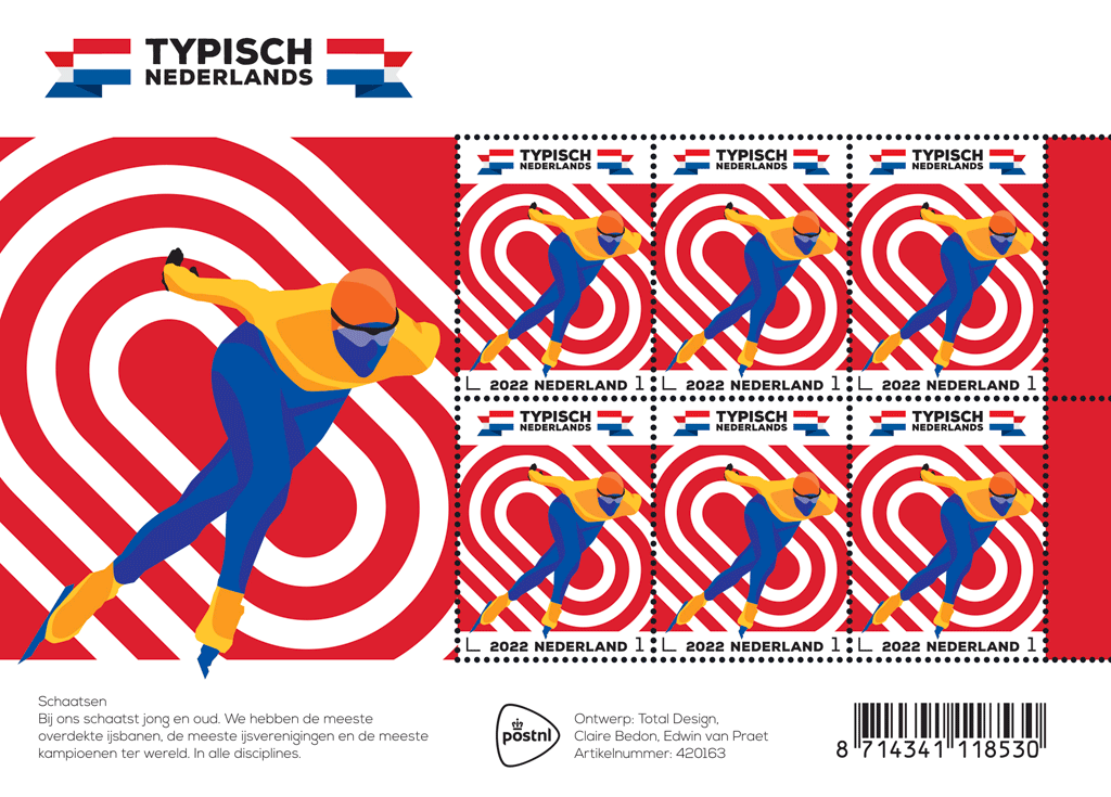 the background form an oval shape, symbolising the typical layout of an ice rink. At the bottom of each stamp is a white strip with the sorting hook, the year 2022, the country (Netherlands) and the denomination 1. The tips of the clap skates continue onto the strip. The logo for the Typically Dutch series is printed above each stamp, with a folded Dutch banner on the left and right. The picture is repeated in enlarged form on the edge of the sheet. The dominant colour red continues on the two tabs on the right. The Typically Dutch logo appears once more on the top edge of the sheet, while the bottom edge features a short explanatory text.
The 2022 stamps for the multi-annual Typically Dutch series were once again designed by Total Design from Amsterdam. And once again, they carefully researched the subject, this time exploring sports that are typically Dutch.
Old Dutch versus popular
‘We explored two types of sports,’ explains Edwin van Praet, creative director at Total Design. ‘On the one hand, there were the Old Dutch sports often tied in with a particular region. Like klootschieten, beugelen, kaatsen and fierljeppen. On the other hand, we had the sports loved by everyone in the Netherlands. Sports linked to our culture, with water and with large numbers taking part in them: football, hockey, horse riding, swimming, korfball, sailing, golf, et cetera. Often, these are the sports the Dutch excel in, where we’re at the top internationally. Based on that initial selection, we created mood boards, a collection of photographs and images to establish the tone. Then we started sketching.’
Styles
Claire Bedon is a graphic designer at Total Design and, together with Van Praet, she designed the 2022 stamps for the Typically Dutch series. The introduction to Dutch sports was a revelation for Bedon, who was born and bred in France. ‘I’d never even heard of most old Dutch sports. And skating isn’t really a thing in France, while it’s hugely popular over here.’ Bedon created sketches in all kinds of design styles: photographic, graphic, illustrative and combinations thereof. ‘We created athlete portraits, for example; some recognisable, some less so. Focusing on the dynamics you get when athletes twist their bodies to really get moving. We also looked at what happens when you put the spotlight on objects that are typical for a particular sport: the ball, the stick, the boat or the bicycle, for example. We also created sketches using the lines on sports fields as a symbol, allowing people to quickly recognise the sport. During our presentation, PostNL responded enthusiastically to the interplay of lines in combination with an illustrative approach to the athletes. Together, we selected five popular sports in which the Dutch excel, also internationally: skating, hockey, cycling, sailing and football.’
Diversity
The atmosphere of the Typically Dutch – skating stamps is determined by the striking red in the background, with blue (face, skating suit, skates), orange (hood, skating suit, shoes) and light grey (glasses) as contrasting colours. Van Praet: ‘All five issues this year include the colours of the Dutch flag. In the right order: first red, then white, then blue and finally 2 kinds of orange. Diversity was essential. The series includes two female athletes, two male athletes and one neutral figure – the skater. The colours were also used to represent the athletes in a neutral way.’
Adding details
When we worked on the design of the skater, we paid a lot of attention to the typical movement that characterises this sport. ‘We gradually put more and more “power” into that movement,’ Bedon explains. ‘We used action photos by sports photographers as inspiration. You look at the dynamics of the body, the power it exudes, the balance while the athlete gives it their all… Of course, it is also important that the skater doesn’t end up floating off the page, they are anchored to the stamp. The skater in the foreground and the ice rink in the background are positioned to create depth. This was enhanced by adding shadows to the skates, legs, chest and arms of the skater. Natural shadows, so you create a believable body and can clearly see where the light is coming from.’
Leaving out details
The addition of shadows was accompanied by the omission of superfluous details. ‘We wanted to make it as minimalistic as possible,’ says Van Praet. ‘It is all about dynamics and movement. The eyes, nose and mouth are missing from the face, also to ensure you can’t make a connection with a particular champion. Of course, in terms of skating technique, everything has to be exactly right. Claire and I bounced the illustrations back and forth between each other until the pose and detailing were perfect. We kept going until we were happy and felt that this was it. The end result is a modern-day skater with clap skates and a hood that is attached to the skating suit. With the very latest skating glasses: no rim, just temples.’
The viewer decides
Bedon explains that the athlete on the stamp is a competitive skater, a real champion. ‘They are skating right around the bend at high speed, racing against their competitors, with their right arm moving freely. You can’t see the left arm due to the perspective, because that hand is on their back. You can just make out the right hand sticking out at the back. That was one of the most difficult parts, to illustrate it as convincingly as possible with as few elements as possible. So which distance is this? 500 metres? 10 kilometres? The viewer decides.’
In the stadium
A striking feature of the design is that both the left and right skates protrude out of the picture and continue onto the strip at the bottom of the stamp. ‘It is only a tiny detail,’ explains Van Praet, ‘but it reinforces the impression that the skater is coming towards you.’ You’re involved in the action, you’re the fan sitting in the stadium, watching a champion coming towards you.’
About the designers
 Claire Bedon (Paris, 1993) studied journalism at the IICP in Paris, followed by photography, art direction and graphic design at the École de Condé, also in Paris. After graduating, she worked as a graphic designer for various agencies and clients until she joined Total Design in 2020. There, she is currently part of the International Branding Team. On behalf of Total Design, she is the curator for LogoArchive, the Instagram account that hosts a collection of all significant Dutch logos.
 Edwin van Praet (Breda, 1971) studied graphic and typographic design at the Academy of Art and Design St. Joost in Breda. After graduating, he worked as a graphic designer at Tel Design in The Hague for seven years. In 2003, he joined Total Identity/Total Design, first as a Senior Designer and now as Creative Director. Van Praet is part of the Branding Team at Total Design. He has won many awards for his work in both national and international design competitions. Van Praet previously designed the 100 years of aviation (2019) stamps and the stamps in the Typically Dutch series featuring typically Dutch dishes (2020) and house types and façades that are typical for the Netherlands (2021).
Availability & Validity
The stamps are available while stocks last at the post office counter in Bruna shops and at www.postnl.nl/bijzondere-postzegels [in Dutch]. The stamps can also be ordered by phone from the Collect Club customer service on telephone number +31 (0)88 868 99 00. The validity period is indefinite.
The denomination on these stamps is ‘1’, the denomination for items weighing up to 20 g destined for delivery in the Netherlands.
Technical Specifications
Postage stamp dimensions: 30 x 40 mm:
Sheet size: 170 x 122 mm
Paper: normal with phosphor print
Gum: gummed
Printing technique: offset
Printing colours: cyan, magenta, yellow, black and orange
Print run: 75,000 sheets
Appearance: sheet of 6 stamps in 6 identical designs
Design: Edwin van Praet and Claire Bedon, Total Design, Amsterdam
Printing company: Cartor Security Printers, Meaucé-La Loupe, France
Item number: 420163


