The design of the 2021-22 stamp will not be released until the date of issue. However, a version was in the USPS Postal Bulletin: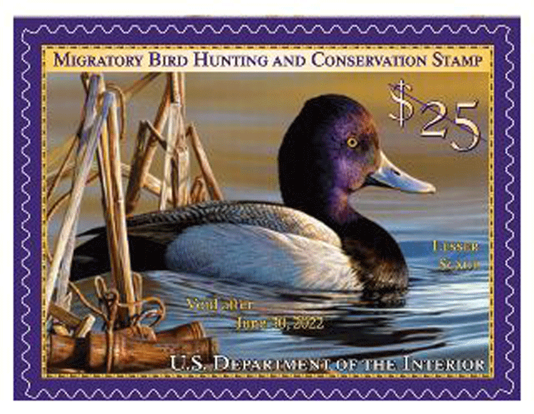 Updated August 2nd:
Here are the Scott catalogue numbers for this issue:
RW88, and RW88A for the souvenir sheet of 1
Updated June 20th:
Here is the first-day cancel: It measures 3.3″ x 1.1″
Updated June 3 from the Postal Bulletin:
On June 25, 2021, in Spanish Fort, AL, the U.S. Department of the Interior will issue the $25 Migratory Bird Hunting and Conservation stamp for the 2021–2022 waterfowl hunting season. The pressure-sensitive adhesive (PSA) stamp will go on sale nationwide June 25, 2021, and is valid through June 30, 2022.
No distribution at all of Item 336600, 2021–2022 $25.00 Migratory Bird Hunting and Conservation Stamp, PSA Pane of 20. It will only be available through Stamp Fulfillment Services and Amplex Corporation.
Technical Specifications (pane of 1):
Issue: Migratory Bird Hunting and Conservation Stamp
Item Number: 336500
Denomination &Type of Issue: $25.00, Special
Format: Pane of 1 (1 design)
Series: Federal Duck
Issue Date & City: June 25, 2021, Spanish Fort, AL 36527
Art Director: Suzanne Fellows, FWS
Artist: Richard Clifton
Modeler: Joseph Sheeran
Manufacturing Process: Flexographic, Offset, Microprint “FWS”
Printer: Ashton Potter (USA) Ltd. (APU)
Press Type: Muller A76
Stamps per Pane: 1
Print Quantity: 2,406,000 stamps
Paper Type: Nonphosphored Type III
Adhesive Type: Pressure-sensitive
Processed at: Ashton Potter (USA) Ltd. (APU)
Colors: Black, Cyan, Magenta, Yellow, Invisible Fluorescent
Stamp Orientation: Horizontal
Image Area (w x h): 1.762 x 1.289 in./44.755 x 32.741 mm
Overall Size (w x h): 1.89 x 1.417 in./48.006 x 35.992 mm
Full Pane Size (w x h): 6.125 x 2.625 in./155.575 x 66.675 mm
Plate Size: 36 stamps per revolution
Plate Numbers: N/A
Marginal Markings:
Front: Selvage Text: 2021–2022 Migratory Bird Hunting and Conservation Stamp • U.S. Fish & Wildlife Service • Celebrate Our Waterfowl and Hunting Heritage • informative text • Artist: Richard Clifton, Lesser Scaup© • If applicable, sign your stamp.
Back: Verso-text • Ordering information • Barcode • U.S. Department of the Interior logo • U.S. Fish & Wildlife Service logo
Technical Specifications (pane of 20):
Issue: Migratory Bird Hunting and Conservation Stamp
Item Number: 336600
Denomination & Type of Issue: $25.00, Special
Format: Pane of 20 (1 design)
Series: Federal Duck
Issue Date & City: June 25, 2021, Spanish Fort, AL 36527
Art Director: Suzanne Fellows, FWS
Artist: Richard Clifton
Modeler: Joseph Sheeran
Manufacturing Process: Flexographic, Offset, Microprint “FWS”
Printer: Ashton Potter (USA) Ltd. (APU)
Press Type: Muller A76
Stamps per Pane: 20
Print Quantity: 60,000 stamps
Paper Type: Nonphosphored Type III
Adhesive Type: Pressure-sensitive
Processed at: Ashton Potter (USA) Ltd. (APU)
Colors: Black, Cyan, Magenta, Yellow, Invisible Fluorescent
Stamp Orientation: Horizontal
Image Area (w x h): 1.762 x 1.289 in./44.755 x 32.741 mm
Overall Size (w x h): 1.89 x 1.417 in./48.006 x 35.992 mm
Full Pane Size (w x h): 8.25 x 8.25 in./209.55 x 209.55 mm
Plate Size: 180 stamps per revolution
Plate Numbers: “P” followed by five (5) single digits
Marginal Markings:
Front: Selvage Text: “Artist: Richard Clifton” (4 positions) • “Department of the Interior 20 x $25.00” (2 positions) • Silhouetted Image of duck printed in Black, Cyan, Magenta, Yellow, Invisible Fluorescent (2 positions) • Plate number (4 positions)
Back: Verso-text behind each stamp • Barcodes (4 positions)Updated May 20th:
The Fish & Wildlife Service tells The Virtual Stamp Club the stamp will be issued Friday, June 25th, with a first-day city of Spanish Fort, Alabama. A first-day ceremony may or may not be held; plans are still “fluid.”
From earlier:
[press release; no picture available]
Delaware Artist Richard Clifton Wins 2020 Federal Duck Stamp Art Contest
Federal Duck Stamp Supports Wildlife Conservation
After two days of competition, Richard Clifton of Milford, Delaware, emerged as the winner of the 2020 Federal Duck Stamp Art Contest with his painting of a single lesser scaup drake. The announcement was made via live stream at the U.S. Fish and Wildlife Service Headquarters in Falls Church, Virginia.
Clifton’s acrylic painting will be made into the 2021-2022 Federal Migratory Bird Hunting and Conservation Stamp, or “Duck Stamp”, which will go on sale in late June 2021. The Service produces the Federal Duck Stamp, which sells for $25 and raises approximately $40 million in sales each year. These funds support critical conservation to protect wetland habitats in the National Wildlife Refuge System for the benefit of wildlife and the enjoyment of people.
This year, the Migratory Bird Conservation Commission, chaired by U.S. Secretary of the Interior David L. Bernhardt, approved the allocation of more than $48 million from the fund, made up partly of Duck Stamp dollars, to support the acquisition of lands from willing sellers for the Refuge System. The new areas provide additional access to the public to some of the most spectacular places available for hunting, fishing, birdwatching, hiking and other outdoor activities.
“Hunters and anglers are the backbone of American conservation, and the Duck Stamp is one of the many ways they contribute to conserving America’s waterfowl and wetlands throughout the country,” said Secretary Bernhardt. “I encourage everyone, including those who do not hunt, to buy a Duck Stamp as it makes a real impact in conserving wildlife species and wetlands habitat.”
Since it was first established in 1934, sales of the Duck Stamp to hunters, bird watchers, outdoor enthusiasts and collectors have raised more than $1 billion to conserve over six million acres of habitat for birds and other wildlife and provide countless opportunities for hunting and other wildlife-oriented recreation on our public lands.
“For more than 80 years, millions of waterfowl hunters have made a difference in protecting our nation’s birds and their habitats,” said Aurelia Skipwith, Director of the U.S. Fish and Wildlife Service. “The Trump Administration has prioritized protecting our wildlife and their habitats and provided access to some of the most spectacular places available for hunting, fishing, birdwatching, hiking and other outdoor activities.”
Waterfowl hunters age 16 and older are required to purchase and carry the current Federal Duck Stamp. Many non-hunters, including birdwatchers, conservationists, stamp collectors and others also purchase the stamp in support of habitat conservation. Additionally, a current Federal Duck Stamp can be used for free admission to any national wildlife refuge that charges an entry fee.
This is Clifton’s second Federal Duck Stamp Contest win. His art previously appeared on the 2007-2008 Federal Duck Stamp.
In addition to Clifton, James Hautman of Chaska, Minnesota, placed second with his acrylic painting of a flock of lesser scaup, and Joseph Hautman of Plymouth, Minnesota, took third place with his acrylic painting of a flock of lesser scaup.
This 2020 contest now has a permanent theme of “celebrating our waterfowl hunting heritage” and it will be mandatory that each entry include an appropriate waterfowl hunting scene and/or accessory. Of 138 entries submitted to this year’s competition, seven entries made it to the final round of judging. Eligible species for this year’s Federal Duck Stamp Contest were the gadwall, brant, cinnamon teal, lesser scaup and red-breasted merganser. View the online gallery of the 2020 Federal Duck Stamp Art Contest entries.
The judges for this year’s Federal Duck Stamp Contest were: Donnie Satchell, conservation partner and artist; Jane Lawson, conservation partner and artist; Eric Morris, conservation partner; Scott Penegar, artist; and Paul Wait, conservation partner.
“The Duck Stamp is one of the most successful conservation programs ever created. I am so proud to be a part of this annual tradition that combines the best of talented artwork from around the country with habitat conservation,” said Jerome Ford, Assistant Director for the Service’s Migratory Bird Program. “As the only federally regulated and sponsored art contest, competing artists offer their time and talent to capture the beauty of waterfowl and the tradition of waterfowl hunting.”
You can contribute to conservation and America’s great outdoors tradition by buying Federal Duck Stamps at many national wildlife refuges, sporting goods stores and other retailers, through the U.S. Postal Service, or online at http://www.fws.gov/birds/get-involved/duck-stamp/buy-duck-stamp.php.






















 Kris McIntosh is the new chair of the Education Department of the
  Women (Sc. 959) issues.
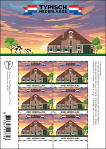 More stamps in the Typically Dutch series will appear in the coming months about wooden houses (22 February), canal houses (22 March), houseboats (6 April) and terraced houses (14 June).
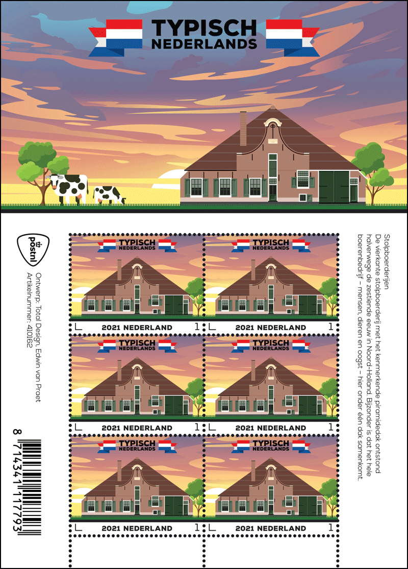
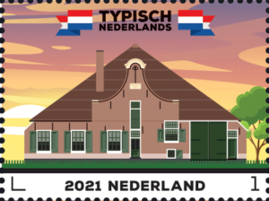 The 1742 farmhouse depicted on the stamp is called Broedersbouw and can be found in the North Holland village of Zuidoostbeemster. In the illustration on the stamps, the farm is flanked on the side by a tree, the front shows the green grassland. There is a black line at the bottom of the stamp that refers to the street level. To the left of the farm, the rising sun can be seen against a sky with blown strips of sky.
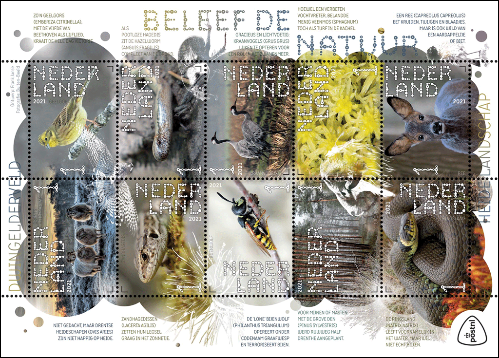
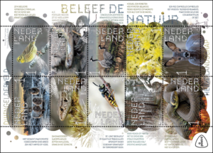 sheet Experience Nature – Dwingelderveld pays attention to the unique flora and fauna of this heather landscape in the middle of Drenthe.
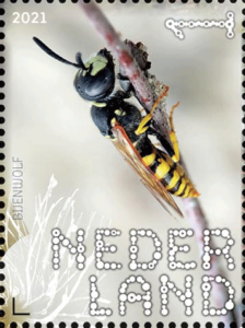
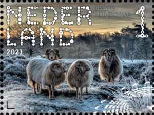 The Dwingelderveld National Park is the largest wet heathland area in Western Europe. This protected nature area was also voted the quietest area in the Netherlands at the end of 2020. Wet ditches and dry sand ridges alternate on the extensive moist heathland of the Dwingelderveld. As a result, there is a lot of variation in plant growth and animal life.
 separate graphic layer on the stamp sheet contains transparent images of a kestrel with spread wings, the needles of a Scots pine, a creeping dung beetle, the profile of the head of a Drenthe heather sheep and a bare pedunculate oak.
 The stamp sheetlet opens with an intense winter image of the Drenthe heath sheep. According to Janse, this animal can still be considered as semi-wild because it can keep itself alive. “On the stamp next to it, there is the yellowhammer, a beautiful bird, on a twig. Typical for the east of our country, especially in Drenthe. And, very special, his vocals resemble the opening bars of Beethoven’s 5th symphony.”