With apologies, the pre-packaging and sending of final invoices for Auction 95 has been delayed due to vandalism in the county I live in – Moore County. Unknown parties shot-up multiple power sub-stations throughout the county, leaving over 40,000 people without power. The outage is estimated to extend to Thursday December 8th.
As many of you know, I am a full-time Firefighter/EMT with Aberdeen Fire/Rescue. I was on duty when the incident occurred. We were busy all night running calls of various nature, and assisting law enforcement with traffic control. Today I am at my part-time station, and will be back at Aberdeen tomorrow (Monday).
The lots have already been separated out by the winning bidders. As soon as power is restored, I will be able to get back to the task and get the invoices out to everyone.
According to The New York Times, the local sheriff “said that the attack appeared targeted, but did not provide further details on a motive or suspect.” A state senator called it a “terrible act, and it appears to be intentional, willful and malicious.”
Some of the damaged equipment will need to be replaced completely, and the outages could last until Thursday for some power customers.
5721 (60¢) Christmas – Virgin and Child
a. Convertible booklet pane of 20
5722 (60¢) Christmas – Elf and Teddy Bear
5723 (60¢) Christmas – Elf Tying Ribbon
5724 (60¢) Christmas – Elf with Toy Car
5725 (60¢) Christmas – Elf with Rocket
a. Block of 4, #5722-5725
b. Convertible booklet pane of 20, 5 each #5722-5725
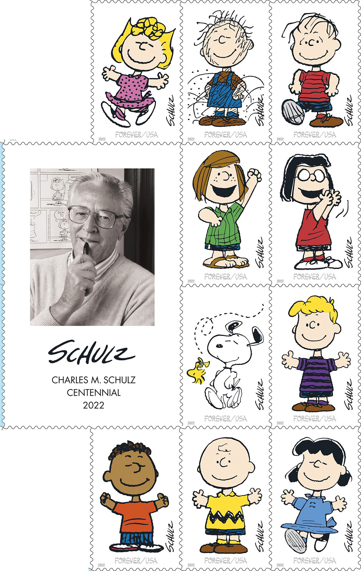
5726 Peanuts Characters pane of 20, 2 each # 5726a-5726j
a. (60¢) Charlie Brown
b. (60¢) Lucy
c. (60¢) Franklin
d. (60¢) Sally
e. (60¢) Pigpen
f. (60¢) Linus
g. (60¢) Snoopy and Woodstock
h. (60¢) Schroeder
i. (60¢) Peppermint Patty
j. (60¢) Marcie
k. As #5726, imperforate
l. As #5726a, imperforate
m. As #5726b, imperforate
n. As #5726c, imperforate
o. As #5726d, imperforate
p. As #5726e, imperforate
q. As #5726f, imperforate
r. As #5726g, imperforate
s. As #5726h, imperforate
t. As #5726i, imperforate
u. As #5726j, imperforate
Updated October 30th, subject to change. Some of the information may not have been confirmed by Canada Post, but the agency did confirm no Lunar New Year stamps in 2023.
All links open in a new window.
January 30
March 1
April 3
April 18
May 8
May 1
May 23
June 21
June 28
July 12
August 28
September 28
October 19
October 30
November 2
November 2
November 7
November 9
November 16
A mailing from Canada Post implies this is the end of the 2023 stamp programme. No mention was made of the previously-listed “A Picture Is Worth A Thousand Words.”
On Thursday, November 3, 2022, the APS Board of Directors unanimously voted to suspend the World Series of Philately accreditation for ARIPEX ahead of the planned show in 2023. The suspension means the winner of the competitive exhibition will not be eligible for the Champion of Champions.
APS Executive Director Scott English and the Committee on National Exhibitions and Judging (CANEJ) Chair Darrell Ertzberger participated in ARIPEX in February 2022, identifying issues with the show. The APS offered corrective actions and support to make the necessary changes to ARIPEX but found no improvement.
On October 30, 2022, CANEJ met to review reports from English, Ertzberger, and others and determined that ARIPEX failed to comply with WSP rules and recommended the APS Board suspend WSP accreditation for 2023. Specifically, the Committee found ARIPEX violating three provisions of Section E(2) due to late and incomplete reporting, failing to maintain a level of excellence, and violating one or more rules for WSP exhibitions.
In suspending the WSP accreditation, the APS outlined several steps to address the concerns, or it will revoke accreditation. The required actions are:
Rebuild the show’s organizational structure to include individuals separate from the Show Chair serving as chairs for the bourse, exhibits, awards, and jury to restore confidence the exhibits can be better managed and preserve the national-level requirements,
The governing body, the Arizona Federation of Stamp Clubs, must rebuild its committee to ensure proper oversight and accountability for the show’s operations, and
Commit to the approved rules of the World Series of Philately to include a functioning website, an approved prospectus, and an approved jury no later than August 1, 2023.
“This was not an easy decision, but we have to protect the interests of members who entrust valuable collections to the show committee,” said English, “I’ve heard from members ready, willing, and able to get ARIPEX back on track. We hope the ARIPEX leadership takes the necessary steps to make it happen.”
World Series of Philately
A WSP show is an APS World Series of Philately show. These U.S. national-level shows have undergone an accreditation process and must follow standards (WSP Rules/Requirements) to maintain their status. The multi-frame grand award-winning exhibit at each WSP show is invited to compete in the annual Champion of Champions at the Great American Stamp Show for the highest exhibiting honor.
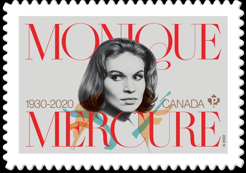
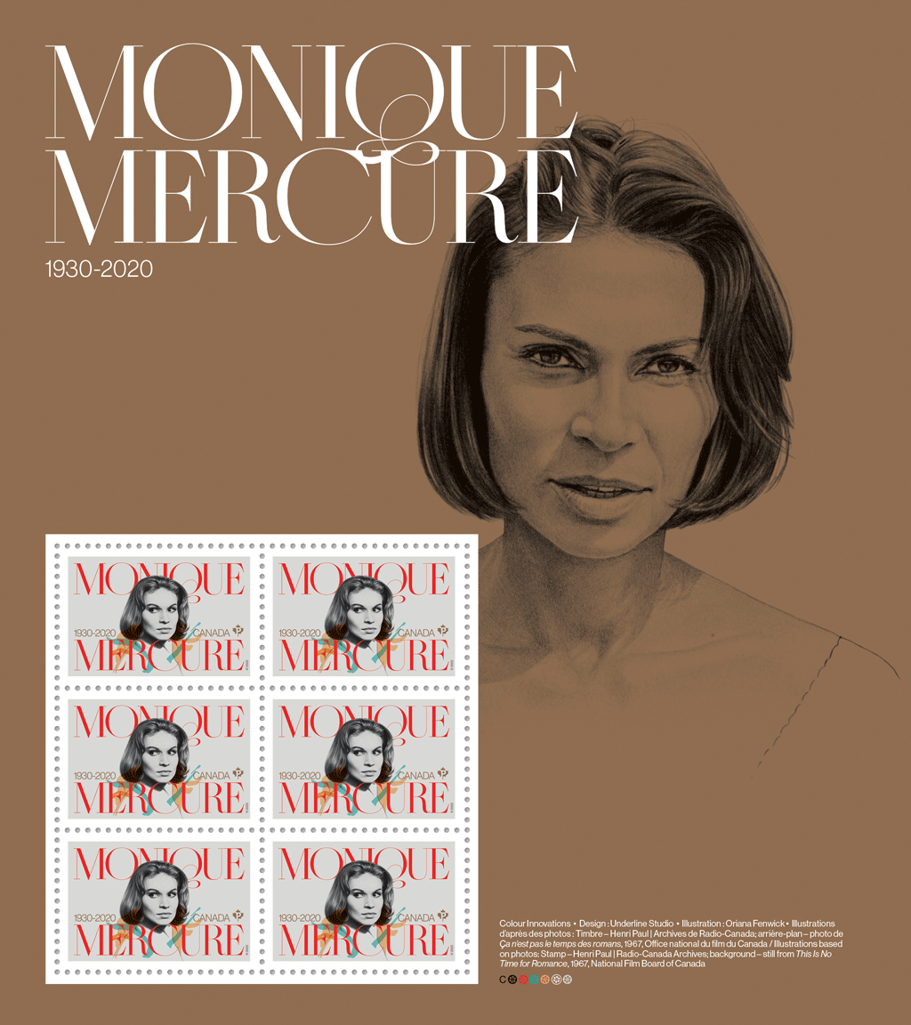
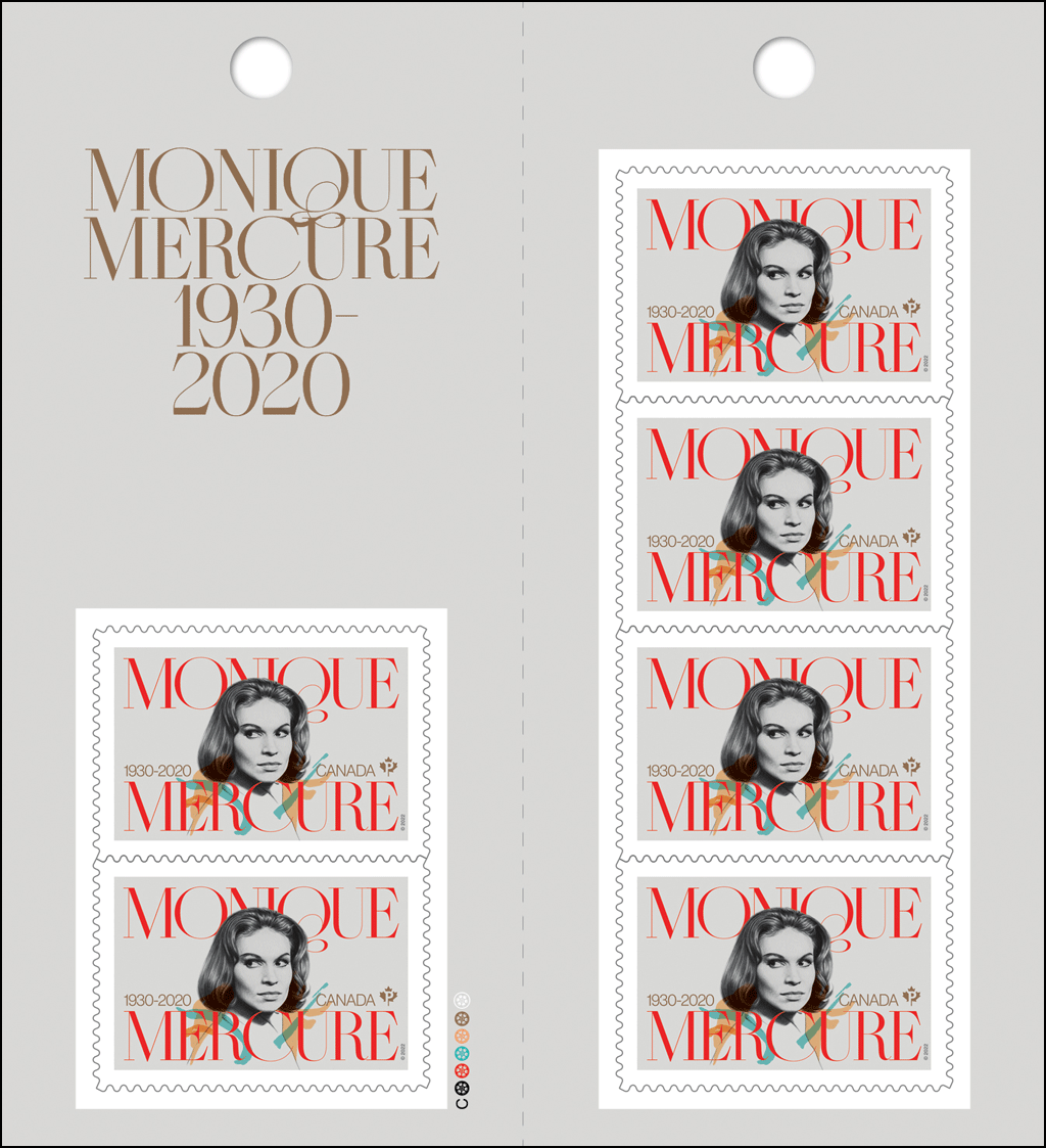
[press release] [click on any of the pictures for larger versions] New stamp honours acclaimed Canadian actress Monique Mercure Quebec’s grande dame of stage and screen appeared in more than 80 films and TV productions
MONTRÉAL – Canada Post today issued a commemorative stamp celebrating Quebec’s grande dame of stage and screen, Monique Mercure. Known for her fiery spirit, versatility and powerful performances, Mercure (1930-2020) was one of Canada’s most beloved and acclaimed actresses.
She began her acting career in the early 1960s at the theatre and made her film debut in 1963 in Claude Jutra’s À tout prendre. This kicked off a career that would extend over the next six decades. A household name in Quebec, Mercure performed in more than 100 classical and contemporary plays in North America and Europe and over 80 films and TV productions.
Pane
Some of her most popular films were Mon oncle Antoine (1971), J.A. Martin photographe (1977) – which earned Mercure Canada’s first Festival de Cannes award for best actress – Naked Lunch (1991) and The Red Violin (1998). She also appeared as a regular in popular French-language TV series Providence (2005-11) and Mémoires vives (2013-16).
Throughout her career, Mercure received numerous awards and honours, including two Genie Awards, two Prix Gémeaux, the Prix Denise-Pelletier, the Prix Gascon-Roux from the Théâtre du Nouveau Monde and a Governor General’s Performing Arts Award for Lifetime Artistic Achievement.
She was named an Officer of the Order of Canada in 1979 and promoted to Companion in 1993. Mercure was also named a Fellow of the Royal Society of Canada and a Grand Officer of the Ordre national du Québec.
Mercure joins her peers from the performing community that Canada Post has honoured with stamps, including Fay Wray, Mary Pickford and Christopher Plummer.
About the stamp
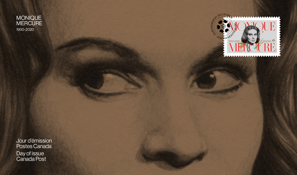
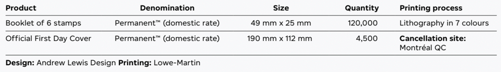
The stamp features an illustration by Oriana Fenwich based on a photograph of Monique Mercure taken in 1963 by Henri Paul, courtesy of Radio-Canada Archives. The stamp was printed by Colour Innovations and designed by Underline Studio. Cancelled in Montréal, the issue includes a booklet of six Permanent™ domestic rate stamps, a pane of six stamps and an Official First Day Cover.
The stamp and collectibles are available now at canadapost.ca at post offices starting November 14.
Canada Post video:
[en Francais pour les médias d’information] Un timbre rend hommage à l’actrice canadienne Monique Mercure La grande dame de la scène et de l’écran au Québec a joué dans plus de 80 films et productions télévisées
MONTRÉAL – Postes Canada a émis aujourd’hui un nouveau timbre commémoratif en l’honneur de Monique Mercure, grande dame de la scène et de l’écran au Québec. Connue pour sa fougue, sa polyvalence et son jeu d’une puissante intensité, Monique Mercure (1930-2020) compte parmi les actrices les plus admirées au pays.
Elle amorce sa carrière d’actrice au début des années 1960 en jouant au théâtre et fait ses débuts au cinéma dans le film À tout prendre, de Claude Jutra, en 1963. Son ascension est fulgurante. Véritable icône au Québec, Monique Mercure joue dans plus d’une centaine de productions théâtrales en Amérique du Nord et en Europe, et plus de 80 films et productions télévisées au cours de ses 60 ans de carrière.
Pane
Ses films les plus mémorables comprennent Mon oncle Antoine (1971), J.A. Martin photographe (1977) – grâce auquel elle devient la première Canadienne à remporter le prix de l’interprétation féminine au Festival de Cannes –, Naked Lunch (1991) et The Red Violin (1998). Elle apparaît régulièrement dans les séries dramatiques Providence de 2005 à 2011 et Mémoires vives de 2013 à 2016.
Monique Mercure remporte de nombreuses distinctions, notamment deux prix Génie, deux prix Gémeaux, le prix Denise-Pelletier, le prix Gascon-Roux du Théâtre du Nouveau Monde et le prix du Gouverneur général pour les arts du spectacle de la réalisation artistique.
Elle est nommée Officier de l’Ordre du Canada en 1979, puis Compagnon en 1993, en plus d’être reçue membre de la Société royale du Canada et grande officière de l’Ordre national du Québec.
Monique Mercure fait partie des personnalités du monde artistique à qui Postes Canada a consacré un timbre, aux côtés de Fay Wray, Mary Pickford et Christopher Plummer, notamment.
À propos du timbre
Le timbre est orné d’une illustration de Monique Mercure réalisée par Oriana Fenwick et inspirée d’une photo prise par Henri Paul en 1963, gracieuseté des archives de Radio-Canada. La vignette a été imprimée par Colour Innovations et conçue par Underline Studio. Oblitérée à Montréal, l’émission comprend un carnet de six timbres PermanentsMC au tarif du régime intérieur, un feuillet de six timbres et un pli Premier Jour officiel.
[press release] [click on any of the pictures for larger versions] Canada Post recognizes acclaimed Canadian actress Monique Mercure
MONTRÉAL – On November 9, Canada Post invites you to attend the unveiling of a special stamp to celebrate the remarkable legacy of Canadian actress Monique Mercure, Québec’s grande dame of stage and screen.
The upcoming stamp will be officially issued on Monique Mercure’s birthday, November 14, after it is unveiled in Montréal on Wednesday, November 9.
Who: Special guests:
Michèle Mercure, Daughter of Monique Mercure
Pier-Yves Larouche, Grandson of Monique Mercure
Louise Sicuro, Founder of Journées de la culture and friend of Monique Mercure
Simon Brault, Director and CEO of the Canada Council for the Arts
Patricia Tuslane, Actress and friend of Monique Mercure
Alice Ronfard, Director
The event includes a special performance from cellist Claude Lamothe accompanied by actress Sophie Clément. Quatuor Rhapsodie will also perform before and after the event.
Where: Rialto Theatre
5723 Avenue du Parc, Montréal
When: Wednesday, November 9, at 6 pm, Eastern Time
[en Francais pour les médias d’information] Postes Canada rend hommage à l’actrice canadienne Monique Mercure
MONTRÉAL – Le 9 novembre, Postes Canada vous invite au dévoilement d’un timbre spécial qui commémore le talent, la beauté et l’héritage remarquables de l’actrice d’ici Monique Mercure, grande dame de la scène et de l’écran au Québec.
Le timbre sera émis officiellement le 14 novembre, date de l’anniversaire de naissance de Monique Mercure, après son dévoilement à Montréal, le mercredi 9 novembre.
Qui: Invités spéciaux:
Michèle Mercure, fille de Monique Mercure
Pier-Yves Larouche, petit-fils de Monique Mercure
Louise Sicuro, fondatrice des Journées de la culture et amie de Monique Mercure
Simon Brault, directeur et chef de la direction du Conseil des arts du Canada
Patricia Tuslane, actrice et amie de Monique Mercure
Alice Ronfard, metteure en scène
L’événement comprend une performance spéciale du violoncelliste Claude Lamothe, accompagné de l’actrice Sophie Clément. De plus, le Quatuor Rhapsodie se produira avant et après l’événement.
Où: Théâtre Rialto
5723, avenue du Parc, Montréal
Quand: Le mercredi 9 novembre à 18 h, heure de l’Est
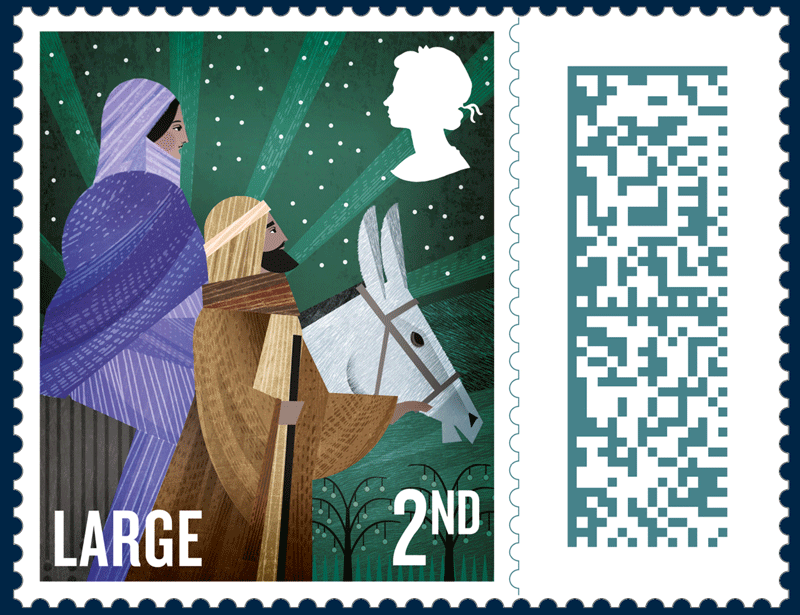
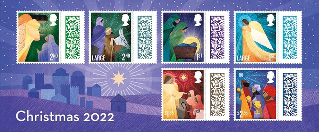
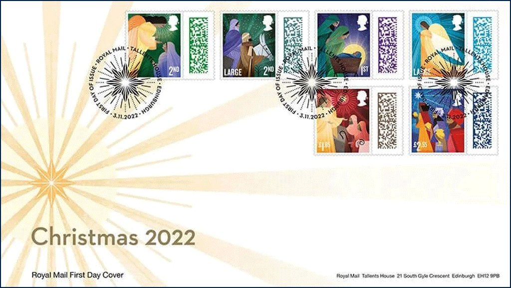
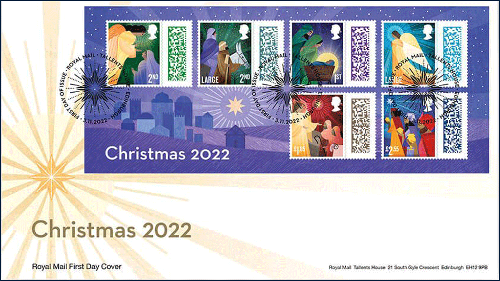
[press release] [click on any of the pictures for larger versions] Royal Mail Reveals Stamps for Christmas 2022
Royal Mail celebrates Christmas 2022 with a series of six barcoded stamps, exclusively illustrated by award-winning artist, Katie Ponder
The six designs reflect Kent-based Katie’s unique style, providing a fresh and contemporary feel to the classic Nativity story
The illustrations this year focus on key moments in the traditional Christmas story including the journey to Bethlehem and the Magi being guided by the star
This year’s stamps will be the last Christmas stamps to feature the silhouette of the Late Queen Elizabeth
Royal Mail is encouraging customers to post their festive greetings early and order their online gifts and shopping well in advance, to help its posties deliver the bumper festive mailbag
The stamps are on sale now and will be available at www.royalmail.com/christmas2022, by phone on 03457 641 641 and 7,000 Post Offices across the UK
Royal Mail has revealed its Christmas 2022 stamps, featuring scenes of the Nativity, exclusively illustrated by award-winning artist, Katie Ponder.
The six designs reflect Kent-based Katie’s unique style, providing a fresh and contemporary feel to the classic Nativity story.
With references to art deco adding a timeless quality to the stamp images, the illustrations this year focus on key moments in the traditional Christmas story – including the journey to Bethlehem and the Magi being guided by the star.
Royal Mail also worked with The Revd Lucy Winkett, Rector of St James’s Church, Piccadilly on the stamp issue.
This year’s stamps will be the last Christmas issue to feature the silhouette of the Late Queen Elizabeth.
David Gold, Director of External Affairs & Policy, Royal Mail, said: “Our Christmas stamp issue is always much anticipated, and it is one we particularly look forward to. The charming style of these designs sets the perfect tone for the festive season.”
The barcodes on this year’s Christmas stamps allow customers to watch a seasonal, themed video created exclusively for Royal Mail by the award winning Aardman studio. The video features Shaun the Sheep and his friends sending some festive cheer to the Farmer’s dog.
To choose and view the video, both the sender and recipient should download the Royal Mail App. The sender can select the Christmas video for the recipient to watch just by scanning the stamp barcode — giving that someone special something extra to smile about this Christmas.
The stamps are on sale now and will be available at www.royalmail.com/christmas2022, by phone on 03457 641 641 and in 7,000 Post Offices across the UK.
[from the PostNL press release] [click on any of the pictures for larger versions] String Instruments
Appearance: Ten personal stamps in ten different designs, marked with ‘Nederland 1’, the denomination for items up to 20g in weight destined for delivery in the Netherlands
Design and photography: Bart de Haas, The Hague
Date of issue: 7 November 2022
Item number: 820060
PostNL gives an overview of ten distinctive string instruments from both Western and non-Western musical traditions. The featured instruments are part of the Kunstmuseum Den Haag’s music collection. All photos were taken by graphic designer Bart de Haas from the Hague, who also designed the stamp sheet. The ten personal stamps in ten different designs are marked with ‘Nederland 1’, the denomination for items up to 20g in weight destined for delivery in the Netherlands. The validity period is unlimited
Each stamp features an overall image and a detail of a string instrument. The picture of the detail continues on the right or left-hand sheet edge. On the stamp, the pictures are connected by a pattern of white circles of different sizes. Each string instrument has its own background colour with a colour gradient. On the sheet edge to the left and right, the picture fragments are separated by a horizontal strip of which the colour is derived from the picture below. The colours on the top and bottom sheet edge are also derived from the stamp colours. The names of the string instruments are shown alternately at the bottom on the left and right-hand side of the stamps. The sheet edge next to it features the name of the country or area where the instrument comes from. The PostNL logo is printed at the top on the left-hand side of the stamp sheet; the logo of the Kunstmuseum Den Haag, the name of the designer Bart de Haas and the item number are printed at the bottom on the right-hand side.
The stamp sheet was designed by graphic designer Bart de Haas from The Hague. He took pictures of the ten featured musical instruments at the Kunstmuseum Den Haag. The museum manages a collection of more than 3,800 musical instruments, which was started by Daniel François Scheurleer (1855-1927).
Scheurleer not only collected musical instruments but also manuscripts, books, prints, drawings and paintings with a musical theme. Over time, the collection was expanded significantly to include non-Western and electronic musical instruments. ‘Milly van Houten-de Kom was a great help when I was researching string instruments,’ De Haas explains. ‘She is responsible for managing the huge collection of the Kunstmuseum. I also sought the advice of Frits Zwart, former music collection curator at the museum.’
De Haas wanted to feature a balanced mix of Western and Non-western instruments. ‘They have not been placed opposite each other, but distributed diagonally from left to right across the stamp sheet. After all, the essence of music is the link between them. The stamps feature string instruments from all over the world. From Europe, of course, but also from Africa, America and Asia. The shape of the instruments varies. The harp is a multi-stringed, complex, large instrument. The rubab, on the other hand, is a small instrument with only a few strings. The soundboard of the kamancheh featured is made from the shell of an armadillo. I was keen to show plenty of variety. Also when it came to the playing method, strumming versus bowing. That is why some stamps feature the bow as well.’
The String instruments stamps are available while stocks last at www.postnl.nl/collect and can be ordered by telephone from the Collect Club customer service on telephone number +31 (0)88 868 99 00.
Technical Details:
Stamp size: 30 x 40mm (wxh)
Sheet size : 170 x 122 mm (wxh)
Paper: normal with phosphor print
Gum: gummed
Printing technique: offset
Printing colours: cyan, magenta, yellow, black
Appearance: personal stamp with denomination Nederland 1 for letters weighing up to 20g with destinations within the Netherlands
Edition: 5000
Item number: 820060
Issue date: 7 November 2022
[press release] [click on any of the pictures for larger versions] New stamp celebrates the Jewish Festival of Lights The contemporary illustration reflects the joyful spirit of Hanukkah
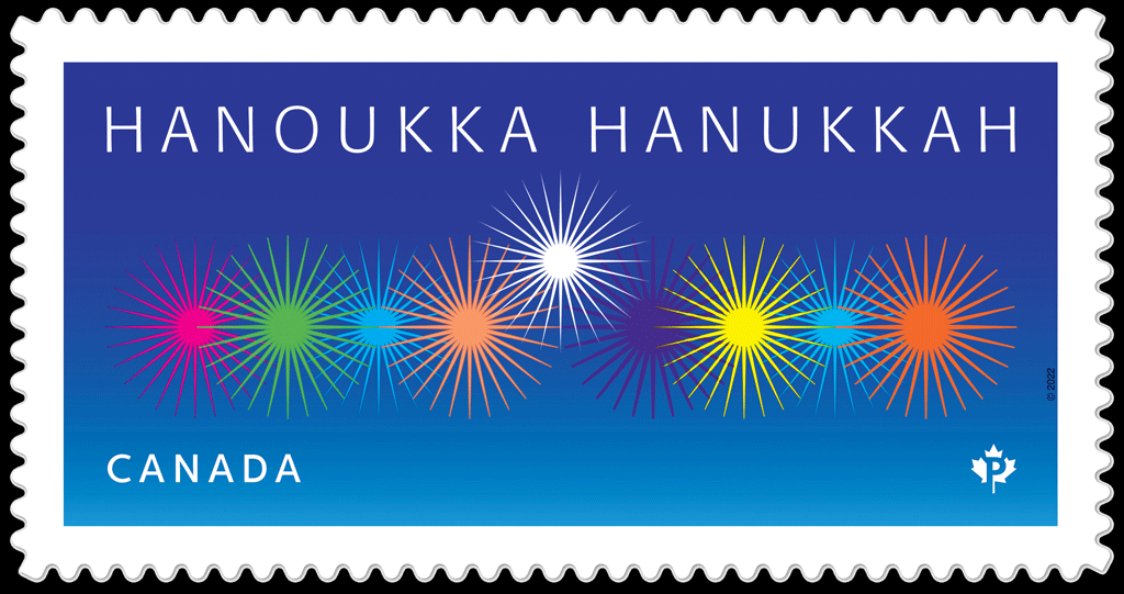
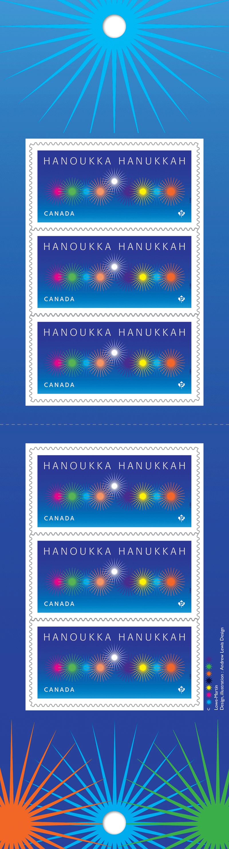
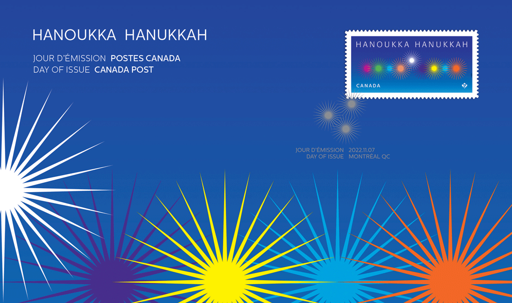
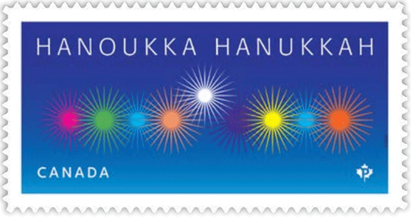
OTTAWA – Today Canada Post launched the fifth stamp in its ongoing series celebrating Hanukkah, the Jewish Festival of Lights. The new stamp reflects the joyful spirit of the festival through a vibrant, contemporary interpretation of the flames on an eight-branched menorah.
Hanukkah is one of the more widely embraced celebrations in the Jewish calendar. An opportunity for reflection and a celebration of triumph and tenacity, it commemorates the rededication of the Temple in Jerusalem after the Jewish people reclaimed it from their oppressors around 165 BCE.
According to Jewish tradition, the Temple’s menorah was to burn continuously, but there was enough oil to last only one day. Miraculously, it lasted the eight days needed to harvest, press and transport a fresh supply of oil.
This miracle is commemorated through the kindling of a special Hanukkah menorah known as a hanukkiyah – a candelabrum bearing a row of eight candle or oil holders. Each evening an additional light is kindled using the shamash (helper candle).
Designed by Andrew Lewis, the stamp was cancelled in Montréal on November 7, in advance of Hanukkah, which this year takes place from nightfall December 18 to nightfall December 26.
The 2022 Hanukkah stamp is available at canadapost.ca and postal outlets across Canada.
[en Francais pour les médias d’information] Un nouveau timbre en l’honneur de la fête juive des Lumières L’interprétation contemporaine reflète l’esprit joyeux de Hanoukka.
OTTAWA – Postes Canada lance aujourd’hui le cinquième timbre de sa série célébrant Hanoukka. Interprétation contemporaine et vivante des flammes d’une menorah à huit branches, ce nouveau timbre reflète l’esprit joyeux de la fête juive des Lumières.
Hanoukka est l’une des plus grandes fêtes du calendrier juif. Se voulant une occasion de réfléchir et de célébrer le triomphe et la ténacité, elle commémore la réinauguration du Temple de Jérusalem, repris de ses oppresseurs par le peuple juif environ 165 ans avant l’ère commune.
Selon la tradition juive, la menorah du Temple devait brûler sans arrêt, mais il ne restait de l’huile que pour une journée. Par miracle, cette petite quantité l’a alimentée pendant huit jours, jusqu’à l’arrivée de nouvelles réserves.
Ce miracle est célébré en allumant une menorah spéciale appelée hanoukkia, un chandelier à huit branches, à raison d’une nouvelle flamme par soir à l’aide du shamash (serviteur).
Conçu par Andrew Lewis, le timbre a été oblitéré à Montréal le 7 novembre, plusieurs semaines avant la fête, qui se tient cette année du coucher du soleil le 18 décembre jusqu’à la tombée de la nuit le 26 décembre.
Le timbre de Hanoukka de cette année est en vente sur postescanada.ca et dans les comptoirs postaux partout au pays.
[from Details magazine]
A fresh take on an age old tradition, this new Hanukkah stamp conveys the joyful spirit of the Jewish Festival of Lights through a fun, flamboyant interpretation of the flames on a hanukkiyah (a special eight branched menorah). This year, the celebration takes place from nightfall December 18 to nightfall December 26.
The kindling of a hanukkiyah is central to the observation of Hanukkah, paying homage to a miracle that took place more than 2,000 years ago. After the Maccabees led the Jews to victory over their oppressors, it is said that the menorah in the rededicated Temple in Jerusalem burned for eight days on a single day’s worth of oil.
Designer Andrew Lewis says his goal in creating the design was to put a new spin on a classical image. The stylized flames, he explains, create a graphic and emotional energy that reflects the joy and excitement of the holiday. “The different colours of the flames represent the various ways people celebrate Hanukkah today – through prayer, singing, feasting, playing with dreidels, sharing gifts,” he says. “The blue background and the white flame of the central shamash (helper candle) ground the design, as those colours hold special importance in Judaism.”
A more-detailed press release will be distributed on the day of issue, 7 November.
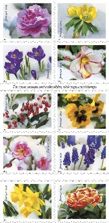
See the bottom of this page for an unreported — and possibly unobtainable — variety.
Scott Catalogue Numbers:
Holiday Birds souvenir sheet of 3, Sc. 3363
Cardinal, 3363a and 3365 booklet single
Blue Jay, 3363b and 3366 booklet single
Grosbeak, 3363c and 3367 booklet single
Star and Manager, Sc. 3364 booklet single
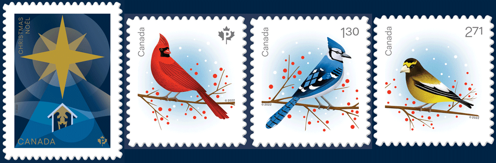
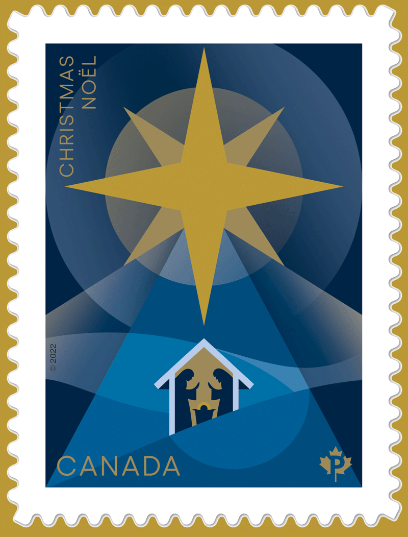
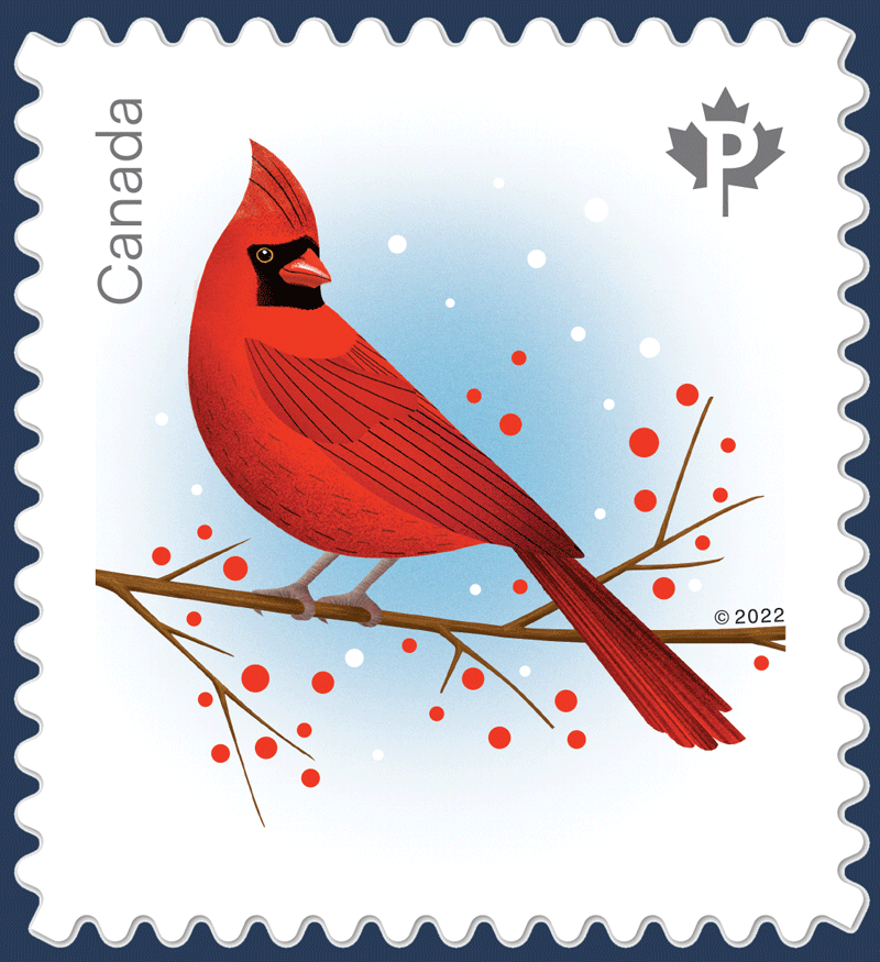
[press release] [click on any of the pictures for larger versions] Christmas and holiday stamps illuminate the season and add cheer The Nativity star and holiday birds capture sacred and secular images
OTTAWA – Canada Post has released new Christmas and holiday stamps that will help Canadians make their mail merrier at this special time of year.
Since 1964, the annual Christmas and holiday stamps have been adding a festive touch to cards and letters throughout the season. For the 2022 stamps, Canadians will once again have their choice of stamps featuring either sacred or secular holiday imagery.
This year, Canada Post is also sharing images of Christmas and holiday stamps dating back decades so Canadians can see how they have evolved over the years, while still capturing the fun and magic of the season.
2022 Christmas and holiday stamps
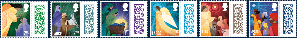
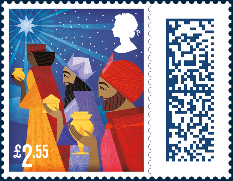
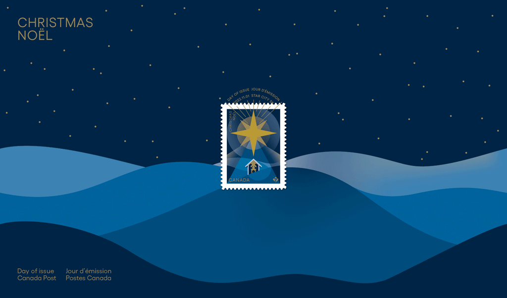
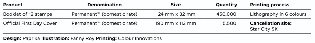
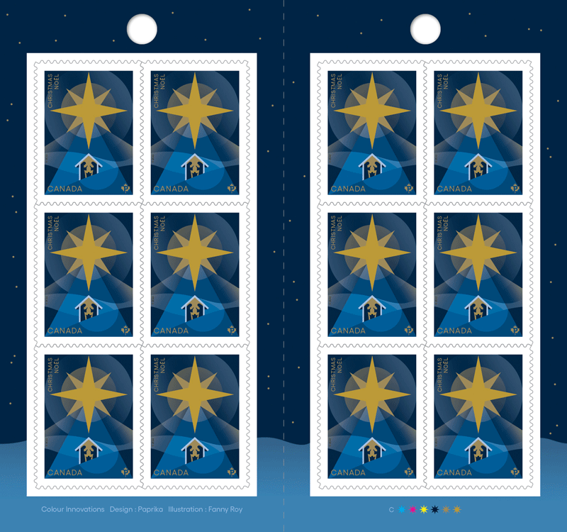
The majestic new Christmas stamp – designed by Paprika and illustrated by Fanny Roy – is inspired by the Nativity, with an emphasis on the star that led the Magi to the infant Jesus. In biblical accounts of the birth of Jesus, the star of Bethlehem served as both a guide that led the Magi to find the young child and a sign that the prophecy of the coming of a saviour had been realized. The Permanent™ domestic rate stamp is available in booklets of 12. The Official First Day Cover is cancelled in Star City, Saskatchewan.
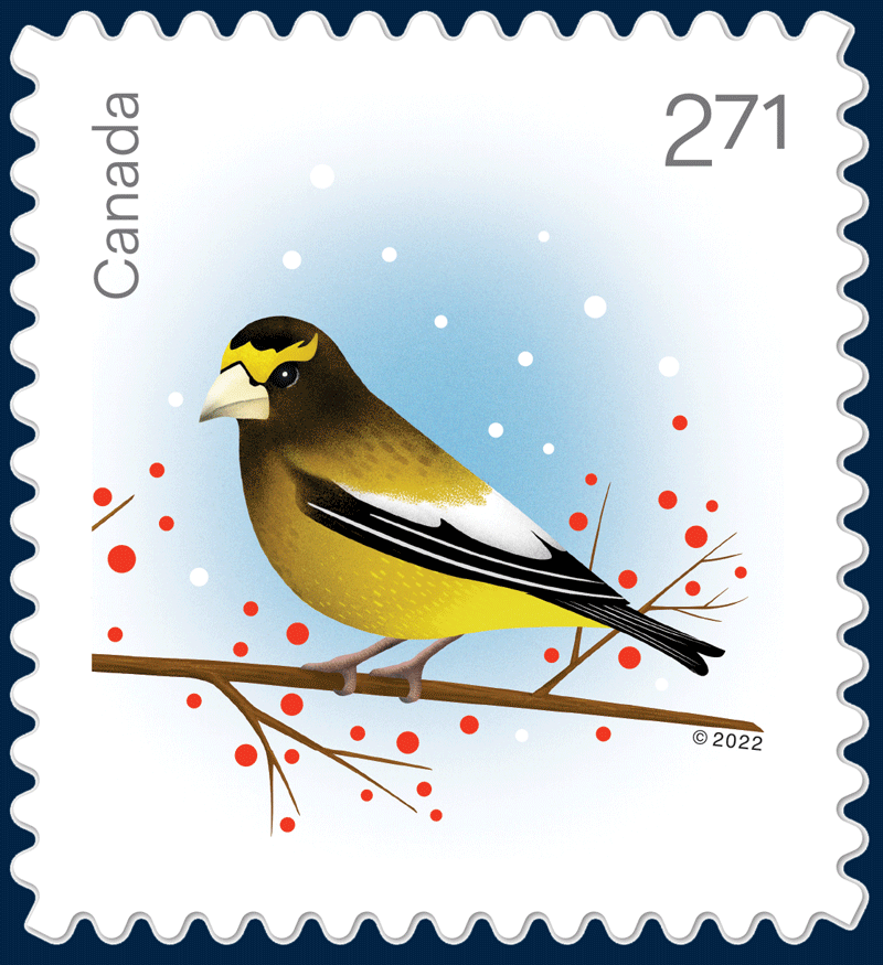
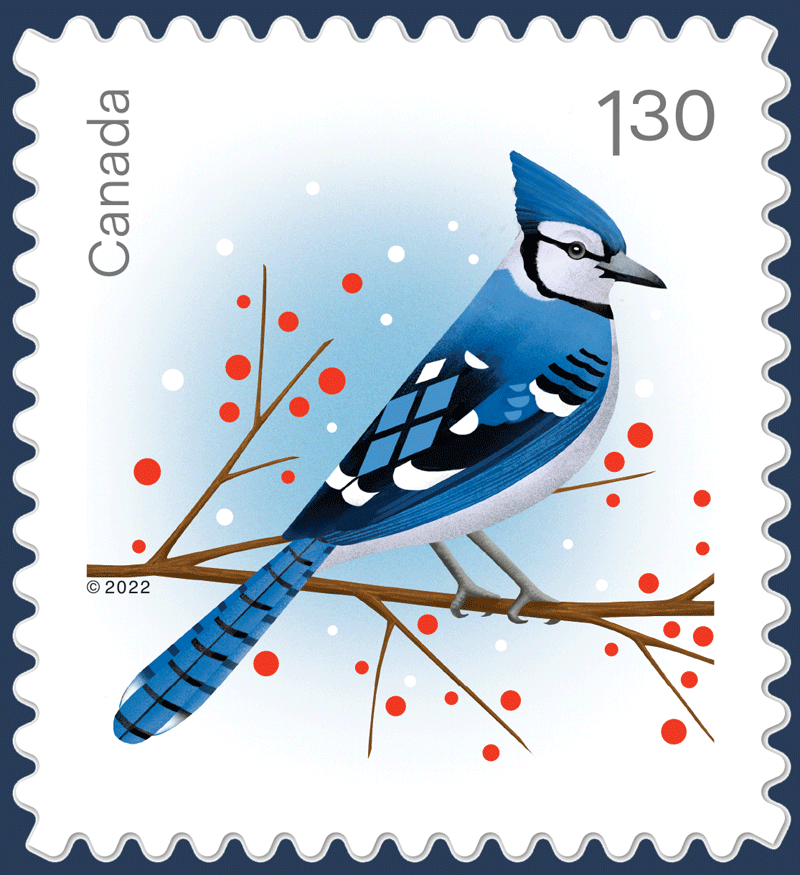
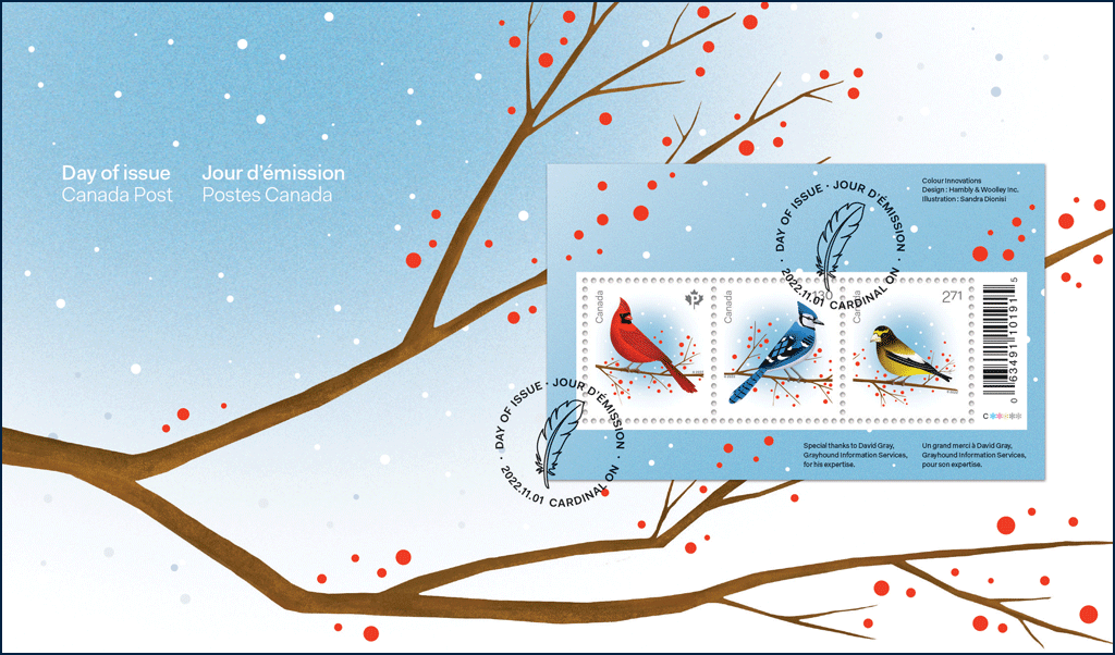
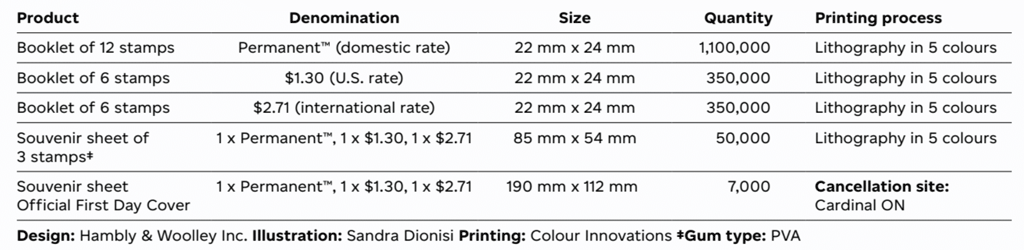
This year’s secular holiday stamps – designed by Hambly & Woolley Inc. and illustrated by Sandra Dionisi – feature three birds that overwinter in Canada: a cardinal (Permanent™ domestic rate), a blue jay (U.S. rate) and an evening grosbeak (international rate). The colourful stamps provide a festive and wintery look, emphasizing the beauty of the natural world during the holiday season. Domestic rate stamps are available in booklets of 12, with the U.S. and international rate stamps offered in booklets of six. A festive souvenir sheet of the three stamps is also available, along with a souvenir sheet Official First Day Cover, cancelled in Cardinal, Ontario.
Images of stamps dating back several decades
For nearly 60 years, the annual Christmas and holiday stamps have reflected the magic, landscapes and cultural traditions that make the season so special. This year, Canada Post is sharing images of some of those stamps from decades gone by. While the artwork and designs have changed significantly over the years, the stamps continue to capture the meaning, memories and cherished moments of the season that Canadians hold dear. Sharing Christmas and holiday stamps on cards and letters remains a time-honoured tradition for many people across the country.
The 2022 stamps and collectibles are available at canadapost.ca and postal outlets across Canada. Christmas and holiday stamps from past years are not being reissued.
[en Francais pour les médias d’information] Des timbres répandent la joie de Noël et des Fêtes L’étoile de la Nativité et les oiseaux des Fêtes ajoutent une touche festive au courrier.
OTTAWA – Postes Canada a émis de nouveaux timbres de Noël et des Fêtes qui permettront aux gens au pays d’égayer leur courrier en cette période de réjouissances.
Depuis 1964, les timbres annuels de Noël et des Fêtes ajoutent une touche festive aux cartes et aux lettres. Cette année encore, les Canadiennes et les Canadiens pourront orner leur courrier de timbres présentant des images sacrées ou profanes des Fêtes.
Cette année, Postes Canada fait aussi un retour sur plusieurs décennies pour montrer comment ses timbres ont évolué, tout en continuant de refléter la joie et la magie du temps des Fêtes.
Timbres de Noël et des Fêtes de 2022
Conçu par Paprika et illustré par Fanny Roy, le sublime nouveau timbre de Noël s’inspire de la Nativité et met en vedette l’étoile qui a conduit les Mages à l’Enfant Jésus. Dans les récits bibliques de la naissance de Jésus, l’étoile de Bethléem guide les Mages jusqu’au nouveau-né, signe que la prophétie de la venue d’un sauveur s’est réalisée. Le timbre PermanentMC au tarif du régime intérieur est offert en carnet de 12 et le pli Premier Jour officiel est oblitéré à Star City, en Saskatchewan.
Conçus par Hambly & Woolley Inc. et illustrés par Sandra Dionisi, les timbres profanes de cette année présentent trois oiseaux qui hivernent au Canada : le cardinal (Permanent au tarif du régime intérieur), le geai bleu (tarif des envois à destination des États-Unis) et le gros-bec errant (tarif du régime international). Par leurs couleurs vives et leur thème hivernal, les vignettes font ressortir la beauté de la nature durant le temps des Fêtes. Le timbre Permanent au tarif du régime intérieur est offert en carnet de 12, tandis que les vignettes au tarif des envois à destination des États-Unis et du régime international le sont en carnet de 6. L’émission comprend également un bloc-feuillet festif réunissant les trois timbres, ainsi qu’un pli Premier Jour officiel du bloc-feuillet oblitéré à Cardinal, en Ontario.
Une tradition au cœur de la population
Depuis près de 60 ans, les émissions annuelles de Noël et des Fêtes reflètent la magie, les paysages et les traditions culturelles qui rendent cette période si spéciale. Cette année, Postes Canada présente des images de timbres qui datent de plusieurs décennies. Bien que les illustrations et les motifs aient beaucoup changé au fil du temps, les vignettes continuent de refléter l’importance, les souvenirs et les moments précieux d’une période chère aux gens d’ici, qui prennent plaisir depuis longtemps à s’envoyer des cartes et des lettres qui en sont ornées.
Les timbres et les articles de collection de 2022 sont en vente sur postescanada.ca et dans les comptoirs postaux partout au pays. Ceux des années précédentes ne seront pas réémis. Added December 9th:
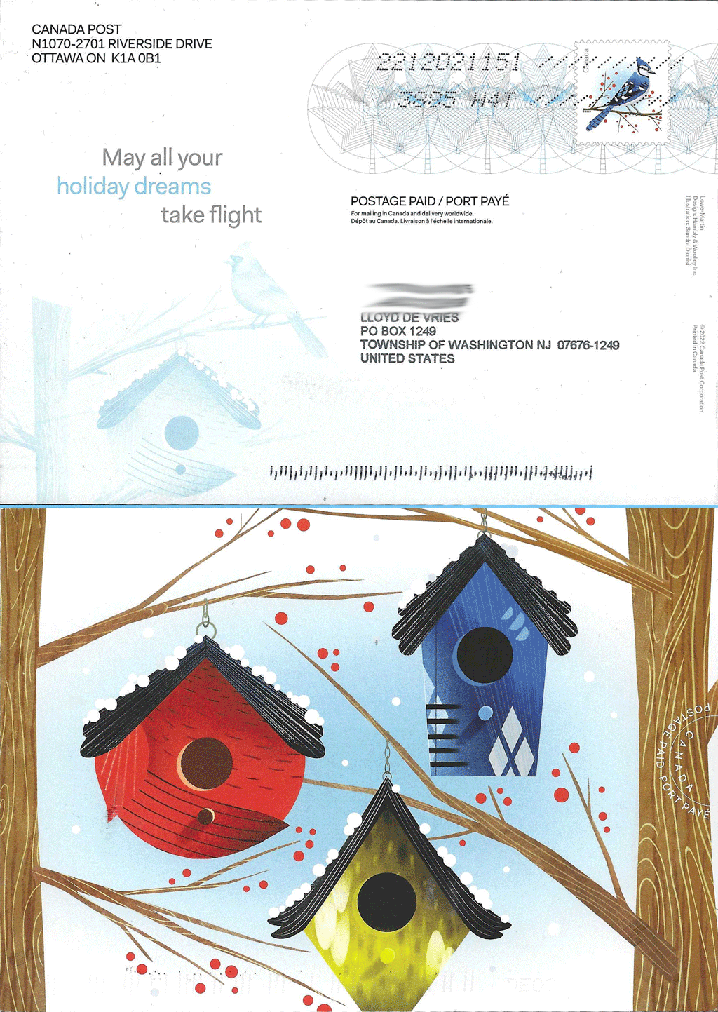
I received this postcard from Canada Post this week. I don’t recall CPC offering postcard-versions of this year’s holiday stamps. It wasn’t in the announcement I posted here and I don’t see a postcard-version of the U.S.-rate stamp on the Canada Post website, either. (It wasn’t easy finding the Holiday Birds stamps, though, so maybe postcards are there…somewhere.) You can click on the picture here for a larger version. Front and back of the postcard are shown.