Canada’s 2015 Stamps

From the July-August issue of Details magazine, the Canada Post philatelic catalogue:

new multi-year series, Provincial Birds (no month given)

January
canflag453Lunar New Year/Year of the Ram
200th anniv of Sir. John A. Macdonald (Canada’s first prime minister and a leading figure in the formation of the Dominion of Canada in 1867.

February
50th anniversary of the Canadian Flag
Responsible Pet Ownership

March
Pansies (annual flower series)

April
Canadian Photography (third in the series, specific subject not announced.)

May
100th anniversary of John McCrae’s In Flanders Fields, a poem from World War I
More UNESCO World Heritage Sites
Canadian dinosaurs & other prehistoric creatures

June
FIFA Women’s World Cup, which is being hosted by Canada in 2015 from June 6 to July 5.
Canadian Weather Extremes (launch of a new series)

September
Canada Post Community Foundation fund-raising stamp
Haunted Canada (continuing series)

October
NHL Heroes (third in a series)
Madonna & Child
Deck the Halls

We will update this page as new information becomes available.

Israel: Simchat Torah Flags stamps

[from Israel Post. These stamps will be issued September 9, 2014]
Festivals 2014 – Simchat Torah Flags

isr_simchatAs far back as the 17th century the children in Ashkenazi communities would come to the synagogue on Simchat Torah night waving flags. The Simchat Torah flags were part of a popular material culture of paper products such as Mizrach hangings, marking the east as the direction for prayer, and paper cutouts. Along with the homemade flags, paper flags were printed with images of traditional Jews and included pictures expressing the Sukkot and Simchat Torah holiday experience.

Eretz Israel, 1930’s
In the early 20th century these flags began featuring Zionist motifs which were incorporated into the traditional look. “For the Torah shall come forth from Zion and the word of the Lord from Jerusalem” was printed as the title of the holiday flag printed here in Eretz Israel in the 1930’s. At the center of the flag stands the Holy Ark with images of Moses and Aharon leaning on it, and in front the four sacred animals who express “bold as a tiger, and light as an eagle, and runs like a gazelle and brave as a lion to fulfill the will of the Father in Heaven”. On the left stand three children, one of whom was characterized as a Yemenite youth with curly sidelocks – a biblical symbol updated for the modern Return to Zion. On the right stands a European boy wearing a cap and holding a blue and white flag, with the symbol of the “Maccabi” sports club on his shirt – an expression of the new Jew, the muscular man who rejuvenates the legacy of the Maccabees.

Israel, 1950’s
In the 1950’s the European tradition of decorating became the tradition among Jews from all ethnic groups. The yearning for the Tomb of Rachel and for the Western Wall became the scenes that decorated the Holy Ark – two cardboard doors, through which one could usually see a picture of Torah scrolls. A group of boys and girls who were stooped over the Torah emphasized the essence of the equal Israeli ethos, which suited most of the Israeli public.

Israel, 1960’s
The victory in the Six-Day War in 1967 presented and emphasized Simchat Torah in the image of the IDF as a savior. “Rejoice and be joyful on Simchat Torah” in the form of IDF soldiers carrying Torah scrolls and dancing around the Holy Ark. The people’s love for their soldiers, their adored heroes became the essence of the flag’s look.

Dr. Haim Grossman
Researcher of Israeli Culture

The three flags that appear on the stamp are from the Haim Grossman collection.

  • The 1950’s flag – drawn by Zvi Livni.
  • The 1960’s flag – drawn by Arie Moskovitz.
  • Photos of the flags by Pini Hamou.

Technical Specifications:
Stamp Size (mm): H 30 / W 40
Plates: 951, 952, 953
Stamps per Sheet: 15
Tabs per Sheet: 5
Method of printing: Offset
Security mark: Microtext
Printer: Cartor Security Printing, France

Britain: Seaside Architecture Stamps

from Royal Mail:

Seaside Architecture
Issue date: 18th September 2014

uk_seaside_allReason and inspiration:
The seaside town evolved as a place where the visitor could find a fantasy environment and enjoy entertainments that could not be found elsewhere.

The seaside holiday is a British invention. Scarborough has the honour of being the world’s first seaside resort and is also the location of the first recorded use of the ‘bathing machine’ (1735). It was in the 18th century that visits to the seaside for the health effects of the sea air became fashionable with the wealthy. Getting to the coast though could pose a problem with the choice of expensive stage coaches or slow sailing vessels.

The first piers arose as a solution to reaching these seaside watering places. The first (Ryde Pier, on the Isle of Wight, 1814) was simply a platform to make getting on and off boats easier. With the growth in reliable steam-driven vessels and regular services to places like Margate and Weymouth, piers became the alternative to wading through water or being carried ashore from the boats.

This stamp issue captures the spirit of the seaside experience through the buildings and structures that are exclusive to, or very distinctive of, the UK’s resorts, which were designed for the pleasure of the visitor.

The structures represent the key time periods of seaside development including: Victorian, Art Deco, Modernism of 1930s and up to present day, showing that contemporary architecture/design is being used to regenerate these resorts.

Previous related stamp issues:

  • 2011 A-Z: Blackpool; Kursaal
  • 2007 Beside the Seaside (ice cream; sandcastle; carousel; beach huts; deckchairs; donkeys)
  • 2001 Punch and Judy
  • 1998 Lighthouses

Stamps:
uk_southwold
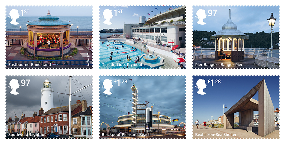
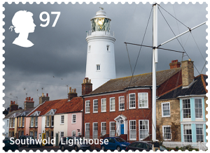
The chosen selection captures distinctive types of seaside architecture from key periods when major investment led to innovation, in particular the late Victorian era and interwar years. There is a good range of resort type – large and small, well-known and less so – from the number one working-class resort of Blackpool to the more sedate Southwold (right) which has grown in popularity as a result of its quiet nostalgic feel. All of the chosen structures are fine examples of their type and the fact that they have been newly photographed as vibrant, well-used places helps celebrate the resurgence of interest in the British seaside which has happened over the last two decades. The contemporary shelter at Bexhill brings the story right up to date.

uk_eastbourne
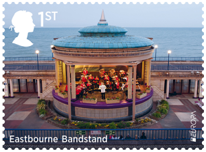
Eastbourne Bandstand – a unique mid-1930s semi-circular design from the Art Deco period but also with a hint of the Orientalism that had been a distinctive feature of seaside architecture since construction the of the Brighton Pavilion. In the days before recorded music and radio, bandstands were to be found at all resorts.

uk_tinside
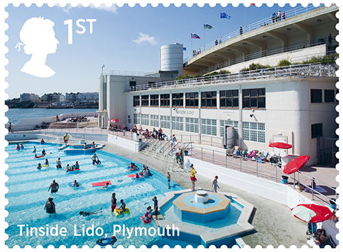
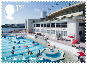
Tinside Lido, Plymouth – One of the best surviving lidos in the country and recently renovated. Built in a Modernist style that really captures the latest fashions of the interwar period, especially outdoor recreation and sunbathing.

uk_bangor
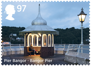
Bangor Pier – Piers represent the great engineering feats achieved in seaside architecture but the Victorians also exploited cast iron in smaller structures that have come to define the seaside atmosphere. The kiosk on Bangor Pier is a great Victorian example on a Welsh pier.

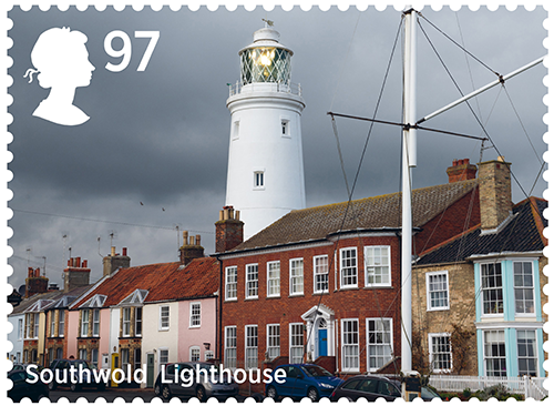
Southwold Lighthouse (illustration above)– Tying in with the Trinity House 500th anniversary in 2014, the lighthouse in the middle of Southwold is one of the symbols of a town that represents a resurgence of seaside popularity based on traditional ‘bucket-and-spade’ activities.

uk_blackpool
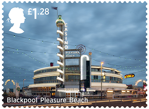
Casino, Blackpool Pleasure Beach – a nationally important example of Modernist architecture and one in which architect Joseph Emberton captured the playfulness of the seaside environment. From its start in the 1890s the Pleasure Beach came into its own during the interwar years and this structure is arguably the culmination of its 1930s revamp.

uk_bexhill
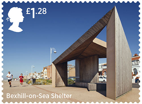
Bexhill-on-Sea Shelter – innovative contemporary architecture has been a major driver of regeneration at the seaside and even seemingly ephemeral structures like shelters can make a big impact on the overall feel of an otherwise traditional promenade. Bexhill-on-Sea has managed to blend a Victorian seafront with iconic 1930s architecture and new 21st-century shelters

Stamps: Technical Details:

Stamp Set Price: £5.74
Stamp Set Code: AS34A
Number of stamps: 6: 2 x 1st class, 2 x 97p, 2 x £1.28
Design::Why Not Associates
All photography by Lee Mawdsley
Stamp designs © Royal Mail Group Ltd 2014
Printer: International Security Printers
Print Process: Lithography
Stamp Format / Size: Landscape 41mm x 30mm
Perforations:14.5 x 14
Sheet Format: 6 sheets, 25/50
Phosphor: Bars as appropriate

Minisheet:

uk_seaside_miniThe Barcode version will be supplied as standard for all mint orders from Tallents House and Post Office. A guillotined version, without the barcode, will be used for our products; FDC, Presentation Pack & Annual products

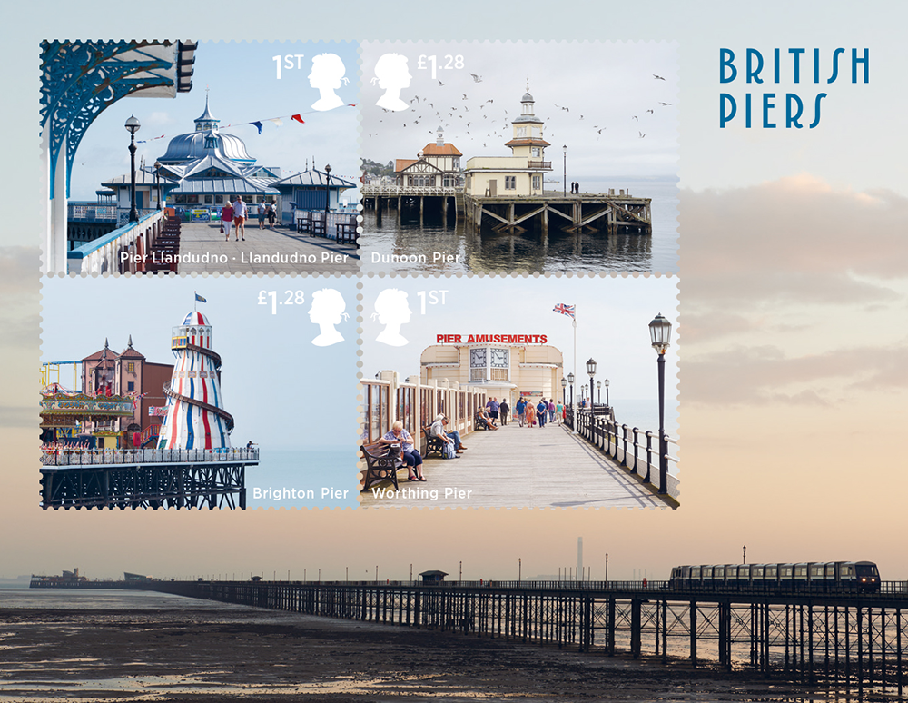
Llandudno – a classic and well-maintained Victorian pier which is the longest in Wales. Great view of the entertainment pavilion with decorative cast iron in the foreground

Dunoon – Scottish example which is still in use by ships like the steamer Waverley. The late Victorian building with its rather domestic-looking timber framed gables is an unusual survival

Brighton – the last surviving of Brighton’s three Victorian piers, still really popular and with a considerable entertainment offer that includes one of the best helter skelters around the coast

Worthing – distinctive 1935 amusements pavilion on a Victorian pier – shows how piers have evolved and links back into interwar structures of main set of stamps

A background image allows for the full impact of Britain’s longest pier at Southend.

Minisheet: Technical Details

Stamp Set Price: £3.80
Stamp Set Code: MZ101
Number of stamps:: 4: 2 x 1st Class, 2 x £1.28
Design:: Why Not Associates
All photography by Lee Mawdsley including the background image of Southend Pier
Printer: Joh. Enschedé Stamps
Print Process: Lithography
Stamp Format / Size: Landscape: 41mm x 30mm
Sheet Size: 115mm x 89mm

Presentation Pack
The design of the Seaside Architecture Presentation Pack was inspired by Art Deco, an artistic movement that had a major influence on the development of British seaside architecture. Designed by Why Not Associates, the pack has a pastel colour palette and features relevant black-and-white and colour photography and illustrations. Writer Kathryn Ferry provides a short history of the evolution of British seaside architecture, beginning with its Georgian origins and concluding with modern-day coastal innovations. A timeline of existing examples of UK seaside architecture complements the editorial content.

First Day Cover
The envelope carries a beach scene featuring Eastbourne Pier and holiday-makers photographed in the early 20th century. Written by Kathryn Ferry, the filler card includes an overview of the development of the British seaside resort, noting its evolution from the 18th century to the modern day. A hand-coloured photograph of Ryde Pier on the Isle of Wight adorns the front side of the card. Designed by Why Not Associates.

Four varieties are available with this stamp issue:
1. Stamps with Tallents House postmark
2. Stamps with alternative postmark
3. Minisheet with Tallents House postmark
4. Minisheet with alternative postmark

Postmarks
The Tallents House postmark features a line drawing of an ornate bandstand located in Brighton. The alternative postmark features references Eastbourne, as the Eastbourne Bandstand stamp is this year’s Europa stamp. The first line of the popular seaside song ‘Oh! I do like to be beside the seaside’ is referenced on the handstamp.

Stamp cards
The six special stamps and four-stamp Miniature Sheet are reproduced at postcard-size in this collectable set of 11 stamp cards (comprising the ten individual stamps and the complete miniature sheet).
Price: £4.95, Code: AQ212

Israel: “Fiddler On The Roof”

[from Israel Post]

“If I were a rich man” enriches this September issue with scenes from the wonderful musical Fiddler on the Roof on the stamps marking 50 years since its first performance. Chaim Topol, famed for his powerful rending of the main role, Tevye the Dairyman, actually created the illustrations that appear on the stamps.

isr_fiddlerThese stamps will be issued September 9, 2014.

Press release:

Fiddler on the Roof – 50 Years
Fifty years ago, in 1964, the curtain rose on “Fiddler on the Roof” — the first large-scale Broadway musical based on a Jewish-Yiddish classic. The plot takes place in a Jewish town in Russia and is based on the stories of Tevya the Dairyman written by the greatest Yiddish humorist, Shalom Aleichem. The first of these short stories was published 120 years ago. The musical was written by Joseph Stein (book), Sheldon Harnick (lyrics) and Jerry Bock (music). The director-choreographer was Jerome Robbins, and in the lead role — Zero Mostel.

Since the premiere in New York, “Fiddler on the Roof” has been performed tens of thousands of times all over the world. The first performance to take place in another country and in another language was in Israel, in Hebrew, in 1965. Yossef “Bomba” Tzur, Shmuel Rodensky and Chaim Topol were the first to portray the character of Tevya in Hebrew. Since then the show has been translated and performed in more than 20 languages, from Yiddish to Japanese, and many millions have seen and continue to see it with great excitement to this day. This year the Hebrew version is being staged for a fourth time in Tel-Aviv, with Natan Datner currently playing the lead role.

The American musical film that was produced based on the show starring Chaim Topol has been seen by more than one billion (!) viewers and continues to be screened again and again in movie theaters and on television worldwide.

Chaim Topol also played Tevya on stage in English in London, U.S.A., Japan and Australia.

Thus, thanks to the heartwarming magic of the musical stage show and film based on these wonderful stories filled with the humor, sadness and human warmth of literary genius Shalom Aleichem, over the past 50 years the world has come to know the special way of life in the Jewish world and Jewish towns which no longer exist.

Dan Almagor
Translator of “Fiddler on the Roof” to Hebrew

The three stamps in this set are based on drawings by Chaim Topol.

Technical Specifications:
Stamp Size (mm): H 30 / W 40
Plates: 957, 958, 959
Stamps per Sheet: 8
Tabs per Sheet: 4
Method of printing: Offset
Security mark: Microtext
Printer: Cartor Security Printing, France

Former PMG Blasts Stamp Selection Process

bailar_morison1Former Postmaster General Benjamin F. Bailar has quit the Citizens Stamp Advisory Committee, reports Linn’s Stamp News, saying it has becoming overly concerned with making money for the USPS and not with the significance of the stamps the U.S. issues. Bailar was a serious stamp collector before he became PMG, and remains an APS member, so this reduces the number of “real” stamp collectors on CSAC further. The Linn’s story is here.

According to the article by Linn’s Washington Correspondent Bill McAllister, Bailar’s letter to Postmaster General Patrick J. Donahoe is scathing at points.

“In my opinion the stamp program should celebrate the things that are great about the United States and serve as a medium to communicate those things to a world-wide audience. To prostitute that goal in the pursuit of possibly illusory profits does not make sense to me,” he wrote.

What’s important to remember is that Bailar isn’t a “philatelic battlefield conversion,” one of these postal stamp functionaries who, when asked if he is a stamp collector, says, “I am now.” Bailar was a stamp collector before he became Postmaster General (1975-78) and after. See the VSC radio feature with him from 2007. Read his comments at the dedication of the Gordon and Mary Morison Pavilion at the American Philatelic Center earlier that year. (The photo above was taken at that event.)

But Bailar also has solid business credentials. He’s a graduate of Harvard Business School, according to Wikipedia, and has worked for several major corporations.

One more quote from the letter, as quoted in the Linn’s article: “The idea that the stamp program can make a meaningful contribution at the Postal Service is not realistic.”

Stamp sales are a drop in the bucket of USPS revenues. They are a drop in the bucket of the USPS deficit. They do garner publicity for the USPS, but to what end? If you want to mail a birthday card to your mother, chances are you won’t use UPS or FedEx. The USPS has no competitors in U.S. mail delivery.

Bailar says membership on CSAC is no longer rewarding. Indications are he is not the only established stamp collector to quit the panel for that reason.

Bailar’s departure leaves Janet Klug, a well-known philatelist, former American Philatelic Society president, exhibit judge and columnist, as Chair of CSAC. And perhaps nominee for for Philatelic Sisyphus of The Decade.

Duck Stamp

canvasbackOn June 27, 2014, in Washington, DC at the Department of the Interior, the U.S. Department of the Interior will issue the $15 Migratory Bird Hunting and Conservation stamp for the 2014–2015 waterfowl hunting season.

The stamp will go on sale nationwide June 27, 2014, and is valid through June 30, 2015.

The Migratory Bird Hunting and Conservation stamp will be available in the following formats:

  • Water-activated gum (WAG) Pane of 20 (Item 335000).
  • Pressure-sensitive adhesive (PSA) Pane of 1 (Item 335100).

There are four philatelic products for this stamp issue.

  • 335006 Migratory Bird Uncut Press Sheet (WAG), $1,100.00 (Quantity 100).
  • 335106 Migratory Bird Uncut Press Sheet Flat (PSA), $350.00 (Quantity 100).
  • 541418 Migratory Bird Silk Cachet, $25.00.
  • 541425 Migratory Bird Artist Commemorative Card, $50.00.

Technical Specifications:
Issue: Migratory Bird Hunting and Conservation Stamp
Item Number: 335000
Denomination & Type of Issue: $15.00 Special
Format: Sheet of 20 (1 design)
Series: Federal Duck
Issue Date & City: June 27, 2014, Washington, DC
Art Director: Laurie Shaffer, FWS
Artist: Adam Grimm
Modeler: Joseph Sheeran
Manufacturing Process: Offset/Microprint “FWS”
Printer: Ashton Potter (USA) Ltd. (APU)
Printed at: Williamsville, NY
Press Type: Stevens, Vari-Size Security
Stamps per Pane: 20
Print Quantity: 100,000 stamps
Paper Type: Nonphosphored Type III
Adhesive Type: Water-Activated Gum
Processed at: Ashton Potter (USA) Ltd. (APU)
Colors: Black, Cyan, Magenta, Yellow, Invisible Fluorescent
Stamp Orientation: Horizontal
Image Area (w x h): 1.73 x 1.26 in./44.02 x 32.00 mm
Overall Size (w x h): 1.89 x 1.42 in./48.01 x 35.99 mm
Full Pane Size (w x h): 10.25 x 7.09 in./260.35 x 179.96 mm
Press Sheet Size (w x h): 18.00 x 22.00 in./457.20 x 558.80 mm
Plate Size: 60 stamps per revolution
Plate Numbers: “P” followed by 11111 (5) single digits
Marginal Markings:
Front: “Artist: Adam Grimm” in four positions • DEPARTMENT OF THE INTERIOR 20 x $15.00 in four positions • Silhouetted Image of Duck printed in B, C, M, Y, in two positions • Plate number in four positions
Back: Barcode (335000) in four positions • Verso-text behind each stamp

canvasbackIssue: Migratory Bird Hunting and Conservation Stamp
Item Number: 335100
Denomination & Type of Issue: $15.00 Special
Format: Pane of 1
Series: Federal Duck
Issue Date & City: June 27, 2014, Washington, DC
Art Director: Laurie Shaffer, FWS
Artist: Adam Grimm
Modeler: Joseph Sheeran
Manufacturing Process: Offset/Microprint “FWS”
Printer: Ashton Potter (USA) Ltd. (APU)
Printed at: Williamsville, NY
Press Type: Stevens, Vari-Size Security
Stamps per Pane: 1
Print Quantity: 2,500,000 stamps
Paper Type: Nonphosphored Type III
Adhesive Type: Pressure Sensitive Adhesive
Processed at: Ashton Potter (USA) Ltd. (APU)
Colors: Black, Cyan, Magenta, Yellow, Invisible Fluorescent
Stamp Orientation: Horizontal
Image Area (w x h): 1.73 x 1.26 in./44.02 x 32.00 mm
Overall Size (w x h): 1.89 x 1.42 in./48.01 x 35.99 mm
Full Pane Size (w x h): 6.13 x 2.63 in./155.58 x 66.68 mm
Press Sheet Size (w x h): 18.00 x 22.00 in./457.20 x 558.80 mm
Plate Size: 18 stamps per revolution
Plate Numbers: N/A
Marginal Markings:
Front: Header: “U.S. Fish & Wildlife Service” • 2014-2015 Migratory Bird Hunting & Conservation Stamp • Peel Here • Artist: Adam Grimm • Canvasback • If applicable peel and attach to hunting license • Informational text
Back: Verso-text • Ordering information • UPC Code (015645335103)

U.N. Scott Catalogue Update – August 2014

United Nations – New York

1087 International Year of Jazz sheet of 12
a. 49¢ Trumpeter with cap and mute in trumpet
b. 49¢ Silhouette of trumpeter in tan
c. 49¢ Saxophone
d. 49¢ Trumpet
e. 49¢ Silhouette of trumpeter in lilac
f. 49¢ Saxophonist wearing hat
g. 49¢ Man with hat holding trombone
h. 49¢ Green saxophone
i. 49¢ Saxophonist without hat
j. 49¢ Trombone
k. 49¢ Trumpeter wearing hat
l. 49¢ Microphone
1088 33¢ Statue and satellite
1089 $2 Abstract art

U36 46¢+3¢ Surcharged Circle and Dots #6¾ size stamped envelope (on Scott U34)
U37 46¢+3¢ Surcharged Circle and Dots #10 size stamped envelope (on Scott U35)

UC32 $1.10+5¢ Surcharged Circle and Dots air letter sheet (on Scott UC31)

United Nations – Geneva

579 International Year of Jazz sheet of 12
a. 1fr Woman behind microphone
b. 1fr Saxophone
c. 1fr Silhouette of pianist at grand piano
d. 1fr Cymbal and silhouette of man holding trumpet
e. 1fr Cymbal and clarinet
f. 1fr Clarinet and drum
g. 1fr Hi-hat
h. 1fr Silhouette of drummer and drum set
i. 1fr Trumpeter with hat
j. 1fr Microphone and cymbal stands
k. 1fr Clarinetist
l. 1fr Bass player
580 2.20fr Palais des Nations
581 2.60fr Peacock
United Nations – Vienna

542 International Year of Jazz sheet of 12
a. 70c Silhouette of saxophonist in blue
b. 70c Woman singing
c. 70c Silhouette of man in red, neon lights
d. 70c Bass player
e. 70c Trombone in gold
f. 70c Silhouette of saxophonist in black, silhouette of man holding trombone
g. 70c “Cocktails” neon sign
h. 70c Silhouette of bass player in orange
i. 70c Stack of record albums
j. 70c Cymbal
k. 70c Trombone in silver
l. 70c Silhouette of clarinetist in black
543 Vienna International Center, 35th Anniversary sheet of 10 + 10 labels
a. 70c Vienna International Center under construction (towers and shadows), red panel + label
b. 70c Vienna International Center, street light at left, green panel + label
c. 70c Vienna International Center, curved building at left, green panel + label
d. 70c Vienna International Center under construction (arch in foreground, cranes at right), red panel + label
e. 70c Vienna International Center under construction (cranes at left, center and right), red panel + label
f. 70c Doorway to Vienna International Center, green panel + label
g. 70c View of curved buildings of Vienna International Center looking up from ground, green panel + label
h. 70c Vienna International Center under construction (two cranes on central tower), red panel + label
i. 70c Completed Vienna International Center, red panel + label
j. 70c Flags in front of Vienna International center, green panel + label
544 70c Bird over Vienna International Center buildings
545 €1.70 Vienna International Center

What Others Should Do

by Lloyd A. de Vries

lloyd2008I was amused recently by some of the letters to the editor in the August American Philatelist (the journal of the American Philatelic Society) and the subsequent discussion in another online stamp collecting discussion venue.

There were two subjects in the letters that caught my attention, equally silly, in my opinion.

One was a rehash of the location of the APS headquarters. “Why is it in the middle of nowhere?”

Give it a rest already. We’ve been over this ground several times.

First, my credentials: I was on the APS Board of Directors when we decided that the previous building in State College, Pa., was no longer adequate and chose the former Match Factory in neighboring Bellefonte. I believe I was the deciding vote to purchase the present building, and it wasn’t an easy decision. I daresay I spent more time looking at the issue then than all three letter-writers combined.

There were many contributing factors to my decision, but I’ll cut right to the most important one: The APS staff. I think as a whole they’re wonderful, and I doubt if most of them would have made the move to another metro area.

Many had working spouses, or were firmly established in the State College area. (APS employees tend to stay for a long period of time.)

Besides the excellence of the staff, there would have been the time required to train new staffers: The jargon (“bourse,” “expertise,” and so on), how to handle stamps, and so on.

Because the cost of living is much higher in any major metropolitan area, we would have had to pay the staffers, or their replacements, more money.

Speaking of money, real estate would have cost more in a major metropolitan area.

Oh, and about those “metropolitan areas:” Everyone had a different idea of what those are.

Someone threatened to sue if we didn’t choose Chicago.

I remember talking to another member who lived in New York City back then, who was insisting the APS should move to a “major metropolitan area.”

“You’re right,” I said. “We’re looking into Los Angeles.”

“No, I mean a MAJOR metropolitan area.”

Okay.

The other idea espoused in a letter, and then taken ad absurdum online, was to open branch offices of the APS around the country, each in a (wait for it) major metropolitan area.

The cost of renting office space in one big city plus paying someone’s salary there would be astronomical, but several?

And the question was raised online, what would the APS Branch Office staffer do?

Be outreach for the society, helping local stamp organizations, answering questions and glad-handing potential donors were some of the answers.

Is that really a full-time job? Well, the offices could be staffed by volunteers. I’m not sure the APS could find 10-20 volunteers to sit in an office 40 hours a week, and there’s still the issues of rent, phone, Internet, furniture, and so on.

One supporter then said that the offices didn’t have to be downtown, but could be in “outlying strip malls.” Well, as a resident of a municipality with the New York (major) metropolitan area, I can see where that would lead: “Why didn’t you choose MY outlying strip mall?”

Stamp society officials hear these “pie in the sky” suggestions all the time. Another perennial is that the APS or another stamp society should advertise in AARP, the magazine for over-50s, either to promote itself or to promote stamp collecting.

The cheapest rate I found for the magazine was $45,260 for a sixth of a page. Black-and-white. One ad. One issue.

The APS only charges $45 a year for membership.

People tell me all the time (and did when I was on the APS board) that my stamp organization should do this, or should do that. Some of these suggestions are as silly as branch offices in outlying strip malls. Some actually have potential

But when I’ve asked the person making the suggestion if he or she would chair the program or spearhead the project, I’ve been turned down.

“I’m too busy.”

“I’m not the right person for this.”

“I’m not in good health.”

Funny how that works, isn’t it?

Canada Honors Country Artists

[press release]
Canada Post celebrates Canadian Country Artists, past and present

canpost_countryOTTAWA, July 31, 2014 /CNW/ – Today Canada Post recognizes Canada’s contribution to the evolution of country music with a series of five new stamps featuring some of the country’s most renowned artists. The new stamps feature Tommy Hunter, k.d. lang, Renée Martel, Hank Snow and Shania Twain – 5 of the most unique voices in Canada’s country music history.

“The music of these artists holds a special place for so many Canadians, and these stamps are likely to stir memories of those lasting musical moments,” says the Honourable Shelly Glover, Minister of Canadian Heritage and Official Languages.

“Our selection for this stamp series reflects the remarkable variety within Canadian – and international – country music, crossing generations and musical approaches,” says Deepak Chopra, President and CEO of Canada Post. “We’re delighted to celebrate the music and achievements of these artists today.”

can_hunterTommy Hunter: For generations of Canadians, Tommy Hunter was like an old friend, singing to them for 27 years on the longest-running network country music television show in the world. A major force in raising the profile and popularity of Canadian country music, Tommy Hunter – Canada’s Country Gentleman – has been inducted into the Canadian Country Music Hall of Fame and is a recipient of the Order of Ontario and the Order of Canada.

can_langk.d. lang: In a career that has spanned nearly 30 years, with over a dozen albums and millions of records sold worldwide, k.d. lang has won both JUNO and Grammy awards for her work. She has received a Governor General’s Performing Arts Award and is an Officer of the Order of Canada. The Canadian Country Music Association has named k.d. lang both Female Vocalist of the Year and Entertainer of the Year.

can_martelRenée Martel: Renée Martel has enjoyed a long and outstanding career. Born in 1947 in Drummondville, Quebec, she grew up in the musical universe of her parents, both musicians. Her father was Marcel Martel, a popular Quebec country music singer from the 1940s. Renée’s own musical journey has swung between the modern and the traditional, between the world of pop music and her country heritage. Her current discography includes more than 25 albums and her musical heritage has lived on.

can_snowHank Snow: Hank Snow, the Singing Ranger, was born 100 years ago in Brooklyn, Nova Scotia. Snow began his career at CHNS Radio in Halifax in 1933, and toured the Maritimes and Western Canada playing at county fairs and local radio stations. In 1936, he recorded under RCA Victor’s Bluebird label in Montréal and signed what would become the longest continuous contract in the history of the recording industry – lasting 47 years. In 1950, Ernest Tubb invited him to join the Grand Ole Opry, where he continued to perform for four and a half decades. Hank Snow recorded over 100 albums, was elected to eight music and song-writing halls of fame, and was voted Canada’s top country performer 10 times.

can_twainShania Twain: Shania Twain is a true Canadian superstar. She was born in Windsor, Ontario and raised in Timmins, and rose to fame in the early 1990s with her debut album Shania Twain in 1993. Her 1997 album, Come On Over, became the best-selling album of all time by a female musician, and the best-selling country album of all time. She has sold over 75 million albums worldwide, won five Grammy Awards, 27 BMI Songwriter Awards, 26 Canadian Country Music Awards and 12 JUNO Awards, among many others. She has also received a star on Hollywood Boulevard and was inducted into the Hollywood Walk of Fame as well as the Canadian Music Hall of Fame.

About the stamps
The stamps measure 40 mm x 32 mm and are available in five separate booklets of 10, one featuring each artist. The five separate souvenir sheets measure 140 mm x 110 mm. The stamps were printed by Lowe Martin Group. Sabrina McAllister and Xerxes Irani designed the Shania Twain, Hank Snow and Renée Martel stamps. The k.d. lang and Tommy Hunter stamps were designed by Roy White of Subplot Design Inc. The Official First Day Cover cancellation sites are: Shania Twain, Windsor, Ont.; Tommy Hunter, London, Ont.; k.d. Lang, Edmonton, Alta.; Renée Martel, Drummondville, Que. and Hank Snow, Brooklyn, N.S. To download images of the stamps or to purchase philatelic products, please visit canadapost.ca/shop.

VSC’s radio feature on these stamps is here.

Canada Post’s Official FDCs (available singly or as a set):

can_country_fdc