Prehistoric Animals (Netherlands 2023)

[from PostNL handouts] [click on any of the pictures for larger versions]
Prehistoric Animals

Issue dates: 13 June 2023, 26 September 2023, 14 November 2023, 19 March 2024

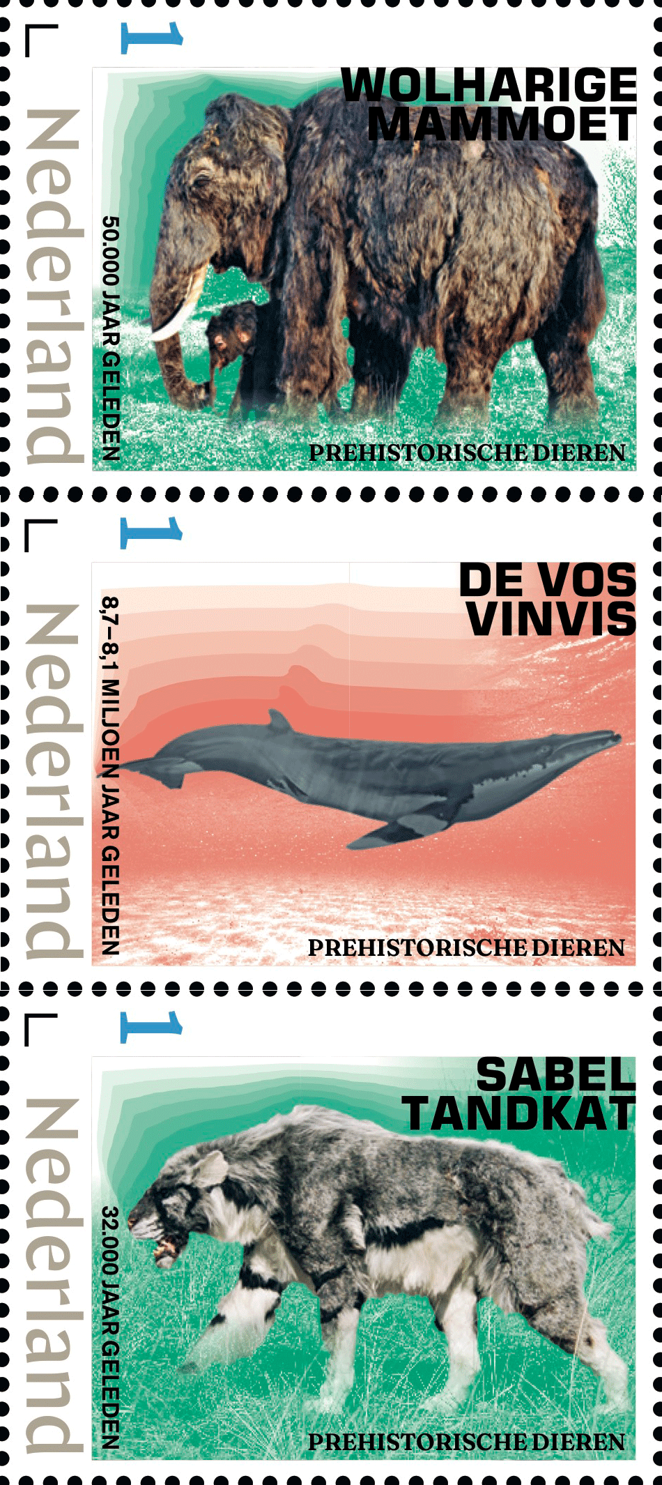
On 13 June 2023, the first three stamp sheets in the new Prehistoric Animals series — the Fox whale, the woolly mammoth and the sabre-toothed cat — will be published. Each 
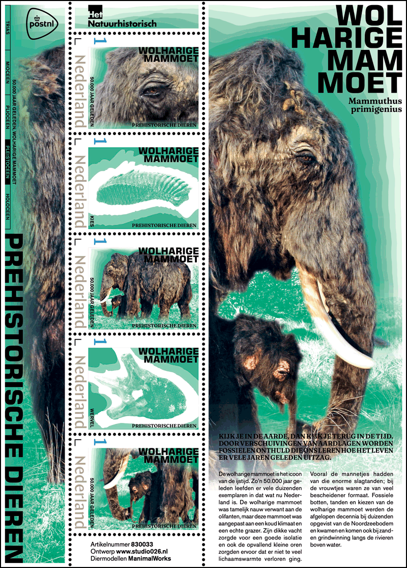
stamp sheet contains five stamps featuring the animals and their fossils.

The entire series comprises 12 stamp sheets. Each quarter, PostNL will publish three stamp sheets at a time. The denomination on these stamps is ‘1’, the denomination for items weighing up to 20g with destinations in the Netherlands.

All 12 prehistoric animals featured on the stamps inhabited the area that is now the Netherlands. Their presence has been inferred from fossils found in Dutch soil, including in the North Sea, in the Eastern and Western Scheldt, along rivers and in quarries. The fossils predominantly comprise bones, skulls, jaws, teeth, molars and horns. Based on the shape of the fossils, palaeontologists can deduce how large the animals were and their other external features. Comparison with surviving related species also provides useful information.

Each stamp sheet includes five personal stamps in five different designs. Three stamps 
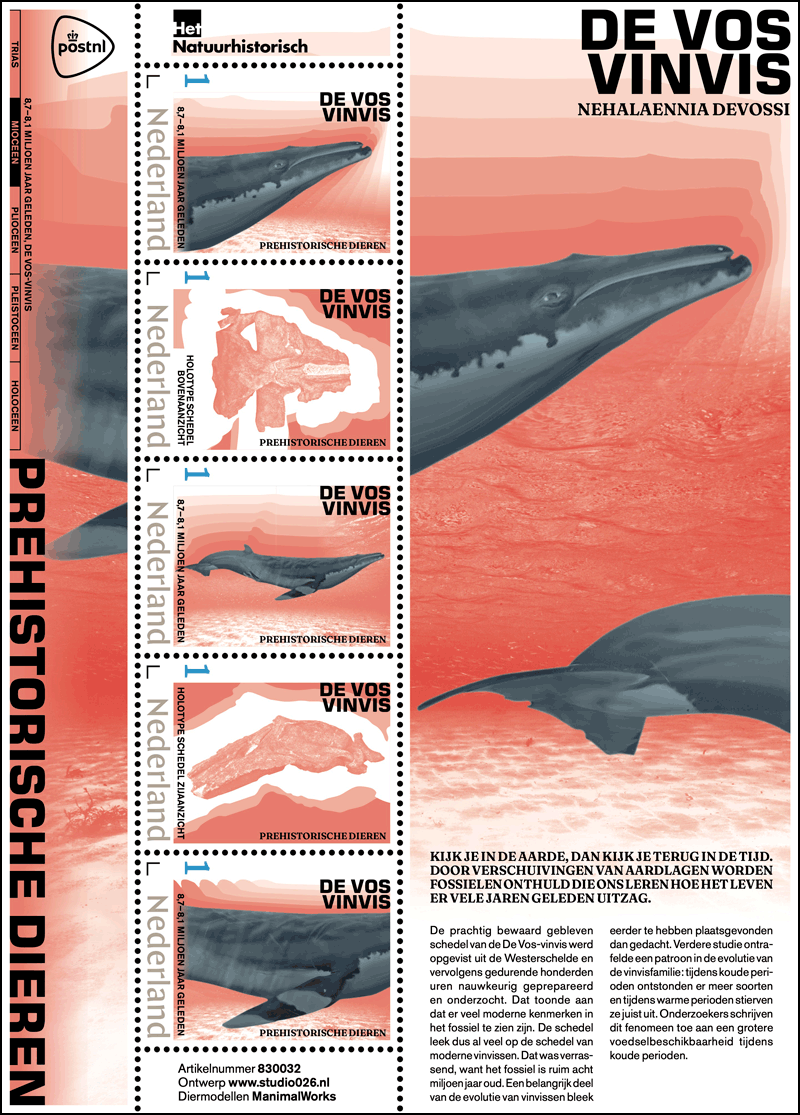
feature various images of the prehistoric animal in its natural habitat. The other two stamps feature fossils of the same animal, surrounded by drawn earth layers in which that fossil was found. The sheet edge features one of the animal photos in large. This photo runs underneath the stamps. Each stamp sheet has a base colour referring to the geological epoch in which the prehistoric animal existed. The timeline of all these epochs is shown vertically on the left-hand side of the stamp sheet, above the series title. The name of the prehistoric animal appears on each stamp and in the top right-hand corner of the sheet. The bottom right-hand corner features a short text about the species and its fossils.

After Velp-based studio026 was commissioned to design 12 stamp sheets about prehistoric animals, Anne Schaufeli and Huub de Lang first of all visited the Natural History Museum Rotterdam. “This museum has a great collection of fossils, mostly from Dutch 
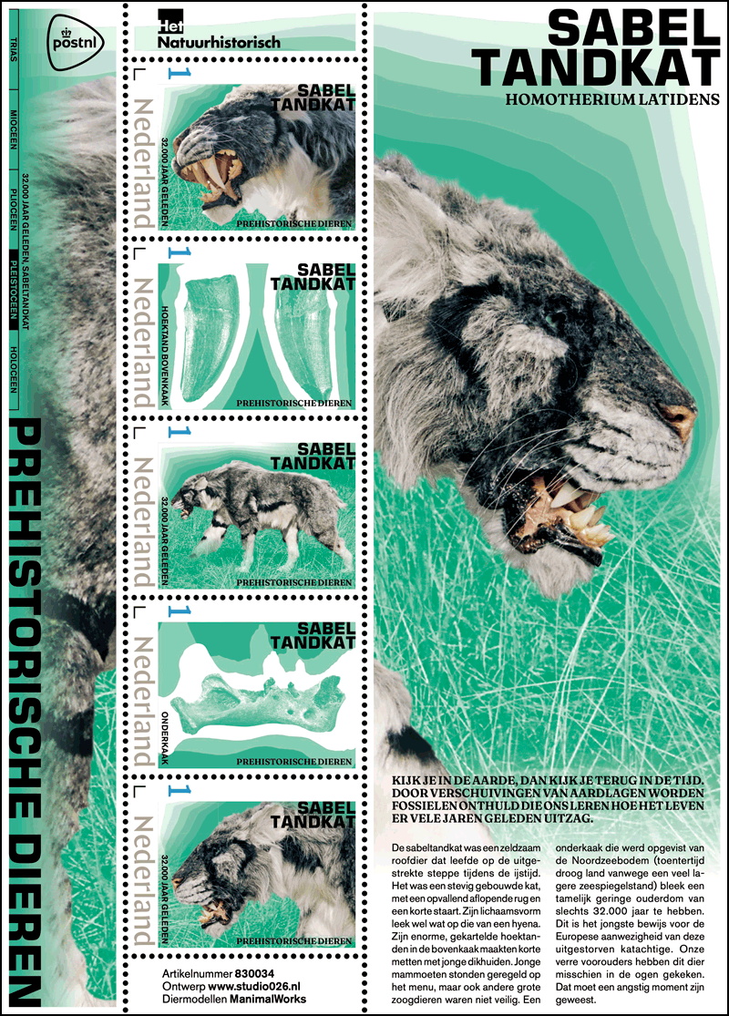
soil,” Schaufeli said. “Bram Langeveld, the curator, had inspiring stores to tell. He told us about prehistoric animals that we didn’t even know existed.”

However, the Museum did not have visual material, so Schaufeli and de Lang turned to ManimalWorks, also in Rotterdam, which produces models of prehistoric animals based on scientific data and information from sources such as cave drawings.

ManimalWorks builds life-size reconstructions for educational purposes such as museums and scientific exhibitions, said Schaufeli. “It’s just amazing how life-like his animal models look. They’re so life like that you could just encounter them somewhere. Before the models go to the client, they are photographed in an environment that is as close as possible to their original habitat. These photos were used on the stamp sheets.”

The overall design concept is based on the stratification of the earth. “We wanted to show not just the animal and the fossil, but the connection between them as well,” said Schaufeli. “Our narrative is that by looking into the earth, you travel back in time.”

Technical Details:
Design: studio026, Velp
Animal models: ManimalWorks, Rotterdam
Stamp size: 30 x 40mm (wxh):
Sheet size: 170 x 122 mm (wxh)
Paper: Normal with phosphor print
Gum: Gummed
Printing technique: Offset
Printing colours: Cyan, magenta, yellow, black
Print run: 5,000 sheets per issue
Format: Sheet containing 5 personalised stamps in 5 different: designs

6 June 2023
Item number 830032 Prehistoric Animals, the Fox whale
Item number 830033 Prehistoric Animals, woolly mammoth
Item number 830034 Prehistoric Animals, sabre-toothed cat

26 September 2023
Item number 830035 Prehistoric Animals, Nothosaurus
Item number 830036 Prehistoric Animals, woolly rhinoceros
Item number 830037 Prehistoric Animals, aurochs

14 November 2023
Item number 830038 Prehistoric Animals, blunt-snouted dolphin
Item number 830039 Prehistoric Animals, mastodon
Item number 830040 Prehistoric Animals, great auk

19 March 2024
Item number 830041 Prehistoric Animals, large baleen whale
Item number 830042 Prehistoric Animals, giant beaver
Item number 830043 Prehistoric Animals, steppe bison

Note: PostNL does not sell directly to collectors in North America. Its website refers to a company called Nordfirm, which says it sells Dutch new issues at face value. The Virtual Stamp Club has no connection to this company.

Experience Nature: De Wieden (Netherlands 2023)

[summarized from a PostNL press release] [click on any of the pictures for larger versions]
Experience Nature: De Wieden

Issue date: 12 June

Appearance: sheet of ten stamps in ten different designs
Item number: 430761
Design: Frank Janse, Gouda
Photography: Buiten-BeeldThe stamp sheet about De Wieden is part of the multi-annual Experience Nature 2021-2023 series. In the series, four stamp sheets are issued every year, each comprising ten different stamps. The stamps feature images of plants and animals in unique Dutch nature reserves across the country. In 2023, it is the turn of the provinces of Flevoland, Friesland, Overijssel and Noord-Brabant.

The Experience Nature – De Wieden issue focuses on the peat bog of nature reserve De Wieden, located in the province of Overijssel. The stamp sheets issued earlier this year (2 January 2023) featured Marker Wadden in Flevoland and Strok en Skrins in Friesland (13 February 2023). On 24 August 2023, the last stamp sheet in the series will be issued, which will be about the Oisterwijkse Bossen en Vennen in North Brabant.

Peat bog De Wieden is an area that covers over 6,000 hectares [14,826 acres or 23 square miles] in the Kop van Overijssel. The nature reserve is part of the Weerribben-Wieden National Park. De Wieden is owned by Natuurmonumenten. Within the National Park, Natuurmonumenten works closely together with Staatsbosbeheer (the Forestry Commission), which owns the Weerribben.

De Wieden owes its name to its distinctive broad lakes (wieden or wijden), including the Belterwijde and the Beulakerwijde. The wetland character of De Wieden is the result of peat excavations, storms, and the flooding of the Zuiderzee in the 18th and 19th centuries.

The nature reserve can be visited by open tour boat from the visitor centre in Sint Jansklooster [about 110 kilometers or 68 miles east-northeast from Amsterdam] and other locations. There are also paths for walkers and cyclists through the greenery and along the water. In the middle of De Wieden, the water tower of Sint Jansklooster offers spectacular views.

The landscape gets its unique character from the combination of the large open waters of De Wieden with small pools and winding ditches and canals. As is the case in all peat bogs, open water, moorlands, floating mats, reed beds, fenlands, shrublands and swamp forests alternate. They are home to many rare plant species, including the meadow thistle, tawny sedge, devil’s bit, and slender cottongrass. The abundance of water makes De Wieden popular with large fish-eaters such as the cormorant, osprey, bittern and purple heron. Other unusual birds include the black tern, marsh harrier, barn owl and short-eared owl.

“Water is the dominant factor in De Wieden,” says ecologist Rosalie Martens, co-manager of the reserve. “Everything is done by boat around here. There is one farmer who still has small numbers of cattle grazing in De Wieden. So he ferries his animals across by boat.

“The nature reserve was man-made through the excavation of peat until 1940. The area requires intensive management, otherwise trees will take hold and the area will become forest again,” Martens added. “In my opinion, it is the most beautiful nature reserve in the Netherlands, where man and nature are in perfect harmony.”

The ten residents of this nature reserve featured on the Experience Nature – De Wieden stamps are the marsh harrier, small pearl-bordered fritillary, common hawthorn, fringed water-lily, English oak, water rail, blackthorn, barn owl, purple heron and oblong-leaved sundew. Each has its own stamp. The stamp sheet also features many more images of flora and fauna typical for this area. The following are shown as monochrome images in a separate graphic layer: oblong-leaved sundew (top right), barn owl (top left), western marsh harrier (just above centre), leaf of the black elder (left of centre and centre), leaf of the English oak (bottom left), small pearl-bordered fritillary (bottom centre) and blackberry (bottom right).

The nature reserves in the Experience Nature series were chosen in consultation with experts from the nature conservation organisation Natuurmonumenten. A number of considerations played a role in the selection of these diverse landscapes. Each area had to have plenty of interesting flora and fauna, for example. There had to be enough diversity, so every species could be represented: from plants, trees and mammals to insects, reptiles and amphibians.

“I also wanted to have a decent choice of beautiful images and it had to have a captivating story attached to it,” said series graphic designer Frank Janse. “The common factor of this issue about De Wieden is the wet, marshy nature of this nature reserve.”

“The large white barn owl at the top left is a real eye-catcher,” added Janse. “The centre features a white image of the marsh harrier. I selected a picture on which the harrier’s wings are almost in the same position as those of the water rail below.”

The Experience Nature – De Wieden mminisheets are available while stocks last at all PostNL sales outlets, the post office counter in Bruna shops and at www.postnl.nl/bijzondere-postzegels [in Dutch].

Technical Details:
Stamp size: 40 x 30mm
Sheet size: 122 x 170mm
Paper: normal with phosphor print
Glue: self-adhesive
Printing technique: offset
Printing colours: cyan, magenta, yellow and black
Print run: 285,000 sheets
Appearance: sheet of 10 stamps in 10 different designs
Design: Frank Janse, Gouda
Photography: Buiten-Beeld
Printing company: Koninklijke Joh. Enschedé B.V., Haarlem
Item number: 430761

Space (with a stamp missing) (Netherlands 2023)

[from PostNL press materials] [click on any of the pictures for larger versions]
Journey to The Moon

Date of issue: 21 April 2023

Format: sheet with nine stamps in different shapes
Item number: 430461
Design and illustrations: Lilian Vos, Vividblue

On 21 April 2023, PostNL issued the Journey to The Moon stamp sheet, dedicated to space. Travelling to and in space has always captured people’s imagination. This year a number of space flights have been planned once again. The Journey to The Moon stamp sheet features nine stamps with illustrations related to space. The 10th stamp featuring the moon is missing. The stamp with the moon is symbolised by the punched-out circle, and PostNL plans to issue it when man sets foot on the moon again around 2025. This tenth stamp will then complete the journey to the moon series. The denomination on the Journey to The Moon stamps is ‘1’, the denomination for items weighing up to 20g destined for the Netherlands. A sheet of nine stamps costs €9.09.

Ever since the development of the first telescopes more than 400 years ago, we have loved looking beyond what the human eye can see. Russian cosmonaut Yuri Gagarin was the first human in space in 1961, while the Russian Soyuz programme was launched in 1967. In 1969, the Americans put a human on the moon for the first time with Apollo 11. The Apollo programme was followed by the space shuttle programme. The ISS International Space Station has been the site of close international cooperation since 1998.

Space is now visited more than ever before. This year, for instance, the ESA European Space Agency will be launching the Juice space probe, which will map Jupiter’s largest moons. A number of commercial organisations will also be testing their latest rockets in 2023, including the New Glenn (Blue Origin) and the Starship (SpaceX). Later this year, NASA will send space probe Psyche to the asteroid of the same name between Mars and Jupiter. The moon will also get a visit in 2023, from Japanese, Russian and Indian unmanned lunar landers, among others.

The Artemis international space programme aims to land astronauts on the moon again by 2025. The programme consists of 3 missions: an unmanned test flight (late 2022), a mission during which astronauts circle the moon without landing (scheduled for 2024) and finally a lunar landing mission (scheduled for 2025).

The stamps feature illustrations of the following nine subjects:

  • the planet Saturn
  • Orion capsule, designed to carry astronauts
  • floating astronaut in spacesuit
  • satellite with solar panels
  • view of the Earth from the moon
  • SLS launch vehicle
  • Orion capsule during ‘splash down’ with parachutes
  • moonboot, a classic part of astronaut outfit
  • walking astronaut in spacesuit.

Three of the stamps are round, the shapes of the other six follow the outlines of the illustrations. The edge of each stamp is perforated with four teeth. The stamp with the moonboot has five additional teeth, as a nod to the sole of the shoe. The illustrations are printed in warm red, cornflower blue, soft yellow, silver and copper.

A Dream Come True
The stamp sheet was created by graphic designer Lilian Vos of Amsterdam-based agency Vividblue. It is her first stamp design, an assignment that fit her like a glove. ‘My father was a collector, especially of first-day envelopes. I remember endlessly admiring the pictures on stamps when I was little. Stamps and stamp designs also definitely played a role in my decision to study graphic design. At the academy’s open day in Maastricht, I had the opportunity to view a number of enlarged stamp designs. I wanted to do that too.’

To learn more about the subject, Vos visited the permanent Space Expo space exhibition in Noordwijk, which she called ‘very impressive.’ After seeing the enthusiasm by the astronauts and staff there, she decided to focus the stamp design mainly on the human aspect of space travel. ‘Noordwijk showed that the subject is still alive, among young and old alike, especially given the ongoing Artemis space programme,’ she said. ‘Mankind is taking trips to the moon again.’

PostNL asked Vos for an innovative design, and thus, the ‘hole’ for the tenth stamp. ‘This unique idea is designed to make people curious, and it’s something we haven’t seen on a stamp sheet before,’ Vos said.

The Journey to The Moon stamps are available while stocks last at the post office counter in Bruna shops and here [direct link; in Dutch]. The ‘1’ denomination for items weighing up to 20g destined for the Netherlands. A sheet of nine stamps costs €9.09.

Technical Details:
Stamp sizes:

  • Saturn: 23.0 x 50.0 mm (h✖️w)
  • Orion capsule: 28.0 x 33.5mm (h✖️w):
  • floating astronaut: 31.8 mm diameter
  • satellite: 28.0 x 44.4mm (h✖️w)
  • Earth: 37.3 mm diameter
  • SLS launch vehicle: 45.4 x 33.4mm (h✖️w)
  • moon boot: 30.1 x 33.0mm (h✖️w)
  • Orion capsule with parachutes: 32.6 x 36.2mm (h✖️w)
  • walking astronaut: 31.8 mm diameter

Sheet size: 150 x 144mm (h✖️w)
Paper: normal with phosphor underprint
Glue: self-adhesive
Printing technique: offset
Printing colours: magenta, yellow, black, blue and silver
Edition: 110,000 sheets
Format: sheet of nine stamps in nine different designs
Design and illustrations: Lilian Vos
Printing company: Koninklijke Joh. Enschedé B.V., Haarlem
Item number: 430461

There is a set of two official FDCs for this issue:

Typically Dutch: Cheese Markets (Netherlands 2023)

[from the PostNL press release] [click on any of the pictures for larger versions]
Typically Dutch – Cheese Markets

Date of issue: 15 May 2023
Appearance: sheet of six stamps in six identical designs
Item number: 430662
Design: Adam Lane and Edwin van Praet, Total Design, Amsterdam

This issue is the fourth in the Typically Dutch series this year. The multi-annual series started in 2020 and, in 2023, will be dedicated to a variety of sights and attractions that are significant for and typical of the Netherlands. A sheet of ten stamps costs €6.06.

The Typically Dutch – Cheese Markets issue was designed by senior graphic designer Adam Lane and creative director Edwin van Praet from Total Design in Amsterdam. As part of this stamp series, stamps featuring museums (2 January), mills (13 February) and flower fields (20 March 2023) were published earlier this year. After the stamps about cheese markets, the last stamp sheet in this series – with as subject the Wadden mudflats – will follow later this year (14 August).

Cows, milk and cheese – a trinity that is inextricably linked to the Netherlands. The figures are impressive: our country produces 650 million kilos of cheese every year, two-thirds of which is sold abroad. This makes the Netherlands the world’s largest cheese exporter, with Gouda and Edam the most popular cheeses among foreign buyers.

The relationship between the Netherlands and cheese goes way back. Archaeological findings show that cheese was being made in our country even before the Common Era. In the Middle Ages, cheese production and trade conquered their central place in Dutch life. Cheese markets flourished and towns with weighing rights set up weigh houses to determine the weight of the cheeses.

Five cheese markets still operate in our country, all with roots in a distant past. They are in Alkmaar, Edam, Hoorn, Gouda and Woerden. In Gouda and Woerden, you will still find real trade; the other cheese markets are tourist attractions.

The fact that these markets are mainly situated in the western part of our country is due to the damp soil, which is most suitable for grazing and rearing cows and therefore for milk production and cheese making. Each cheese market has its own history and customs. Alkmaar, for instance, is best known for its cheese carriers, who carry cheeses on their characteristic barrows, and Edam was granted the permanent right to operate a cheese weighing house by Prince William I of Orange in 1573. The cheese market in Hoorn concentrates on the medieval Roode Steen square, where horse-drawn wagons take the cheeses and pick them up. In Gouda, the cheese market has been held at the Gouda Cheese Market, right in front of De Waag, for centuries, and in Woerden it has been held every Saturday morning since 1885, with traditional handjeklap (bartering by slapping hands) negotiations between the region’s cheese farmers and the market master.

Festivals like the cheese markets had been suggested in 2021 for earlier in the Typically Dutch series, but the COVID-19 pandemic had shut down nearly all such activities at that time.

The Design
The Typically Dutch – Cheese Markets stamp sheet features illustrations of large cheeses shaped like wagon wheels. Each stamp features four cheeses lying down and one cheese standing up. The cheeses fill the stamp up to the perforation edges. At the bottom of each stamp is the sorting hook, the year 2023, the country (Nederland) and the denomination (1), which covers items weighing up to 20g destined for the Netherlands.

‘We looked for iconic shapes that best matched the sights we wanted to showcase. For cheese markets, it was logical to choose the iconic wagon wheels,’ said senior graphic designer Adam Lane of Total Design. ‘We tested other shapes too, including cheese balls and pieces of cheese, either flat or triangular. But the wagon wheel best suited the rectangular shape of the stamps.’

For Lane, the cheese market subject is his favourite in the Typically Dutch series this year. ‘I love cheese, you can never eat too much cheese,’ he said.

He admits the high stacks of cheese in the sheet margins [the right side is shown here] are a little exaggerated. ‘Of course, I realise that at real cheese markets they never stack them that high,” he said. ‘But at the market, I noticed that at the beginning of the day, the stacks are still neat, but at the end of the day, they’re a lot untidier — just like on the sheet edge.’

The Typically Dutch – Cheese Markets stamps are available while stocks last at the post office counter in Bruna shops and through the webshop. The stamps can also be ordered by phone from the Collect Club customer service on telephone number +31 (0)88 868 99 00. The validity period is indefinite.

Technical Details:
Stamp size: 40 x 30mm:
Sheet size: 122 x 170mm
Paper: normal with phosphor print
Gum: gummed
Printing technique: offset
Printing colours: cyan, magenta, yellow and black
Print run: 75,000 sheets
Appearance: sheet of 6 stamps in 6 identical designs
Design: Adam Lane and Edwin van Praet, Total Design, Amsterdam
Printer: Cartor Security Printers, Meaucé-La Loupe, France
Item number: 430662

Windmill Preservation Society (Netherlands 2023)

[from a PostNL press release] [click on any of the pictures for larger versions]
De Hollandsche Molen’s 100th Anniversary

Date of issue: 15 May 2023
Format: sheet of 10 personalised stamps in 10 different designs,
denomination 1 for post weighing up to 20g with destinations within the Netherlands
Item number: 830044
Design: Bart de Haas, The Hague

In 2023, Vereniging De Hollandsche Molen [English: ‘The Dutch Windmill Association’] will celebrate its 100th anniversary by drawing attention to the multifaceted significance of windmills in the Netherlands. The ten stamps depict various types of windmills from across the Netherlands, focussing on both construction and technology.

The stamps were designed by Bart de Haas from the Hague. A sheet of ten stamps costs €10.10.

‘De Hollandsche Molen, vereniging tot behoud van molens in Nederland’ [English: ‘The Dutch Windmill, association for the preservation of windmills in the Netherlands’] was founded on 15 May 1923 in Amsterdam. Initially, the association focused on preserving windmills in their economic function. After the World War II, the windmill lost its role as a means of production and the focus shifted to its scenic and historical value.

Thanks to the efforts of De Hollandsche Molen, hundreds of windmills have been preserved and, in many cases, set in motion again. The association advises windmill owners, monitors the proper design of the windmill environment, raises awareness for the windmill and windmill preservation in society, promotes windmill ownership and mediates financial support for restoration and maintenance.

Some 10,000 mills were still in operation in the Netherlands in the 19th century. Of these, 1,200 remain, including polder windmills that can drain excess water from low-lying land (called “polders”) and industrial mills that can grind grain into flour, saw wood into planks and press oil from seeds. These stamps feature examples of the following types of windmill: the octagonal internal turning mill, the octagonal scaffolding mill, the paltrok mill, the watermill (lower beam and middle/upper beam), the post mill, the wip mill, the round stone ground sailor, the round stone tower mill and the round stone scaffolding mill.

The names of the ten windmills featured on the stamp sheet are:

  • De Sluismolen, 1575 (Alkmaar-Koedijk, Noord-Holland)
  • De Wetsinger, 1872 (Wetsinge, Groningen)
  • De Held Jozua, 1719 (Zaandam, Noord-Holland)
  • De Noordmolen, 1347 (Ambt Delden, Overijssel)
  • De Lelie, 1836 (Puttershoek, Zuid-Holland)
  • Tot Voordeel en Genoegen, 1798 (Alphen aan de Maas, Gelderland)
  • De Middelmolen, 1655 (Molenaarsgraaf, Zuid-Holland)
  • Coppensmolen, 1883 (Zeeland, Noord-Brabant)
  • De Hoop, 1808 (Wolphaartsdijk, Zeeland)
  • Bovenste Plasmolen, 1725 (Plasmolen, Limburg)

The De Hollandsche Molen’s 100th anniversary stamps feature cut-outs from photos of ten special windmill parts: five inner parts (inner cross wheel, edge runner stones, track wheel with pinion, sack hoist and a couple of mill stones) and five outer parts (self-turning sail, outer cross wheel, stage and tail beam, scoop wheel and water wheel). The tab next to each stamp [an example is shown on the left here] shows the mill in its entirety, with a colour gradient on the left from blue to green and on the right from blueish green to greyish green. A similar colour gradient is visible on the upper and lower sheet edges.

On the stamps, a geometric frame is placed over each detailed picture, referring to the shape of the windmill in question (octagonal, rectangular or round). Each stamp image was given a layer of colour with a relationship to the windmill’s function, for example yellow for a corn mill and blue for a water mill. The photo area outside of the frame is blurred to make the windmill part inside the frame stand out. Each stamp shows the name and function of the windmill, construction year and name of the windmill component. The tabs specify the windmill type and the province in which it is located.

Windmills are a favourite subject for Dutch stamps. Previously published stamps featuring windmills include the graphic photos on the 1963 Summer Stamps, for example (designed by Cor van Weele) and colourful illustrations on the 2013 Dutch Windmills stamp sheet (designed by Joost Veerkamp). Another stamp sheet in the Typically Dutch series was published last February, featuring an iconic illustration inspired by the Kinderdijk windmills (designed by Total Design).

‘Windmills are typically Dutch, just like clogs, tulips and dykes. You can’t get more Dutch than that,’ says graphic designer Bart de Haas from The Hague, who was responsible for designing the De Hollandsche Molen’s 100th anniversary stamps. ‘We all know what a windmill looks like – the silhouettes in the landscape are imprinted in our collective memory. But we’re much less knowledgeable about the ingenious operation behind the various types of windmill. These latest windmill stamps therefore focus on the technology, featuring photos of the typical parts of a windmill. I also wanted to show a wide variety of windmill types, with as little overlap as possible. The proportions on the stamp sheet more or less match reality. For example, there are many more windmills than water mills in the Netherlands and more corn mills than polder mills.’

Of the ten parts, five come from inside the windmill and five come from the outside. The indoor and outdoor shots are staggered diagonally across the stamp sheet from top to bottom. Some of the parts were an obvious choice, such as the mill stones at De Hoop corn mill, the water wheel at De Bovenste Plasmolen and the edge runner stones at oil mill De Noordmolen.

The photos used were taken by no less than twelve different photographers. ‘They’re all passionate windmill enthusiasts,’ says De Haas. He edited all of the pictures to make the more suitable for the stamps.

The stamps are available while stocks last at www.postnl.nl/bijzondere-postzegels [in Dutch]. The stamps can also be ordered by phone from the Collect Club customer service on telephone number +31 (0)88 868 99 00. The validity period is indefinite. The denomination on the stamp is ‘Nederland 1’, for standard letters weighing up to 20g sent to an address within the Netherlands.

Technical Details:
Stamp size: 30 x 40mm (wxh):
Sheet size: 170 x 122 mm (wxh)
Paper: Normal with phosphor print
Gum: Gummed
Printing technique: Offset
Printing colours: Cyan, magenta, yellow, black
Edition: 5,000 sheets
Appearance: Sheet containing 10 personal stamps in 10 different designs
Denomination: Denomination 1 for post weighing up to 20g with destinations within the Netherlands
Design: Bart de Haas, The Hague
Photography: William Bouter, Martin E. van Doornik, Piet Glasbergen, Matthieu Hoogduin, Tony Hop, Bernd Käding, Frank Moerland, Marcel van Nies, Harmannus Noot, Dirk Prince, Martijn Scholtens, Jesse in ’t Veld, J. Vingerhoed, Pieter Zuijkerbuijk
Item number: 830044

Peace, The Highest Value Of Humanity (Netherlands 2023)

[from a PostNL press release] [click on any of the pictures for larger versions]
Peace, The Highest Value Of Humanity

Date of issue: 9 May 2023

A sheet of six stamps in six identical designs marked with ‘Internationaal 1’, the denomination for items up to 20g in weight destined for delivery outside of the Netherlands.

The cooperating postal companies in Europe have been issuing stamps with a common theme for over 65 years, under the auspices of PostEurop, the organisation to which all of the European national postal operators belong. Originally the theme for the 2023 common European stamp issue by all postal services was ‘underwater world’. Because of the war in Ukraine, PostEurop made a different choice for 2022. The underwater topic was moved to 2024 and the new theme became ‘Peace – the Highest Value Of Humanity.’

The Dutch stamps are marked ‘Internationaal 1′, the denomination for items up to 20g in weight destined for delivery outside of the Netherlands. A sheet of six stamps costs €9.90.

Just as in 2016, PostEurop decided to prescribe a common design motif for the 2023 issue. This means there are two competitions attached to this year’s stamp issue. The first, for the design motif, took place in 2022. The second is the EUROPA Stamp Best Design Competition for all stamps that incorporate this design motif.

PostNL’s stamps feature Post Luxembourg’s winning design motif: colourful infinity knots linked together in a double heart shape. The knots end in stylised intertwined hands. The colour palette used symbolises all the nations of the world. According to PostEurop’s jury report, the motif is a visual metaphor for a peaceful society in which cooperation with respect for each other’s culture takes centre stage. Post Luxembourg’s winning entry was created by Linda Bos and Runa Egilsdottir of A Designers Collective.

The design of the Dutch version of the Peace, the Highest Value Of Humanity stamp sheet was created by Bart de Haas from the Hague. He incorporated Post Luxembourg’s design motif into the Dutch stamps and gave it his own twist with, among other things, the typography and the design of the sheet edge.

Using the work of other designers was not difficult in the case of this motif, de Haas explains. ‘On behalf of PostNL, I had also submitted a proposal for the design motif. Our entry and Post Luxembourg’s were actually very similar. They both had a predominantly graphic character, with the same principles of interconnection, colourfulness and universal values. There were also similarities in the form, such as the diagonal orientation with infinite knots, hands and heart shapes. Even the colour palette was almost identical.’

After various experiments, de Haas decided to let thin lines that are based on the infinite knots return at the bottom and the top of the sheet border [below right]. De Haas: ‘I divided the sheet border into vertical strips by extending the perforations with gradient colour bands. In these bands, diagonal hairlines transition into circular shapes. The light blue, orange and green of the bands are based on the shades of the colours on the stamps. They are also graduated to create more three-dimensionality. The light blue bands run down the sides to nicely blend in with the dark blue of the Priority logo. The light blue also has a colour gradient on the stamps and on the tabs, but on the stamps it is horizontal and on the tabs it is vertical. This creates a lattice, just like the infinity knot on the stamps.’

The Peace, the Highest Value of Humanity stamps are available while stocks last at the post office counter in Bruna shops and at shop.postnl.nl/webshop/postzegels [in Dutch]. The stamps can also be ordered by phone from the Collect Club customer service on telephone number +31 (0)88 868 99 00. The validity period is indefinite.

Technical Details:
Stamp size: 36 x 25mm:
Sheet size: 108 x 150mm
Paper: normal with phosphor print
Gum: gummed
Printing technique: offset
Printing colours: cyan, magenta, yellow, black and orange
Edition: 60,000 sheets
Appearance: sheet of stamps in 6 equal designs

Celebrating 10 Years of Willem-Alexander’s Reign (Netherlands 2023)

[press release] [click on any of the pictures for larger versions]
10 years King Willem-Alexander: Jubilee Stamps in Bright Orange

The Hague, 28 April 2023 – In 2013, King Willem-Alexander was inaugurated as head of state of the Netherlands. To celebrate his 10th anniversary as king, PostNL is today issuing the stamp sheet ’10 years of King Willem-Alexander’. The stamps feature photographs that are characteristic of the king’s unifying, encouraging and representative role.

On April 30, 2023, it will be 10 years since Crown Prince Willem-Alexander succeeded his mother Queen Beatrix and became King of the Netherlands. The photos on the jubilee stamps clearly illustrate how the king has fulfilled his public role ever since.

Monochrome orange
The stamp sheet contains photos of the King’s Games in 2019, working visits to the Netherlands Institute of Ecology in Wageningen in 2022 and to Sint Maarten in 2013, the state visit to Indonesia in 2020 and the Speech from the Throne in 2022. All photos were originally in color and are transformed into fresh and vibrant orange to draw the images of the different photographers together.

Quotes and keywords
The original color photos have been edited and printed in orange. On the bright orange sheet edge is a large Dutch royal crown that is made up of quotes from speeches by King Willem-Alexander, including his much-discussed and acclaimed speech on Dam Square on May 4, 2020. The quotes continue on to the stamps and follow on from the keywords of King Willem-Alexander’s reign: binding, encouraging and representative.

King of flesh and blood
The design of 10 years of King Willem-Alexander was made by Huub de Lang and Anne Schaufeli of studio026 from Velp. For these jubilee stamps they came up with a design concept that does justice to the monarchy and the personality of the king. “King Willem-Alexander is approachable, open to people and likes to make contact easily,” says Schaufeli. “He is a king of flesh and blood. You can see that in the way he carries out his duties.”

Active and involved
The designers used the keywords unifying, encouraging and representative as criteria for the image selection of characteristic moments from the past 10 years. They chose images with the king as he always shows himself: active and involved. Schaufeli: “It is not a representative chronological overview of 10 years of kingship, but an ode to how King Willem-Alexander gave substance to this. And still does.”

Embossing
The keywords are placed in a layered letter with ‘drop shadow’ over the photos on the stamps. Embossing has been applied in the background on the sheet edge, a printing technique in which parts of the design stand out by means of relief. “All this together strengthens the concept,” says Schaufeli. “It gives the design stature and a chic look, while at the same time giving it a modern interpretation. Classic on the one hand, contemporary on the other. In fact, just like the king.”

Availability
The stamp sheet ’10 years King Willem-Alexander’ has 5 stamps in 5 different designs, with the value indication Nederland 1, intended for mail up to and including 20 grams with a destination within the Netherlands. The stamps will be available from April 28, 2023 at the Bruna stores and via the webshop. The stamps can also be ordered by telephone from the Collect Club customer service on telephone number 088 – 868 99 00. The period of validity is indefinite. The price per sheet with 5 stamps is € 5.05.


[in het Nederlands]
10 jaar koning Willem-Alexander: Jubileumpostzegels in feloranje

Den Haag, 28 april 2023 – In 2013 werd koning Willem-Alexander ingehuldigd als staatshoofd van Nederland. Om zijn 10-jarig jubileum als koning te vieren, geeft PostNL vandaag het postzegelvel ‘10 jaar koning Willem-Alexander’ uit. Op de postzegels staan foto’s die kenmerkend zijn voor de samenbindende, aanmoedigende en vertegenwoordigende rol van de koning.

Op 30 april 2023 is het 10 jaar geleden dat kroonprins Willem-Alexander zijn moeder koningin Beatrix opvolgde en Koning der Nederlanden werd. De foto’s op de jubileumpostzegels illustreren duidelijk hoe de koning sindsdien zijn publieke rol vervult.

Monochroom oranje
Op het postzegelvel staan foto’s van de Koningsspelen in 2019, werkbezoeken aan het Nederlands Instituut voor Ecologie in Wageningen in 2022 en aan Sint-Maarten in 2013, het staatsbezoek aan Indonesië in 2020 en de Troonrede in 2022. Alle foto’s waren oorspronkelijk in kleur en zijn in fris en levendig oranje omgezet om de beelden van de verschillende fotografen naar elkaar toe te trekken.

Citaten en kernwoorden
De oorspronkelijke kleurenfoto’s zijn bewerkt en in oranje gedrukt. Op de feloranje velrand staat een grote Nederlandse koningskroon die is opgebouwd uit citaten uit toespraken door koning Willem-Alexander, onder meer uit zijn veel besproken en geprezen speech op de Dam op 4 mei 2020. De citaten lopen door naar de postzegels en sluiten aan op de kernwoorden van het koningschap van koning Willem-Alexander: samenbindend, aanmoedigend en vertegenwoordigend.

Koning van vlees en bloed
Het ontwerp van 10 jaar koning Willem-Alexander is gemaakt door Huub de Lang en Anne Schaufeli van studio026 uit Velp. Voor deze jubileumpostzegels bedachten zij een ontwerpconcept dat recht doet aan het koningschap en de persoonlijkheid van de koning. “Koning Willem-Alexander is benaderbaar, staat open voor mensen en legt graag en gemakkelijk contact”, zegt Schaufeli. “Hij is een koning van vlees en bloed. Dat zie je terug in de wijze waarop hij uitvoering geeft aan zijn taken.”

Actief en betrokken
De ontwerpers gebruikten de kernwoorden samenbindend, aanmoedigend en vertegenwoordigend als criteria voor de beeldselectie van karakteristieke momenten uit de afgelopen 10 jaar. Daarbij kozen ze voor beelden met de koning zoals hij zichzelf altijd laat zien: actief en betrokken. Schaufeli: “Het is geen representatief chronologisch overzicht van 10 jaar koningschap, maar een ode aan hoe koning Willem-Alexander daaraan invulling heeft gegeven. En nog steeds doet.”

Preegdruk
De kernwoorden zijn in een gelaagde letter met ‘dropshadow’ over de foto’s op de postzegels geplaatst. In de achtergrond op de velrand is preegdruk toegepast, een druktechniek waarbij delen van het ontwerp door middel van reliëf extra opvallen. “Dat alles samen versterkt het concept”, aldus Schaufeli. “Het geeft het ontwerp statuur en een chique uitstraling, terwijl het tegelijkertijd een moderne invulling kreeg. Enerzijds klassiek, anderzijds eigentijds. Eigenlijk net als de koning.”

Verkrijgbaarheid
Het postzegelvel ‘10 jaar koning Willem-Alexander’ telt 5 postzegels in 5 verschillende ontwerpen, met de waarde aanduiding Nederland 1, bedoeld voor post tot en met 20 gram met een bestemming binnen Nederland. De postzegels zijn vanaf 28 april 2023 verkrijgbaar bij de Bruna-winkels en via de webshop. De postzegels zijn ook telefonisch te bestellen bij de klantenservice van Collect Club op telefoonnummer 088 – 868 99 00. De geldigheidstermijn is onbepaald. De prijs per vel met 5 postzegels is € 5,05.

Typically Dutch: Flower Fields

[from PostNL’s press release] [click on any of the pictures for larger versions]
Typically Dutch – Flower Fields

Date of issue: 20 March 2023
Appearance: sheet of six stamps in six identical designs
Item number: 430361
Design: Adam Lane and Edwin van Praet, Total Design, Amsterdam

On 20 March 2023, PostNL will publish the Typically Dutch – Flower Fields stamp sheet. This issue is the third in the Typically Dutch series this year. The multi-annual series started in 2020 and, in 2023, will be dedicated to a variety of sights and attractions that are significant for and typical of the Netherlands. The six identical postage stamps will be marked ‘Nederland 1’, the denomination for items weighing up to 20g destined for the Netherlands. A sheet of ten stamps costs €6.06. The Typically Dutch – Flower Fields issue was designed by senior graphic designer Adam Lane and creative director Edwin van Praet from Total Design in Amsterdam. As part of this stamp series, stamps featuring museums (2 January) and mills (13 February) were published earlier this year. Stamps featuring cheese markets (15 May) and the wadden mud flats (14 August) will follow later this year.

The first flower fields were created between Leiden and Haarlem on geest lands at around 1850. Geest land soil consists of sand mixed with clay or peat, a type of soil that proved very suitable for growing flower bulbs. Such bulb fields can also be found elsewhere in the Netherlands, including in northern Noord-Holland, near Venlo, on Texel, in north-western Friesland, in the Noordoost Polder and on the Zeeland and Zuid-Holland islands. The flowering of the fields annually attracts around 2 million tourists. After the crocuses in February, tulips, daffodils and hyacinths bloom from March to May. In late summer, gladioli, dahlias, carnations and asters take over for the next colourful period.

Flowers may be lovely, but really, cultivation is all about the bulbs themselves multiplying underground.

The floriculture of flowers and plants is an important economic sector in our country, with an export value of €7.3 billion in 2021. The Netherlands also plays an important role in the trade of flowers grown elsewhere. 52 percent of the world trade in cut flowers, both home grown and imported from other countries, passes through Dutch hands. The FloraHolland cooperation is the world’s largest flower auction, handling over 90 per cent of Dutch trade. The history of Dutch flower culture dates back to the 16th century, when the tulip first arrived in the Netherlands. The famous flower originated in the Ottoman Empire (present-day Turkey) and was first planted by Carolus Clusius in the hortus botanicus in Leiden. Its name, tulip, also comes from the East. Ottoman sultans wore the flower on their turban – dūlbend in Persian – which is what the word tulip is derived from, meaning white tulip.

Design: The Typically Dutch – Flower Fields stamp sheet features colourful illustrations of stylised tulips. Each stamp features three tulips side by side. The stem and leaves of the tulip on the left and right continue on the stamp below. The iconic shapes of the tulips are grouped in a tight pattern across the stamps. The pattern is interrupted on the sheet edge. The background of the stamp sheet and stamps is a soft shade of green. The other colours match the background: purple, yellow and pink for the tulips’ flowers, dark green for the stem and leaves. Along the bottom of each stamp runs a white strip containing the sorting hook, the year 2023, the country (Nederland) and the denomination (1). The logo for the Typically Dutch series is printed above each stamp, with a folded Dutch banner on the left and right. The Typically Dutch logo appears once more on the top edge of the sheet, while the right edge features a short explanatory text. The title of this issue on flower fields in the Netherlands is printed in dark green on the sheet border between the large pictorial logo at the top of the stamp sheet and the stamps.

The choice of the tulip as the flower on the stamps of Typically Dutch – Flower Fields was pretty obvious, stamp designer Edwin van Praet believes. ‘It is a typically Dutch flower. In fact, you won’t find a flower that’s more Dutch than the tulip. Moreover, it is pretty easy to turn the tulip into an iconic shape. Tulips are at their most beautiful when you see them outside together. I often travel along the geest lands by rail, from The Hague to Amsterdam and back. In spring, you can admire the flower fields with their gorgeous colours through the train window. You really get the best views from the train.’

The other stamp designer, Adam Lane, has also got to know the Dutch flower fields. ‘I cycled there once, from Amsterdam to Lisse. In England, where I come from, flowers are a lot less important than they are here. And when you see flowers in England, they usually come from the Netherlands. For the design of the flower field stamps, I used the simplest geometric tulip shape. It is the art of leaving things out – the balance between slightly too much and too little detail. When you put multiple tulip shapes in a pattern, they become easily recognisable. It also helps that the colours remind you of a bouquet. Or rather, of a field full of flowers.’

The Typically Dutch – tulips stamps are available while stocks last at the post office counter in Bruna shops and through the webshop. The stamps can also be ordered by phone from the Collect Club customer service on telephone number +31 (0)88 868 99 00. The validity period is indefinite.

Technical Details:

Stamp size: 40 x 30mm:
Sheet size: 122 x 170mm
Paper: normal with phosphor print
Gum: gummed
Printing technique: offset
Printing colours: cyan, magenta, yellow and black
Print run: 75,000 sheets
Appearance: sheet of 6 stamps in 6 identical designs
Design: Adam Lane and Edwin van Praet, Total Design, Amsterdam
Printer: Cartor Security Printers, Meaucé-La Loupe, France
Item number: 430361

Experience Nature: Skrok and Skins (Netherlands 2023)

[from the PostNL press release] [click on any of the pictures for larger versions]
Experience Nature – Skrok and Skrins

Date of issue: 13 February 2023
Appearance: sheet of ten stamps in ten different designs
Item number: 430261
Design: Frank Janse, Gouda
Photography: Buiten-Beeld

On 13 February 2023, PostNL will publish the Experience Nature – Skrok and Skrins* issue: a sheet of ten stamps in ten different designs. The denomination on these stamps is ‘1’, the denomination for items weighing up to 20g destined for the Netherlands. A sheet of ten stamps costs €10.10.

The Skrok and Skrins stamp sheet is part of the Experience nature 2021-2023 perennial series. In the series, four stamp sheets are issued every year, each comprising ten different stamps. The stamps feature images of plants and animals in unique Dutch nature reserves across the country. In 2023, it is the turn of the provinces of Flevoland, Friesland, Overijssel and Noord-Brabant.

This sheet focuses on the grasslands of the Skrok and Skrins nature reserves, located in the province of Friesland. The stamp sheet issued earlier this year (2 January 2023) featured Marker Wadden in Flevoland. Stamp sheets featuring the Wieden in Overijssel (12 June 2023) and the Oisterwijkse Bossen en Vennen in North Brabant (24 August 2023) will be published later this year.

The Skrok and Skrins nature reserves are located in the Greidhoek. This region in Friesland is known for its vast meadow landscape scattered with grasslands and terps. The meadows in these nature reserves are a favourite habitat for meadow birds such as golden plover, black-tailed godwit, lapwing, pied avocet and common redshank. Skrok and Skrins are bird reserves owned by Natuurmonumenten and are each about 100 hectares in size. Visitors can observe the meadow birds and migratory birds from the bird hide at the Swyns pond. The hut is accessible from an old mass path from the hamlet of Skrok. Natuurmonumenten keeps Skrok and Skrins wet, making them ideal feeding and resting areas for many bird species. Skrins, which is a similar nature reserve to Skrok, lies in an old estuary that was reclaimed during the Middle Ages. The area consists of wet ditches and convex fields. In some places, salt water still reaches the surface, causing unusual plants such as seaside arrowgrass and brass button to grow there. From January to May, Natuurmonumenten floods a large part of Skrins, which attracts large numbers of geese and thousands of golden plovers, which also benefit. The Skrins bird hide is situated between Hinnaard and the hamlet of Skrins.

Ranger Simon de Winter is around Skrok and Skrins very single day, as he manages the meadow bird reserves on behalf of Natuurmonumenten. ‘

“They are both special areas – old farmland that has been farmed for hundreds of years, says ranger Simon de Winter, who is around Skrok and Skrins very single day, as he manages the meadow bird reserves on behalf of Natuurmonumenten.
The preserve is much as it always was, de Winter added, and “each season there is always something going on. Of course, the best time to come is in the spring, when it’s teeming with black-tailed godwits, Northern shovelers, pied avocets, common redshanks and many more species of meadow birds.”

The ten residents of this nature reserve featured on the Experience Nature – Skrok and Skrins stamps are the

  • hare,
  • common redshank,
  • sea milkwort,
  • golden plover,
  • black-tailed godwit,
  • pied avocet,
  • lapwing,
  • water horsetail,
  • brass button and
  • ruff.

The stamp sheet also features many more images of typical flora and fauna from this area. The following are shown as monochrome images in a separate graphic layer: water horsetail (top right), flowering rush (top centre), lapwing (just above centre left), brass button (just above centre right), golden plover (centre left), hare (bottom left) and sea milkwort (bottom centre and right).

The Experience nature – Skrok and Skrins stamp sheet was designed by graphic designer Frank Janse from Gouda. On the sheet, the ten plants and animals are depicted in their natural environment, each on their own stamp. In some cases, the image or background colour continues onto the adjacent stamp and onto the sheet edge. All photos are incorporated in a graphic layer of different-sized overlapping circles, which break through the boundaries of the perforations. The circle pattern returns as small droplets on the sheet edge and the tabs. There is another graphic layer on top of the circles featuring monochrome images of animals and plants from this area. These images are almost abstract as they cross the perforations and connect the stamps to each other.

In Friesland, nature is diverse, with vast meadows, large lakes, the Wadden Sea and small landscapes featuring forests, wooded banks and heaths. Both the mainland and the islands are important stopover sites during bird migration. There are large national parks, including the Drents-Friese Wold National Park, the Lauwersmeer National Park, the Alde Feanen National Park and the Schiermonnikoog National Park. The entire Wadden Sea area has also been recognised as a UNESCO World Heritage Site.

The stamps in the Experience nature – Skrok and Skrins series are available while stocks last at all PostNL sales outlets, the post office counter in Bruna shops and at www.postnl.nl/bijzondere-postzegels [in Dutch].

Technical Details:
Stamp size: 40 x 30mm:
Sheet size: 122 x 170mm
Paper: normal with phosphor print
Glue: self-adhesive
Printing technique: offset
Printing colours: cyan, magenta, yellow and black
Print run: 285,000 sheets
Appearance: sheet of 10 stamps in 10 different designs
Design: Frank Janse, Gouda
Photography: Buiten-Beeld
Printing company: Koninklijke Joh. Enschedé B.V., Haarlem
Item number: 430261

* PostNL media relations says “skroks” and “skins” are the names of nature preserves and also hamlets in the region, and the words don’t translate by themselves.

Jimmy Nelson – Ode to the Netherlands (Netherlands 2023)

[from the press release] [click on any of the pictures for larger versions]
Jimmy Nelson – Ode to the Netherlands
Issue date: 25 January 2023

The series of four stamp sheets entitled “Jimmy Nelson – Ode to the Netherlands” feature portraits of women and girls in Dutch national and regional dress, photographed by Jimmy Nelson for his 2022 book Between the Sea and the Sky. The stamps were designed by graphic designer Larissa Rosvaenge of Jimmy Nelson Studio. The denomination on these stamps is ‘1’, the denomination for items weighing up to 20g destined for the Netherlands.

National and regional dress is location- and region-specific clothing that is subject to unwritten rules that are known and clear to those who wear it locally. Most Dutch regional dress can be traced back to earlier civic fashions, especially from the 17th and 19th centuries. In some places, elements of that fashion were maintained while the general fashion changed. Many variations emerged throughout the years. In many areas of the Netherlands, regional costume has disappeared; in others, the disappearance is taking longer than predicted.

  • Ode to the Netherlands I (item 830011) features the dress of Veluwe, Huizen, Schouwen-Duiveland, Volendam, Rijssen
  • Ode to the Netherlands II (item 830012) features Walcheren, Friesland, Leeuwarden, Scheveningen, Arnemuiden
  • Ode to the Netherlands III ((item 830013) features Spakenburg, Marken, Urk, Zaanstreek, Kampereiland
  • Ode to the Netherlands IV (item 830014) features Hindeloopen, Staphorst, Katwijk, Enkhuizen, Axel

In the book, British-Dutch artist Jimmy Nelson [right] portrays 20 Dutch communities in traditional and regional dress in their own environment. The 528-page book features intimate photographic portraits and iconic landscapes, captured with an analogue plate camera. The detailed nature of the images, with plenty of contrast and depth, harks back to the work of the Dutch master painters of the 17th century.

The Jimmy Nelson – Ode to the Netherlands stamps were designed by Larissa Rosvaenge [left], who is responsible for all designs as a graphic designer within the Jimmy Nelson Studio team. She also designed the book Between the Sea and the Sky from which the photos featured on the stamps were taken.

The Between the Sea and the Sky project was created during the COVID pandemic, when travelling to faraway places, where Nelson usually takes his photographs, was not possible. “As a creative company, we are always looking for human connection,” Nelson explains. “Thanks to the COVID measures, we discovered that there is actually a great wealth of cultural heritage within the Netherlands, a heritage that creates connections within the conscious community, also through storytelling and experiencing a collective past together. As a creative studio, we consider beauty to be an important factor. We are not anthropologists or regional dress experts, but we delved deep into the subject and presented it in the most beautiful and balanced way possible, both in the book, in the accompanying exhibition and now also on the stamps.”

In selecting the photos, designer Rosvaenge sought balance.

“Balanced ages, for example: the youngest person portrayed on the stamps is 3 years old, the oldest well into their 80s,” she said. “But also balance in where people came from, what colours predominated in the pictures and what viewing directions there were. Moreover, we tried to avoid repetition as much as possible.”

A colour scheme that reflects the seasons emerged almost spontaneously, Rosvaenge added.

“We ended up with stamp sheets on which white predominated in winter, light colours emerged in spring, stronger colours appeared in summer and darker shades surfaced in autumn.”

Nelson says technology played an important part in these pictures.

“I shoot in natural light with an analogue plate camera, with a wide aperture and a slow shutter speed. This requires people to sit still for a long period of time, and you can see that in the intensity of their facial expressions.”

Rosvaenge says the designs have multiple layers.

“All sorts of things are going on, and you will have to look several times to get through those layers,” the designer said. “That is why I would love it if people bought two of each stamp sheet: one to keep, the other for sending mail. Preferably for love letters, of course.”

Sale & Validity
The Jimmy Nelson – Ode to the Netherlands stamps are available while stocks last at www.postnl.nl/collect and can be ordered by telephone from the Collect Club customer service on telephone number +31 (0)88 868 99 00. The validity period is indefinite.

Technical Details
Stamp size: 30 x 40mm (wxh)
Sheet size: 170 x 122 mm (wxh)
Paper: normal with phosphor print
Gum: gummed
Printing technique: offset
Printing colours: cyan, magenta, yellow and black
Print run: 4 x 10,000 sheets
Appearance: four sheets of five personal stamps in five different : designs
Design: Larissa Rosvaenge
Photography: Jimmy Nelson
Printing company: Koninklijke Joh. Enschedé B.V., Haarlem