
[from the press release] [click on any of the pictures for larger versions]
Jimmy Nelson – Ode to the Netherlands
Issue date: 25 January 2023
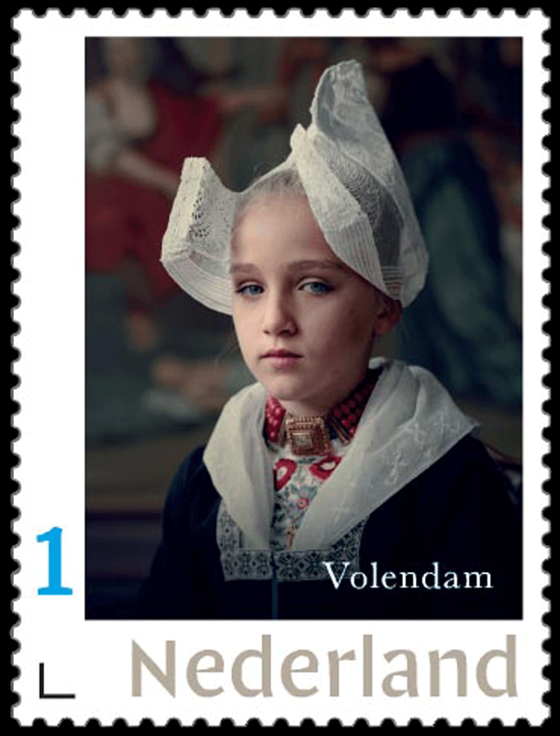
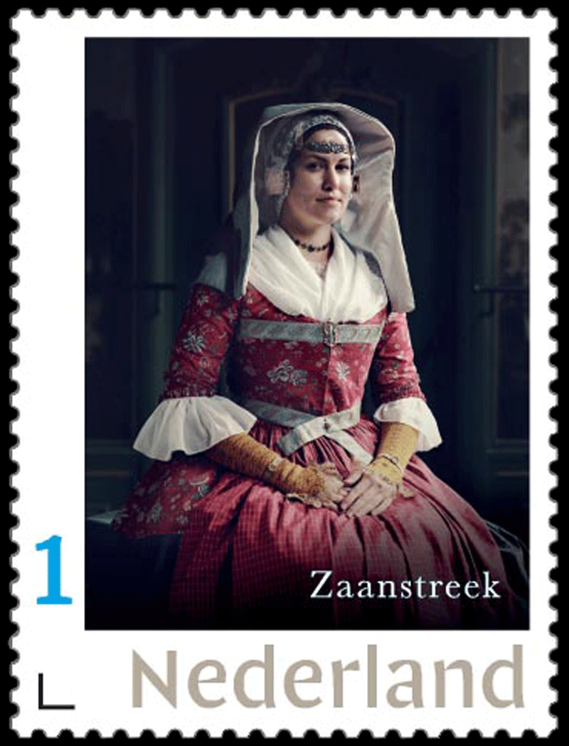
The series of four stamp sheets entitled “Jimmy Nelson – Ode to the Netherlands” feature portraits of women and girls in Dutch national and regional dress, photographed by Jimmy Nelson for his 2022 book Between the Sea and the Sky. The stamps were designed by graphic designer Larissa Rosvaenge of Jimmy Nelson Studio. The denomination on these stamps is ‘1’, the denomination for items weighing up to 20g destined for the Netherlands.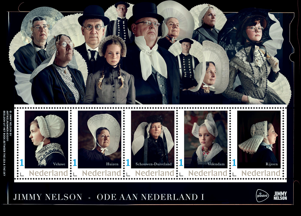
National and regional dress is location- and region-specific clothing that is subject to unwritten rules that are known and clear to those who wear it locally. Most Dutch regional dress can be traced back to earlier civic fashions, especially from the 17th and 19th centuries. In some places, elements of that fashion were maintained while the general fashion changed. Many variations emerged throughout the years. In many areas of the Netherlands, regional costume has disappeared; in others, the disappearance is taking longer than predicted.
- Ode to the Netherlands I (item 830011) features the dress of Veluwe, Huizen, Schouwen-Duiveland, Volendam, Rijssen
- Ode to the Netherlands II (item 830012) features Walcheren, Friesland, Leeuwarden, Scheveningen, Arnemuiden
- Ode to the Netherlands III ((item 830013) features Spakenburg, Marken, Urk, Zaanstreek, Kampereiland
- Ode to the Netherlands IV (item 830014) features Hindeloopen, Staphorst, Katwijk, Enkhuizen, Axel
 In the book, British-Dutch artist Jimmy Nelson [right] portrays 20 Dutch communities in traditional and regional dress in their own environment. The 528-page book features intimate photographic portraits and iconic landscapes, captured with an analogue plate camera. The detailed nature of the images, with plenty of contrast and depth, harks back to the work of the Dutch master painters of the 17th century.
 The Jimmy Nelson – Ode to the Netherlands stamps were designed by Larissa Rosvaenge [left], who is responsible for all designs as a graphic designer within the Jimmy Nelson Studio team. She also designed the book Between the Sea and the Sky from which the photos featured on the stamps were taken.
The Between the Sea and the Sky project was created during the COVID pandemic, when travelling to faraway places, where Nelson usually takes his photographs, was not possible. “As a creative company, we are always looking for human connection,” Nelson explains. “Thanks to the COVID measures, we discovered that there is actually a great wealth of cultural heritage within the Netherlands, a heritage that creates connections within the conscious community, also through storytelling and experiencing a collective past together. As a creative studio, we consider beauty to be an important factor. We are not anthropologists or regional dress experts, but we delved deep into the subject and presented it in the most beautiful and balanced way possible, both in the book, in the accompanying exhibition and now also on the stamps.”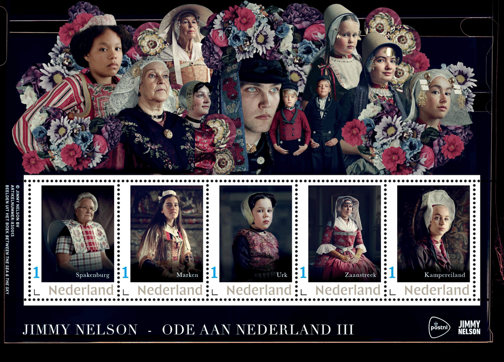
In selecting the photos, designer Rosvaenge sought balance.
 “Balanced ages, for example: the youngest person portrayed on the stamps is 3 years old, the oldest well into their 80s,” she said. “But also balance in where people came from, what colours predominated in the pictures and what viewing directions there were. Moreover, we tried to avoid repetition as much as possible.”
A colour scheme that reflects the seasons emerged almost spontaneously, Rosvaenge added.
“We ended up with stamp sheets on which white predominated in winter, light colours emerged in spring, stronger colours appeared in summer and darker shades surfaced in autumn.”
Nelson says technology played an important part in these pictures.
 “I shoot in natural light with an analogue plate camera, with a wide aperture and a slow shutter speed. This requires people to sit still for a long period of time, and you can see that in the intensity of their facial expressions.”
Rosvaenge says the designs have multiple layers.
“All sorts of things are going on, and you will have to look several times to get through those layers,” the designer said. “That is why I would love it if people bought two of each stamp sheet: one to keep, the other for sending mail. Preferably for love letters, of course.”
Sale & Validity
The Jimmy Nelson – Ode to the Netherlands stamps are available while stocks last at www.postnl.nl/collect and can be ordered by telephone from the Collect Club customer service on telephone number +31 (0)88 868 99 00. The validity period is indefinite.
Technical Details
Stamp size: 30 x 40mm (wxh)
Sheet size: 170 x 122 mm (wxh)
Paper: normal with phosphor print
Gum: gummed
Printing technique: offset
Printing colours: cyan, magenta, yellow and black
Print run: 4 x 10,000 sheets
Appearance: four sheets of five personal stamps in five different : designs
Design: Larissa Rosvaenge
Photography: Jimmy Nelson
Printing company: Koninklijke Joh. Enschedé B.V., Haarlem


