Typically Dutch: Sailing (Netherlands 2022)

[from a PostNL press release] [click on any of the pictures for larger versions]
Typically Dutch – Sailing
Issue date: May 9, 2022

  • Sheet of six stamps in six identical designs
  • Item number: 420561
  • Design: Claire Bedon and Edwin van Praet (Total Design), Amsterdam

This issue is the fourth in the Typically Dutch series this year. In 2022, the multi-annual series is dedicated to five sports in which the Dutch excel. Earlier this year, stamps 
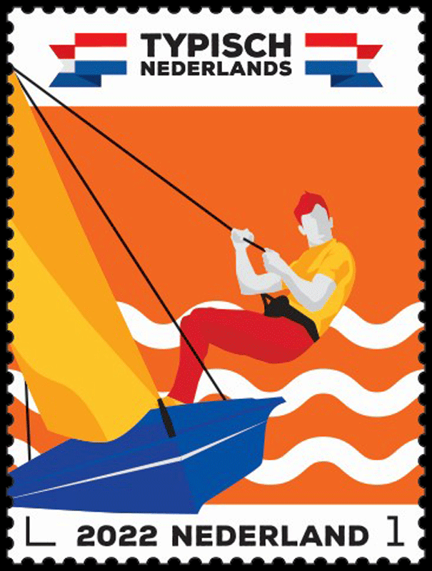
featuring ice skating (3 January), hockey (21 March) and cycling (4 April) were published as part of this series. On 15 August, PostNL will complete this stamp series by issuing a football-themed sheet.

The issue was designed by graphic designer Clair Bedon and creative director Edwin van Praet from Total Design in Amsterdam. The six identical postage stamps will be marked ‘Nederland 1’, the denomination for items weighing up to 20g destined for the Netherlands.

Living with water, fighting against water, using water – that may be the best way to describe the Dutch. It is not surprising, therefore, that the Netherlands is an international leader when it comes to water sports: from swimming and water polo to windsurfing, kite surfing and sailing. The Royal Dutch Water Sports Association (Watersportverbond) has more than 400 water sports associations with over 80,000 members. This association has a long history and was founded in 1890 as Verbonden Zeilvereenigingen van Nederland en België. The Watersportverbond represents the interests of youth teams and promising teams up to and including the top athletes of TeamNL Zeilen (Sailing). The federation is also responsible 
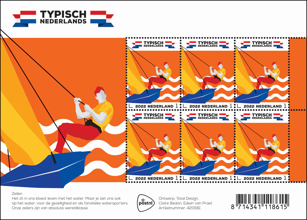
for registering over 100 national, international, Olympic and Paralympic competition classes.

The Dutch are at the very top in global sailing and windsurfing. Marit Bouwmeester (Laser Radial), Dorian van Rijsselberghe, Kiran Badloe and Lilian de Geus (RS:X), Lobke Berkhout (470), Annemiek Bekkering and Annette Duetz (49er FX) have already been world champions in their class at least once. The most recent successes were achieved at the World Championships at the end of 2021 in Oman, with gold medals for Odile van Aanholt/Elise de Ruijter (49er FX) and Bart Lambriex/Floris van de Werken (49er). The Dutch have also won many gold medals at the Olympic Games, both past and present. From Joop Carp, Berend Carp and Piet Wernink (6.5-metre class, Antwerp 1920) and Daan Kagchelland, O-Jolle, Berlin 1936) to Stephan van den Berg (windsurfing, Los Angeles 1984), Dorian van Rijsselberghe (RS:X, London 2012, Rio de Janeiro 2016), Marit Bouwmeester (Laser Radial, Rio de Janeiro 2016) and Kiran Badloe (RS: X, Tokyo 2020).

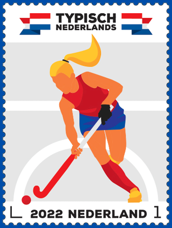
The Typically Dutch – Sailing stamp sheet features an illustration of a competitive sailor hanging outboard from a trapeze on his sailing boat. On the bottom half of the stamp, three wavy lines can be seen in the background, symbolising the water on which competitive sailors practice their sport. The bottom of each stamp has a white strip containing the sorting hook, the year 2022, the country (Netherlands) and the denomination (1). The keel of the sailing boat runs into this strip slightly. In the top left-hand corner, the same happens with the top of the sail and the cordage. The logo for the Typically Dutch series is printed above each stamp, with a folded Dutch banner on the left and right. The picture is repeated in enlarged form on the edge of the sheet. The dominant colour orange continues on the tabs on the right. The Typically Dutch logo appears once more on the top edge of the sheet, while the bottom edge features a short explanatory text.

“We explored two types of sports,” explains van Praet. “On the one hand, there were the Old Dutch sports often tied in with a particular region, like klootschieten, beugelen, kaatsen and fierljeppen. On the other hand, we had the sports loved by everyone in the Netherlands, sports linked to our culture, with water and with large numbers taking part in them: football, hockey, horse riding, swimming, korfball, sailing, golf, et cetera.”

The mood of the Typically Dutch – Sailing stamps is established by the orange background colour, with blue (sailing boat), red (trousers, hair), yellow (sail, shirt), grey (face, arms and hands) and black (mast, cordage, trapeze vest) as contrasting colours. “All five issues this year include the colours of the Dutch flag [and] in the right order,” says van Praet. “First red, then white, then blue and finally two kinds of orange.

“Diversity was essential. That is why we used red, white, blue and orange for the skin colour, rather than pink or brown. The series features two female athletes, two male athletes including this competitive sailor, and one neutral figure.”

The stamps are available while stocks last at the post office counter in Bruna shops and at www.postnl.nl/bijzondere-postzegels [in Dutch]. The stamps can also be ordered by phone from the Collect Club customer service on telephone number +31 (0)88 868 99 00. The validity period is indefinite.

Technical Details:
Postage stamp dimensions: 30 x 40 mm:
Sheet size: 170 x 122 mm
Paper: normal with phosphor print
Gum: gummed
Printing technique: offset
Printing colours: cyan, magenta, yellow, black and orange
Print run: 75,000 sheets
Appearance: sheet of 6 stamps in 6 identical designs
Design: Edwin van Praet and Claire Bedon, Total Design, Amsterdam
Printing company: Cartor Security Printers, Meaucé-La Loupe, France
Item number: 420561

The Lady of Stavoren (Netherlands 2022)

[from a PostNL press release] [click on any of the pictures for larger versions]
The Lady of Stavoren
Issue date: May 9, 2022

  • Sheet of 6 stamps in 2 different designs marked with ‘Internationaal 1’, the denomination for items up to 20g in weight destined for delivery outside of the Netherlands
  • Item number: 420562
  • Design: Edwin van Gelder, Amsterdam
  • Illustrations: Toon Wegner through Stichting Nobilis, Fochteloo

This is the winner of the EUROPA Stamp Best Design Competition, in which cooperating postal companies in Europe have been issuing stamps with a common theme for over 65 years.

PostNL chose the story of the Lady of Stavoren in consultation with the Meertens Institute. Other folktales such as Saint Servatius, the Flying Dutchman, Ellert en Brammert and the Witte Wievenkuil were also considered. PostNL was guided in its decision by the moralistic nature and familiarity of the story. A bronze statue of the Lady, made by sculptor Pier de Groot, has stood in the harbour of Stavoren since 1969.

The Lady of Stavoren is a legend about how pride comes before a fall. The story is about a rich merchant’s wife. In a fit of rage, she throws grain overboard in the harbour of Stavoren. When bystanders are outraged, the woman throws a precious ring into the waves and says she will only regret it when the sea returns her ring. And the sea does just that, as she finds the ring in the belly of a fish. From then on, things start to go downhill: the woman loses all her money, the harbour silts up and Stavoren’s prosperity becomes a thing of the past.

The Lady of Stavoren is a legend by name. The sandbank off Stavoren was called Vrouwenzand (literally ‘Lady’s Sand’, named after Maria, patron saint of the local monastery of St. Odulphus. When the monastery and the origin of the name had faded from memory, the story of The Lady of Stavoren emerged. It is historically accurate that the prosperous town of Stavoren lost its trading position due to the siltation of the harbour. The oldest known version of this legend was recorded in the 16th century. Since then, the story has been retold and embellished in many different versions. For example, the empty ears of wheat growing on the sandbank date from the 18th century. The ring motif was added in the early 19th century.

Design:
The The Lady of Stavoren stamp sheet features six stamps in two different designs by graphic designer Edwin van Gelder. The stamps feature cut-outs from an illustration by Toon Wegner from the book The Lady of Stavoren. Each stamp features a line from a Dutch street song about the same subject. The tabs next to the stamps show the international Priority indication. The legend of The Lady of Stavoren is briefly recounted on the sheet edge, with literal quotations taken from the aforementioned booklet. The text on the sheet edge is accompanied by other illustrations from the book: the woman pointing to the ship that features prominently in the story. The texts, illustrations and captions are printed in gold (PMS 871) because The Lady of Stavoren wanted to possess all the riches in the world and her castle was clad with gold.

“I considered a purely typographical strategy, but that did not do justice to the narrative character of this legend,” says van Gelder. “On the other hand, I found photography too flat. I don’t make that kind of illustration in my design work, so I looked at what others have previously done. The first images I came across were a bit disappointing. Then I came across a book of beautiful, timeless illustrations by Toon Wegner, and I found it absolutely charming. His lithographs perfectly match the mood of the story. I used them to retell the story, but this time with a more abstract, contemporary twist. It was important to me that I created a contemporary image, which is why I came up with crops based on the original illustrations.”

The stamps are available while stocks last at the post office counter in Bruna shops and at www.postnl.nl/bijzondere-postzegels [in Dutch].

Technical Details:
Stamp size: 36 x 25mm:
Sheet size: 108 x 150mm
Paper: normal with phosphor print
Gum: gummed
Printing technique: offset
Printing colours: black, blue and gold
Edition: 60,000 sheets
Appearance: sheet of 6 stamps in 2 different designs
Design: Edwin van Gelder, Amsterdam
Illustrations: Toon Wegner through Stichting Nobilis, Fochteloo
Printing company: Koninklijke Joh. Enschedé B.V., Haarlem
Item number: 420562

150th Anniversary of Artist Mondriaan (Netherlands 2022)

[press release] [click on any of the pictures for larger versions]
PostNL Celebrates Mondrian Year with Golden Stamp

PostNL on April 14 issued a special gold stamp in honor of the 150th birthday of painter Piet Mondriaan. The Amersfoort culture alderman Fatma Koşer Kaya officially received the first copy of the gold stamp.

Victory Boogie Woogie
Mondriaan (1872-1944) became world famous with his geometrically abstract works. The gold stamp features a cutout of the Victory Boogie Woogie, Mondrian’s last painting from 1944. The unfinished work, owned by the Dutch state, hangs in the Kunstmuseum in The Hague. The font on the stamp for the value indication 1 and the Netherlands is a design by type designer Martin Majoor from Arnhem. For the rest of the typography, the SF Orson Casual Heavy by type designer Derek Vogelpohl (ShyFoundry) from Omaha, Nebraska was used.

Limited edition
The 24-carat gold stamp 150 years Piet Mondrian is printed in a limited edition. PostNL delivers the stamp including a special storage cassette with certificate of authenticity. The price is € 50.00. PostNL issues gold stamps exclusively on the occasion of special anniversaries and other special commemorations, always in a limited edition. The special thing about this latest issue is that colors other than gold have been used for the first time.

Cargo bike à la Mondrian
The golden 150th anniversary of Piet Mondriaan stamp was delivered today with an electric PostNL mailbox. For the occasion, this was provided with the characteristic black lines and colorful surfaces that we know from Mondrian’s paintings. Four of these mailbox bikes have been made that will continue to ride throughout the Mondriaan year. PostNL is replacing more and more vans with these types of cargo bikes, which are cleaner and more city-friendly. Hundreds of these are now driving through the Netherlands.

Special Artists meet Mondrian
Simultaneously with the presentation of the first gold stamp, alderman Koşer Kaya opened the exhibition Special Artists meet Mondriaan in the Mariënhof (Kleine Haag 2, Amersfoort). The exhibition consists of works by people with disabilities, who have been inspired by paintings by Mondriaan. In addition to paintings, drawings, textiles and ceramics are on display.

Availability
The golden stamp 150 years Mondriaan is, while stocks last, only available via the webshop [in Dutch] at the customer service of Collect Club on telephone number 088 – 868 99 00. The stamp shows value 1, intended for mail up to and including 20 grams with a destination in the Netherlands. The validity period is indefinite. [Inasmuch as the stamp costs €50 (about US$54.25), you’d be a fool to use it for a domestic letter — or even an international one! —VSC]

[The Wikipedia article on Mondriaan, or “Mondrian,” notes that he was living in New York City at the time of his death at age 71 from pneumonia.]

Delftware Tulip Vases (Netherlands 2022)

[from a press release]
Date of issue: 21 March 2022
Form: sheet with six stamps in six different designs, with value 1 for post up to and including 20 grams for a destination within the Netherlands
Item number: 420161
Design: Jeremy Jansen, Amsterdam
Lithography: Marc Gijzen, Voorburg

The six different stamps in this sheet feature tulip vases from the collections of a number of Dutch museums. The production of these unique glazed earthenware vases reached its peak at the end of the 17th century. The denomination on these stamps is ‘1’, the denomination for items weighing up to 20g destined for the Netherlands.

The history of Delftware is closely linked to that of Chinese porcelain. Delft was one of the VOC’s trading posts, with warehouses where large stocks of this porcelain were stored. [“VOC” stands for “Vereenigde Oostindische Compagnie,” the Dutch East India Company. — VSC] Delft potters developed a type of tin-glazed earthenware that could be compared to Chinese porcelain in terms of shape, shine and decoration. Delftware owes its fame mainly to the flower vases with spouts, known since the 19th century as tulip vases. From 1680 onwards, these vases appeared on the market in all shapes and sizes: from gourd bottles, triumphal arches, bowl shapes and goddesses with spouts on their heads to flower pyramids. The pyramids consist of spherical or square segments that are stacked to incredible heights, with the tallest one being almost 2 metres tall. Flowers such as tulips, carnations, Sweet Williams, hyacinths, daffodils and Persian ranunculus could be inserted into the spouts. Often they were also displayed empty on a table, as a showpiece. Because of their decoration, often with Far-Eastern figures and motifs, the vases evoke associations with the Far East. Their construction can also be reminiscent of Chinese pagodas.

The Delftware tulip vases issue features nine different vases, with some vases appearing several times on a number of stamps. Three stamps feature a single vase, two stamps feature three vases, and one stamp features four vases. The three large vases on the stamps are varnished, giving them a porcelain-like sheen. The edge of the sheet not only features all the vases again, but also the names of the museums that have these tulip vases in their collections. The background colour behind the name of each museum corresponds to the colour beneath their vases. Some of the typography on the stamps is placed in a vertical reading direction. On all stamps, the sorting hook is placed at the bottom right-hand side.

Designer Jeremy Jansen studied the subject by consulting catalogues of Dutch museums that have Delftware tulip vases in their collections. ‘For example the Kunstmuseum in The Hague published a wonderful book about a retrospective exhibition in 2007. This catalogue is also an inventory of where all these vases can be found around the world. For practical reasons, I limited myself to vases in Dutch museums. I kept the idea of an inventory in mind, so the stamp sheet has become a sampler, a visual overview of the vases that can be viewed in the Netherlands.’

The stamp sheet features nine different tulip vases from four different museums, using existing images.

The order on the sheet edge, clockwise from top left:

  • Bowl-shaped flower vase, pottery De Grieksche A, tin-glazed earthenware, height 28.8 cm, circa 1690 (Kunstmuseum Den Haag)
  • Flower vase with a blue and white decor of Chinese motifs, pottery De Metaale Pot, tin-glazed earthenware, height 61 cm, 1685-1691 (Keramiekmuseum Princessehof Leeuwarden)
  • Flower pyramid in the style of a Chinese pagoda, pottery unknown, tin-glazed earthenware, height 108 cm, circa 1700 (Rijksmuseum Amsterdam)
  • Octagonal gourd flask with spouts, pottery De Grieksche A, tin-glazed earthenware, height 29.7 cm, circa 1690 (Het Loo palace, Apeldoorn)
  • Flower vase with spouts, in the shape of a gourd flask, pottery De Grieksche A, tin-glazed earthenware, height 28.2 cm, circa 1690 (Kunstmuseum Den Haag)
  • Flower vase with five spouts, pottery De Metaale Pot, tin-glazed earthenware, height 16 cm, circa 1690-1715 (Rijksmuseum Amsterdam)
  • Flower vase, pottery De Metaale Pot, tin-glazed earthenware, height 28.4 cm, circa 1691-1724 (Kunstmuseum Den Haag)
  • Flower vase with mirror monogram WR (Willem Rex) and bust of king-stadtholder Willem III, pottery De Metaale Pot, tin-glazed earthenware, height 39.8 cm, circa 1695-1702 (Het Loo palace, Apeldoorn)
  • Flower pyramid consisting of 11 segments, attributed to pottery De Metaale Pot, tin-glazed earthenware, height 156 cm, circa 1692-1700 (Rijksmuseum Amsterdam)

The Delftware tulip vases stamps are available while stocks last at the post office counter in Bruna shops and at https://shop.postnl.nl/webshop/collect-club/delftse-tulpenvazen-6-vel-nl1 [in Dutch]. The stamps can also be ordered by phone from the Collect Club customer service on telephone number +31 (0)88 868 99 00. The validity period is indefinite.

Technical Details:
Stamp size: 25 x 36mm
Sheet size: 75 x 144mm
Paper: normal with phosphor print
Glue: synthetic
Printing technique: offset, varnish
Printing colours: cyan, magenta, yellow, black, blue and orange
Edition: 91,000 sheets
Appearance: sheet of six stamps in six different designs
Design: Jeremy Jansen, Amsterdam
Lithography: Marc Gijzen, Voorburg
Printing company: Koninklijke Joh. Enschedé B.V., Haarlem
Item number: 420161

Typically Dutch – Hockey (Netherlands 2022)

[from a press release]
Issue: Typically Dutch – Hockey
Date of issue: 21 March 2022
Appearance: sheet of six stamps in six identical designs
Item number: 420361
Design: Claire Bedon and Edwin van Praet (Total Design), Amsterdam

This issue is the second in the Typically Dutch series this year. In 2022, the multi-annual series is dedicated to five sports in which the Dutch excel. Other stamps in the series are Skating (3 January), Cycling (4 April), Sailing (9 May) and Football (15 August).

Pim Mulier introduced hockey to the Netherlands in 1891. The first hockey clubs were soon established in Amsterdam, Haarlem and The Hague, followed in 1898 by the Nederlandsche Hockey & Bandy Bond, now called Koninklijke Nederlandse Hockey Bond (KNHB, ‘Royal Dutch Hockey Association’). On 23 January 1926, the Dutch men’s hockey team played its very first international match. In Antwerp, they defeated the national team of Belgium, scoring 1-2.

Hockey is a major sport in the Netherlands, with over 250,000 active hockey players based at more than 300 clubs across the country. They play field hockey (September-December and March-June) and indoor hockey (December-February). The Dutch women’s and men’s teams have been competing at the highest level for many years. Both teams won many awards, including Olympic titles (women’s team in 1984, 2008, 2012 and 2020, men’s team in 1996 and 2000). The women’s team has won the world title eleven times, while the men’s team has won it three times.

Hockey matches last 4 x 17.5 minutes and are played by two teams of eleven players. Each team may use up to five substitutes. Indoor hockey matches are played by two teams of six players each. An indoor team may have up to six substitutes on the bench. Unlike football, players may be substituted an unlimited number of times in hockey.

The stamps show an illustration of a hockey player in action. She has the ball on her stick and is about to make a passing move. In the background are the 23m line and the shooting circle, representing the typical layout of a hockey pitch. At the bottom of each stamp is a white strip with the sorting hook, the year 2022, the country (Netherlands) and the denomination 1. The ball and the hockey player’s right shoe run through this strip. The same is happening with the ponytail in the white strip at the top. The logo for the Typically Dutch series is printed above each stamp, with a folded Dutch banner on the left and right. The picture is repeated in enlarged form on the edge of the sheet.

The 2022 stamps for the multi-annual Typically Dutch series were once again designed by Total Design from Amsterdam.

‘We explored two types of sports,’ explains Edwin van Praet, creative director at Total Design. ‘On the one hand, there were the Old Dutch sports often tied in with a particular region. Like klootschieten, beugelen, kaatsen and fierljeppen. On the other hand, we had the sports loved by everyone in the Netherlands. Sports linked to our culture, with water and with large numbers taking part in them: football, hockey, horse riding, swimming, korfball, sailing, golf, et cetera. Often, these are the sports the Dutch excel in, where we’re at the top internationally. Based on that initial selection, we created mood boards, a collection of photographs and images to establish the tone. Then we started sketching.’

A striking feature of the design is that both the ball and the right shoe protrude out of the picture and continue onto the strip at the bottom of the stamp. The same is happening with the ponytail in the white strip at the top. ‘They’re very small details,’ explains Van Praet, ‘but it reinforces the impression that the hockey player is coming towards you.’ You’re involved in the action, you’re the fan sitting in the stadium, watching a sportsperson coming towards you.’

The stamps are available while stocks last at the post office counter in Bruna shops and at www.postnl.nl/bijzondere-postzegels [in Dutch]. The stamps can also be ordered by phone from the Collect Club customer service on telephone number +31 (0)88 868 99 00. The validity period is indefinite.

Technical Details:
Postage stamp dimensions: 30 x 40 mm:
Sheet size: 170 x 122 mm
Paper: normal with phosphor print
Gum: gummed
Printing technique: offset
Printing colours: cyan, magenta, yellow, black and orange
Print run: 75,000 sheets
Appearance: sheet of 6 stamps in 6 identical designs
Design: Edwin van Praet and Claire Bedon, Total Design, Amsterdam
Printing company: Cartor Security Printers, Meaucé-La Loupe, France
Item number: 420361

Typically Dutch: Cycling (Netherlands 2022)

[from a press release]

Issue: Typically Dutch – Cycling
Date of issue: 4 April 2022
Appearance: sheet of six stamps in six identical designs
Item number: 420461
Design: Claire Bedon and Edwin van Praet (Total Design), Amsterdam

On 4 April 2022, PostNL will publish the Typically Dutch – cycling stamp sheet. This issue is the third in the Typically Dutch series this year. In 2022, the multi-annual series is dedicated to five sports in which the Dutch excel. Earlier this year, stamps featuring ice skating (3 January) and hockey (21 March) were published as part of this series. Later this year, PostNL will publish stamps featuring the typically Dutch sports of sailing (9 May) and football (15 August).

There’s nothing more Dutch than a bicycle. The Netherlands is home to more bicycles (22.9 million) than people. With all those bicycles, we travel some 17.4 billion kilometres per year, which is around 1,000km per person, with an average speed of 15.6km/hour. Relatively, 
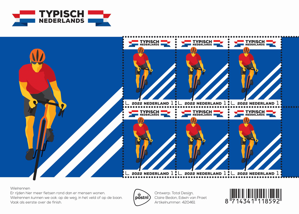
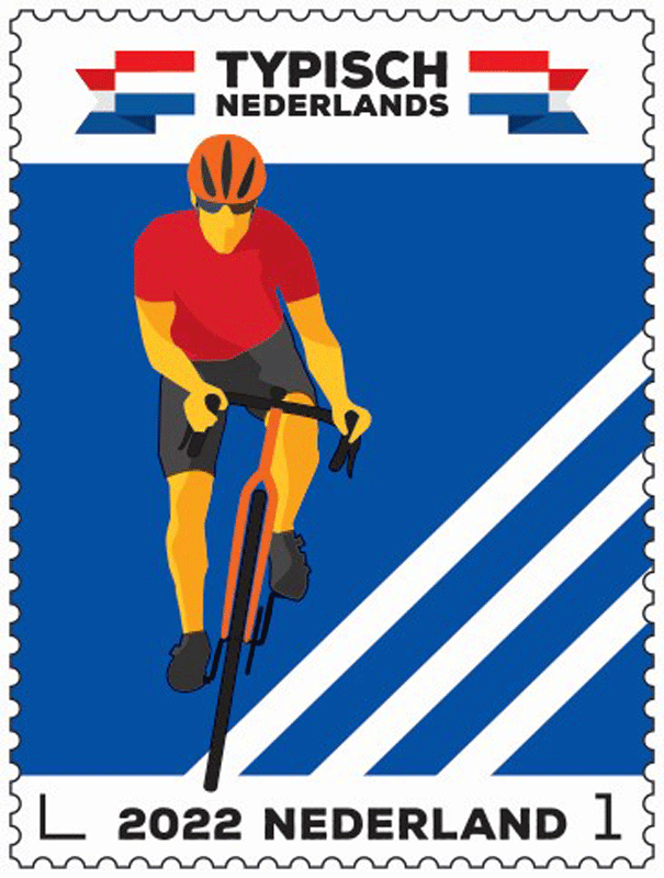
the most kilometres are covered by the 36,000 cyclists who are members of the over 370 cycling clubs in the Netherlands. Their interests are protected by the Koninklijke Nederlandsche Wielren Unie (KNWU, ‘Royal Dutch Cycling Union’), which was founded in 1928. Besides road cycling, there are many other cycling disciplines: BMX, track cycling, cyclocross, mountain biking, beach racing, para-cycling and artistic cycling.

The Netherlands has produced many famous cyclists, including big names such as Jan Jansen (Tour de France winner), Hennie Kuiper (gold medallist at the Olympic Games), Joop Zoetemelk (Tour de France and Vuelta de España winner) and Tom Dumoulin (Giro d’Italia winner). The Dutch are often also world leaders in disciplines such as track cycling (Jeffrey Hoogland, Harrie Lavreysen) and cyclocross (Lars Boom, Matthieu van der Poel). The achievements of Dutch female cyclists are even more impressive. Especially over the past few decades, Dutch women have dominated global cycling. Well-known champions are Leontien van Moorsel (four Olympic gold medals, Tour de France Féminin winner; shown on the right), Marianne Vos (one Olympic gold medal, twice World Championships winner in road cycling, three times Giro Rosa winner), Anna van der Breggen (one Olympic gold medal, twice World Championships winner in road cycling, once World Championships winner in time trial, four times Giro Rosa winner) and Annemiek van Vleuten (one Olympic gold medal, once World Championships winner in road cycling, twice World Championships winner in time trial, twice Giro Rosa winner).

The stamps on the Typical Dutch – cycling stamp sheet feature an illustration of a cyclist gaining momentum by getting out of the saddle and pushing the bicycle to the left. In the bottom right-hand corner, three diagonal lines can be seen in the background, representing the lines on a cycle track and on public roads. At the bottom of each stamp is a white strip with the sorting hook, the year 2022, the country (Netherlands) and the denomination 1. The tyre of the front wheel continues onto the strip a little way. The same is happening with the bicycle helmet in the white strip at the top. The logo for the Typically Dutch series is printed above each stamp, with a folded Dutch banner on the left and right. The picture is repeated in enlarged form on the edge of the sheet. The dominant colour blue continues on the two tabs on the right. The Typically Dutch logo appears once more on the top edge of the sheet, while the bottom edge features a short explanatory text.

The mood of the Typically Dutch – cycling stamps is created by the colour blue in the background, with orange (helmet, front fork), red (cycling shirt), yellow (face, arms, legs) and black (glasses, bib shorts, handlebars, cycling shoes, front wheel, pedals and bottom bracket) as contrasting colours. Van Praet: ‘All five issues this year include the colours of the Dutch flag. In the right order: first red, then white, then blue and finally two kinds of orange. Diversity was essential. The series features two female athletes, two male athletes including the cyclist, and one neutral figure.’

Technical Specifications:
Postage stamp dimensions: 30 x 40 mm:
Sheet size: 170 x 122 mm
Paper: normal with phosphor print
Gum: gummed
Printing technique: offset
Printing colours: cyan, magenta, yellow, black and orange
Print run: 75,000 sheets
Appearance: sheet of 6 stamps in 6 identical designs
Design: Edwin van Praet and Claire Bedon, Total Design, Amsterdam
Printing company: Cartor Security Printers, Meaucé-La Loupe, France
Item number: 420461

The Netherlands from The Air, Set 1 (2022)

Issue date: 22 March
Groningen, Friesland, Drenthe

Issue: The Netherlands from the Air
Appearance: 12 sheets of five different personal stamps marked ‘Nederland 1’, the denomination for post weighing up to 20g sent to an address within the Netherlands
Design: studio026, Velp
Photography: Karel Tomeï, Eindhoven

In 2022, PostNL will be issuing a series of 12 personal stamps entitled Kijk op Nederland (The Netherlands from the Air). Each stamp in the series features an aerial photograph of a prominent site in the Netherlands, based on the themes of architecture, buildings, infrastructure, nature and water. The sheets will be issued in four sets, 22 March, 14 June, 13 September, and 15 November.

More details on the series are here.

This set:
Groningen
Fortified village (Bourtange), salt marsh (Hornhuizen), Groninger Museum (Groningen), art installation De Natte Ogen (Winschoten), Damsterdiep (Eemskanaal)

Friesland
ir. D.F. Wouda Steam Pumping Station – Woudagemaal (Lemmer), Afsluitdijk (Kornwerderzand), Het Rif (Schiermonnikoog), skûtsjesilen (De Veenhoop), Achmea tower (Leeuwarden)

Drenthe
LOFAR telescope (Exloo), roundabout (Coevorden), brinkdorp (Noord-Sleen), Bargerveen Nature Reserve (Veenland), Hunebedcentrum dolmen (Borger)

Technical Details:
Sheet size: 102 x 148 mm (wxh)
Stamp size: 40 x 30mm (wxh)
Paper: normal with phosphor print
Gum: gummed
Printing technique: offset
Printing colours: cyan, magenta, yellow, black and blue
Print run: 5,000 sheets per issue

The Netherlands from the Air (2022)

Issue: The Netherlands from the Air
Appearance: 12 sheets of five different personal stamps marked ‘Nederland 1’, the denomination for post weighing up to 20g sent to an address within the Netherlands
Design: studio026, Velp
Photography: Karel Tomeï, Eindhoven

In 2022, PostNL will be issuing a series of 12 personal stamps entitled Kijk op Nederland (The Netherlands from the Air). Each stamp in the series features an aerial photograph of a prominent site in the Netherlands, based on the themes of architecture, buildings, infrastructure, nature and water. The themes are shown at the top of each stamp sheet. Each theme was assigned its own colour, which in turn corresponds to the colour of the typography on the stamps. Each stamp states where the picture was taken, what we are looking at and what the title of the series is. The bottom edge of the sheet features an enlargement of one of the aerial photos as a background image.

The top of the sheet edge features a graphic representation of a fictitious Dutch subdivision pattern. By colouring in parts of it, the letters of the title of the series have been made visible on top of the subdivision pattern: KIJK OP NEDERLAND. The title becomes visible when all the stamp sheets are placed side by side. [Click to see a much, much bigger image.]On the left edge of the sheet, under the provincial name, is a map of the Netherlands depicting the provincial boundaries. The relevant province is picked out in colour.

The sheets will be issued on four dates, as follows:Item number: 820031 Groningen 22 March
Item number: 820032 Friesland, 22 March
Item number: 820033 Drenthe, 22 MarchItem number: 820034 Overijssel, 14 June
Item number: 820035 Flevoland, 14 June
Item number: 820036 Gelderland, 14 JuneItem number: 820037 Utrecht, 13 September
Item number: 820038 Noord-Holland, 13 September
Item number: 820039 Zuid-Holland, 13 SeptemberItem number: 820040 Zeeland, 15 November
Item number: 820041 Noord-Brabant, 15 November
Item number: 820042 Limburg, 15 November

Details on the 22 March set are posted here.
Details on the 14 June set will be posted here.
Details on the 13 September set will be posted here.
Details on the 15 November set will be posted.

In addition to the usual stamp release schedule, PostNL also has an annual personal stamp release schedule. This programme is flexible. It allows PostNL to respond to topical developments and requests. Each issue is designed based on a fixed layout with a fixed number of personal stamps. The stamps are available while stocks last on the webshop.

The design of the personal stamps for the The Netherlands from the Air series was created by Huub de Lang and Anne Schaufeli of studio26 in Velp. They designed stamps for PostNL before, but this was the first commission for a series. ‘With a huge topic this time,’ says Anne Schaufeli. ‘The brief was to depict the Netherlands from above on 12 stamp sheets using existing photographic material. One province per stamp sheet – that was our starting point. Then we developed our concept, as usual. The main thing that struck us is that if you look at the Netherlands from above, you notice that everything is cultivated down to the square metre. This malleability of the landscape is reflected in the subdivision patterns that you can often only see clearly from the air. The land was divided and delimited through subdivision, revealing the intervention of man. This is really characteristic of the Netherlands. We found the balance between man and nature to be an excellent theme to pursue further. This is typical of our approach: first we plan, then we work it out. This way, we could also find images that could represent the Netherlands in the same way on all stamp sheets.’

Based on the concept they had drawn up, Schaufeli and De Lang established the selection criteria for the photos. ‘We decided to use the themes of architecture, buildings, infrastructure, nature and water,’ Schaufeli explains. ‘As these are pretty broad terms, we were able to use a large variety of images. For each province, we first looked at which landmarks would qualify. This included logical candidates such as the Afsluitdijk, for example, plus the Delta Works, the windmills at Kinderdijk and the Ridderkerk intersection, of course. But the search for images also threw up all kinds of surprises. Like the Natte Ogen art installation in the Haringvliet near Winschoten and the green cathedral at Almere.’

Dutch photographer Karel Tomeï specialises in aerial photography. Schaufeli: Following our advice, PostNL contacted Tomeï to ask if he would like to participate in this series of stamps. So he started looking for images with the concept and themes as guidelines. Sometimes the image we were looking for could not be found, other times he came up with pictures we were not expecting. Or he would send us a beautiful image, but the content just didn’t fit the concept. And vice versa. We ended up looking at masses of pictures.’

According to Schaufeli, other criteria also played a part in the selection of the 60 photos for the 12 stamp sheets. ‘We didn’t want too much repetition. Like 12 bridges, for example. And each stamp sheet had to give an equivalent overall picture. That was a bit of a puzzle, to say the least. The angle at which the photos were taken is important. We would have preferred them all to be taken straight from above, but that does not work in all cases. For example, if you want to feature a tall building. However, our aim to get as many pictures taken straight from above sometimes ended up with amazing results. Take the Groninger Museum, for example, which makes a very different impression from the air than it does from the side.’

Technical Details:
Sheet size: 102 x 148 mm (wxh)
Stamp size: 40 x 30mm (wxh)
Paper: normal with phosphor print
Gum: gummed
Printing technique: offset
Printing colours: cyan, magenta, yellow, black and blue
Print run: 5,000 sheets per issue

Mauritshuis Art Museum’s 200th Anniversary (Netherlands 2022)

Issue: Mauritshuis Bicentenary Celebration
Date of issue: 21 February 2022
Appearance: sheet with six stamps in six different designs, with value 1 for post up to and including 20 grams for a destination within the Netherlands
Item number: 420262
Design: Studio Maud van Rossum, Amsterdam
Photography: Mauritshuis, The Hague
Lithography: Marc Gijzen, Voorburg

On 21 February 2021, PostNL issued a new stamp sheet with six stamps about the famous flower still-lifes at the Mauritshuis in The Hague. Mauritshuis bicentenary celebration is being issued to mark two centuries since the museum opened its doors to the public. The denomination on these stamps is ‘1’, the denomination for items weighing up to 20g destined for the Netherlands. The stamp sheet was designed by Studio Maud van Rossum from Amsterdam.

The Mauritshuis in The Hague houses a world-famous collection of 17th-Century Dutch paintings. The collection is on display in two historic buildings in The Hague: the Mauritshuis and the Galerij Prins Willem V. The Mauritshuis is a 17th-century city palace on the Plein, and the Galerij Prins Willem V is an 18th-century museum on the Buitenhof.

The history of the collection in the Mauritshuis begins in the Galerij Prins Willem V. This gallery was opened in 1774 and was the first museum open to the public in the Netherlands. This is where Stadtholder Willem V displayed his collection of paintings to the general public. His son, King William I, donated a large number of these works to the Dutch state. In 1822, 200 years ago this year, the collection moved to the Mauritshuis. The most famous paintings, such as The Bull by Paulus Potter, View of Haarlem with Bleaching Fields by Jacob van Ruisdael, Two African Men by Rembrandt, View of Delft and Girl with a Pearl Earring by Johannes Vermeer are always on display. There are also special exhibitions on different subjects that change three times a year.

Opening on 17 February 2022 – the anniversary year –, the In Full Bloom exhibition will focus on the most beautiful floral still-lifes from the Mauritshuis collection. In the 17th Century, still-life paintings with flowers were a specialised genre in the Low Countries. It emerged in Middelburg and Antwerp and then also became popular further north. To celebrate the bicentenary, a flower installation inspired by the collection of paintings is being built in and around the Mauritshuis. The façade of the Mauritshuis will also be adorned with an ‘impossible bouquet’ of flowers, consisting of sustainable imitation flowers combining spring, summer and autumn, just like the still-lifes from the 17th Century.

‘The Mauritshuis has a fantastic website that even allows you to visit the museum online,’ said stamp designer Maud van Rossum. “They took advantage of the lockdown to digitise the entire museum. So you can take a virtual walking tour through the exhibition rooms from the comfort of your own sofa. That same evening, I was able to view each flower still-life in the collection on my own screen.’

In 2020, graphic designer Van Rossum designed the stamp issue that celebrated the 450th anniversary of the publication of the world’s first atlas. In 2021, she created the stamps for Queen Máxima’s 50th birthday. ‘This is a completely different subject,’ says Van Rossum about the Mauritshuis bicentenary celebration stamp sheet.

The stamps are available while stocks last at the post office counter in Bruna shops and at www.postnl.nl/bijzondere-postzegels [in Dutch].

Technical Details:
Stamp size: 25 x 36mm
Sheet size: 108 x 150mm
Paper: normal with phosphor print
Gum: gummed
Printing technique: offset
Printing colours: cyan, magenta, yellow and black
Edition: 95,000 sheets
Appearance: sheet of six stamps in six different designs
Studio: Maud van Rossum, Amsterdam
Photography: Mauritshuis, The Hague
Lithography: Marc Gijzen, Voorburg
Printing company: Koninklijke Joh. Enschedé B.V., Haarlem
Item number: 420262

Experience Nature: Nieuwkoopse Plassen (Netherlands 2022)

[press release] [click on any of the pictures for larger versions]
Experience Nature – Nieuwkoopse Plassen

  • Issue: Experience Nature – Nieuwkoopse Plassen
  • Date of issue: 21 February 2022
  • Appearance: sheet of ten stamps in ten different designs
  • Item number: 420261
  • Design: Frank Janse, Gouda
  • Photography: Buiten-Beeld

On 21 February 2022, PostNL will publish the Experience Nature – Nieuwkoopse Plassen issue: a sheet of ten stamps in ten different designs. The denomination on these stamps is ‘1’, the denomination for items weighing up to 20g destined for the Netherlands. The stamp sheet about the Nieuwkoopse Plassen is part of the multi-annual Experience nature 2021-2023 series. In the series, four stamp sheets are issued every year, each comprising ten different stamps. The stamps feature images of plants and animals in unique Dutch nature reserves across the country. In 2022, it is the turn of the provinces of Zeeland, Zuid-Holland, Limburg and Gelderland.

[The PostNL site for stamp purchases is here.]

The 21 February 2022 issue focuses on the low peatlands of the Nieuwkoopse Plassen, situated in the centre of Zuid-Holland. The stamp sheet issued earlier this year (3 January 2022) was about Fort Ellewoutsdijk in Zeeland. Later this year, stamps will be issued featuring the chalk landscape of the Sint-Pietersberg in Zuid-Limburg (13 June 2022) and the Leuvenum Woods on the Veluwe in Gelderland (15 August 2022).

The Nieuwkoopse Plassen nature reserve covers an area of around 1400 hectares, most of which is owned by Vereniging Natuurmonumenten. The lakes were created by peat extraction, which started in the 16th century. In addition to the larger Zuideinderplas and Noordeinderplas, it also has a number of smaller lakes and watercourses with names such as Maarten Freekenwei, Weide van Vliet, Armengat, Bleigaten, Poeltje and Noordse Plassen. This expansive low peatland bog is home to numerous unusual plants and animals. For example, the area is home to significant populations of purple herons, fen orchids and Tundra voles. In addition to its lakes, ponds and watercourses, the area also has many reed beds, especially in the eastern part. This is also the location of Lusthof De Haeck; an old remnant of swamp forest with paths, bridges and views of the surrounding lakes. The Nieuwkoopse Plassen are still under development. The Ruygeborg – a new natural area between Nieuwkoop and Noorden – has been in development since 2012, for example. In combination with the Groene Jonker – a wetland area created near Zevenhoven in 2008 – it is now an ecological link with the Vinkeveense Plassen.

Sources: natuurmonumenten.nl, wikipedia.nl

John Pietersen has been a forest ranger at Vereniging Natuurmonumenten since 2009. He was born and raised in the village of Noorden, on the shores of the Nieuwkoopse Plassen. He describes the area for which he is responsible as a unique low peatland bog with lots of water. ‘Even when it looks green, there is a big chance there is water underneath. That’s what we call floating land. The Nieuwkoopse Plassen were created through peat cutting and extraction. You can still see this in the landscape. The water has settled in areas where peat used to be extracted. We call those petgaten. The peat was laid out to dry on artificial drying islands. These still stick out above the water. Actually, it is a man-made area, with a lot of rare nature. Like unique orchids, for example. Right in the centre of the area you’ll even find a swathe of bog heath, the largest in Western Europe. That’s where you can see the Erica in bloom, surrounded by water. It’s an amazing sight. The area is a favourite destination, especially for nature lovers. Not too busy, with a lovely balance between recreation and nature conservation. I know the lakes and wetlands like the back of my hand, I can even navigate through them effortlessly in the dark. I have lived by these wetlands all my life, but the area never ceases to amaze me. I’m a bog man through and through.’

The Experience nature – Nieuwkoopse Plassen stamps feature the following ten inhabitants of the nature reserve:

  • the black tern,
  • hairy dragonfly,
  • Southern Marsh orchid,
  • ragged robin or cuckoo flower,
  • spined loach,
  • marsh cinquefoil,
  • lesser bulrush,
  • water soldier,
  • white water lily, and
  • bittern.

Each has its own stamp. The stamp sheet also features many more images of flora and fauna from this area. These are featured as transparent images in a separate graphic layer: spoonbill (top right), white water lily (top centre), gadwall (top centre right), grebe (centre left) and bitterling (bottom left and right). These transparent images cross the perforations and connect the stamps with each other and the sheet edge.

Design
The Experience Nature – Nieuwkoopse Plassen stamp sheet was designed by graphic designer Frank Janse from Gouda. On the sheet, the ten plants and animals are depicted in their natural environment, each on their own stamp. In some cases, the image or background colour continues onto the adjacent stamp and onto the sheet edge. All photos are incorporated in a graphic layer of different-sized overlapping circles, which break through the boundaries of the perforations. The circle pattern returns as small droplets on the sheet edge and the tabs. There is another graphic layer on top of the circles featuring transparent images of animals and plants from this area. The monochrome images are almost abstract and link the stamps.

The entire Experience Nature series was designed by Janse. While the focus was on various animal and plant species in the period from 2018 to 2020, in 2021-2023 the focus will be on unique Dutch nature reserves and their flora and fauna.

Nieuwkoopse Plassen in Zuid-Holland is situated near the towns of Nieuwkoop, Noorden and De Meije. The peat river of the same name, the Meije, runs along the south-eastern border of the area.

The denomination on these stamps is ‘1’, the denomination for items weighing up to 20 g destined for delivery in the Netherlands.

Technical Specifications:
Stamp size: 40 x 30mm
Sheet size: 122 x 170mm
Paper: normal with phosphor print
Glue: self-adhesive
Printing technique: offset
Printing colours: cyan, magenta, yellow and black
Print run: 285,000 sheets
Appearance: sheet of 10 stamps in 10 different designs
Design: Frank Janse, Gouda
Photography: Buiten-Beeld
Printing company: Cartor Security Printers, Meaucé-La Loupe, France
Item number: 420261