Updated April 3rd: The Scott Catalogue number for this issue is 5179.
Updated February 20th: Here are some details on the first day ceremony:
 Wednesday, March 1, 2017
9:30 a.m. CST
Nebraska State Capitol
Second Floor Rotunda
1445 K Street
Lincoln, NE 68508
Updated February 12th: Here is the Digital Color Postmark for this issue: 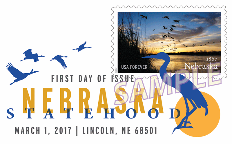 It measures 2.95” x 1.32″. The B&W first-day cancel for this issue is the standard 4-bar “FIRST DAY OF ISSUE.” Here is the “special” postmark that local post offices may use:
 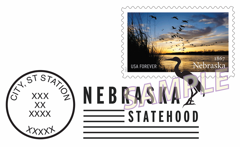 It measures 2.9” x 1.3″
Updated February 3rd:
 On March 1, 2017, in Lincoln, NE, the U.S. Postal Service« will issue the Nebraska Statehood stamp (Forever« priced at 49 cents), in one design, in a pressure-sensitive adhesive (PSA) pane of 20 stamps (Item 474400).
The stamp will go on sale nationwide March 1, 2017.
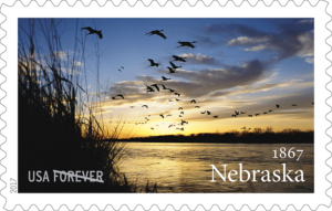
This stamp celebrates the 150th anniversary of Nebraska’s statehood. Known for its agricultural bounty, the Cornhusker State became the 37th state of the Union on March 1, 1867. Nebraska photographer Michael Forsberg tucked himself among prairie grasses on the riverbank between the small cities of Grand Island and Kearney to capture the image shown on the stamp. In the photograph, sandhill cranes fly low to scout for sandbars, which provide shelter from nighttime predators during a mid-migratory rest for half a million of these ancient birds. This spectacle along the Platte River is unique to Nebraska. Forsberg captured this image as winter thawed into spring around the year 2000. Art director Derry Noyes designed the stamp using Michael Forsberg’s existing photograph.
Stamp Fulfillment Services will make an automatic push distribution to Post Offices (in Nebraska only) of a quantity to cover approximately 30 days of sales.
How to Order the First-Day-of-Issue Postmark:
Customers have 60 days to obtain the first-day-of-issue postmark by mail. They may purchase new stamps at their local Post Office, at The Postal Store« website at http://www.usps.com/shop, or by calling 800-782-6724. They should affix the stamps to envelopes of their choice, address the envelopes (to themselves or others), and place them in a larger envelope addressed to:
FDOI — Nebraska Statehood Stamp
USPS Stamp Fulfillment Services
8300 NE Underground Drive, Suite 300
Kansas City, MO 64144-9900
After applying the first-day-of-issue postmark, the Postal Service will return the envelopes through the mail. There is no charge for the postmark up to a quantity of 50. There is a 5-cent charge for each additional postmark over 50. All orders must be postmarked by May 1, 2017.
There are six philatelic products for this stamp issue:
- 474406, Press Sheet with Die-cut, $58.80
- 474410 Digital Color Postmark Keepsake, $11.95
- 474416 First-Day Cover, $0.93
- 474421 Digital Color Postmark, $1.64
- 474424 Framed Art, $39.95
- 474430 Ceremony Program, $6.95
Technical Specifications:
Issue: Nebraska Statehood Stamp
Item Number: 474400
Denomination & Type of Issue: First-Class Mail Forever
Format: Pane of 20 (1 design)
Series: Statehood
Issue Date & City: March 1, 2017, Lincoln, NE 68501
Art Director: Derry Noyes, Washington, DC
Designer: Derry Noyes, Washington, DC
Typographer: Derry Noyes, Washington, DC
Existing Photo: Michael Forsberg
Modeler: Joseph Sheeran
Manufacturing Process: Offset, Microprint — “USPS”
Printer: Ashton Potter (USA) Ltd. (APU)
Printed at: Williamsville, NY
Press Type: Muller A76
Stamps per Pane: 20
Print Quantity: 20,000,000 stamps
Paper Type: Nonphosphored Type III, Block Tag applied
Adhesive Type: Pressure-sensitive
Processed at: Ashton Potter (USA) Ltd. (APU)
Stamp Orientation: Horizontal
Image Area (w x h): 1.42 x .84 in./36.07 x 21.34 mm
Overall Size (w x h): 1.56 x .98 in./39.62 x 24.89 mm
Full Pane Size (w x h): 7.24 x 5.92 in./183.90 x 150.37 mm
Press Sheet Size (w x h): 21.72 x 11.84 in./551.69 x 300.74 mm
Colors: Black, Cyan, Magenta, Yellow
Plate Size: 240 stamps per revolution
Plate Numbers: “P” followed by four (4) digits
Marginal Markings:
Front: Plate numbers in four corners of pane
Back: © 2016 USPS • USPS Logo • Two barcodes (474400) • Plate Position Diagram • Promotional Text
Updated January 5th: This stamp will be issued March 1st in Lincoln, Nebraska.
From the USPS, November 22nd, 2016:
 This stamp celebrates the 150th anniversary of Nebraska statehood. Known for agriculture, the Cornhusker State became the 37th state on March 1, 1867. Nebraska photographer Michael Forsberg set up among prairie grasses on the riverbank between the small cities of Grand Island and Kearney to capture the image shown on the stamp. In the photograph, sandhill cranes fly low to scout for shelter from nighttime predators. This mid-migratory rest for half a million birds along the Platte River is unique to Nebraska. Forsberg captured this image as winter thawed into spring around the year 2000. Art director Derry Noyes designed the stamp using Forsberg existing photograph.
 It measures 2.95” x 1.45.
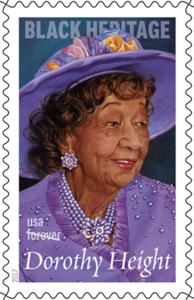 On February 1, 2017, in Washington, DC, the U.S. Postal Service® will issue the Dorothy Height stamp (Forever® priced at 49 cents), in one design, in a pressure-sensitive adhesive (PSA) pane of 20 stamps (Item 474300).
 From the USPS, November 22nd, 2016:
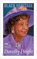 The 40th stamp in the Black Heritage series honors Dorothy Height (1912-2010), the tireless activist who dedicated her life to fighting for racial and gender equality. Although she rarely gained the recognition granted her male contemporaries, she became one of the most influential civil rights leaders of the 20th century. The stamp features artist Thomas Blackshear II gouache and acrylics on board portrait of Height. The painting is based on a 2009 photograph shot by Lateef Mangum. Art director Derry Noyes designed the stamp.
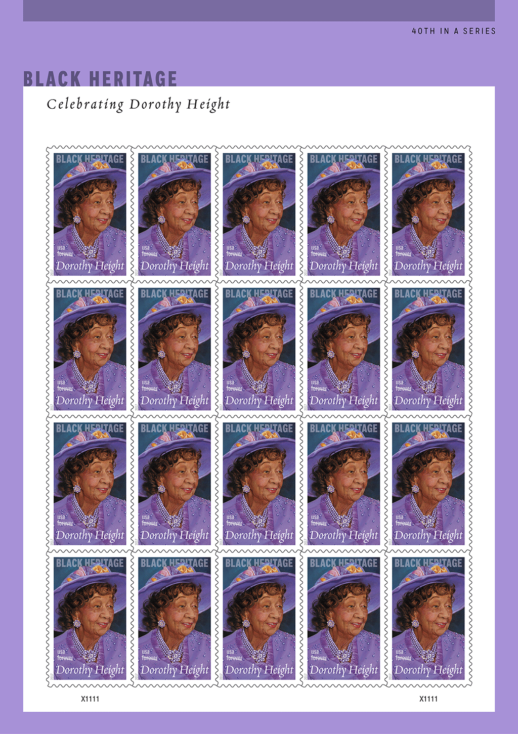
 This new Forever stamp is similar in design to the two-ounce Celebration Corsage stamp and can be used for weddings and RSVP cards. It also is perfect for party invitations, thank-you notes, announcements, birthday cards, Father’s Day cards and other occasions. The stamp art features a photograph of an arrangement of ranunculus, with floral accents of succulents, Astrantia, Berzelia, and clubmoss greenery. The ribbon wrapping the stems harmonizes with the colors and textures of the plant material. The boutonniere was arranged by floral designer Carol Caggiano and photographed by Renée Comet. Art director Ethel Kessler designed the stamp.
 This new 2-ounce stamp is perfect for many of life special moments, as it can accommodate the weight of heavy invitations for birthdays, weddings, anniversaries, and other celebrations; oversize greeting cards for all occasions; and mailings such as small gifts that require extra postage. Celebration Corsage is similar in design to the Celebration Boutonniere Forever stamp, and the two form a natural pair. The corsage was arranged by floral designer Carol Caggiano and photographed by Renée Comet. Art director Ethel Kessler designed the stamp.
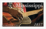 This stamp celebrates the 200th anniversary of Mississippi statehood. Mississippi became the 20th state on Dec. 10, 1817. The stamp features a 2009 photograph showing a close-up of a guitar player hands. Mississippi is the birthplace of many legendary blues artists who created a uniquely American genre of music. Among states, the Magnolia State is 32nd in size, and with nearly three million people, it ranks 31st in population. Art director Greg Breeding designed the stamp with an existing photo taken by Lou Bopp.
 The 16th stamp in the Distinguished Americans series honors Robert Panara (1920-2014), an influential teacher and a pioneer in the field of deaf studies. The stamp features a 2009 photograph of Panara. He is shown signing the word “respect. “During his 40-year teaching career, Panara inspired generations of students with his powerful use of American Sign Language. Panara taught at Gallaudet University in Washington, DC for nearly 20 years at the National Technical Institute for the Deaf (part of the Rochester Institute of Technology in New York state). Art director Ethel Kessler designed the stamp with an existing photograph by Mark Benjamin, official photographer of the National Technical Institute for the Deaf in Rochester.
 The U. S. Postal Service celebrates our nation passion for athletics with Have a Ball! The stamps feature colorful illustrations of eight different sports balls: baseball, basketball, football, golf, kickball, soccer, tennis and volleyball. Millions in the U. S. participate annually in the sports represented on the stamps. Mike Ryan designed the stamps and Greg Breeding served as the art director. Daniel Nyari created the colorful, stylized stamp art.
 Mastering a realistic style that defied artistic trends, Andrew Wyeth (1917-2009) created haunting and enigmatic paintings based largely on people and places in his life — a body of work that continues to resist easy or comfortable interpretation. Finding endless inspiration both in his hometown of Chadds Ford, PA, and in rural Maine, he scrutinized the lives, houses and personal belongings of people around him, sometimes painting their portraits but just as often using objects and places to represent them. 2017 is the centennial of Wyeth’s birth. With subtle symbolism and eerie implications, his work invites us to reinterpret his personal vision. Derry Noyes art directed and designed this pane of 12 stamps.
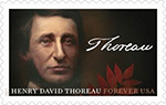 With his personal example of simple living, his criticism of materialism and the questions he raises about the place of the individual in society and humanity’s role in the natural world, Henry David Thoreau (1817-1862) continues to inspire readers. For 26 months, Thoreau lived in a one-room house on a lake just outside his hometown of Concord, MA, writing prolifically while farming, reading, thinking, taking long walks and observing nature around him. “Walden,” the 1854 book he wrote about his experience, still holds the attention of readers by blending elements of numerous genres to create a complex, eclectic and unique work. Art director Greg Breeding designed this stamp with original art by Sam Weber.
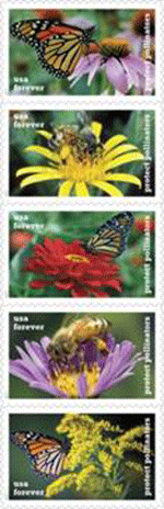 This stamp pays tribute to the beauty and importance of pollinators with stamps depicting two of our continent’s most iconic, the monarch butterfly and the western honeybee, each shown industriously pollinating a variety of plants native to North America. These particular species exemplify the ecological service provided by all pollinators, which include other insects, birds, and bats. Crop pollination by insects contributes approximately $15 billion of produce to the U. S. economy each year. Trending declines in their populations alert us that pollinators are helped by planting pollinator gardens with native flowers or heirloom varieties of fruits and vegetables. Art director Derry Noyes designed this stamp pane with existing photographs.
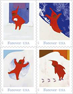 features a different illustration of main character Peter exploring and playing in his neighborhood while wearing his iconic red snowsuit. The images include: Peter forming a snowball, Peter sliding down a mountain of snow, Peter making a snow angel, and Peter leaving footprints in the snow. Art director Antonio Alcalá designed the stamps with Ezra Jack Keat’s original art.
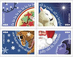 The 2017 Christmas season will be celebrated with four new Forever stamps featuring images that illustrate four beloved Christmas carols: “Jingle Bells,” “Deck the Halls,” “Silent Night,” and “Jolly Old Saint Nicholas. ” Familiar lines from each song highlight the individual stamps. Shades of blue in the stamp backgrounds evoke the evening scenes from the four carols. This booklet of 20 stamps includes five of each design. The late Howard E. Paine was art director; artist Steve McCracken created the original art.
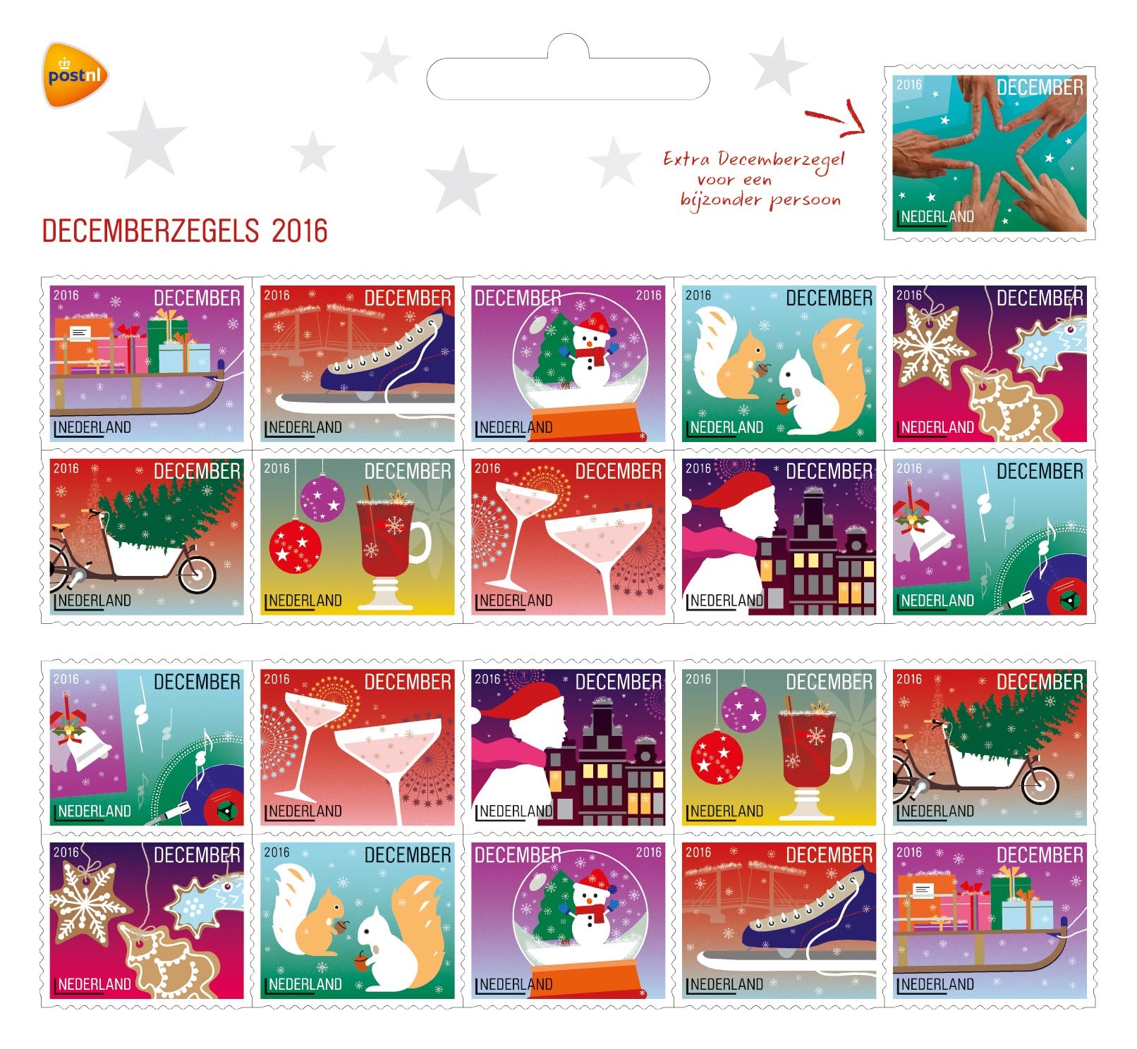 About the design:
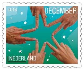 champagne glasses, a woman wearing a knit cap and scarf on a cold, wintery night and a record player with cheery Christmas music. Each stamp features gradient rich, warm colours. The atmosphere on the stamps is enriched with crystal shapes each with a different function – from fireworks to snowflakes, from champagne bubbles to even the shiny reflections on the ornaments and the single on the record player. There is a certain, unique logic to each of the colours. For example, the squirrels are set in a green environment, the skate is on blue ice and the drawbridge is shown against the red evening afterglow. The background colour on the extra December stamp was taken from the same palette as the other stamps. The image is a picture of five hands spread out to make a star. This image symbolises unity and connecting people and goes nicely with the thought of using this stamp to send a card to a special person. The font used for the typography is the modern, round, friendly and modest Brauer by Philippe Desarzens of Elektrokosmos from 1999/2006, an updated version of Pierre Miedinger’s font of the same name from 1974.
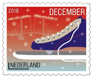 Stamp size: 25.3 x 20.8 mm
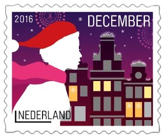 Edgar Smaling and Carlo Elias of Smel have designed stamps for PostNL before. The last ones were the 2014 December stamps. “This new assignment was a complete surprise,” Carlo says, “and of course again a great honour. PostNL asked us to build on the style we developed in 2014, but not to copy it completely. Which was a good thing, as that wouldn’t do our style justice. We also had other concepts to deal with. Ten different illustrations instead of twenty. A horizontal format instead of a vertical one. And the extra 21st stamp to surprise a special person with a Christmas greeting.” For the illustrations, Smel looked for modern subjects. Edgar: “Of course we have the classics like Christmas trees, ornaments, bells and snowflakes. But it also features contemporary images. The modern cargo bicycle used to transport children for example, with the Christmas tree in it. The comeback of the record player with the renewed interest in vinyl. The mulled wine with star anise. And the German Lebkuchen, fast gaining popularity in our country as Christmas cookies. We focused on the same principles in the selection of each subject: recognition, sharing, warmth and cosiness.” “We also revised our illustration style”, Carlo explains. “We went for a two-dimensional approach with a stronger focus on the larger picture than on finer lines. No 3D, no classic perspective, but we did create depth through a clever use of colour and layers. Look at the Magere Brug (“Skinny Bridge”) stamp. Positioning the skate on the foreground and blurring the colour of the bridge automatically creates distance. This sheetlet contains lots of dynamic images. The snow globe is tilted, because it will only snow once you shake it. The sleigh is also tilted up
  somewhat, a logical direction that refers to pulling the rope. The cargo bicycle is riding into the stamp, the woman is rushing along the canal houses, the champagne glasses are moving towards each other and the record on the record table is spinning. That movement is counter-balanced by the calm of the illustrations on the stamps with the mulled wine and the squirrels. That was how we brought balance to all of it. There is a similar balance in our choice of location – half of the stories are set outside and the other half is inside.” As is often the case in Smel’s work, these illustrations again contain subtle details. Edgar: “There are many different ways to depict the arm of the record player. The art is in leaving things out while still maintaining recognisability. The details are an essential part of the illustrations. Take the nostalgic triangle on the single or the mirrored squirrels, for example. Or look at the cinnamon stick in the mulled wine, next to the star anise. You can even see the lemon peel floating in the glass. The shape of the star anise is blown up in the background. It’s barely visible, but it’s there. We applied the same technique for the windmills on the back of the stamp sheetlet.” Carlo calls it “a challenge to find the right balance between what most people like and what we think is a good design. What we make is usually pert and unique. So for example, giving an unaesthetic subject like Lebkuchen its own aesthetic was quite the challenge. With all the necessary details. All stamps were designed as miniature stories on a miniature scale, but I dare say the design would have the same strength and effect if it were blown up to poster size.” About the designers The 2016 December stamp sheet was designed by Edgar Smaling and Carlo Elias, founders of Smel. Both designers studied between 1993 and 1997 at the Academy of Art and Design St. Joost in Breda. Smel, founded in 2001, consists of an energetic team of dedicated, multidisciplinary creative professionals, working for clients in government, fashion, design, art, photography and architecture. They design strategic corporate identities, magazines, books, house styles and websites. In doing so, they aim for airy shape concepts subtly connecting quality and the power of imagination. Smel provided the designs for the 2009 Summer stamps, the 125 Years of Carré stamps in 2012 and the December stamps in 2014.
 NORTH POLE — Yes, Virginia, there is a Santa Claus — and the U.S. Postal Service can help you prove it when Santa replies to your child’s letter — complete with a North Pole postmark.
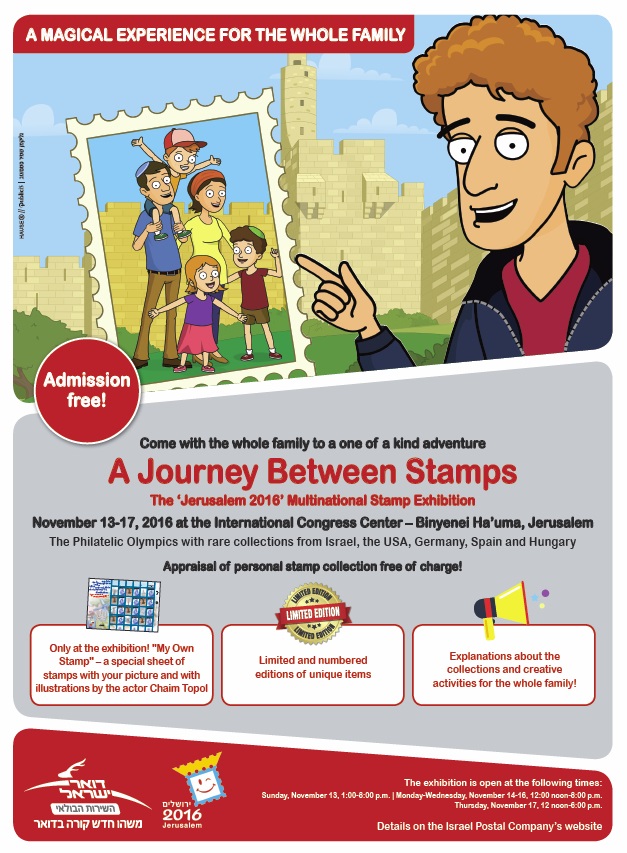 Israel Post says its retail and marketing operations will be at the show and unable to fulfill orders or answer e-mails during that period.
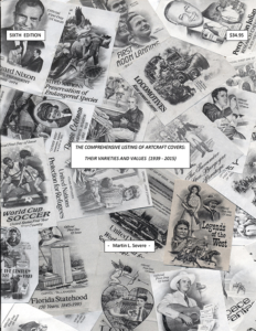 The Comprehensive Listing of ArtCraft Covers: Their Varieties and Values (1939-2015) is the Sixth (Compendium) Edition in this mammoth project which documents all known ArtCraft covers and varieties produced by the Washington Press (Washington Stamp Exchange). The Listing references over 15,000 collectibles, spanning the company’s full 76 years of production, and has been affectionately labeled “The ArtCraft Bible” by the active community of ArtCraft collectors worldwide.
 Is there one unalterable truth for stamp collectors? If so, I would propose that it is a universal feeling that U.S. stamp design is less than spectacular, and many of us share a belief that if we were running things, we could do better. Perhaps.
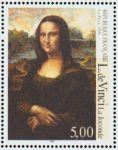 While any or all of these criticisms may have merit, it is all second-guessing. And my guess is that all artists — even the great ones — had to put up with similar carping (“That’s supposed to be a smile on Mona Lisa? Looks more like she’s
 In my view about 10% of U.S. issues really rank high on both subject and design scales.
 subject.
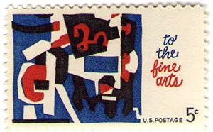 I well remember when modern art first made its appearance on a U.S. stamp with the 5¢ “Fine Arts” issue of 1964 (left). One would have thought listening to the reaction of collectors that the world as we knew it had come to an end.
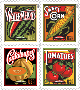 I personally don’t enjoy much of the poster art that has been and is used. The “Summer Harvest” issue is an example (right). And as to modern art, I think much of it is a fraud on the public when presented as works of inspiration possessed of deep and profound meaning. And yet, a portion of the public buys it and goes to see it in museums.
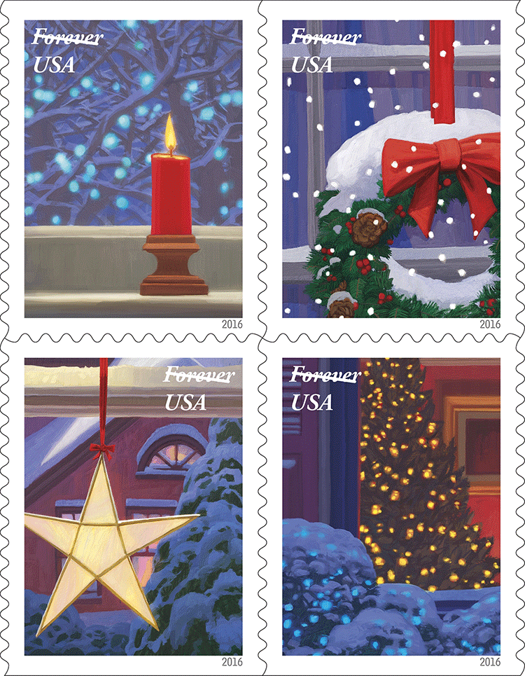
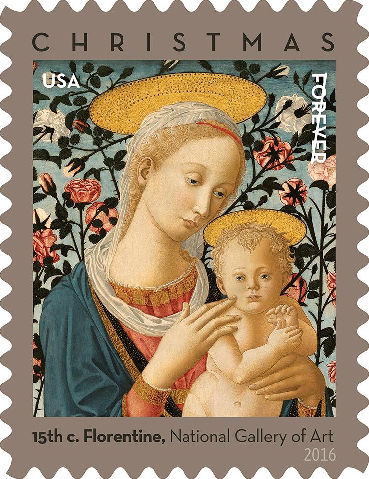
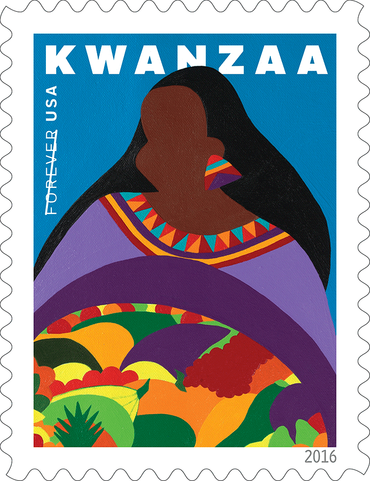
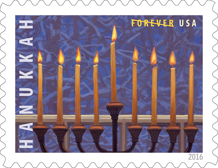
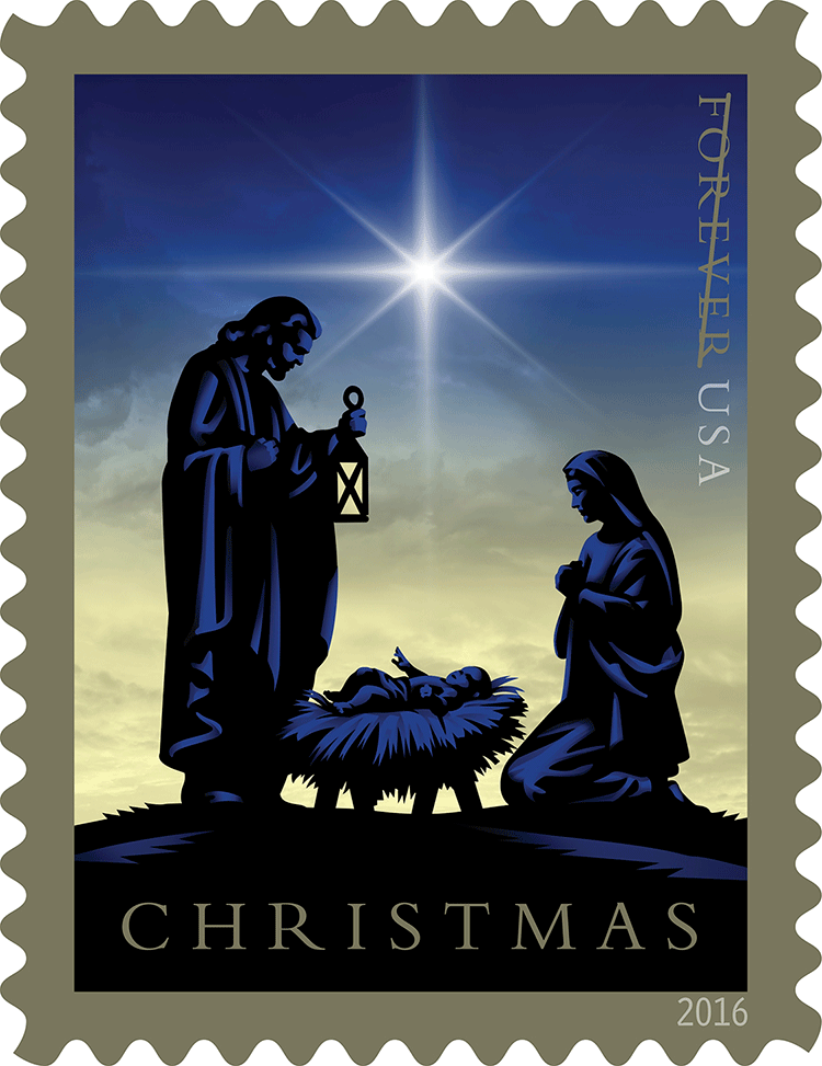 Other holiday-season issues: