
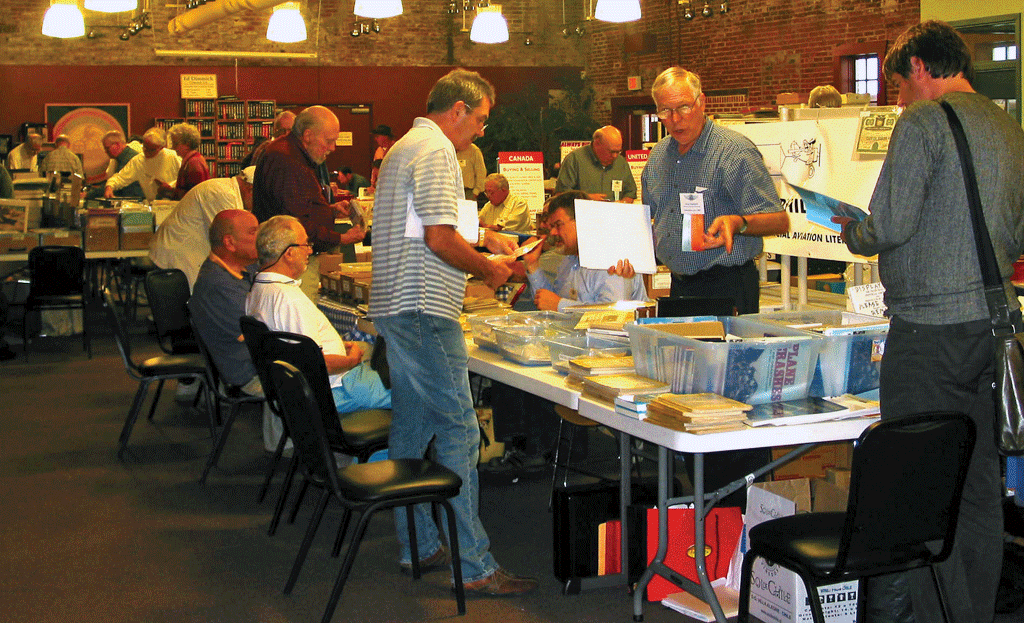
Dealing With Stamp Design
by John M. Hotchner
 John wrote this column several years ago, but it is as pertinent now as it was then: Collectors still complain about U.S. stamp designs.
Is there one unalterable truth for stamp collectors? If so, I would propose that it is a universal feeling that US stamp design is less than spectacular, and many of us share a belief that if we were running things, we could do better. Perhaps.
In the past two days, I have heard complaints about the Forget-me-not stamp (It needs a 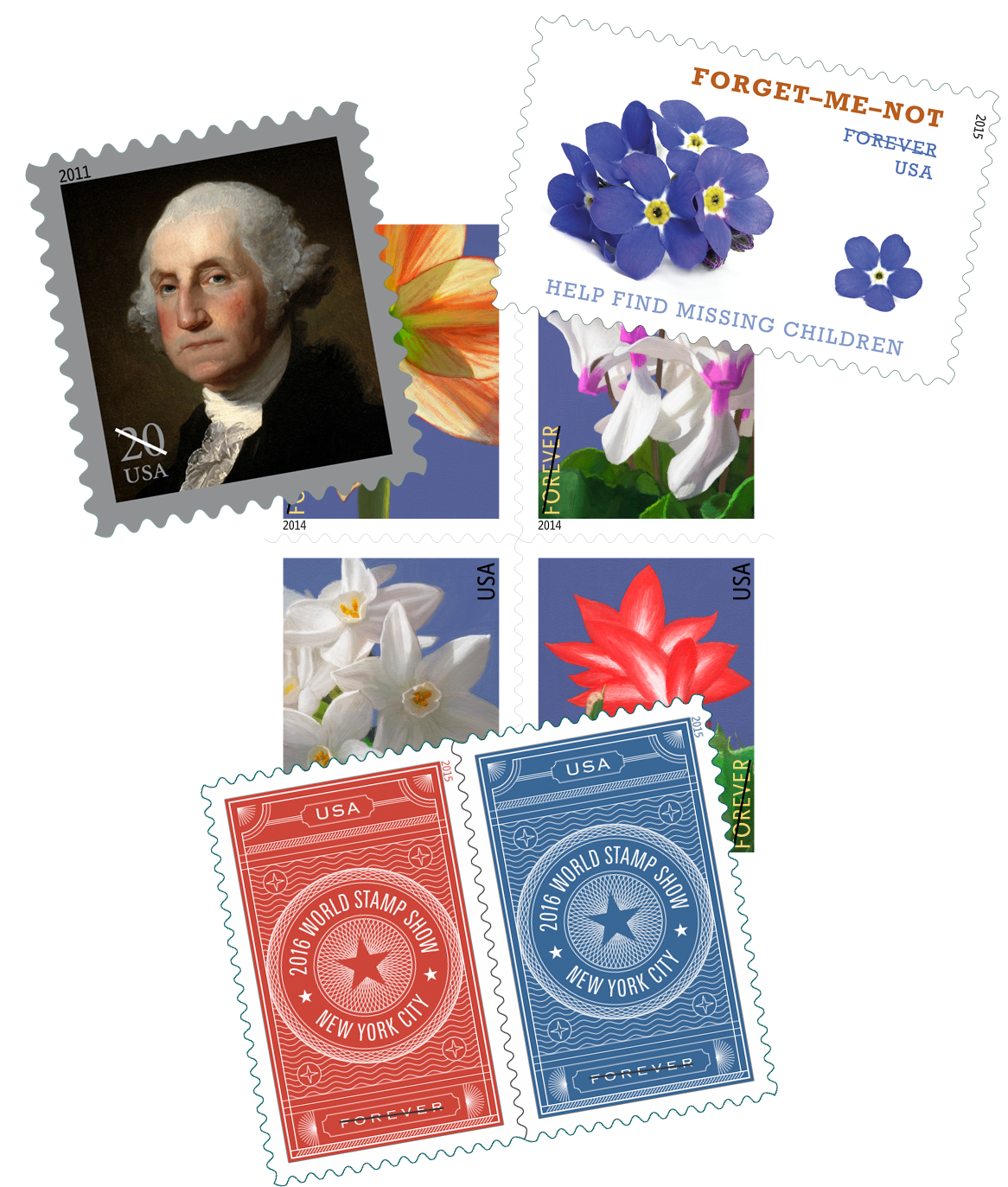 frame to focus the design), the last George Washington stamp (It is too dark and George is lost in the dark framing), the Winter Flowers issue of 2014 (They look too much like Easter Seals), and the World Stamp Show publicity stamps (A lost opportunity to picture stamp collecting or classic American stamps.)
While any or all of these criticisms may have merit, it is all second-guessing. And my guess is that all artists – even the great ones – had to put up with similar carping (“That’s supposed to be a smile on Mona Lisa? Looks more like she’s suffering a gas attack after too many baked beans!”)
Well, we as collectors have the right to criticize, but it is all hot air unless we actually do something about it. And there are several strategies.
- Don’t buy what you don’t like. Avoid such issues for use as postage, for your albums, and for gifts for children and grandchildren. The USPS tracks closely what sells, and just as important, what doesn’t. Vote with your wallet.
- Learn how to draw a neat “X” in the album page box for stamps you w
 ill not add to your collection because you don’t like the art style, or you class them as just plain ugly. You are the arbiter of what makes the cut. And no one has to agree with you.
 - Create a Hall of Shame – a special section of your album in which you place all the stamps that annoy you.
- If you have more stamps in that section than on your printed album pages, maybe it is time to curtail your collecting by ending at a given year.

You will need to be careful to differentiate whether it is the design you dislike or the subject. Sometimes, our view can be so colored by dislike of the subject that no design will hit the mark. On the other side of that fence, the flood of multi-colored fruits, flowers, foliage, fauna, flyers, food, and flags may have great popularity with the American public, but only a few stand out as clever and original depictions.
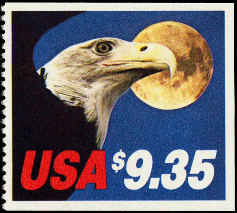
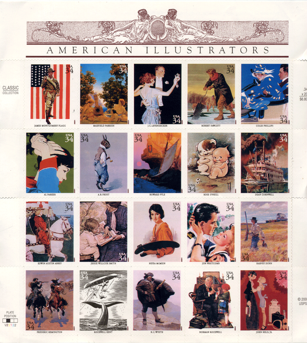
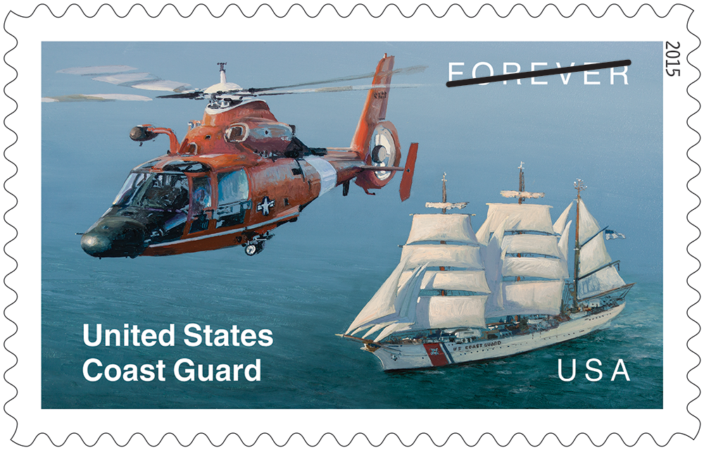 In my view about 10% of U.S. issues really rank high on both subject and design scales. One in the current crop is the U.S. Coast Guard commemorative released August 4, 2015 [left]. Full disclosure: I was involved in development of the subject while a member of the Citizens’ Stamp Advisory Committee (1998-2010) but it had not gone to the artists at the point that I timed out from the Committee. So I was surprised and
 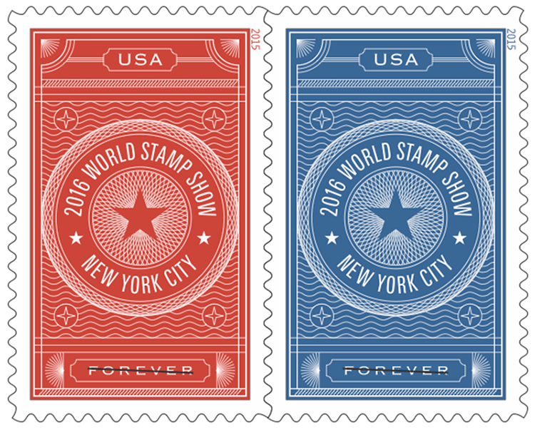 delighted by the exceptional art that illustrates the subject.
Contrast that with the New York 2016 publicity pair [right] – a good subject that in my opinion is a generic and uninspiring design that will inspire no one to attend the show.
What can we reasonably expect from U.S. stamp design? Certainly, we need to recognize that in stamps as in art generally, there will be a range of style. This is right and proper as stamps are a reflection of the breadth and diversity of American art; much like the stamp program having a commission to reflect the breadth and diversity of America itself and its population.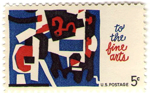
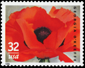
I well remember when modern art first made its appearance on a U.S. stamp with the 5¢ “Fine Arts” issue of 1964 [left]. One would have thought listening to the reaction of collectors that the world as we knew it had come to an end.
There were similar protests when children’s art in the form of stick figures on the 20¢  Family Unity issue 1984 [right] was included. And when cartoon-type art made its first appearance with the 1991 “Comedians” set of 29¢ stamps using the pen-and-ink impressions of Al Hirschfeld.
They were later followed by actual cartoons from the comics section of our daily press.
The latter complaints were especially mystifying to me as both political cartoons and the so-called “funny papers” are features of American journalism that have been developed to a high level in the United States. Stamps celebrating these American institutions are right on the mark, and the art is appropriate.
I personally don’t enjoy much of the poster art that has been and is used. The current 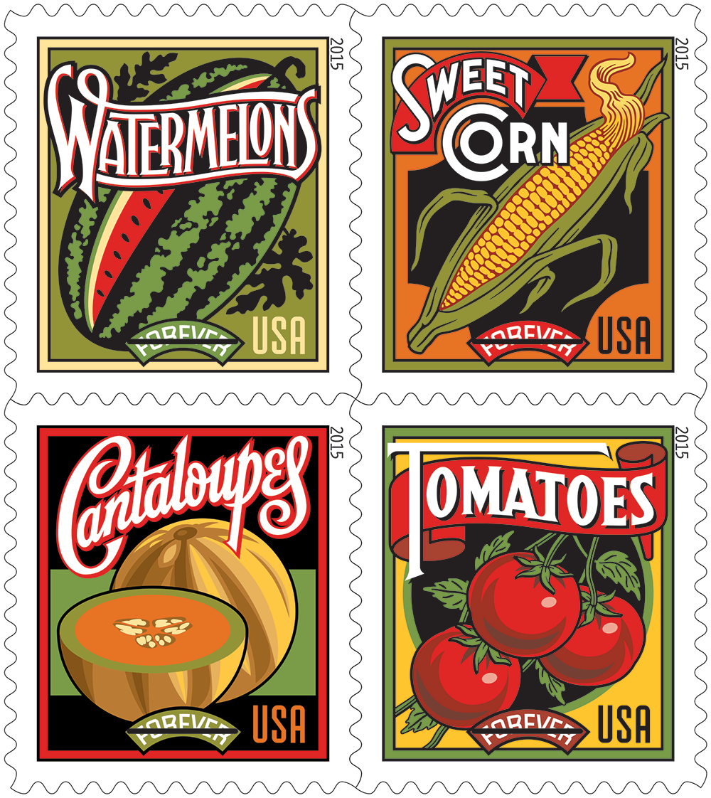 “Summer Harvest” issue [left] is an example. And as to modern art, I think of it as a giant fraud on the public when presented as works of inspiration possessed of deep and profound meaning. And yet, a portion of the public buys it and goes to see it in museums.
Can the U.S. stamp program ignore that? Should it? Regretfully, I have to admit that it has its place.
So, my conclusion is that it is irrational to expect that every issue will please every collector. In fact, the USPS can expect criticism of some sort on the majority of its issuances if for no other reason than that the  American public has a wide variety of likes and dislikes, and a wide variance of art appreciation, from those of us who merely know what we like, to those of us educated to know what we should like.
Which means that criticism will be plentiful and conflicting. And the USPS needs to listen to it, but act on it sparingly.
Should you wish to comment on this editorial, or have questions or ideas you would like to have explored in a future column, please write to John Hotchner, VSC Contributor, P.O. Box 1125, Falls Church, VA 22041-0125, or email, putting “VSC” in the subject line.
Or comment right here.


 And I feel the same way about stamps. If money and time were not an issue I would collect the entire world. That’s how I started out collecting 70 years ago, but as a matter of practicality I had to whittle my efforts down to about 25 countries that I still play with today. A few are serious collections with errors, plate varieties, multiples, sheet markings, covers, and other fodder of the specialist; but most are simply fill-in-the-blank album collections that I enjoy.
 She chose not to be boxed in by countries, dates, subjects, or art form. When it came to choosing stamps for her collection, she couldn’t provide a want list. Looking over dealer stocks, or club auction lots, stamps or sets would say to her, “Buy me.” Sometimes she knew why, and other times she didn’t, but more often than not, her response was “Absolutely!” She was not trying to build a complete or valuable collection. Rather she was engaged in maximizing her enjoyment of her hobby.
 It’s common these days for collectors to box ourselves in from the start. We collect a country (perhaps limited to a span of years), or a theme/topic, and ignore everything outside our box. But I’d like to advocate for spreading your wings. Try something new: a country you identify with, a different theme, stamps that seem to you to be especially attractive or meaningful, stamps showing places you would like to visit but probably never will!
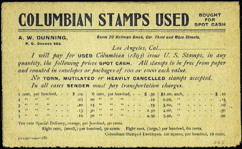
 You can go through tens of thousands of these cheap stamps and not find one, but if you do, you will be well rewarded as the catalogue value for a used single is $600.
 he bought only what he could afford, and what he could afford to lose; because when it came time to sell in the early 1960s, the market for sheets of U.S. commemoratives had tanked.
 So, when all the little Johnnies and Janies got to college age in the late ‘50s and early ‘60s, the tens (if not hundreds) of thousands who had the same idea went to the well to collect on their investments, and found that there was far more supply than demand. If they could get 75% of face for routine stamps and full face for plate blocks, they were doing very well. Crank in the reduced purchasing power of the dollar, thanks to inflation, and even the realizations received were not nearly high enough to cover the initial outlay.
 printings that have topical value — such as Space-related, some sports heroes, the first stamps of a continuing series (such as Black Heritage) — still bring a modest premium. Also, some booklet panes, line pairs, plate number coils, and souvenir sheets. But for the vast majority of post WWII stamps, people selling them in quantity are now able to realize a mere 50-60% of face. And even some booth-holders at stamp shows who used to offer sheets of stamps to collectors for face value, are now forced to undercut their prior pricing in order to remain competitive.
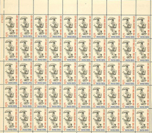 Now, don’t expect this dynamic to hold for single stamps being sold to collectors. Dealers who retail modern- era U.S. singles have to do more than buy and sell in large quantities. Even if they buy cheap, they have to break up sheets, put single stamps in glassines or make up year sets, advertise by individual Scott numbers, provide storage space for what is pending sale, and haul their wares to wherever they retail; or pay commissions if they are selling online using established websites. It all takes an investment of time and space, in addition to the investment of money. So you will pay more than face for single stamps to complete your album pages.
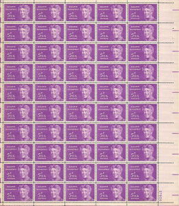 The holder of quantities of U.S. mint, often in my experience survivors of the original purchaser, rarely have a clue that what they have is not so much windfall as white elephant. I can’t count the number of times I’ve had to explain to the new owners the facts of philatelic life; that they have only a few alternatives:
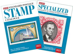 In the last three editions, this column looked at what it takes to get started as a stamp collector, choosing what to collect, and how to get stamps for your collection, and how a Scott Standard Postage Stamp Catalogue can help you identify your stamps and build your collection. This may also help if you don’t have a catalog, and are simply trying to find the correct box in a stamp album where your stamp should be placed.
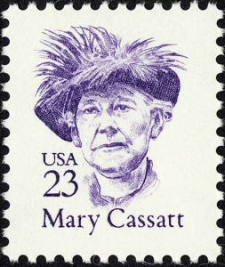 The 23¢ purple stamp showing Mary Cassatt has a couple of helpful attributes in addition to Cassatt herself. It is an airy design with lots of white background, identifies the country of issue as “USA” and it has a value of 23¢.
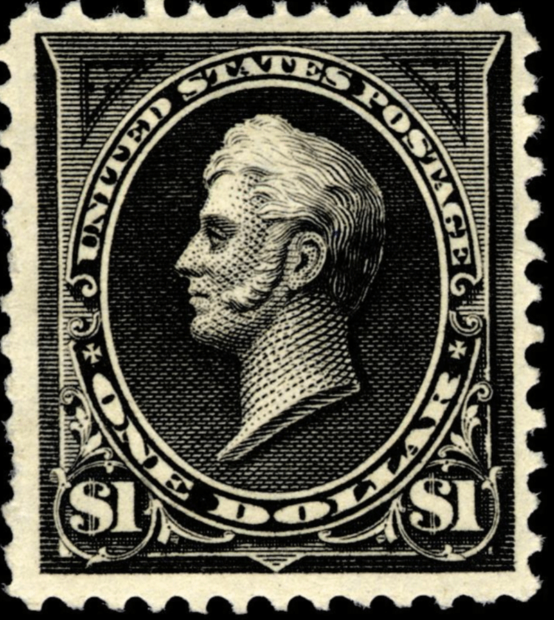
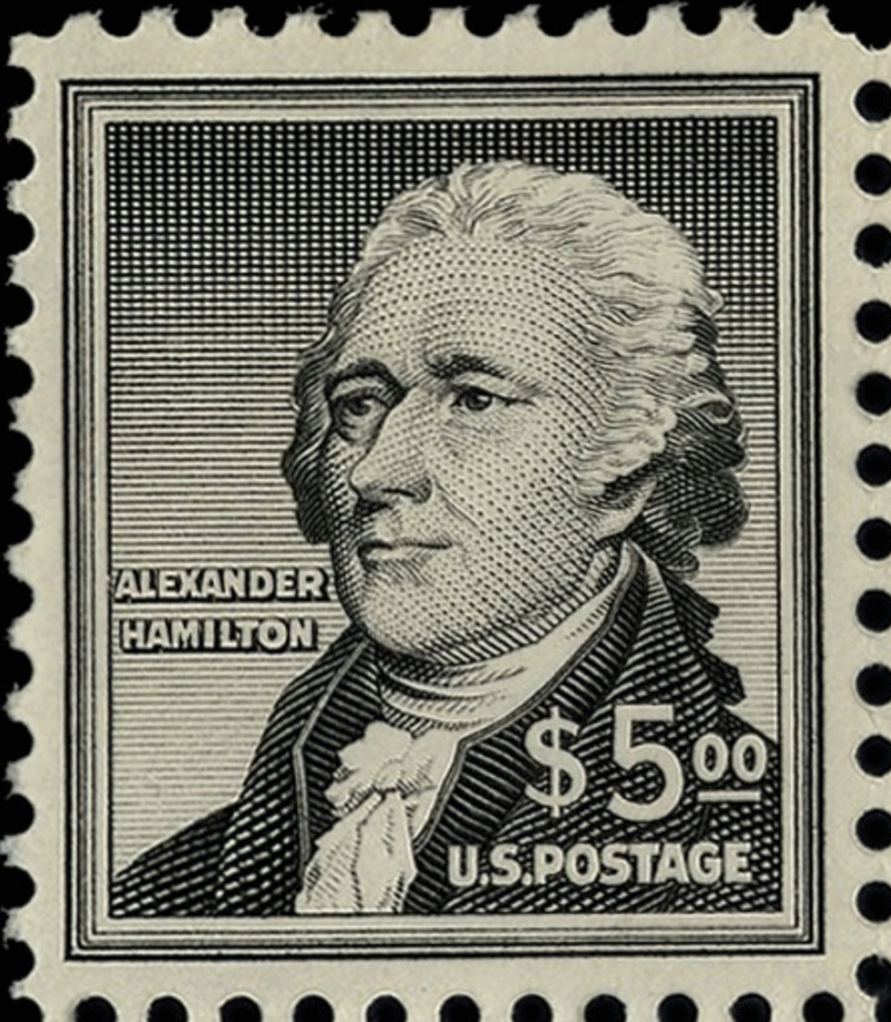
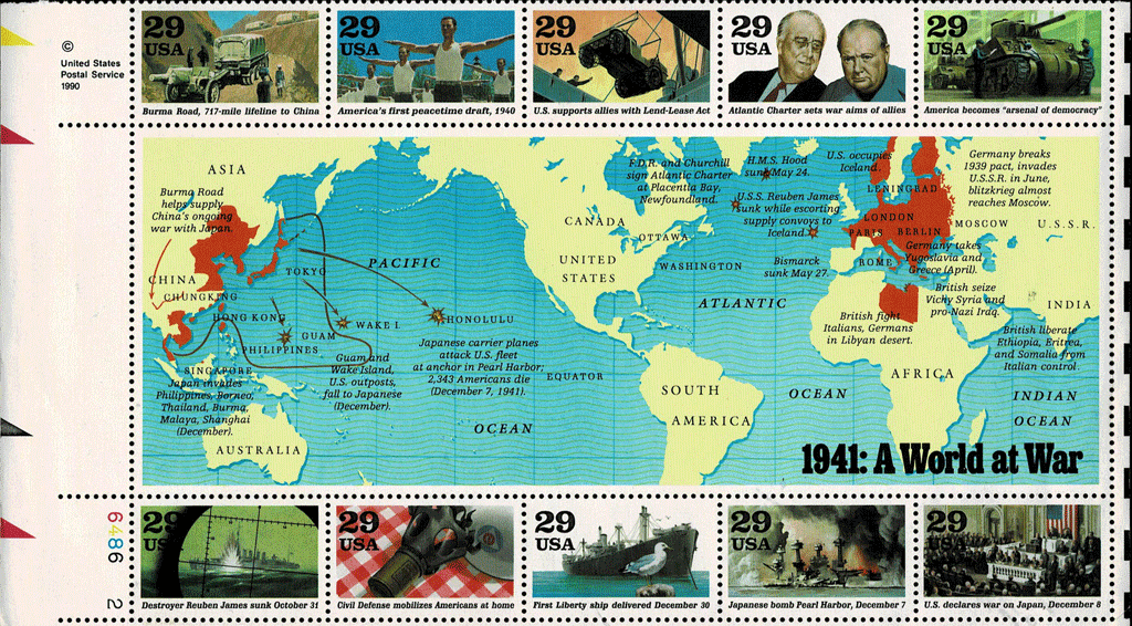
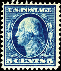 If we did not have the subject index, the design itself would be a great pointer. American stamps into the mid-20th Century tended to have little white space, single color designs, and a lot of fancy elements that filled the design space. A good example is the 5¢ George Washington stamp. It says across the top “U.S. Postage,” has laurel leaves around the portrait of Washington, spells out the word “Cents,” and has ribbons under the portrait. This level of complexity marks this stamp as being from the first part of the 20th Century. Not only were the designs “heavy,” but they were repetitive. Almost every U.S. stamp issued into the 1920s pictured Washington, Ben Franklin, or a portrait from a very limited cast of characters emphasizing presidents, major political figures or military heroes. Another feature to notice between the 23¢ Cassatt and the 5¢ Washington is the method of showing the country name: “U.S.” or “USA” replaced the spelled-out version or “U.S. Postage” on most stamps starting in the mid-’60s. So, the heavy design and the “U.S. Postage” again mark the 5¢ stamp as something from early in the 20th Century. Here the Index is not a lot of help as there are dozens of stamps picturing or honoring George Washington. Leafing through the catalogue for the early part of the century will quickly identify the set of 1918-1922 Washington-Franklin stamps as being where the 5¢ Washington comes from. The problem is that there are no fewer than 14 different versions of this 5¢ design — sheet stamps, coils, different perforations, different watermarks, different papers. (And the 5¢ is easy compared to the 1¢, 2¢, and 3¢ stamps of the Washington-Franklin series!)
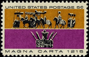 The multi-color 5¢ “poster art” stamp labeled “Magna Carta, 1215” is a commemorative, so will most likely be found in the 5¢ rate era. “United States Postage” is spelled out. The label is also listed in the Index, where we learn it is Scott No. 1265.
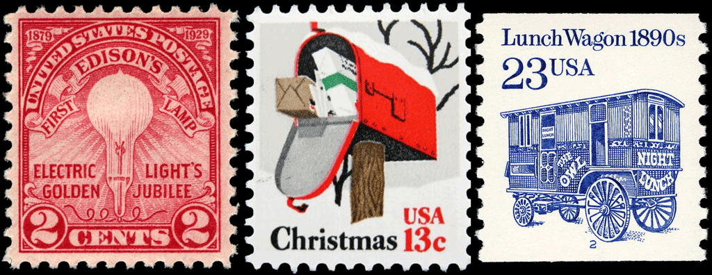
 Transportation coil series, which began in 1981. It is in the Index, as Scott #2464.
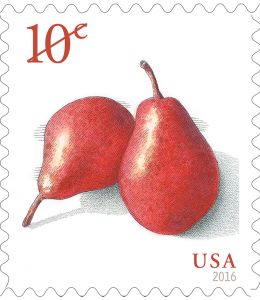 Finally, the 10¢ Red Pears is a design with lots of white space. The Index does not list Red Pears, but does list several stamps under “Pears”. Looking at the candidates we see that the design was first used for a coil in 2016, but our stamp is not a coil, and it has the date “2017” in the lower left corner. So it is the sheet issue (with perforations around all four sides) identified as Scott #5178.
 each stamp is assigned a number that becomes its universally understood reference point for all collectors and dealers. The latter is important when you look at printed price lists, offerings on Internet sites, or in auction catalogues.
 their tables at stamp shows. You can also get together with another collector to buy catalogues that you can share.
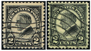 Take a look at the picture on the right, in which are copies of Scott #610 and #613. The former, a perf 11×11, flat plate-printed black stamp, is catalogued 25¢ used. The latter, a perf 11×11 rotary press printing in black, catalogues $37,500. The difference is a quarter millimeter in the height of the stamp design!

