[press release – April 6th]
 U.S. Postal Service Reveals New Forever Stamp Design Honoring Former President George H.W. Bush
WASHINGTON — The U.S. Postal Service today announced it will issue a commemorative Forever stamp honoring former President George H.W. Bush, who died Nov. 30, 2018, at the age of 94.
The 41st president guided the United States through the end of the Cold War and drove the creation of a multinational coalition that successfully forced Iraq to withdraw from Kuwait in the Persian Gulf War.
An advocate for public service, Bush explained his vision of a nation of volunteers as “a brilliant diversity spread like stars, like a thousand points of light in a broad and peaceful sky.” 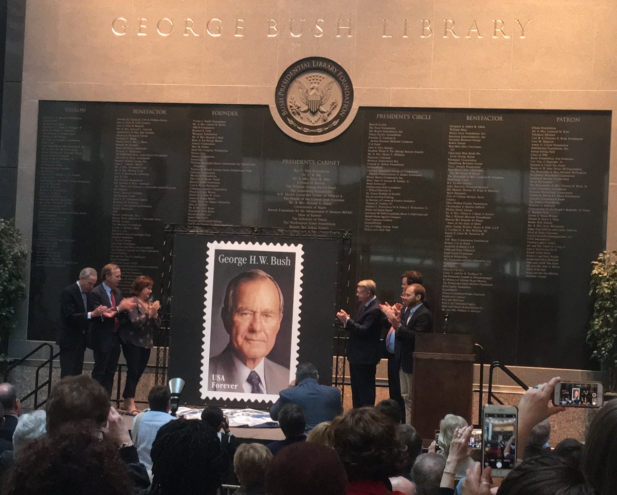 [The stamp design was unveiled Saturday at the Bush Library, above]
The stamp art is a portrait of Bush painted by award-winning artist Michael J. Deas. It is based on a 1997 photograph taken by Timothy Greenfield-Sanders. Phil Jordan was the art director and stamp designer.
The first-day-of-issue ceremony will be held on the president’s birthday, June 12, at the George H.W. Bush Presidential Library and Museum, 1000 George Bush Drive West, College Station, TX. (shown below)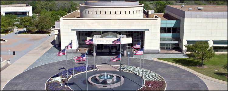
Robert M. Duncan, chairman of the U.S. Postal Service Board of Governors, will serve as the dedicating official.
The stamp will be available for pre-order April 6, 2019, for delivery on or after the June 12 ceremony at usps.com/stamps, or by phone at 800-Stamp24 (800-782-6724).
The stamp is being issued as a Forever stamp, which will always be equal in value to the current First-Class Mail 1-ounce price.
Our initial posting here:
We can expect a stamp on or about June 12th for President George H.W. Bush, who passed away December 1st at the age of 94. He was born June 12, 1924, and U.S. custom is that former presidents are honored with a stamp on their first birthday after their death.
Although he was born in Milton, Mass., the family compound where he spent a significant part of each year is in Kennebunkport, Maine. He spent the rest of the year in Houston.
The USPS has not confirmed release of this stamp.
Here’s a larger version of this stamp: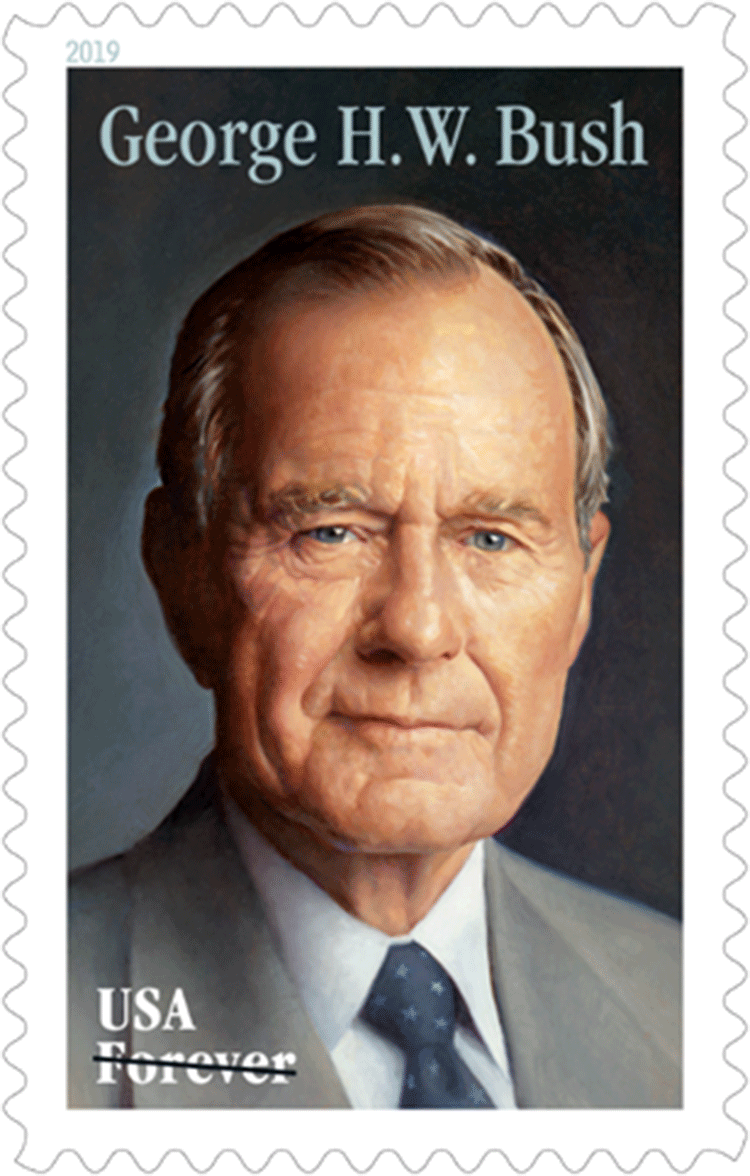
Further details and information will appear below the line, in the order received.
From the May 9th Postal Bulletin:
On June 12, 2019, in College Station, TX, the U.S. Postal Service will issue the George H.W. Bush stamp (Forever priced at the First-Class Mail rate) in one design, in a pressure-sensitive adhesive pane of 20 stamps (Item 478200). The stamp will go on sale nationwide June 12, 2019. The George H.W. Bush stamp must not be sold or canceled before the June 12th first-day-of-issue.
This stamp honors former President George H.W. Bush, who died on November 30, 2018, at the age of 94. The stamp art is a portrait of Bush painted by award-winning artist Michael J. Deas. It is based on a 1997 photograph taken by Timothy Greenfield-Sanders. The 41st president of the United States guided the U.S. through the end of the Cold War and drove the creation of a multinational coalition that successfully forced Iraq to withdraw from Kuwait in the Persian Gulf War. An advocate for public service, Bush explained his vision of a nation of volunteers as “a brilliant diversity spread like stars, like a thousand points of light in a broad and peaceful sky.” Phil Jordan was the art director and stamp designer.
Availability to Post Offices: Item 478200, George H.W. Bush (Forever Priced at the First-Class Mail Rate) Commemorative Pane of 20 Stamps: Stamp Fulfillment Services will make an automatic push distribution to Post Offices of a quantity to cover approximately 30 days of sales.
A special dedication postmark is available to local post offices:  How to Order the First-Day-of-Issue Postmark:
Customers have 120 days to obtain the first-day-of-issue postmark by mail. They may purchase new stamps at their local Post Office™ or at The Postal Store website at usps.com/shop. They must affix the stamps to envelopes of their choice, address the envelopes (to themselves or others), and place them in a larger envelope addressed to:
FDOI – George H.W. Bush Stamp
USPS Stamp Fulfillment Services
8300 NE Underground Drive, Suite 300
Kansas City, MO 64144-9900
After applying the first-day-of-issue postmark, the Postal Service will return the envelopes through the mail. There is no charge for the postmark up to a quantity of 50. There is a 5-cent charge for each additional postmark over 50. All orders must be postmarked by October 12, 2019.
Technical Specifications:
Issue: George H.W. Bush Stamp
Item Number: 478200
Denomination & Type of Issue: First-Class Mail Forever
Format: Pane of 20 (1 design)
Series: N/A
Issue Date & City: June 12, 2019, College Station, TX 77840
Art Director: Phil Jordan, Falls Church, VA
Designer: Phil Jordan, Falls Church, VA
Typographer: Phil Jordan, Falls Church, VA
Artist: Michael J. Deas, New Orleans, LA
Modeler: Sandra Lane/Michelle Finn
Manufacturing Process: Offset, Microprint
Printer: Banknote Corporation of America
Press Type: Alprinta 74
Stamps per Pane: 20
Print Quantity: 40,000,000 stamps
Paper Type: Phosphor, Block Tag
Adhesive Type: Pressure-sensitive
Processed at: Banknote Corporation of America
Colors: Pantone 5513, Cyan, Magenta, Yellow, Black
Stamp Orientation: Vertical
Image Area (w x h): 0.84 x 1.42 in/21.336 x 36.068 mm
Overall Size (w x h): 0.98 x 1.56 in/24.892 x 39.624 mm
Full Pane Size (w x h): 5.92 x 7.24 in/150.368 x 183.896 mm
Press Sheet Size (w x h): 11.84 x 21.72 in/300.736 x 551.688 mm
Plate Size: 240 stamps per revolution
Plate Numbers: “B” followed by five (5) single digits
Marginal Markings:
Front: Plate numbers in four corners
Back: ©2019 USPS • USPS logo • Two barcodes (478200) • Plate position diagram • Promotional text
Updated May 18th:
Here are scratch versions of the first-day cancels: 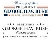
Updated May 23rd:
[press release]
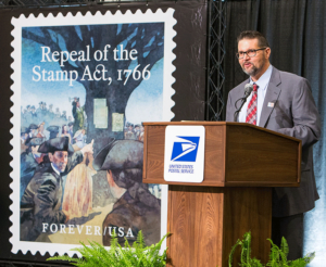
U.S. Postal Service Honoring Former President George H.W. Bush with Forever Stamp
First Day of Issue Event June 12th at Bush Center in College Station, Acknowledging President Bush’s 95th Birthday
What: The U.S. Postal Service is issuing a Forever stamp honoring George Herbert Walker Bush, America’s 41st president, who died on November 30, 2018.
The first day of issue event for the stamps is free and open to the public. News of the stamp is being shared with the hashtags #GHWBushStamp or #USPresidentsStamps.
Who: Pierce Bush, CEO, Big Brothers Big Sisters Lone Star, Grandson of George H.W. Bush
Hon. Robert M. Duncan, Chairman, Board of Governors, U.S. Postal Service, and Dedicating Official
David B. Jones, President and CEO, George & Barbara Bush Foundation
Warren Finch, Director, George H.W. Bush Presidential Library and Museum
Amb. Chase Untermeyer, Founding Chairman, Qatar-America Institute
Jean Becker, Former Chief of Staff, Office of George H.W. Bush
When: Wednesday, June 12, 2019, at 11 a.m. CDT
Where: Annenberg Presidential Conference Center
Frymire Auditorium
1002 George Bush Drive West
College Station, TX 77845
RSVP: Dedication ceremony attendees are encouraged to RSVP at usps.com/georgehwbush.
Background: George Herbert Walker Bush (1924–2018), served as America’s 41st president from 1989 to 1993. During his term in office, he guided the U.S. and its allies to a peaceful end of the Cold War, helped reunify Germany, and led a multinational coalition that successfully forced Iraq to withdraw from Kuwait during the Persian Gulf War.
On the domestic front, President Bush signed historic civil rights legislation to integrate Americans with disabilities more fully into society. His Clean Air Act tightened air pollution standards and dramatically reduced urban smog and acid rain. George Bush also called and inspired millions of Americans to serve their communities with his vision of “a thousand points of light.”
In addition to serving as vice president under President Reagan, Bush held a number of other senior leadership roles including Ambassador to the United Nations, Chairman of the Republican National Committee, Chief of the U.S. Liaison Office in China, and Director of Central Intelligence.
George H.W. Bush was the first sitting vice president elected president since Martin van Buren in 1836, and one of only two presidents to have a son who also served as Commander-in-Chief.
Customers may purchase stamps and other philatelic products through the Postal Store at usps.com/shop, by calling 800-STAMP24 (800-782-6724), by mail through USA Philatelic or at Post Office locations nationwide.
Updated May 24th:
Here are the first-day postmarks for this issue: 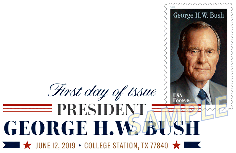 The Digital Color Postmark for this issue measures 2.94″x0.98″
 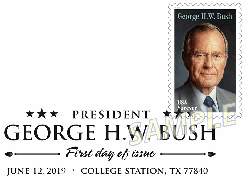 The B&W pictorial measures 2.93″x0.94″
 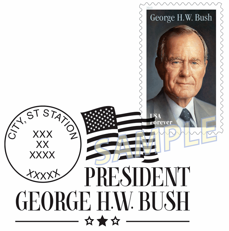 The “special” postmark, for other post offices, measures 2.24″x1.46″
Updated August 7th:
The Scott catalogue number for this issue is 5393.

 American Philatelic Society executive director Scott English has signed a contract renewal, through August 2021. (English is shown at right at a first-day ceremony in 2016.)
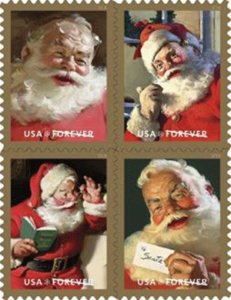 5332 (50¢) Christmas – Head of Santa Claus
 A U.S. Treasury Department task force, ordered by President Trump, is proposing an overhaul to the U.S. Postal Service, including (and perhaps in particular) how it prices packages delivered by e-commerce companies like Amazon.
 Sustainable Path Forward, provides a series of recommendations to overhaul the United States Postal Service’s (USPS) business model in order to return it to sustainability without shifting additional costs to taxpayers.
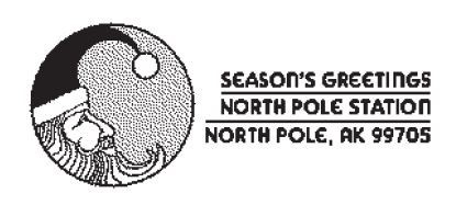 WASHINGTON — Yes, Virginia, there is a Santa Claus — and the U.S. Postal Service can help you prove it when Santa replies to your child’s letter — complete with a North Pole postmark (right).
 “Letters from Santa” must be received by the Anchorage, AK, postmaster no later than Dec. 15. Santa’s helpers at the Postal Service will take care of the rest.
 A familiar sight on public buildings and private homes alike, the American flag has been portrayed in myriad ways on U.S. postage. This stamped envelope features a graphic design of the flag that evokes a rich sense of history even as it presents a recognizable icon in a fresh, contemporary way. Kit Hinrichs created the artwork for this stamped envelope. Ethel Kessler served as art director.
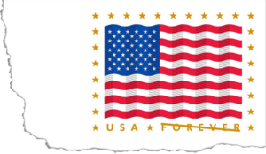 A familiar sight on public buildings and private homes alike, the American flag has been portrayed in myriad ways on U.S. postage. This stamped envelope features a graphic design of the flag that evokes a rich sense of history even as it presents a recognizable icon in a fresh, contemporary way. Kit Hinrichs created the artwork for this stamped envelope. Ethel Kessler served as art director.
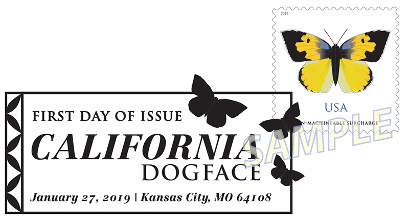
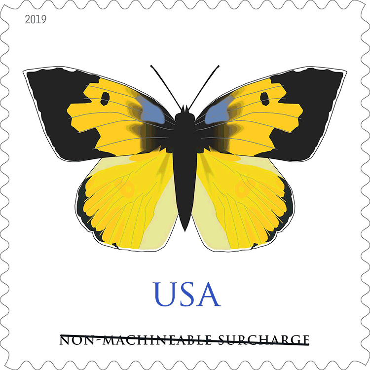 The California dogface graces the seventh non-machineable butterfly stamp for use on irregularly sized envelopes, such as square greeting cards, invitations or announcements. The stamp art was digitally created using images of preserved butterflies as a starting point. The result is a highly stylized, simplified image of a California dogface (Zerene eurydice) rather than an exact replica. Nationally known artist Tom Engeman created the stamp art. Art director Derry Noyes designed the stamp.
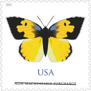 On January 27, 2019, in Kansas City, MO, the U.S. Postal Service will issue the California Dogface stamp (Non-denominated priced at the Non-machineable Surcharge rate) in one design, in a pressure-sensitive adhesive (PSA) pane of 20 stamps (Item 120100). The stamp will go on sale nationwide January 27, 2019, and must not be sold or cancelled before the first-day-of-issue.
 It measures 2.98″x1.39″.
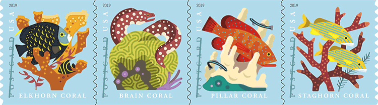 Four new postcard stamps celebrate the beauty and wonder of coral reefs. Each stamp depicts a type of stony coral, along with associated reef fish, in a highly stylized manner: elkhorn coral, shown with two French angelfish; brain coral, with a spotted moray eel; staghorn coral, with bluestriped grunts; pillar coral, with a coney grouper and neon gobies. Art director Ethel Kessler designed the stamps. Tyler Lang created the stamp art.
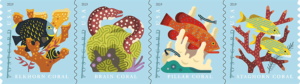 Format: Pane of 20 (4 designs)
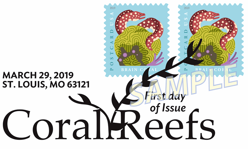 It measures 2.90″ x 1.39″
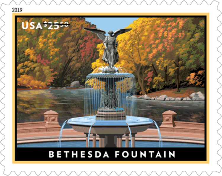 With this Priority Mail Express stamp, the Postal Service commemorates the Bethesda Fountain, one of Central Park’s most iconic structures. Dedicated in 1873, the fountain is a gathering place beloved by New Yorkers and out-of-town visitors alike. The stamp art features a stylized depiction of the fountain. The illustration was first rendered as a pencil sketch and then scanned and finished digitally. Art director Greg Breeding designed the stamp with original art by Dan Cosgrove.
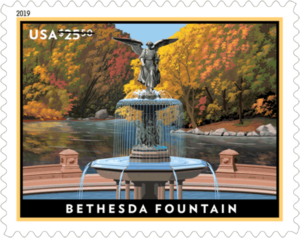 On January 27, 2019, in Kansas City, MO, the U.S. Postal Service will issue the $25.50 Bethesda Fountain Priority Mail Express stamp in one design, in a pressure-sensitive adhesive (PSA) pane of four stamps (Item 129900). The stamp will go on sale nationwide January 27, 2019, and must not be sold or cancelled before the first-day-of-issue.
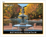
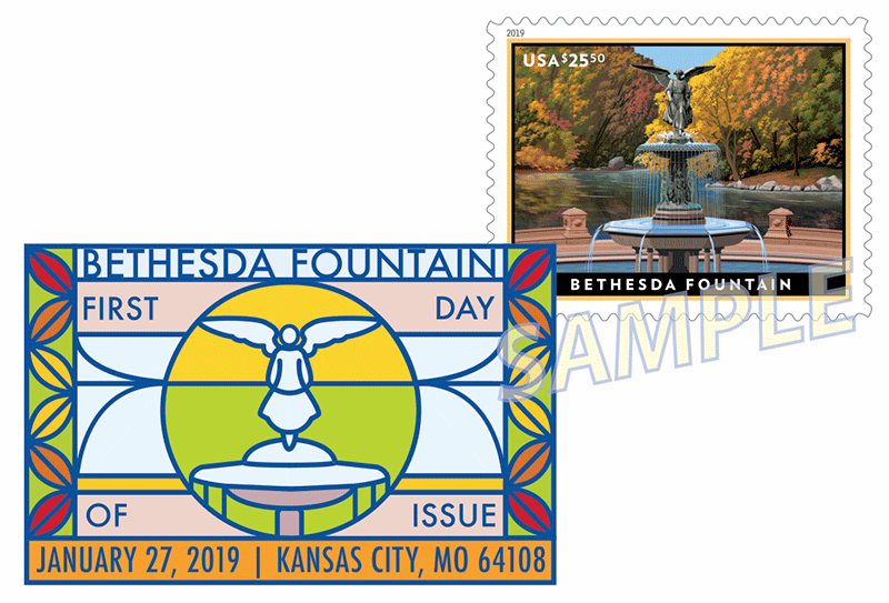 The Digital Color Postmark measures 2.19″x1.41″.
 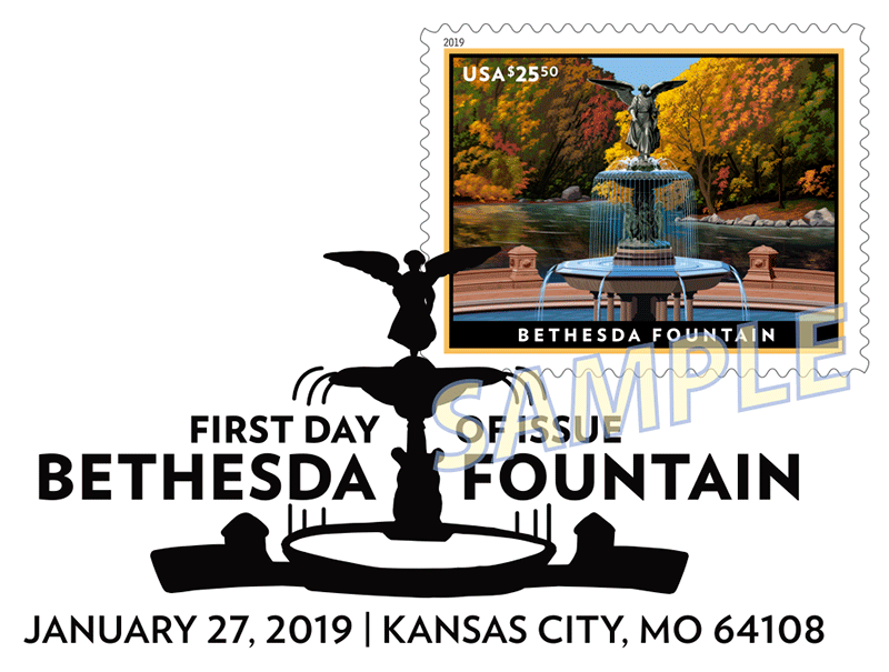 The B&W pictorial measures 2.84″1.42″.

